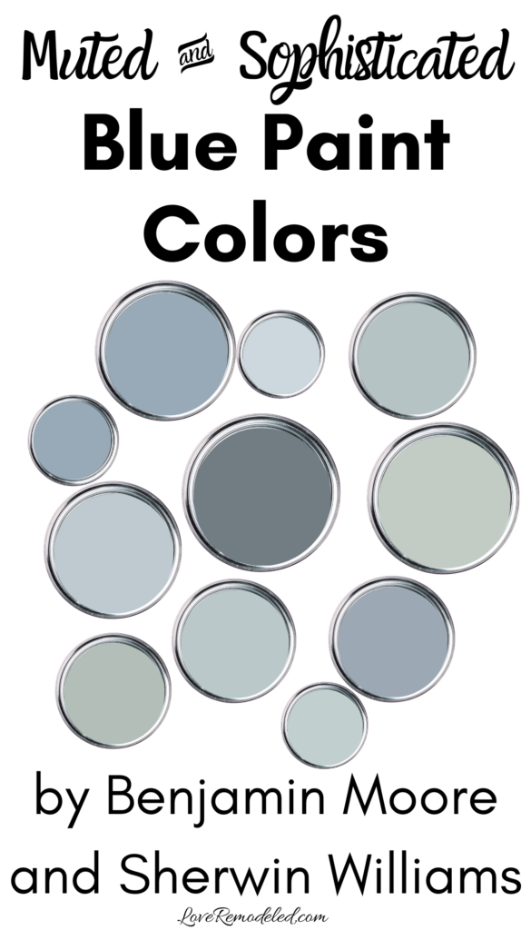
Muted blues are some of my favorite paint colors. They feel so soft and soothing, adding quiet refinement to any space. Since blue has been found to be the most popular favorite color, muted blues tend to have a very wide appeal.
Some blues lean more purple, others more green. But almost all of them are perfect for a home because a muted blue blends the appeal of blue with the sophistication of gray.
I love soft blue paint colors so much, so it is hard for me to narrow down my list of the best shades to only a few. Having spent the better part of the last ten years studying paint colors, I tend to know which ones work the best though.
So, here are my favorite muted blue paint colors. I separated them into colors by Sherwin Williams and by Benjamin Moore, in case you are partial to one company over the other.
This post may contain affiliate links. If you have any questions, please see my disclaimer page.
Muted Blue Paint Colors – Sherwin Williams
Sherwin Williams Upward
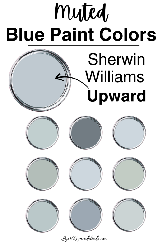
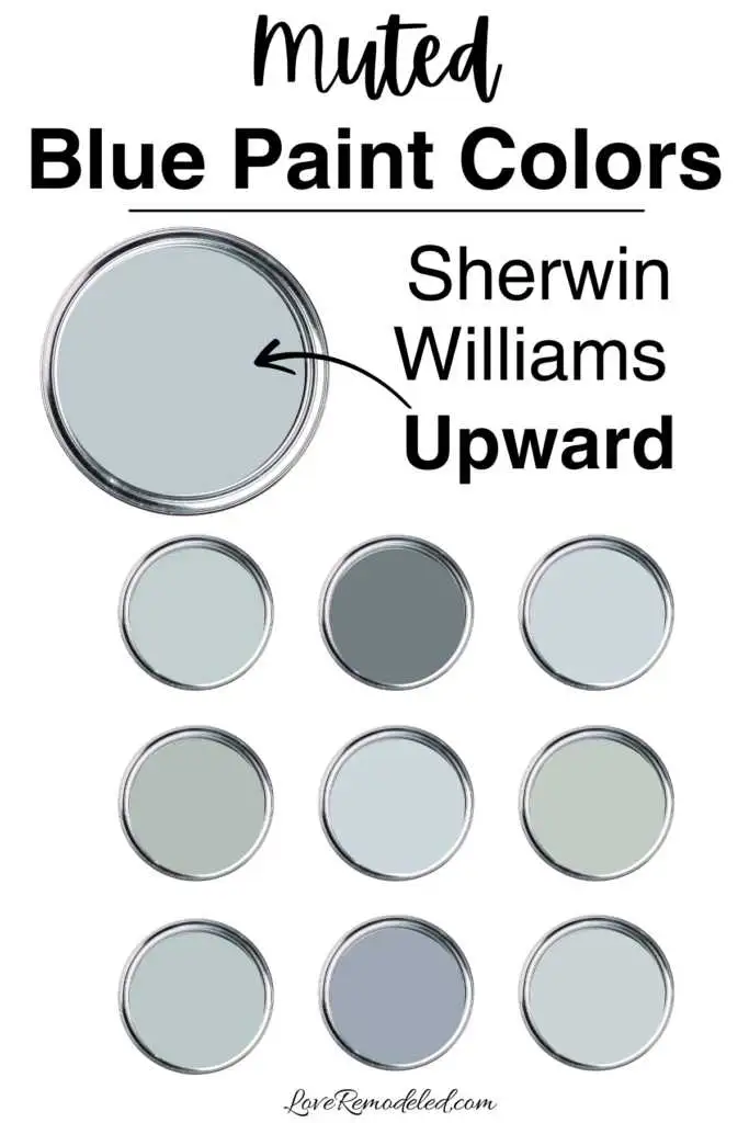
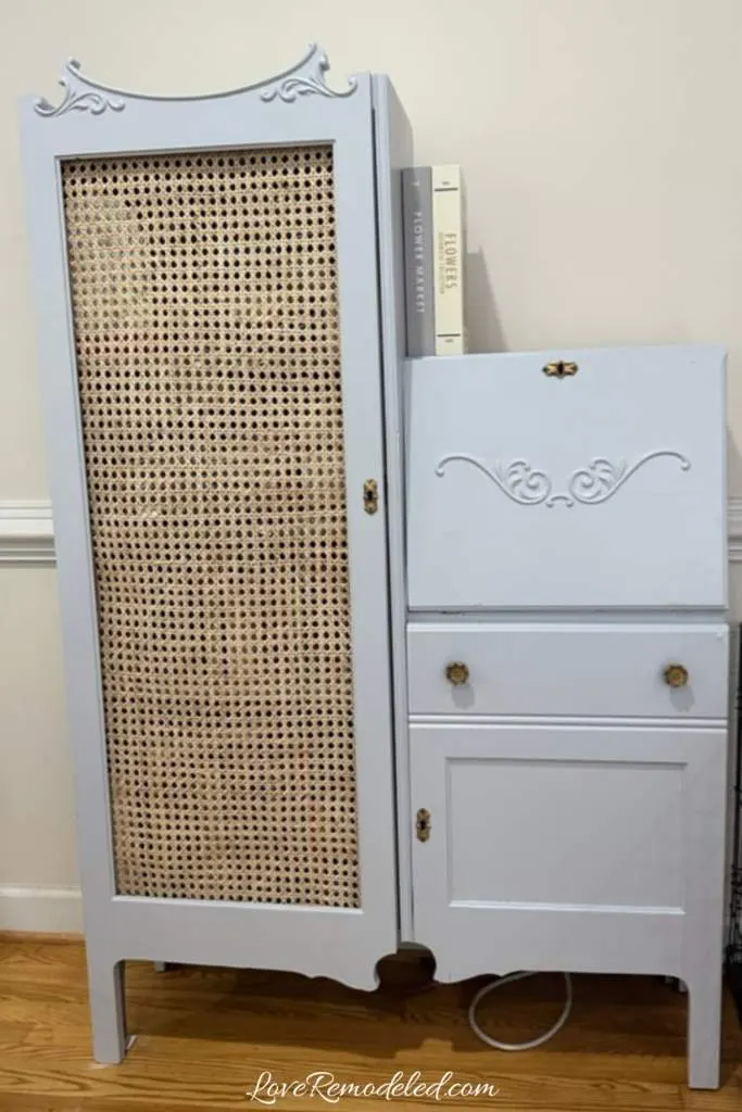
Sherwin Williams Upward is a muted blue paint color that is soft and elegant. It is a shady grayish blue that has a purple undertone. In morning light, it may look a bit more gray, but in afternoon sun you’ll see the true color of Upward. While Upward doesn’t look overtly purple, when you compare it to a more true blue, you can see the purple tones in it.
Upward isn’t a color that I would recommend for every space. You really need to test this color against the other blues in your room. If your blues have more green in them, you might want to select a different shade, as the green in the one blue will really highlight the purple in Upward.
But, Upward is a pretty color. I used Upward on an old secretary desk in my home, and I get compliments on the color all the time.

Sherwin Williams Tradewind
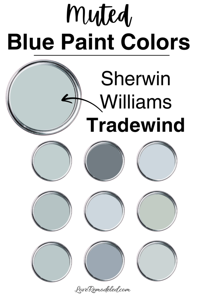
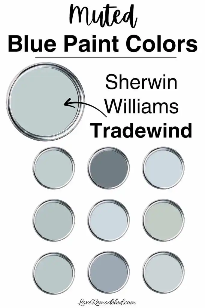
Sherwin Williams Tradewind is a soft blue that has a bit of green in it. It is like a very light aqua shade.
Tradewind can work in almost any space because it is not too dark and not to light. It has a little bit of gray in it, but not so much that it will ever look gray.
But, Tradewind also isn’t a true blue, so you have to be sure to test it in your space to make sure it works.
Sherwin Williams Lullaby

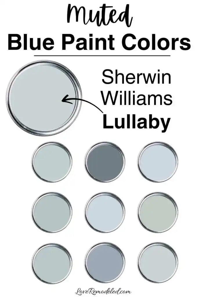
Sherwin Williams Lullaby is a muted blue that rings more like a true blue. It has a good bit a gray it.
Overall, Lullaby is a pretty versatile color. It can look almost gray at times, and functions as a nice almost-neutral backdrop to the other shades in your space.
Lullaby is a very muted blue, and doesn’t lend too much color to a room. If you want a paint color that just hints at blue, Lullaby might be the right shade for you.
Sherwin Williams Niebla Azul

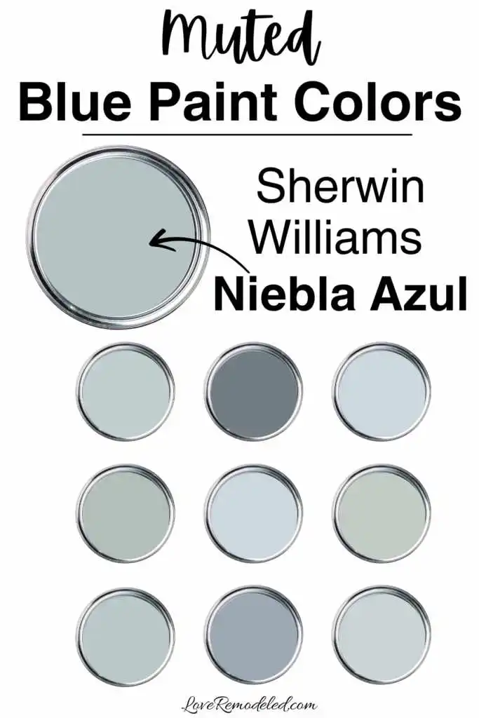
Sherwin Williams Niebla Azul is a blue that technically falls into the medium depth of paint colors, but it isn’t actually too terribly dark. This color has a good bit of gray in it, but not so much that it looks gray too frequently.
Niebla Azul is a good blue that still looks blue but isn’t bright at all. It will need adequate light to support it. This will make sure it doesn’t make the room feel dark or dingy. If you have decent natural light that can be augmented by lamps and overhead fixtures in the evening, Niebla Azul may work for you.
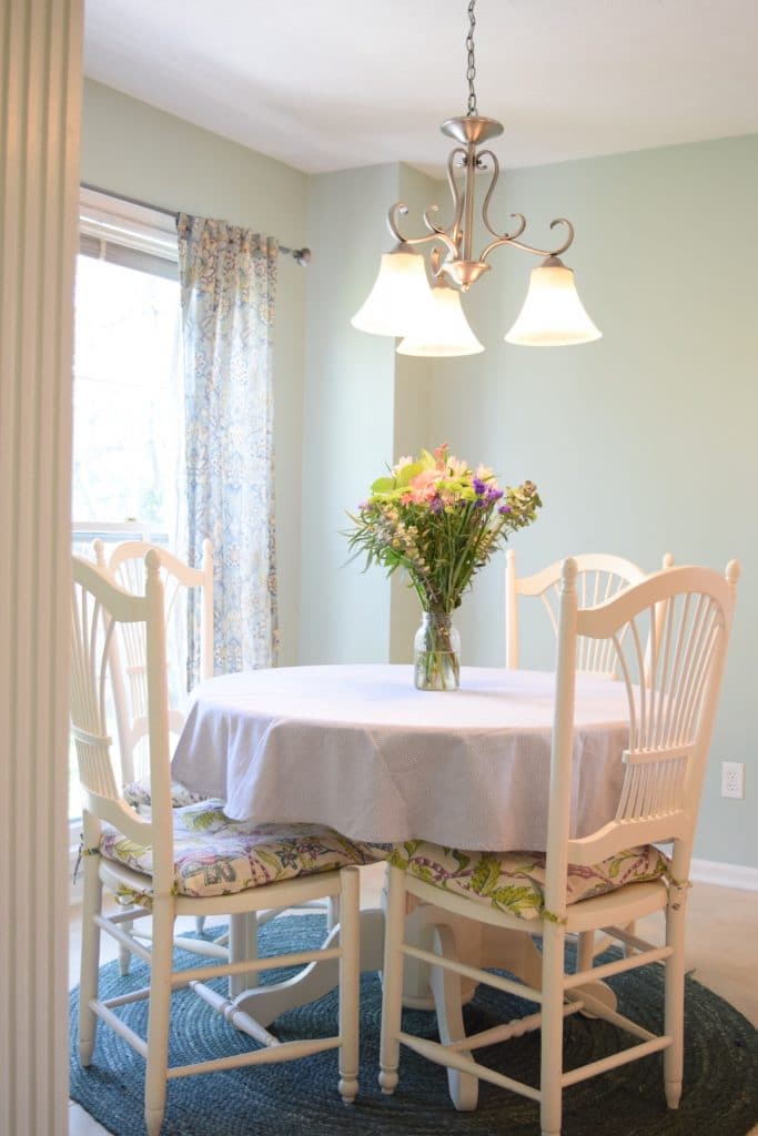
Sherwin Williams Rainwashed

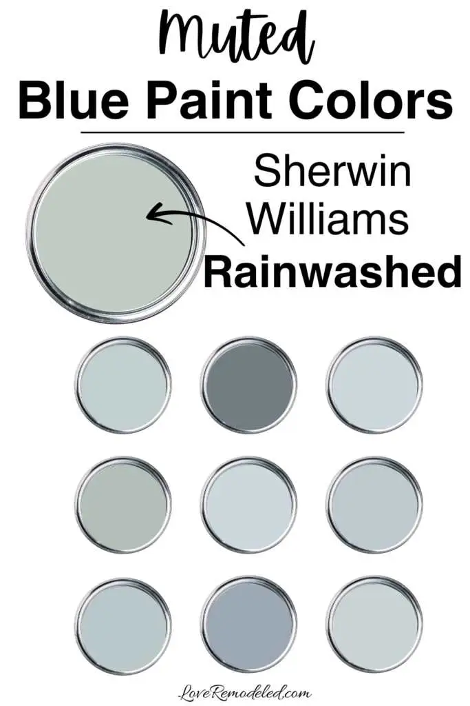
Sherwin Williams Rainwashed is a light blue green blend that has a good bit of gray in it. This soft paint color tends to lean more blue though, and creates a soothing, relaxed vibe in a space.
Rainwashed isn’t a true blue paint color. It can definitely look blue, but it has that green undertone. The green in Rainwashed gives it a spa-like feel, as opposed to a more sophisticated vibe that a true blue may give.
I used Rainwashed in a kitchen with light maple cabinets to give the space an elegant pop of color.

Sherwin Williams Aleutian

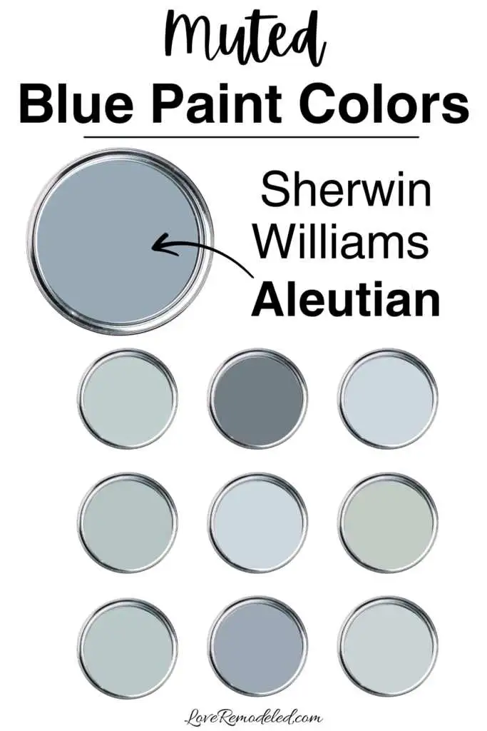
Sherwin Williams Aleutian is a darker muted blue. It has gray undertones, and is more of a true blue. Aleutian is not a super dark color, but it does have a little bit of meat on its bones.
Aleutian is great in a whole room if you are going for moody, brooding ambiance. Because it has more depth to it, it can feel fairly dark in a space, even though it is a mid-tone paint color.
A darker shade like Aleutian can bring a sophisticated look to a library, office or bedroom. I wouldn’t use a shade this dark as an all-over-the-house color, but in the right space, it can be a great muted blue paint color to use.
Muted Blue Paint Colors by Benjamin Moore
Benjamin Moore Beacon Gray is a light muted blue paint color. This shade is soft and airy, and almost looks like a very cool off-white.
Beacon Gray will take on a bit more color in a room with less light though, and may even look like a gray on your walls if you have a good bit of northern light (which will cool down any paint color).
It is a great paint color for someone who wants their walls to hint blue without being fully committed.
Benjamin Moore Beach Glass

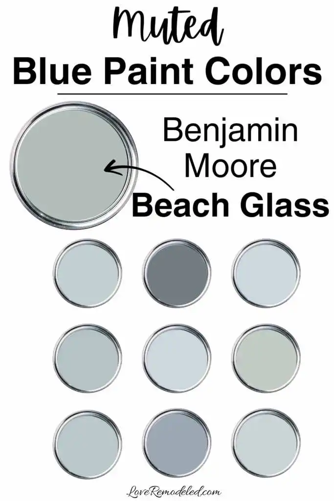
Benjamin Moore Beach Glass is a muted blue green paint color. It isn’t a true blue, but could certainly pass for one to the untrained eye.
The little bit of green in Beach Glass makes it feel more spa like. It has a good bit of gray too though, and this keeps it from looking to juvenile.
Beach Glass is a great color for a bathroom or bedroom. It can work with other blues that have similar undertones, or with deep navys. Just be careful to check the undertones of your blues before putting the whole space together.
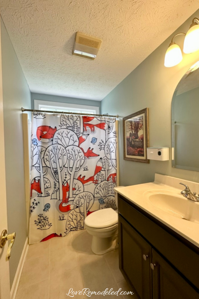
Benjamin Moore Smoke
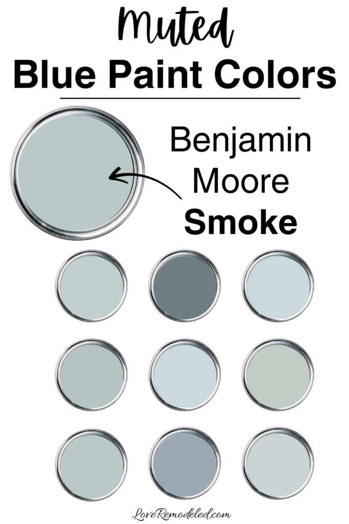
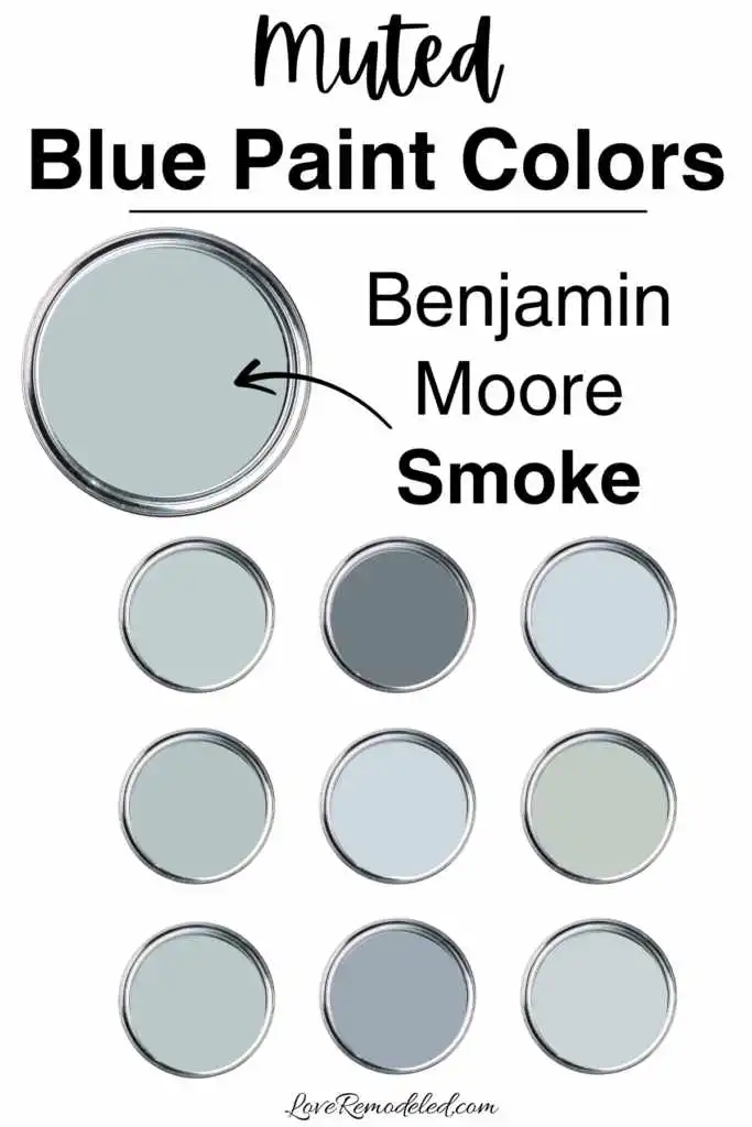
Benjamin Moore Smoke is a light, muted blue paint color that has a little bit of gray in it. It is soft and easy to use, since it isn’t too light or too dark.
Smoke is a great paint color for a bathroom, bedroom, or living space. It has a bit more green in it than some blues, but you don’t really see the green until you compare it to a more true blue.
I used Smoke in a children’s bathroom recently, and loved how it created a calming yet happy vibe in the room.

Benjamin Moore New Hope Gray

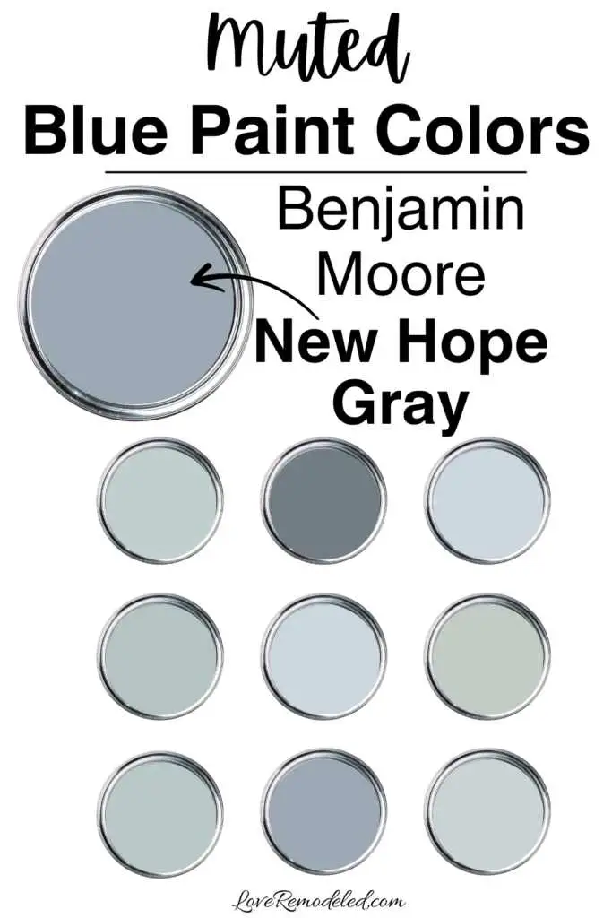
Benjamin Moore New Hope Gray is a mid-tone blue that has a good bit of gray in it. New Hope Gray is one of Benjamin Moore’s most popular paint colors, because it is a good blue that doesn’t look too purple or green.
This paint color can work in a whole room, but you will need to make sure that you have enough light to support it. This will keep the walls from looking drab. New Hope Gray is a moody sort of muted blue that reminds me of a storm cloud right before it starts to thunder.
Benjamin Moore Wolf Gray
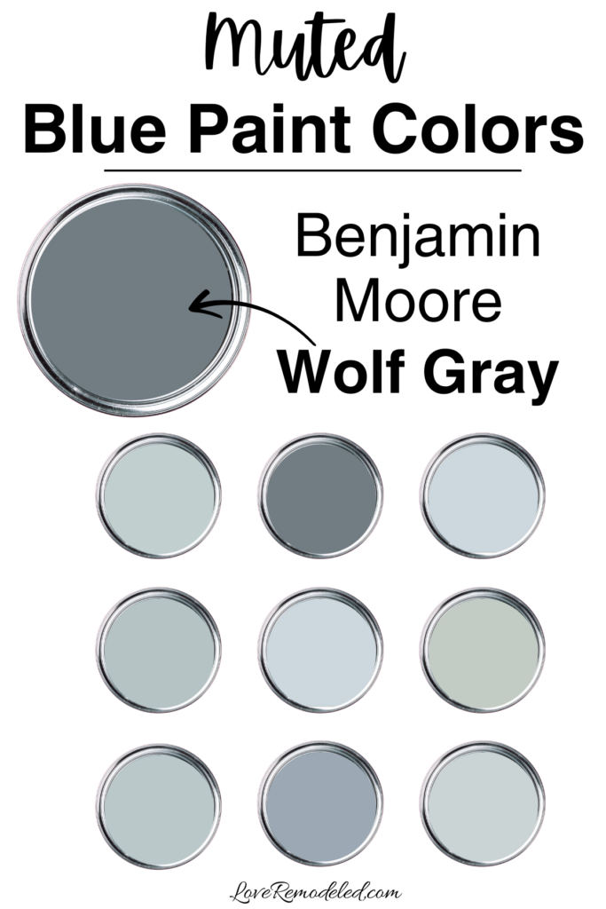
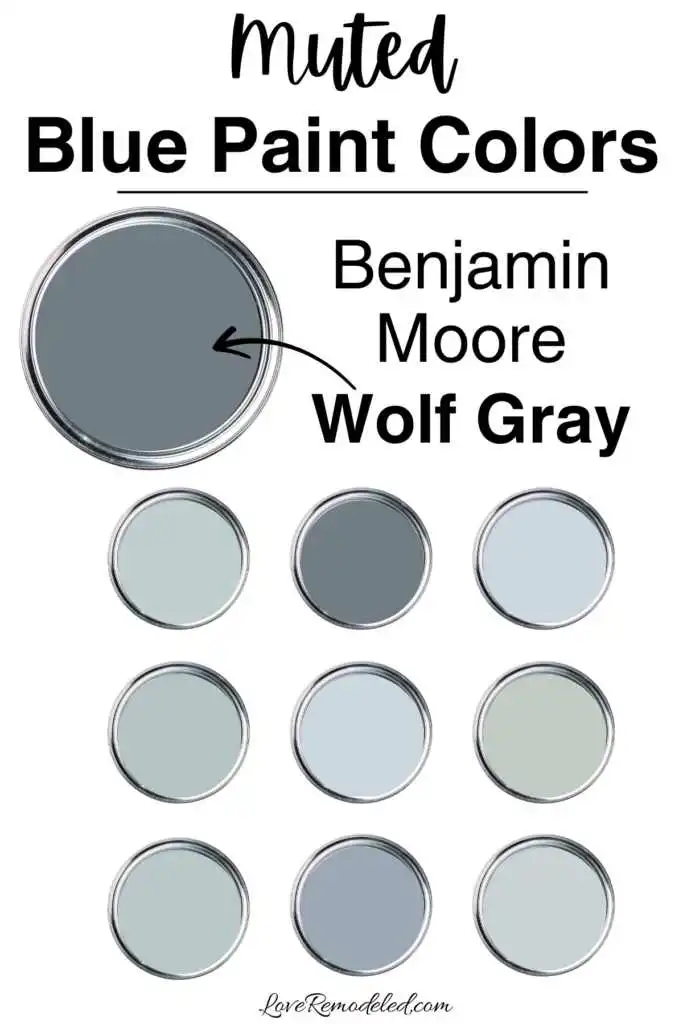
Benjamin Moore Wolf Gray is a deep mid-tone blue paint color that almost crosses over into the dark blue territory. In cooler lights, such as morning sun or north facing rooms, Wolf Gray may even look gray. But with good lighting, the blue in it really comes through.
Wolf Gray is a bit too dark for a whole room (in most cases). While some rooms can handle a moody blue like this, most will be better off with lighter shades. But, if you’re feeling daring and want a darker muted blue paint color, Wolf Gray should be on your shortlist.
Final Thoughts on Muted Blue Paint Colors
All blues are cool colors, and cool colors are great in almost any space. Muted blues are the pinnacle of cool shades, because the combine the appeal of a blue color with the sophistication of gray.
Muted blue paint colors are great it you:
- want a soothing, relaxing environment
- are interested in a paint color that is more interesting than your typical neutral
- aren’t ready to commit to a vibrant paint color but don’t want a neutral
- love blues but don’t want to have obviously blue walls
- want a sophisticated look
Overall, muted blues are my favorite paint color to paint on a wall for anyone who doesn’t want a neutral. They have wide appeal, go with so many other colors, and work in almost any style of home.
This post may contain affiliate links. If you have any questions, please see my disclaimer page.
Wondering How To Pick the Perfect Paint Color?
I have the best solution for you!
Samplize sells peel and stick paint samples in almost every paint color.
These no-mess, peel and stick sheets are made from real paint, so they will show you exactly what the paint color will look like.
Simply place them on your walls next to your trim, furnishings or fixed elements, and easily see which paint color works best in your space and with your lighting.
Then, peel the sheet off your wall and reapply it somewhere else if you like. You can try several different paint colors with no mess, no fuss and no cleaning paint brushes.


Oh, and you can have them in your home by tomorrow with OVERNIGHT shipping!
As a bonus, be sure to use the code LoveRemodeled10 at check out to get an extra 10% off! Samplize sheets are cheaper than a sample can of paint, and way less work.
They are the easiest (and fastest!) way to try a paint color in your home, with no hassle.