Sherwin-Williams Upward (SW 6239) is a beautiful blue paint color. It is refreshing, expansive and airy.
Upward was recently announced as Sherwin Williams 2024 Color of the Year.
Each year, Sherwin Williams chooses a paint color that reflects emerging color trends. This year, they chose this gorgeous medium light blue.
Blue paint colors are very in style right now. With the rise of the popularity of coastal home style, including coastal grandmother and coastal grandmillenial (think Serena and Lily, Ballard Designs, etc.), light blues are all the rage.
Paint Color Details on Sherwin Williams Upward
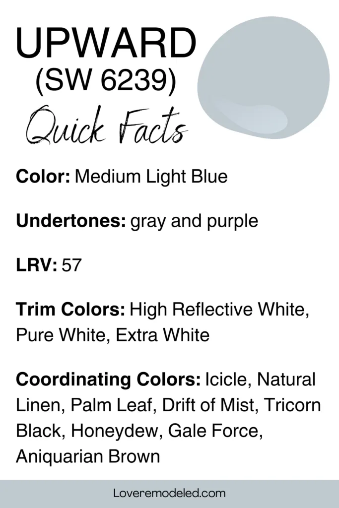
Sharon Williams describes Upward as a denim blue. In my opinion, it is a very light denim color, not the dark denim that you might most commonly think of.
Lighter tends to be better for paint colors though, so this is a good thing, even if it isn’t the most accurate description.
I like Sherwin Williams Upward because it provides a pop of color without actually being too colorful.
For someone who is venturing out of the all white or all gray world that home decor has been in for a while, Upward is a great transition color.
You won’t experience the shock having super vibrant walls, but instead can ease your way into showing a little more personality on your walls.
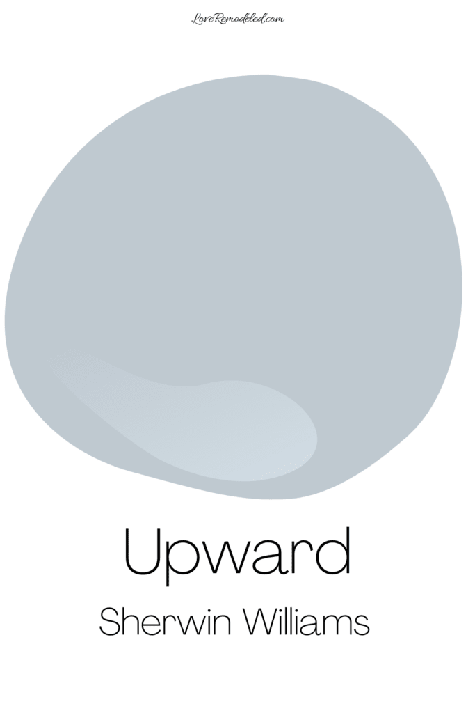
Sherwin Williams also describe Upward as a light neutral. In fact, Upward is in the neutrals section of the Sherwin Williams paint book.
I wouldn’t exactly go so far as to call it in neutral, because when I think of neutrals I think of grays, creams, whites, off-whites, beiges, and blacks. And Upward is definitely a blue color.
But Upward can act as a neutral. Because it is light and a fairly muted shade, it can handle being paired with some brighter tones like a neutral can.
And, Upward can take on the look of a neutral and dim lighting or in a Northern facing room.
Sherwin Williams Upward Undertones
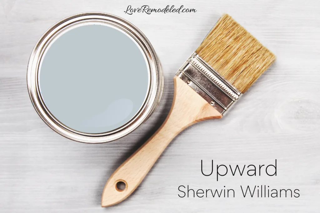
This is because it has a gray undertone. Basically, that just means that in addition to blue, the formula also has some gray in it.
A gray undertone is great in paint colors because it keeps them from being too bright or too juvenile looking.
Upward is no exception. This light blue is not reminiscent of the baby blue that she would put in a newborn’s nursery. It’s sophisticated and mature.
So, in a room with cooler lighting (such as a northern facing room), you will see more of the gray in Upward.
But, if you put Upward in a southern facing room or in a space with warmer lighting, the blue will show up more and Upward will look like a very light grayish blue.
Upward also has just a hint of purple in it.
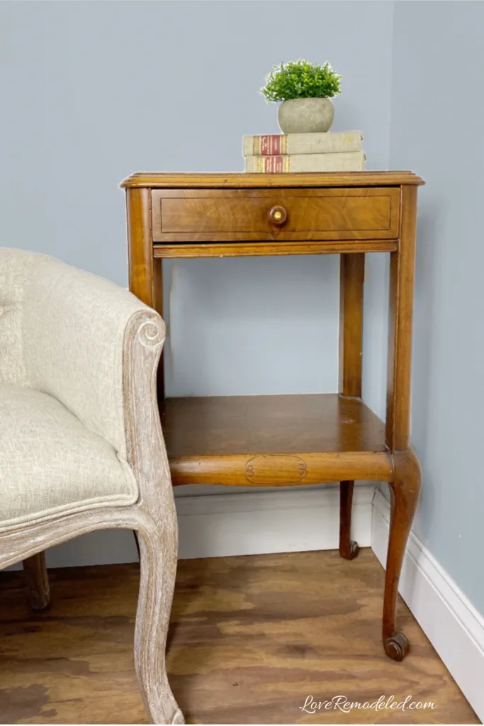
Don’t worry, Upward won’t look purple on your walls. But this does have some important implications. You won’t want to pair Upward with a blue that has green undertones because it may clash.
As with all paint colors, you are going to want to test it in your space and with your furnishings before you paint your walls. Making sure all the undertones in your space work together, is important step in choosing a paint color.
My favorite way to test paint colors in my home is to get a Samplize sheet. More on that in a bit.
Is Upward Warm or Cool?
Sherwin Williams Upward is a cool paint color.
As a cool blue, Upward makes a space feel relaxed and breezy. Cool blue paint colors can also seem to make the walls recede into the distance, like the horizon or ocean does.
Colors that Go With Sherwin Williams Upward
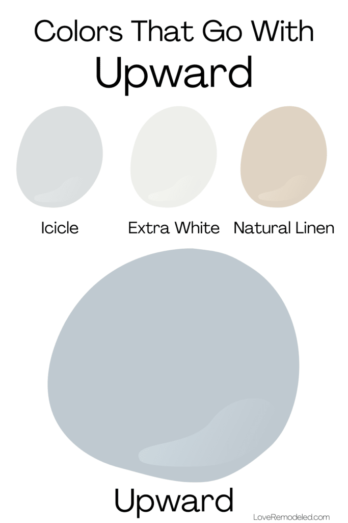
Sherwin Williams pairs Upward with Icicle, Extra White, and Natural Linen. All of these paint colors are great options. Extra White works amazing on trim, woodwork and can also be used on walls.
Icicle is a light silvery gray. It would work well in adjacent room, especially if you have a room with less light.
Natural Linen is a gorgeous neutral in the beige family. It’s not the yellow or pinkish beige that is so outdated though. Instead, Natural Linen is a nice, grayish beige that is modern.
You may also find some great coordinating colors for Upward on its color strip.
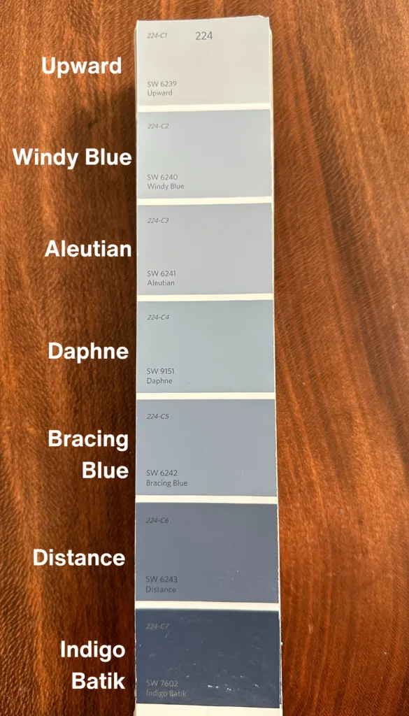
Upward shares a color strip with Windy Blue, Aleutian, Daphne, Bracing Blue, Distance and Indigo Batik.
In particular, I like pairing Upward with Daphne, a midtown grayish blue, and Indigo Batik, a dark blue.
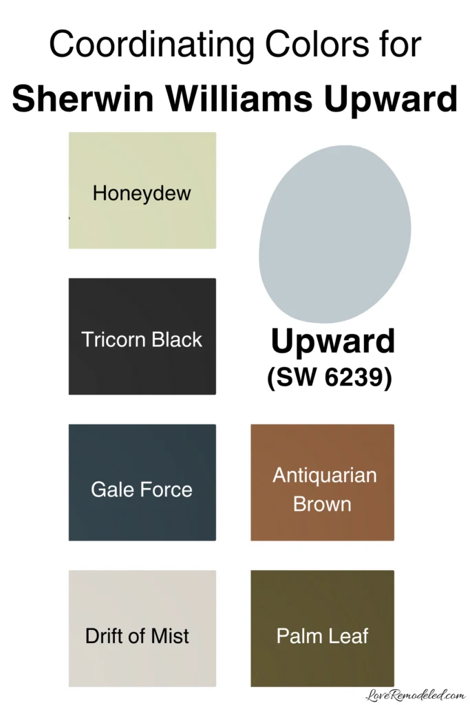
Since Upward is Sherwin Williams 2024 Color of the Year, they have also identified several other shades that pair nicely with it. They are Drift of Mist, Palm Leaf, Antiquarian Brown, Honeydew, Tricorn Black, and Gale Force.
Finally, some other paint colors that go well with Upward are Natural Tan, Accessible Beige, Ice Cube, Spatial White and First Star.
Trim Colors for Sherwin Williams Upward
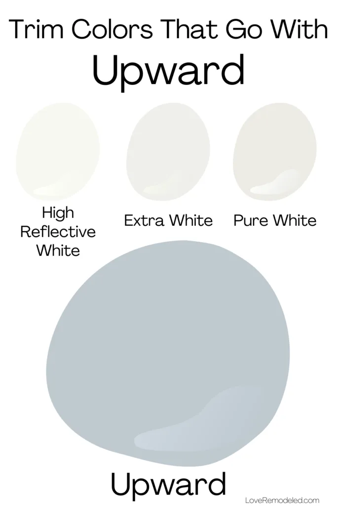
For trim colors, I like to use Upward with High Reflective White, Extra White or Pure White.
High Reflective White has basically no undertones, and is the whitest paint color that Sherwin Williams has.
Extra White has cool blue and gray undertones, making it a natural fit with Upward. It will look little chilly, and contribute to an overall cool look in the space.
Pure White has a little more warmth to it, with yellow and gray undertones. It will look less stark than the other shades.
Where Can I Use Upward?
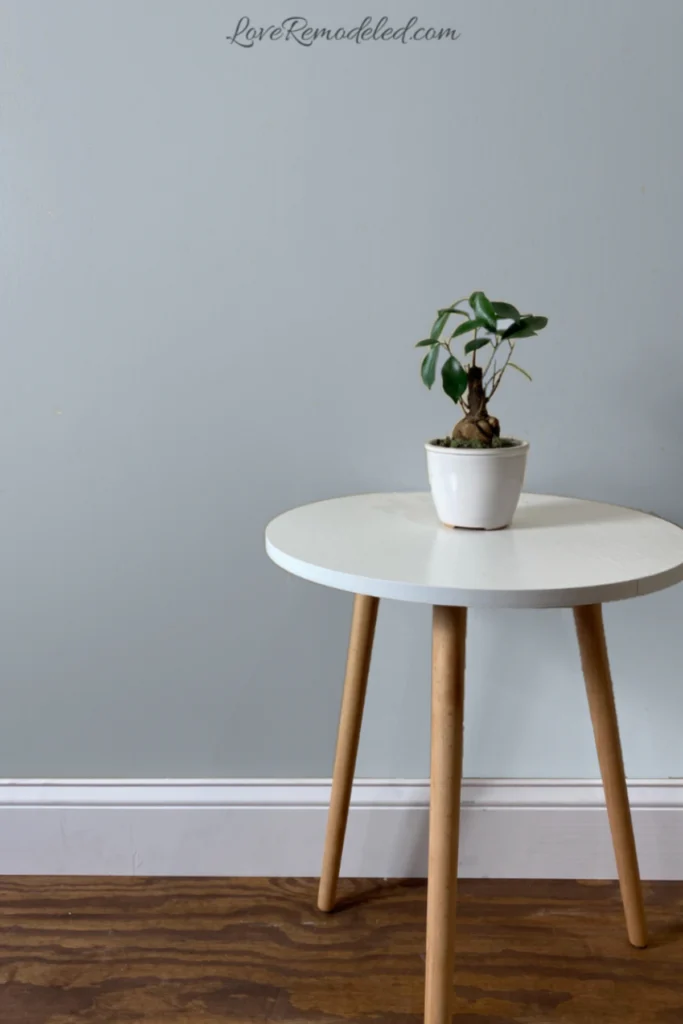
Upward works in just about any space you want to put it. It can be an all over the house paint color, in a single room, or just as an accent on a piece of furniture.
You can also use Upward on a home exterior if you have other cool tones that you are working with. If you use Upward outside though, remember that it will look a little lighter than you expect because of all of the sunlight.
Wondering How To Pick the Perfect Paint Color?
I have the best solution for you!
Samplize sells peel and stick paint samples in almost every paint color.
These no-mess, peel and stick sheets are made from real paint, so they will show you exactly what the paint color will look like.
Simply place them on your walls next to your trim, furnishings or fixed elements, and easily see which paint color works best in your space and with your lighting.
Then, peel the sheet off your wall and reapply it somewhere else if you like. You can try several different paint colors with no mess, no fuss and no cleaning paint brushes.
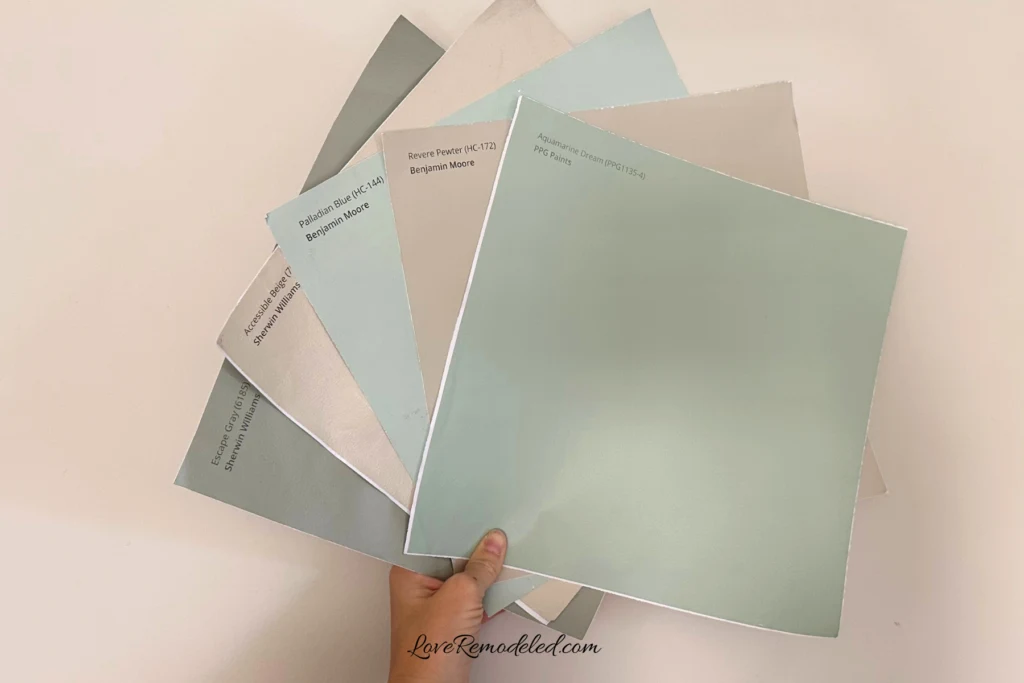
Oh, and you can have them in your home by tomorrow with OVERNIGHT shipping!
As a bonus, be sure to use the code LoveRemodeled10 at check out to get an extra 10% off! Samplize sheets are cheaper than a sample can of paint, and way less work.
They are the easiest (and fastest!) way to try a paint color in your home, with no hassle.
My Thoughts on Sherwin Williams Upward
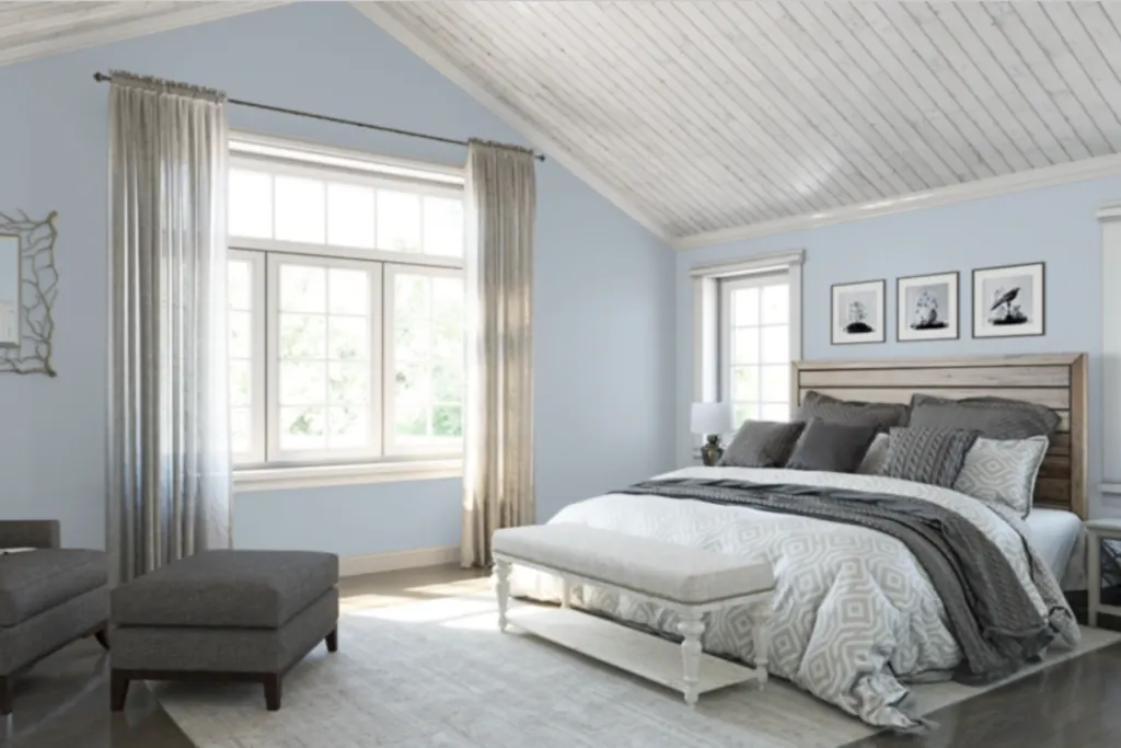
In my own home, I have been leaning towards shades like Upward for a while.
These calming blues make me feel peaceful. I love Upward with cream and white shades, brown leather furniture, navy blue accents, and pops of pink throw pillows to add a little warmth to the space.
So personally, I think Sherwin Williams nailed it with their choice for the Color of the Year this year. They were spot on with choosing a color that is neutral, versatile, on-trend and easy on the eyes.
What do you think of Sherwin Willams 2024 Color of the Year? Did they get it right this year?
Let me know in the comments!
Interested in previous Sherwin Williams Colors of the Year? Check out the last ten years here.
Have a question? Leave me a comment! Remember to check back for a response – it may take me up to a week or two depending on how busy I am, but I’ll be sure to get back to you!
Want to show off your project? Join the discussion in Love Remodeled’s Facebook group!
Melissa
Wednesday 17th of January 2024
What would you put on the vaulted ceiling with the Upward on the walls? North facing.
Lauren
Thursday 25th of January 2024
Hi Melissa! For a white, I would go with Pure White. You also have the option of continuing Upward onto the vaulted ceiling. This could look really pretty, though it is a bit bolder of a choice than a classic white ceiling.