
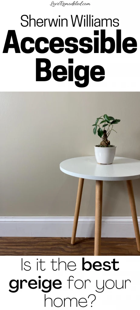
Accessible Beige is an hugely popular beige paint color made by Sherwin Williams.
Accessible Beige has had steady popularity, including when beiges were so in vogue in the 2000s. Since then, it has only increased in favor with homeowners and designers due to its versatility.
Sherwin Williams has featured Accessible Beige in their Bold Invention Color Collection, and their Living Well – Balance Color Collection.
Keep reading for everything you need to know about Sherwin Williams Accessible Beige.
Accessible Beige Undertones
While it has the name “beige” in it, Accessible Beige is not a true beige.
In fact, I don’t even include it on my list of the top beige and tan paint colors (so if you’re looking for a true beige, you should check out that post).
True beige paint colors tend to have a lot of gold in them.
Accessible Beige lacks these gold tones though, and instead has gray undertones. This means that Accessible Beige is actually a greige paint color (a blend of gray and beige).
While some greiges favor gray, Accessible Beige has more beige than gray, but not too terribly much.
Accessible Beige also has just a hint of green in it, which gives it a very earthy feel.
Is Accessible Beige Warm or Cool?
As with all greige paint colors, Accessible Beige is a warm color. Cool colors tend to have blue, green and purple tones in them, while warm colors have red, oranges and yellows in them. The beige in Accessible Beige plants it firmly in the warm category.
One of the things that I love about Accessible Beige is its ability to transition between more of a gray and more of a beige paint color, depending on the lighting and the time of day. Like most greiges, it is transitional in that it shifts with the changing light.
Accessible Beige LRV
Accessible Beige has a LRV (Light Reflectance Value) of 58, meaning that it reflects a good amount of light. It is not the brightest and lightest color though. The LRV scale goes from 0, which is completely black, to 100, which is completely white.
So, Accessible Beige isn’t necessarily going to lighten a dark room. But, it also won’t look dark on your walls. It is a good lighter mid-tone.
Complimentary Colors for Accessible Beige
Sherwin Williams pairs Accessible Beige with Aesthetic White, Cadet and Sanderling.
This particular color scheme is full of neutrals that work nicely with Accessible Beige. Aesthetic White is a lighter greige shade. Sanderline is a greenish brown paint color. Cadet is a cool, bluish gray paint shade.
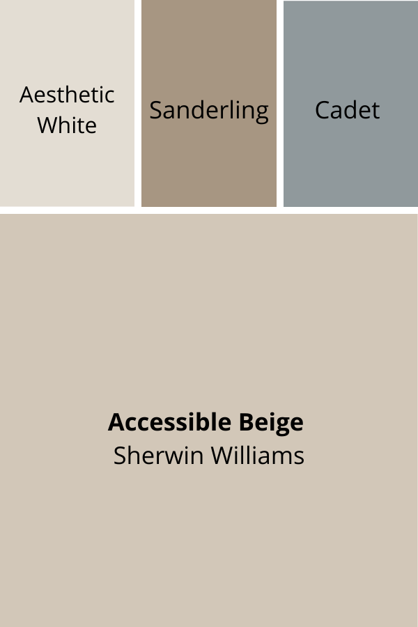
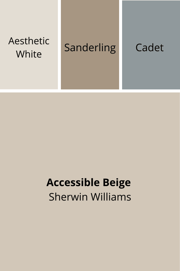
Because Accessible Beige is an earthy shade, it tends to go well with other paint colors that have a natural feel to them. Creams, greens, blues and browns typically pair nicely with Accessible Beige.
Accessible Beige is not the best shade to put with bright colors though. It gives off a mature, balanced vibe, so stick to more muted, grayed out greens and blues to complement it.
People often wonder if Accessible Beige goes with Sea Salt, another extremely popular Sherwin Williams paint color.
I find that Sea Salt and Accessible Beiges are great shades to put together. They have similar depths, which makes them look nice together. Plus, both have a bit of gray in them with makes neither come off as too bright.
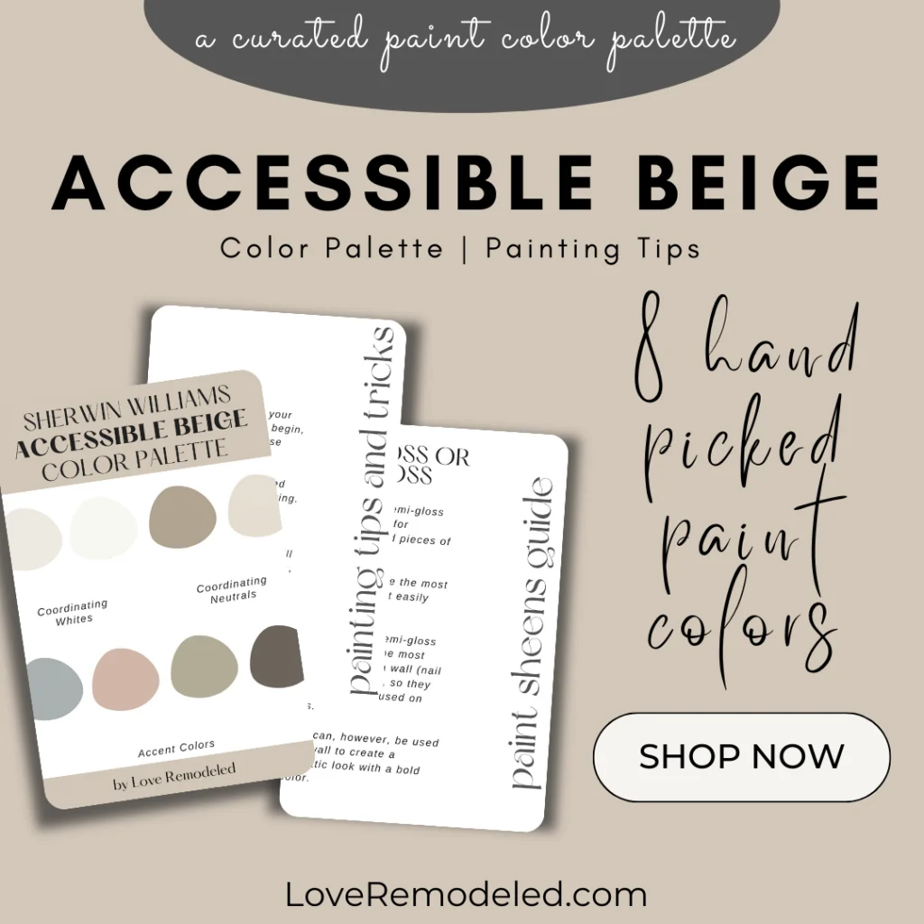
For additional coordinating colors, check out this Accessible Beige Color Palette for 8 additional paint colors to pair with Accessible Beige.

Benjamin Moore Accessible Beige Equivalent
People often wonder, “What Benjamin Moore color is closest to Accessible Beige?”
There are no real exact matches between Benjamin Moore and Sherwin Williams paint colors, both because formulas are different and because the actual paint products are different (and differing paint products can make even the same formula look different!).
But, Benjamin Moore has many really nice greige paint colors that are similar to Accessible Beige.
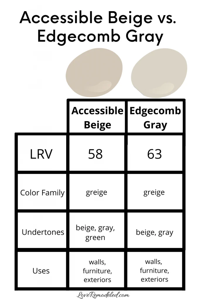
For the purposes of answering the question, I will say that Sherwin William’s Accessible Beige is most similar to Benjamin Moore’s Edgecomb Gray. They are definitely not exact matches though!
Both have more beige than gray in them, and they have similar depths, though Accessible Beige is a bit darker. Also, Accessible Beige has more brown in it than Edgecomb Gray does. Where Edgecomb Gray can look almost light and airy, Accessible Beige tends to lean more earthy.
The tones of Accessible Beige and Edgecomb Gray are similar though, more than many of the other popular greige shades.
Where Can I Use Accessible Beige?
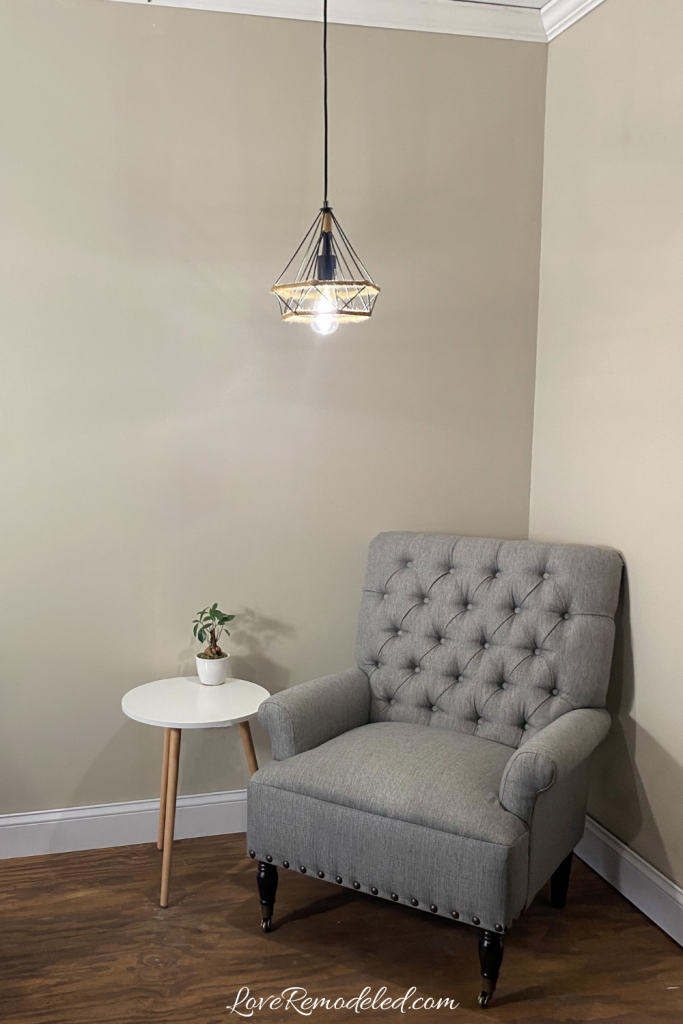
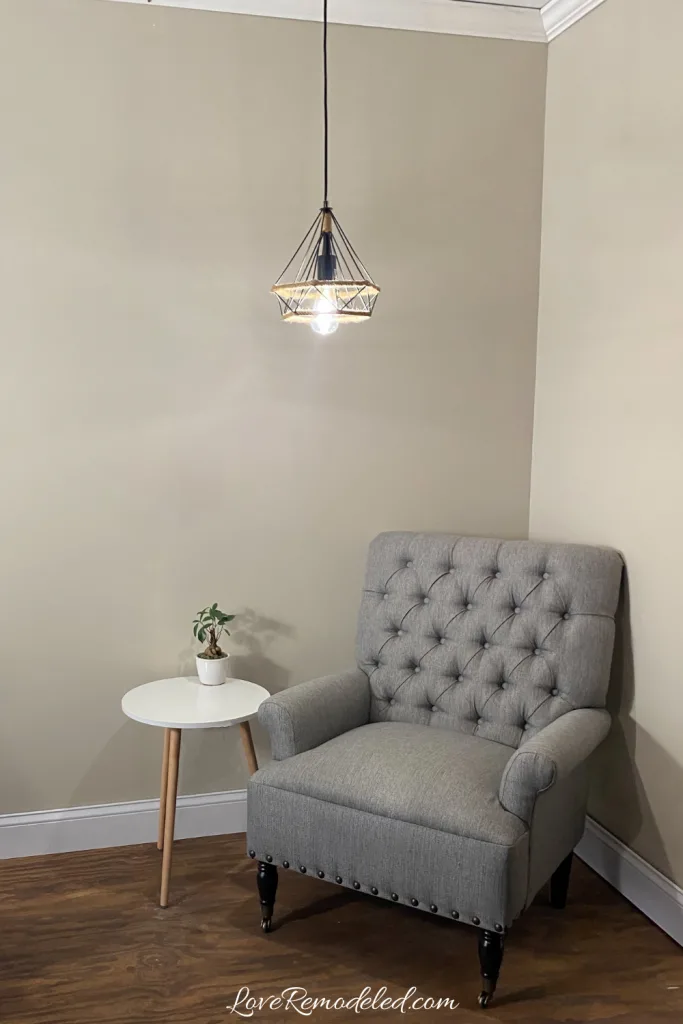
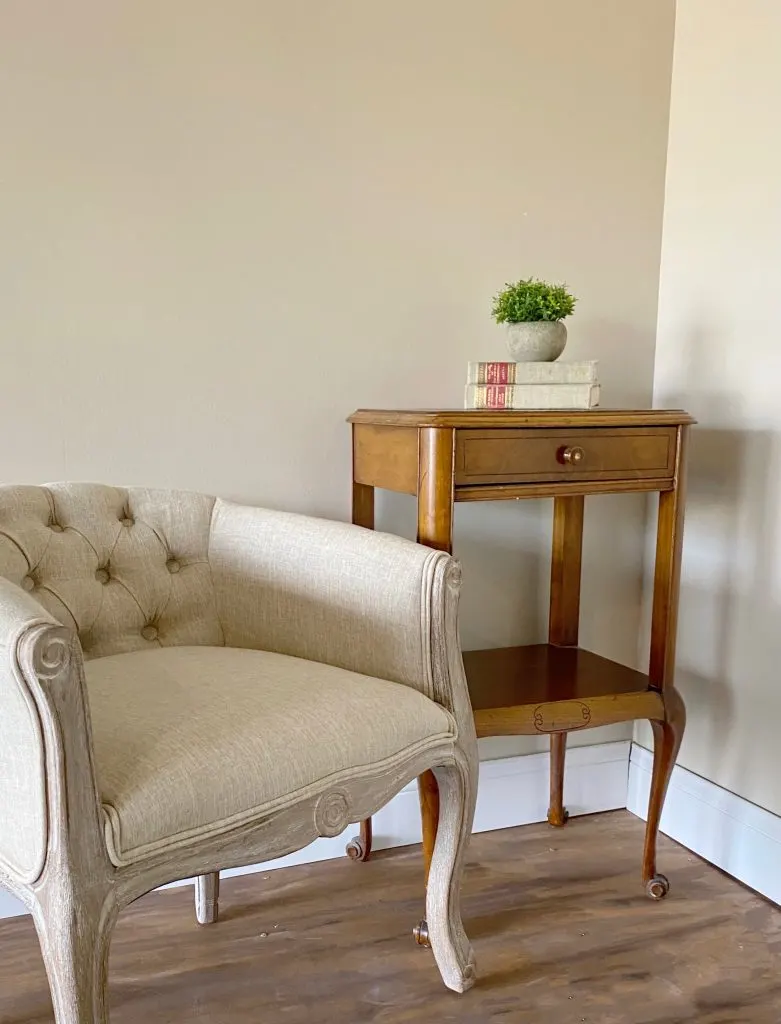
Accessible Beige is a great color for home interiors. It is a shade that can be used anywhere in the home, and everywhere in the home. It goes well in living rooms, dining rooms, entryways, offices, and hallways. Additionally, it can work in bedrooms, basements and bathroom.
Because it is a good blend of beige and gray, it works great in a space if the homeowner is looking for a warm neutral that leans towards beige.
Accessible Beige can also be used on home exteriors. It looks nice on siding when accented with the right coordinating colors. For example, I might pair Accessible Beige siding or painted brick with white soffits and windows, sage green shutters and an iron colored front door.
Accessible Beige Compared to other Popular Paint Colors

When I take a deep dive into paint colors, I like to compare them to other shades that you might be considering.
So let’s take a look at Accessible Beige as compared to other very popular greige paint colors.
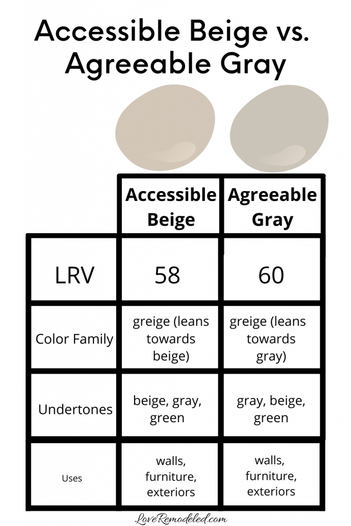
Accessible Beige vs. Agreeable Gray
Agreeable Gray and Accessible Beige are like two sides of the same coin. If this makes any sense to you… Agreeable Gray is the gray beige of Accessible Beige’s beige gray.
Agreeable Gray is SUPER popular for many of the same reasons that Accessible Beige is. It is neutral and versatile. Like Accessible Beige, it is the best of both the gray world and the beige world.
There are some important differences between Accessible Beige and Agreeable Gray though.
First, Accessible Beige is a much warmer shade than Agreeable Gray. It has more beige in it, and this makes it look more earthy.
Because of this, Accessible Beige tends to be a bit more of a comfortable, cozy paint color. In contrast, Agreeable Gray gives off a calming, balanced “art gallery wall” feel.
Second, Agreeable Gray is a bit more of an “updated” paint color, because it has more gray in it than beige. In the last few years, preferences have shifted away from true beiges to more gray tones. With this shift, many people began to favor greiges like Agreeable Gray over warmer greiges like Accessible Beige.
As with all things in fashion though, they come back around. We’re seeing more beige paint colors in homes again, so Accessible Beige will likely continue to have share in the spotlight for many years to come.
Click here for more information on Agreeable Gray.
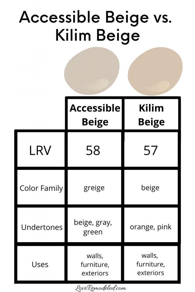
Accessible Beige vs. Kilim Beige
Kilim Beige is a well known beige paint color by Sherwin Williams, but it is not quite as popular as Accessible Beige.
Kilim Beige is much more of a true beige. It has more golden undertones, and definitely is not a greige paint color. It lacks the gray undertones that Accessible Beige has in it.
Since gray undertones tend to make paint colors more versatile than their non-grayed counterparts, Kilim Beige is a great paint color for a homeowner that wants really beige walls.
Kilim Beige is not good for a homeowner that doesn’t like yellow undertones, or one that wants a shade that effortlessly goes with anything.
If you want a more neutral “beige,” stick with Accessible Beige. If you want a color that is going to really warm up the space, Kilim Beige might be a good bet for you.
I go into more depth on Kilim Beige on my post about beige and tan paint colors.
For now though, this infographic helps you see the color difference between Accessible Beige and Kilim Beige.

Click here if you want more information on Kilim Beige.
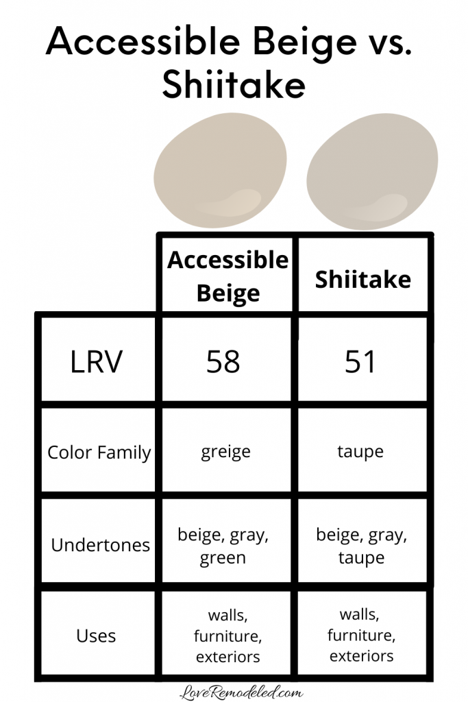
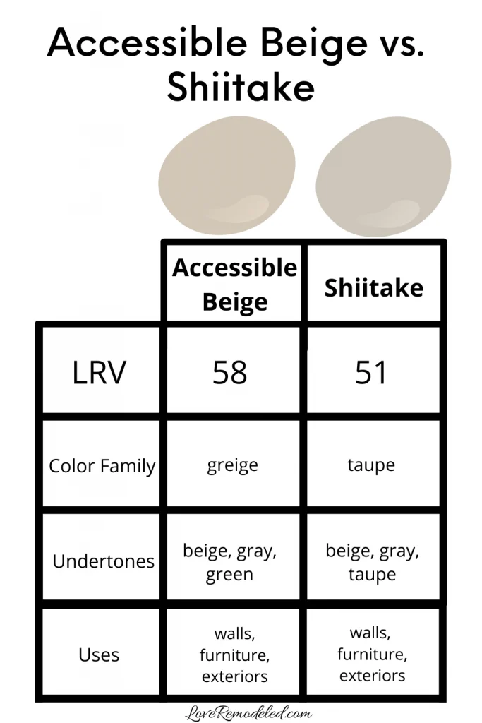
Accessible Beige vs. Shiitake
Accessible Beige and Shiitake are located on paint color strips that are right next to each other on the Sherwin William’s paint deck. They are very similar shades.
Accessible Beige has a bit more green in it, while Shiitake has a bit more of a taupe look. Additionally, Shiitake looks a bit darker than Accessible Beige does (and has a lower LRV).
If you’re considering Accessible Beige, Shiitake should be on your shortlist as well. Shiitake is going to have a bit more depth in the space, but this can work nicely in rooms like an office or dining room.
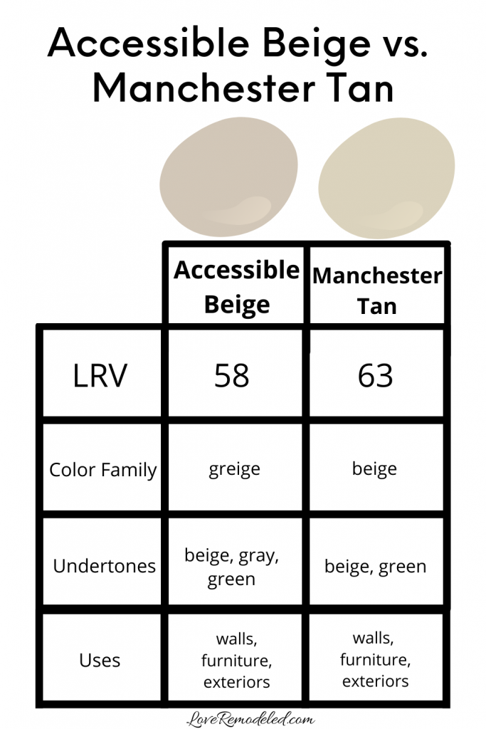
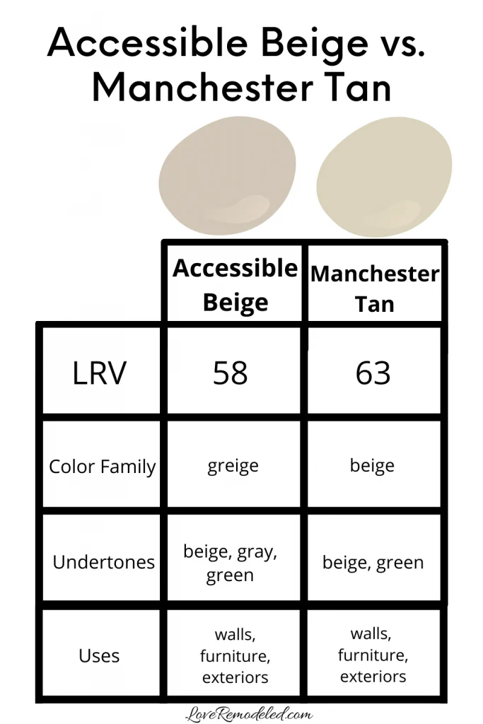
Accessible Beige vs. Manchester Tan
Manchester Tan is one of Benjamin Moore’s best selling paint colors. While it has the word “tan” in the name, it is actually more of a beige paint color.
As a beige, it is more of a gold undertone than Accessible Beige. This makes it feel warmer than Accessible Beige, and also a bit less versatile.
Manchester Tan is another shade I feature on my post about beige and tan paint colors. Check it out for more info, especially if you’re looking for a warm paint color that has some gold, but not too terribly much (as beiges go at least).
Accessible Beige vs. Edgecomb Gray
Edgecomb Gray is a personal favorite of mine by Benjamin Moore. It is very neutral, very light and almost can be classified as an off-white in my book.
I discussed it a bit above in the section about which Benjamin Moore paint color is most like Accessible Beige, so I won’t go into too much detail here, but here are the stats.
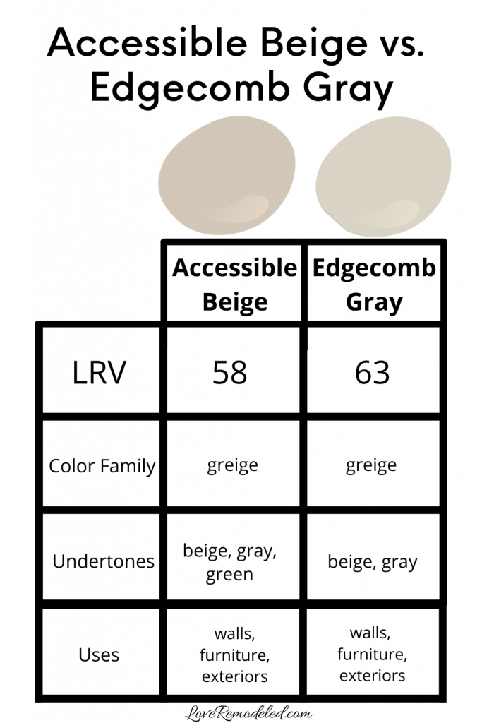
Also, check out this post if you’re considering Edgecomb Gray.
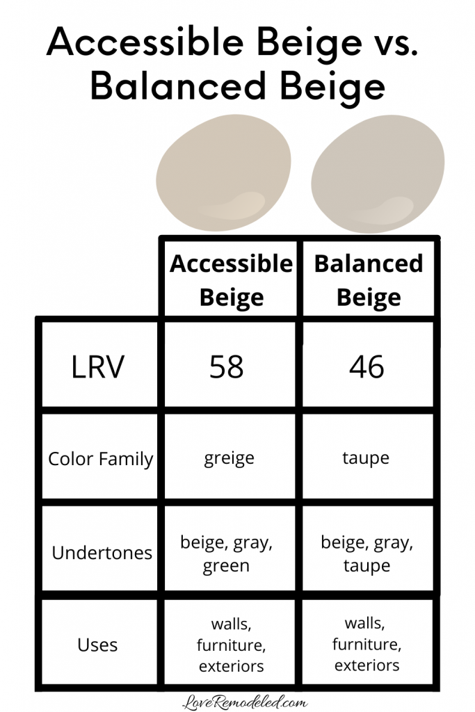
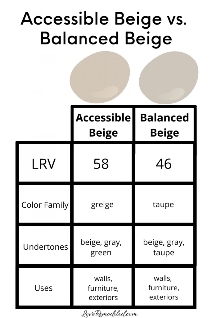
Accessible Beige vs. Balanced Beige
Accessible Beige and Balanced Beige share a color strip, but that doesn’t mean that they are just lighter or darker versions of each other.
Balanced Beige is a darker shade than Accessible Beige, and it holds itself much more like a taupe paint color than a beige.
Taupe paint colors are predicted to be in this year, so if you want a shade that is more trendy, Balanced Beige may be a good bet for you.
Again thought, Balanced Beige is moving into a medium depth range of colors. It has an LRV of 46, and it is going to feel heavier on your walls than Accessible Beige does.
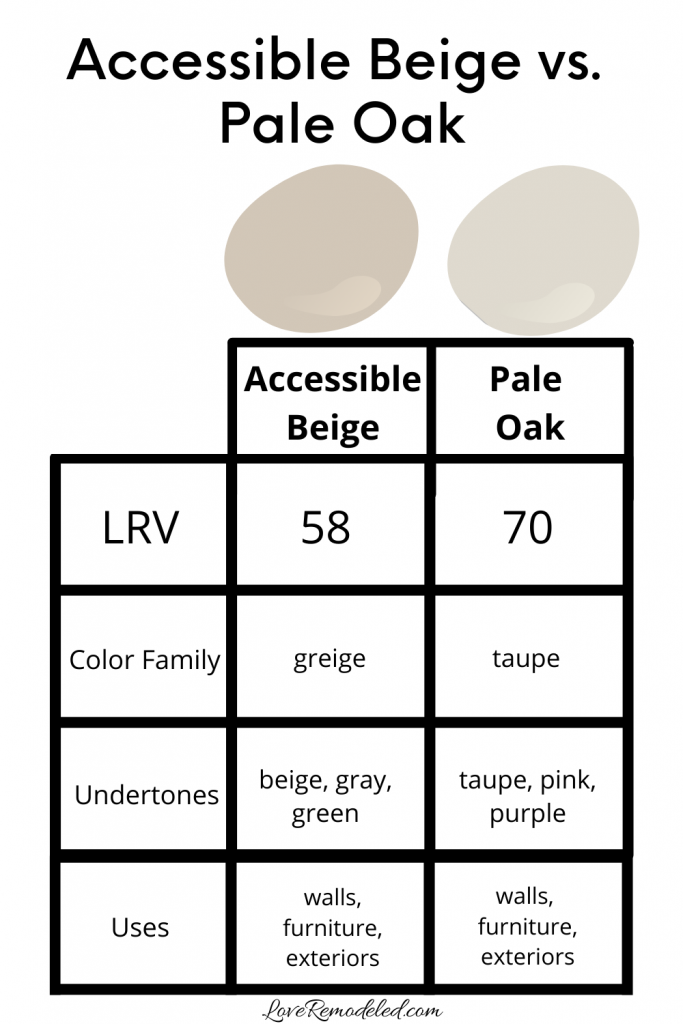
Accessible Beige vs. Pale Oak
Pale Oak is a beautiful, light and airy shade of off-white by Benjamin Moore. Instead of a greige, it is actually a very light taupe color. It has some gray, some beige, and hints of pink and purple in it.
While both Accessible Beige and Pale Oak are neutrals, the comparison ends there. Pale Oak is much lighter than Accessible Beige, and doesn’t carry any of the yellowy-green undertones that Accessible Beige has.
Pale Oak is another great shade for all over the home.
Both Accessible Beige and Pale Oak are beautiful paint colors, but in different ways.

Click here for more information on Pale Oak.
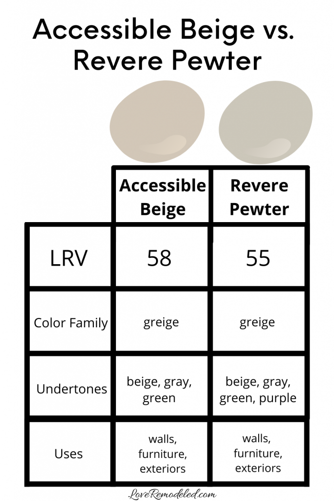
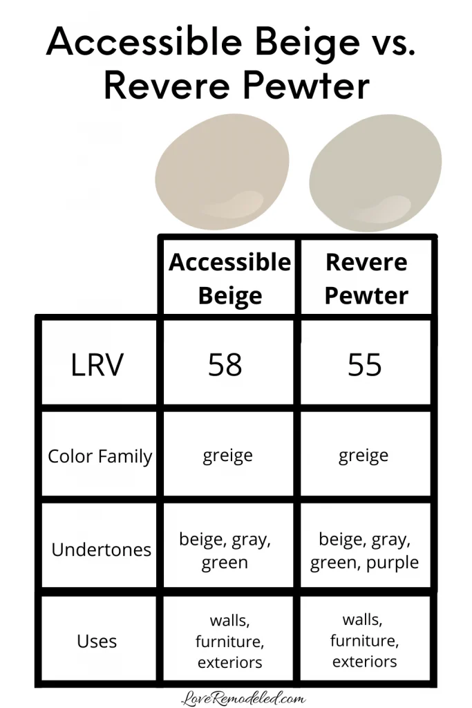
Accessible Beige vs. Revere Pewter
Revere Pewter is quite possibly Accessible Beige’s biggest rival in terms of popularity for its shade.
While I find that Edgecomb Gray is a bit more similar in terms of the actual color, Revere Pewter is the go-to beigey gray for Benjamin Moore, and Accessible Beige is the go-to beigey gray for Sherwin Williams.
Revere Pewter is a tiny bit darker than Accessible Beige, and has more of a purple undertone. This cools it down just slightly. Overall, they are very similar shades, and if you’re considering one, you should consider the other.
My favorite way to compare shades like this is with Samplize squares. When you just can’t figure out which will be best in your home, it is great to view the colors in your space. I’ll talk a bit more about these peel and stick squares later.
Check out this post if you want more information on Revere Pewter.
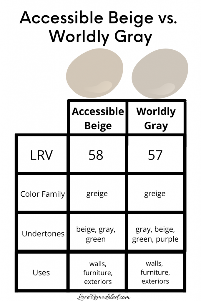
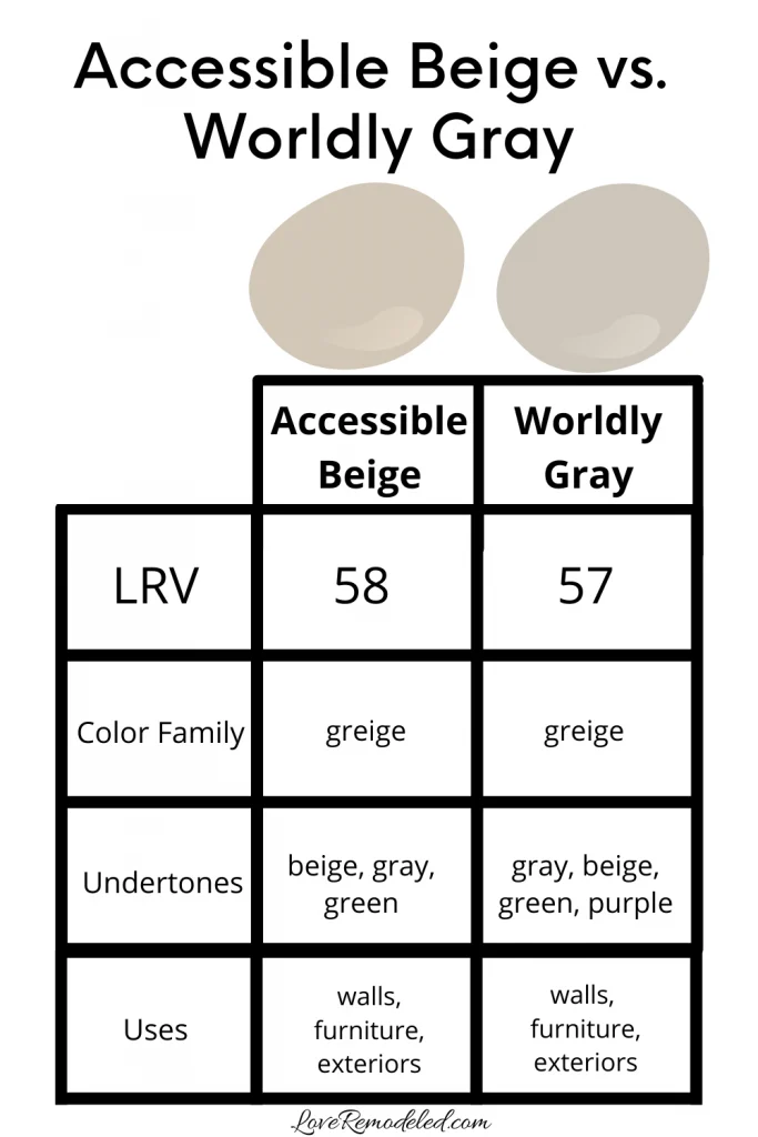
Accessible Beige vs. Worldly Gray
Worldly Gray is yet another popular greige paint color by Sherwin Williams.
Worldly Gray is a warm paint color, but in a different way than Accessible Beige. Worldly Gray has slight green and purple undertones in its mix of beige and gray. To me, it resembles the color of putty.
When you compare Worldly Gray and Accessible Beige, you see the yellow-green undertones in Accessible Beige more.
These shades are just slight variations off of each other, so this is another good paint color to get a Samplize square of and compare it to Accessible Beige in your own space.
Click here for more details on Worldly Gray.
Accessible Beige vs. Repose Gray
Repose Gray is the last of the big three from Sherwin Williams. Accessible Beige, Agreeable Gray and Repose Gray are probably the top three best selling greige paint colors.
Repose Gray is the coolest of the three, with the most gray in it. It also has purple and blue undertones.
While Repose Gray and Accessible Beige have the same LRV, Repose Gray looks like a much darker color. This is because LRV isn’t actually how light or dark a color is, but rather how much light is reflected back into the room by the paint color.
So, despite this one similarity, Repose Gray and Accessible Beige are actually quite different paint colors. Repose Gray will look more like a true gray (though it isn’t), while Accessible Beige will look more like a beige (though it isn’t).
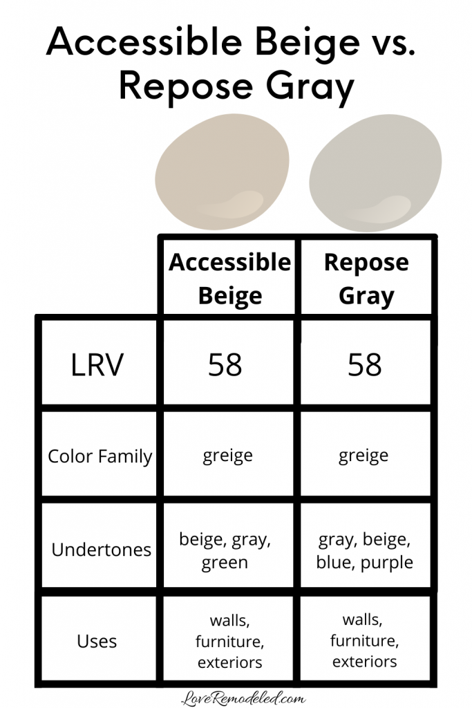
Check out this post if you want more information on Repose Gray.
Now that we discussed SO many beige and greige paint colors, your head may be swimming.
Wondering How To Pick the Perfect Paint Color?
I have the best solution for you!
Samplize sells peel and stick paint samples in almost every paint color.
These no-mess, peel and stick sheets are made from real paint, so they will show you exactly what the paint color will look like.
Simply place them on your walls next to your trim, furnishings or fixed elements, and easily see which paint color works best in your space and with your lighting.
Then, peel the sheet off your wall and reapply it somewhere else if you like. You can try several different paint colors with no mess, no fuss and no cleaning paint brushes.


Oh, and you can have them in your home by tomorrow with OVERNIGHT shipping!
As a bonus, be sure to use the code LoveRemodeled10 at check out to get an extra 10% off! Samplize sheets are cheaper than a sample can of paint, and way less work.
They are the easiest (and fastest!) way to try a paint color in your home, with no hassle.
Final Thoughts on Accessible Beige
Accessible Beige is probably the most popular beige paint color made by Sherwin Williams. This is because it isn’t a true beige. It has a beige look to it, but also has a lot of gray in it. The gray in Accessible Beige makes it a much more versatile shade than a true beige.
Overall, Accessible Beige is a very usable paint color that goes in a lot of different style homes. It can work in a southwestern, farmhouse, traditional, or transitional style home. It also looks nice on home exteriors.
If you want a paint color that feels sophisticated and grounded, Accessible Beige might be a good shade for you!

Have a question? Leave me a comment! Remember to check back for a response – it may take me up to a week or two depending on how busy I am, but I’ll try my best to get back to you!
Want to show off your project? Join the discussion in Love Remodeled’s Facebook group!
Beth
Friday 2nd of June 2023
This is an awesome post! I wish I'd had it when I stressed over kitchen cabinet paint colors but we have our home on the market and will get to start over with our new home, fingers crossed. I've used Agreeable Gray in our entire condo and love it but the new home leans more toward beige. This post is so helpful. Thanks so much!
Lauren
Tuesday 6th of June 2023
Thanks so much Beth!! I love Agreeable Gray too :).
Elizabeth
Friday 25th of June 2021
Hello, we recently moved into our home and the wall color is Klime beige which i do not like. I want to repaint the walls but I'm torn between Accessible beige and Agreeable gray. We have alot of brown furniture and alot of light. Our house faces East and West. We have very tall ceilings in the living room and entry way and all white trim. What would you recommend. Thanks Elizabeth
Louann
Thursday 25th of November 2021
@Elizabeth, I have too and for months I have been considering agreeable gray. I’m just over gray and I hear Gray is going out and for earthy tones coming in. So I went to look …found Worldly Gray then now Aceesuvle Beige at Sherwin-Williams so comparing worldly gray vs accessible beige. Now I’m reading this article. If I were you I would try worldly gray if accessible beige is too dark. That’s my opinion because again I’m over agreeable gray.
Lauren
Wednesday 30th of June 2021
Hi Elizabeth! Between the two, Agreeable Gray is the more popular and more in style color right now. Accessible Beige is a greige, but it leans more beige than gray. I would go with Agreeable Gray!
Jenn
Tuesday 18th of May 2021
Thanks for this post. It was helpful. I really like Accessible Beige, but it is too dark for what I’m looking for. I also bought a sample of Aesthetic White. It is TOO light.
Can you recommend a color between the two?
Louann
Thursday 25th of November 2021
@Jenn, as I’m reading this article I’m looking at poster boards I painted with accessible beige and worldly gray comparing the two. I definitely check out the worldly gray SW 7043. I bought a sample at Home Depot and painted on poster boards. Love both for this den…I also have Benjamin Moore’s Edgecomb gray HC-173 in a bedroom - that I love.
Lauren
Sunday 23rd of May 2021
Hi Jenn! Thank you for your comment! Check out Neutral Ground or Canvas Tan, and see if you like either of those! Good luck!