Repose Gray is a timeless greige paint color by Sherwin Williams. It is incredibly popular right now, and has been for years.
In fact, it is second paint color listed on Sherwin Williams’ most popular paint colors list, likely indicating that it is the second best selling paint color after Agreeable Gray.
This is because it is a nearly perfect greige. It leans towards gray more than beige, but has enough beige to warm it up a bit. It tends to look like more of a clean gray than some other greige paint colors.
Repose Gray is part of Sherwin Williams Senior Living Cool Foundations collection, Pottery Barn – Fall/Winter 2020 Collection, and the Dreamer collections.
I am actually pretty surprised that Repose Gray hasn’t been featured by more of Sherwin Williams’ collections due to its popularity and versatility.

I am a little late to the bandwagon on this one, but I gotta say, I personally love Repose Gray.
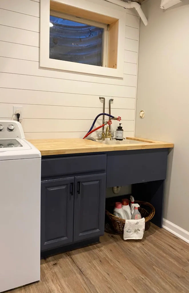
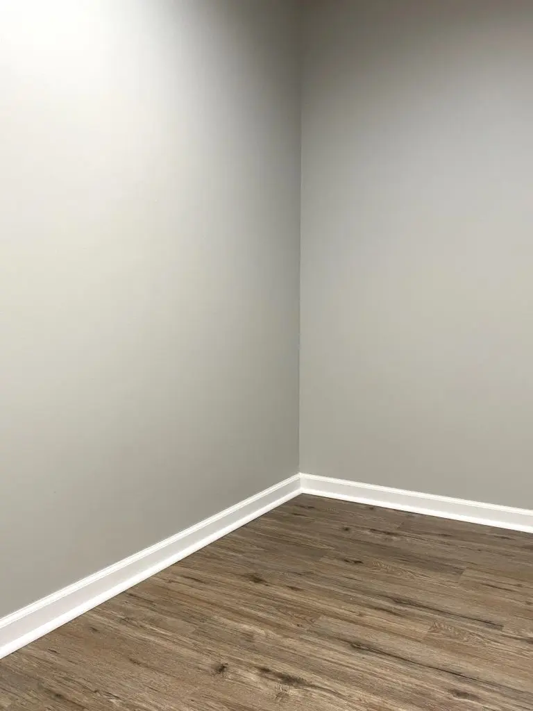
I recently painted my newly finished laundry room this color, and it is perfection. It has just enough depth to make a statement, but not so much that it is overpowering.
This post may contain affiliate links. If you have any questions, please see my disclaimer page.
Repose Gray Undertones
Repose Gray is one of the very popular greige paint colors that are trending right now. This means that it has beige and gray undertones.
Repose Gray leans more towards gray than beige, and can frequently just look gray unless you have cooler or more “true” grays in the room.
In addition, Repose Gray also has very light purple undertones and some soft blue undertones. These blue undertones mean that it can appear a little cooler than some greige paint colors.
If you’re concerned about this, remember that Repose Gray will likely show its blue undertones more in a North facing room, since this cooler light tends to accentuate any cool tones in paint colors.
Overall though, Repose Gray is a warm gray, because of its brown undertones, but reads slightly cooler on the scale than some due to its blue undertones.
Repose Gray LRV
Repose Gray has an LRV, or Light Reflectance Value, of 58.
This means that it is categorized as a “light” color, though it has more weight than some mid tone light colors.
It is a bit too dark to be considered light and airy, but not so dark that it makes your room feel significantly smaller.
Because of this, it works in small or large rooms, and with both North facing and South facing sun exposure.
Where to Use Repose Gray
Repose Gray is a gorgeous paint color for anywhere in your house. It works just as well in formal living rooms as it does in children’s play rooms. It is good in bedrooms and kitchen. It even lends a sophisticated air to dining rooms and bathroom.
Repose Gray looks good with both white trim and wood trim.
Sherwin Williams Repose Gray is a great anchor paint color for a home. By this, I mean that it is a good color for all your main living spaces, such as entryways, hallways, living rooms, dining rooms, and family rooms.
It also plays nicely with a lot of other paint colors and accent colors.
Is Repose Gray Outdated?
Repose Gray is not at all an outdated color.
It is a warm gray, and warm grays are on trend still. While we are seeing some designers and homeowners shift towards beige paint colors, the most popular beiges have a good bit of gray in them.
Is Repose Gray Still Popular in 2023?
Even though we are seeing designers shift towards beige, it always takes the average homeowner much longer to begin to adopt new trends.
Given this, Repose Gray is still popular in 2023. It has a classic sort of feel and isn’t a paint color that will fall too hard with trends. Plus, since it straddles the gray/beige line, it is very versatile.
Warm grays will always have a following, since they are a perfect backdrop for many different style homes.
Coordinating Colors and Color Palettes for Repose Gray
Repose Gray Color Scheme #1
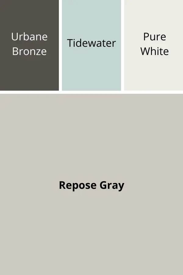
In this color palette, Repose Gray is paired with Urbane Bronze, Tidewater and Pure White.
Urbane Bronze is Sherwin Williams’ 2021 Color of the Year. It is earthy and dark, and would great as an accent wall, on furniture or as a bold trim option.
Tidewater is a gorgeous blue green that would be a perfect color in an adjoining room.
Last, Pure White is a great white paint color that goes with Repose Gray. It works well on trim, built-ins and walls.
Repose Gray Color Scheme #2
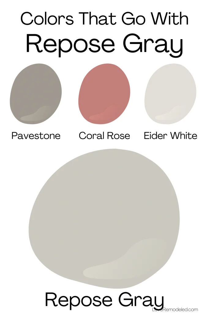
My second color scheme includes the colors that Sherwin Williams’ recommends as coordinating colors for Repose Gray.
Pavestone is a medium dark earthy greige shade that favors brown. This paint color would work well as an accent wall or as a wall color in an adjoining room that you want to give a dramatic look.
Coral Clay is a pinkish orangy shade that would be great as an accent wall or on a piece of furniture.
Eider White is a great gray color for adjoining rooms (but be careful – it can show more than a bit of purple undertones at times!).
Repose Gray Color Scheme #3
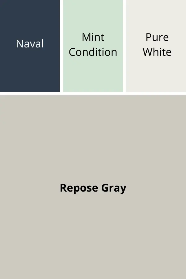
For a last color scheme, Repose Gray serves as an anchor paint color for these cooler shades.
Naval, Sherwin Williams’ 2020 Color of the Year, is a very dark navy paint color that is great on an accent wall, on built-ins, or on furniture.
Mint Condition is a bright minty green and would be gorgeous on cabinets or in a nearby room.
And last, Pure White – my go-to white paint color for trim.
Repose Gray Color Comparisons
As I do in most of my color posts, I am going to compare Repose Gray to a few of the other really popular greige paint colors. This can be helpful in determining if a paint color is the right one for your home.
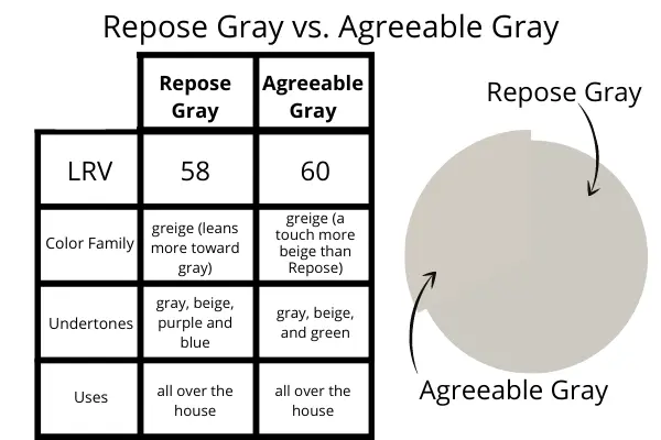
Repose Gray vs. Agreeable Gray
As I mentioned above, Agreeable Gray is the most popular Sherwin Williams’ paint color. It is another greige paint color with a lot of similarities to Repose Gray, but some important differences.
Repose Gray and Agreeable Gray have very similar LRVs. This means that they will reflect almost the same amount of light back into the room.
While they are both gray paint colors with strong beige undertones, Repose Gray has purple and blue undertones, where as Agreeable Gray has green undertones.
In addition, Repose Gray has more weight to it than Agreeable Gray. It will feel more imposing on your walls, and will make a bit more of a statement than Agreeable Gray does. Overall, Agreeable Gray comes across as lighter than Repose Gray.
I always think of Agreeable Gray as reminiscent of an art gallery wall – it creates a great backdrop for other things. Conversely, Repose Gray is a hint more dominant (but in a good way!).
Repose Gray vs. Revere Pewter
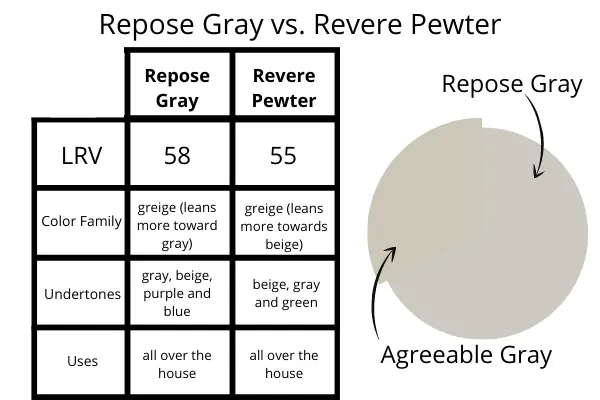
Revere Pewter is Benjamin Moore’s most popular greige paint color (and may be there most popular color of all!). While it is a greige like Repose Gray, it leans more heavily towards beige than gray.
Additionally, Revere Pewter has green undertones. To me, this makes Revere Pewter look more earthy, where as Repose Gray lends itself more to a clean gray look.
Both Repose Gray and Revere Pewter are great shades for all over the home.
Check out a full color review of Revere Pewter here!
Repose Gray vs. Mindful Gray
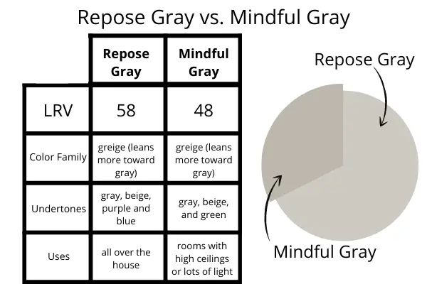
Mindful Gray is another very popular Sherwin Williams greige paint color. It is right below Repose Gray on the color strip, and so some would say that it is just a darker version of Repose Gray.
When you really look closely though, its easy to see that this isn’t true. Repose Gray has those purple and blue undertones, while Mindful Gray carries a lot of green undertones.
Mindful Gray has an LRV of 48, while Repose Gray’s LRV is 58. This 10 point difference means that Mindful Gray will reflect a good bit less light, and will feel heavier on your walls.
Last, while Repose Gray is a good all-over the house color, Mindful Gray is going to work best in specific rooms that have high ceilings, or lots of natural light.
Wondering How To Pick the Perfect Paint Color?
I have the best solution for you!
Samplize sells peel and stick paint samples in almost every paint color.
These no-mess, peel and stick sheets are made from real paint, so they will show you exactly what the paint color will look like.
Simply place them on your walls next to your trim, furnishings or fixed elements, and easily see which paint color works best in your space and with your lighting.
Then, peel the sheet off your wall and reapply it somewhere else if you like. You can try several different paint colors with no mess, no fuss and no cleaning paint brushes.
Oh, and you can have them in your home by tomorrow with OVERNIGHT shipping!
As a bonus, be sure to use the code LoveRemodeled10 at check out to get an extra 10% off! Samplize sheets are cheaper than a sample can of paint, and way less work.
They are the easiest (and fastest!) way to try a paint color in your home, with no hassle.
Final Thoughts on Sherwin Williams Repose Gray
If you’re looking for one shade that is going to be gorgeous all over the house, Repose Gray is a really great option.
It is an incredibly versatile paint color that can be used all over the house – it is good in living rooms, dining rooms, kitchens, entryways, family rooms, bedrooms, bathrooms and more.
Additionally, I like Repose Gray because it isn’t too dark to use in most spaces, and it works well with a lot of coordinating colors.
Please feel free to leave any questions or comments below. I read and respond to all of them!
Want to see all your paint options in one convenient place? Click here to get everything you need to start painting, including Sherwin Williams and Benjamin Moore paint color decks!

Repose Gray, by Sherwin Williams, Paint Color Review
Have a question? Leave me a comment! Remember to check back for a response – it may take me up to a week or two depending on how busy I am, but I’ll be sure to get back to you!
Want to show off your project? Join the discussion in Love Remodeled’s Facebook group!


Kristina Seppala
Wednesday 12th of October 2022
Hi, I need to paint my wall in my bedroom and the furniture will be a storm gray(dark) wood. The wall is near a stonington gray in the master bathroom. It's more of a northeast facing bedroom with not a lot of light. I like tone on tone but want a little warmth. My 3 picks are gray owl -bm, repose gray-sw or agreeable gray- sw. I want the room to flow as I've had a brown/tan bedroom for over 15 yrs and changing it up. I was leaning toward gray owl but then thought i should play it safe with agreeable gray but the repose didnt' look too bad just a little darker. I will be lightening the bedding with white in it. Thanks if you could steer me in the right direction.
Lauren
Thursday 13th of October 2022
Hi Kristina! This is a hard one to do without seeing the space. I would recommend joining my Facebook group and showing a picture of the space so we can help you decide which shade works. Without seeing the furniture, it's hard to know which will be best. My guess is either Gray Owl or Repose Gray, but that is just a guess. I'm sorry I can't be more helpful!
Shae
Tuesday 13th of September 2022
We are moving to a new (90s) house with honey oak cabinets and floors throughout. However our couch is very gray (cool). The only 5hong we can afford to do right now is paint the walls. Any suggestions on what colors to use? I'm not sure how to pull together the warm cabinets and floors with our cool gray couch. Thanks Shae
Lauren
Thursday 13th of October 2022
Hi Shae! I think you can make all this work! My suggestion would be to go with a blue wall, because it will look gorgeous with the honey oak and the gray couch. Tradewind or Silver Strand come to mind as good options. If you're looking for a gray wall, you may have trouble finding one that works with the gray couch, but just check them against it first to make sure they work. You could try going with something like Passive or Gray Owl. Both are nice, light grays. Check those out and see what you think!
Donna
Wednesday 2nd of February 2022
Would repose grey look ok as an accent color on my bricks step- downs in my den thats painted an earthy yellow green? I have dark brown furniture and medium light wood floors and a brown/ grey brick fireplace. They are painted dark brown but I feel it’s too much brown with my dark brown furniture and dark stained door casings
Lauren
Tuesday 8th of February 2022
Hi Donna! Unfortunately, I can't really say! I looked at what I thought was an earthy yellow green with Repose Gray and it seemed to work okay, but I just don't know what shade you have exactly. But, with the other colors you mentioned, I think Repose Gray would work. Sorry I can't help more!
joe
Sunday 19th of December 2021
hi
would a dark brown couch go with repose gray walls in the living room?
Lauren
Thursday 6th of January 2022
Hi Joe! It probably will! I can't say for certain, but I think that it would work okay. Try a swatch against the couch to be sure :)
Julie
Tuesday 2nd of November 2021
Hello Lauren- I am in the process of redoing a 1970's lake house and have to decide on paint colors NOW. I have opened the kitchen up into the great room. It is east facing and has a lot of am light. The cabinets are Pure White, the island is Gauntlet Gray, and I was thinking of painting the beams in the great room Peppercorn. I went with light vinyl flooring that seems to have a lot of yellow. Which gray will look best? Agreeable Gray (looks somewhat pink), Repose Gray (looks very white or almost light blue), or Mindful Gray (I worry that it will be too dark). Help!! Thank you.
Lauren
Sunday 7th of November 2021
Check out Love Remodeled's Facebook group to see the answer to this question :)