
What is “greige”?
Greige is a color that is a blend of gray and beige. Some greiges can look more beige, and some greiges can look more gray, depending on the mix of the two colors.
As a paint color, greiges have become increasingly popular among homeowners and designers because they are versatile, neutral, and easy to pair with many different styles.
Why should I choose greige paint?
If you’re looking to paint your walls, greige is a color that should be considered for a number of reasons.
First, greige colored paint blends with most any color accents. Because they straddle the line between gray and beige, they are the perfect neutral.
Second, greige paint makes a statement without being loud. Among greige paint colors there are super light colors all the way to very dark. For subtle, easy neutral look, a light color will work wonders to update a room. For a dramatic, bold look, a dark greige will make the room pop without being bright.
Third, they are hugely popular. Greige paint colors are the best sellers from all the major paint companies, including Sherwin Williams and Benjamin Moore.
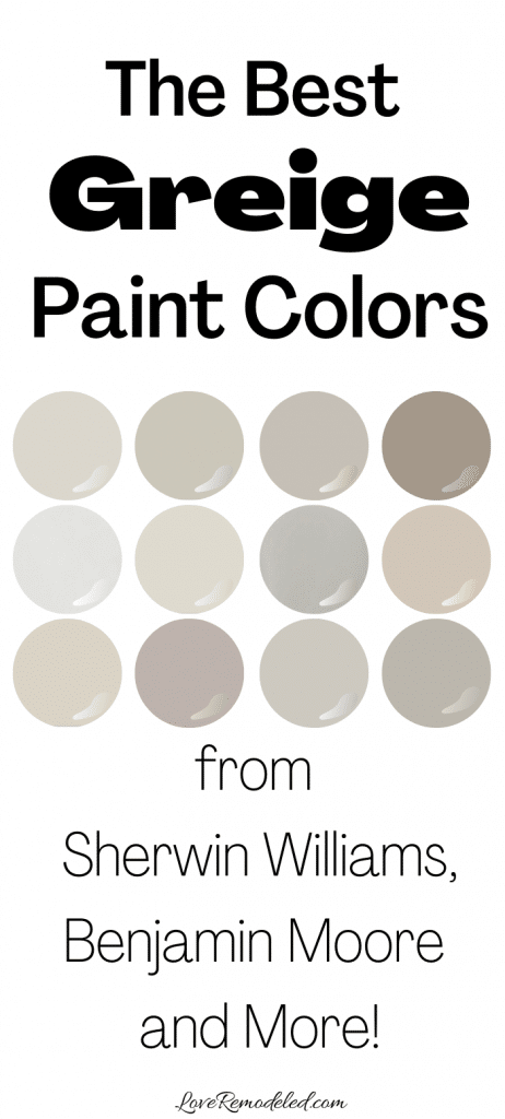
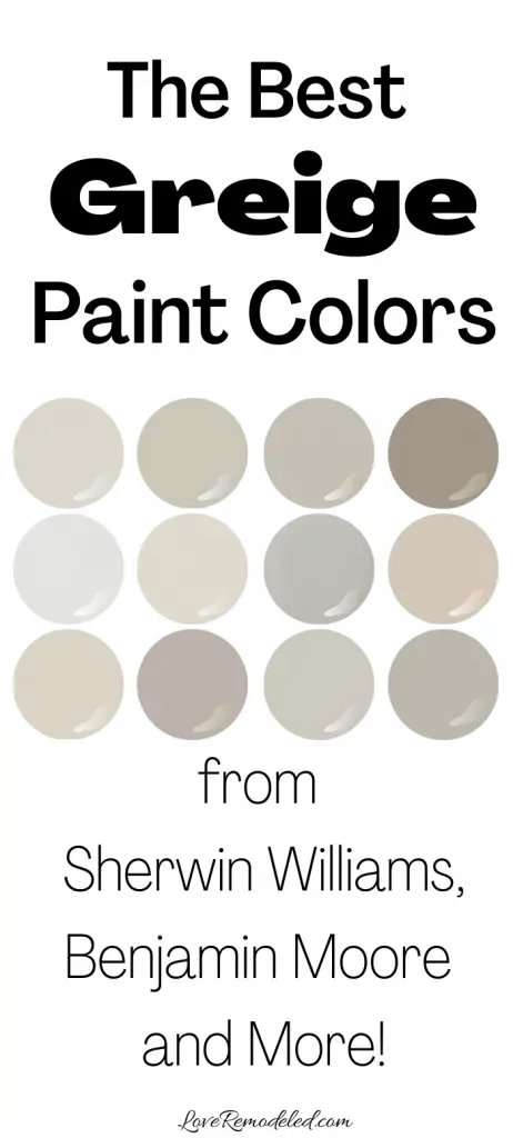
Here are some of the most popular greige paint colors, to help you decide which color is right for your home.
Best Greige Paint Colors from Sherwin Williams
Agreeable Gray
Agreeable Gray is a gorgeous greige paint color by Sherwin Williams, and may just be their most popular color of all. It is a mix of gray and beige, and leans slightly more towards gray with a touch of yellow undertones.
In a room with bright white LED lighting or lots of natural light, it will look a bit more gray. In a room with incandescant or warm LED lights, the beige in Agreeable Gray will appear more prominent.
Agreeable Gray has an LRV (Light Reflectance Value) of 60, meaning it reflects a fair amount of light. While Sherwin Williams puts it in the “light” category of their colors, I would say its more of a light medium shade.
Because it is a warm paint color, Agreeable Gray serves as a great backdrop for other warm shades. It works well in any or all rooms of your home.
I have used Agreeable Gray in several homes and it has been great in them all. It goes well with white or wood trim, and is the perfect light color to give a room some interest, but not appear overstated.
For more information about Agreeable Gray, to view how it looks in a room, or to see color palettes with Agreeable Gray, click on the link.
To try Agreeable Gray in your home without painting your walls yet, pick up your Samplize square of Agreeable Gray here!
Repose Gray
Repose Gray (SW 7015) is another extremely popular greige.
It is frequently recommended by realtors when selling a home because it is so widely liked. When compared to Agreeable Gray, it is going to look more like a true gray, though it definitely has beige and a hint of purple undertones in it.
Repose Gray has an LRV of 58, and I would again consider it to be a light medium shade. It goes well with both wood and white colored trim, and works with bright accents just as well as it does with other neutrals.
Similar to Agreeable Gray, Repose Gray can be used in any of the rooms of your home. Click here for a full review of Repose Gray.
To see how Repose Gray looks in your home with your lighting, pick up your Samplize square here!
Mindful Gray
Mindful Gray is directly below Repose Gray on Sherwin Williams’ color wheel, and has similar undertones.
However, Mindful Gray is darker and looks as though it has a touch more beige in it than Repose Gray does.
Mindful Gray has an LRV of 48, and while it is still considered to reflect a lot of light, it is darker than the other two greiges listed above. It, too, truly is a greige color, and carries the versatility that most griege paints do.
Mindful Gray can be used in any room of the house, but unlike Agreeable Gray and Repose Gray, I find it a bit too dark to be the only color used in a home. I would use it more readily in a large room or a room with a lot of natural light.
Pick up your Samplize of Mindful Gray here!
Mega Greige
Mega Greige is a dark greige paint color that is very similar to Agreeable Gray. It has a good mix of gray and beige, but favors beige a bit more than some on this list.
Mega Greige has an LRV of 37, which puts in it the “medium” range of Sherwin William’s colors.
My personal opinion, though, is that Mega Greige is a pretty dark color for walls. I like it as an accent wall, or in a room where you want the walls to make a bold statement. I don’t think it is a good choice for an all-over paint color.
I used Mega Greige as a coordinating color to Agreeable Gray in my entryway. It was the perfect dark greige that wasn’t too overpowering. To see Mega Greige in a room, click on this link.
Find out if Mega Greige will work in your space with a Samplize square found here.
Accessible Beige
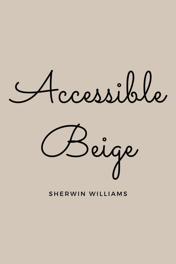
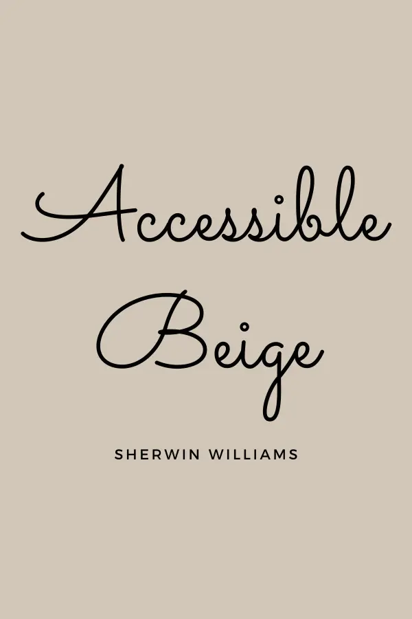
Accessible Beige is the most popular beige paint color at Sherwin Williams, and it is actually a greige paint color.
Accessible Beige is a warm paint color that heavily favors beige, but has a touch of gray in it, keeping it from looking too brown.
Accessible Beige has a LRV of 58, meaning that it reflects a good amount of light. Accessible Beige is a good color the common areas of a home, but is a slightly less current shade of greige than the others on the list.
Check out this post for all the details on Accessible Beige!
If you want to try Accessible Beige in your home, pick up a Samplize square here!
Colonnnade Gray
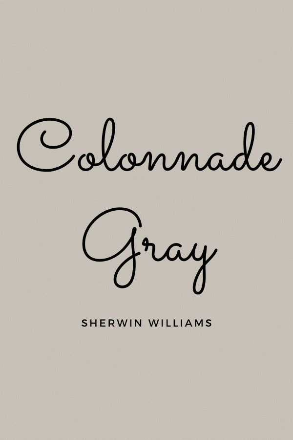
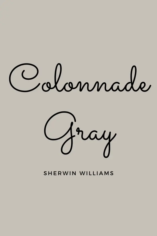
Colonnade Gray is a greige paint color that comes off as more of a true gray than a beige.
When compared to other greiges, Colonnade is actually on the lighter side.
Colonnade Gray has an LRV of 53, which I categorize as a light medium shade. While it will have a bit more depth than the popular Agreeable Gray, Repose Gray and Accessible Beige, it won’t make the room feel smaller.
I used Colonnade in a finished basement and it was a great medium shade. If you want something that is going to have a bit more punch to it, without being dark, Colonnade Gray is a good bet.
For more information on Colonnade Gray, click here!
If you want to see Colonnade in your own home, get your Samplize square here.
Best Greige Paint Colors from Benjamin Moore
Edgecomb Gray
Edgecomb Gray is a soft, warm paint color that leans more strongly towards a beige than a gray. It looks almost creamy (but not yellow) in a bright room, but will look more grayish in a less well lit space.
Edgecomb Gray has an LRV of 63, meaning it is one of the lightest colors on this list. It is perfect for any room of the home.
I currently have Edgecomb Gray in my dining room and hallways.
It is my few favorite shade – perfectly light and slightly beige, but the gray in it pulls it back from being too beige. In evening light it looks gray, but in bright sunlight, it the perfect light greige.
For more information on Edgecomb Gray, click here!
To see how Edgecomb Gray looks with your lighting and accents, get your Samplize square here.
Revere Pewter
Revere Pewter is a very popular Benjamin Moore greige paint color chosen by homeowners and designers. It is included on almost all lists of the most popular gray paint choices (even though it is a greige).
Revere Pewter has a bit more beige in it than gray, but is a good neutral shade that can go in any room of the home.
With an LRV of 55, I classify Revere Pewter as a light medium paint color.
If you want to see if Revere Pewter will work in your space, get your Samplize square here.
Check out a full color review of Revere Pewter here!
Pale Oak
Pale Oak is another gorgeous, soft greige paint shade by Benjamin Moore.
Pale Oak has an LRV of 70, which puts it on the lighter end of the greige spectrum. Some even classify Pale Oak as a “white” because it is so light. Pale Oak is similar to Edgecomb Gray, but will be less pronounced on your walls.
Pale Oak has more beige in it than gray, and has soft yellow undertones.
Find out if Pale Oak will work in your home with a Samplize square.
Balboa Mist

Balboa Mist is a good light true greige paint color. It has beige and gray undertones in pretty similar amounts.
Balboa Mist has an LRV of 67, which means it is a light color, but will still show up nicely on your walls. Balboa Mist is similar to Pale Oak, but where Pale Oak leans beige, Balboa Mist leans gray.
Find out how Balboa Mist will look in your home but getting your Samplize Square here.
Other Amazing Greige Paint Colors
Clare is a newer paint company with a modern business model.
Instead of going to a store and looking through hundreds of paint swatches, Clare’s paint colors have been curated designers to be just right for most people.
For many people, if you want a medium depth greige, choosing between Mindful Gray, Revere Pewter, Wordly Gray, and Agreeable Gray can be difficult.
They’re all warm colors, they’re all a good mix of gray and beige that lean more toward gray, and they’re all super popular.
Clare takes the indecisiveness away by only selling a four greige paint colors.
Additionally, Clare is an online paint store. This means that you order the paint online and it arrives at your home in a few days. I got mine in 2 days!
I fell in love with the way the paint goes on, and the “Perfect Eggshell” finish is just that – perfect. It’s not shiny, but not dull, and cleans up really nicely.
For more about Clare paint, check out the link.
Greige
For a medium depth greige, Clare offers a warm paint color simply called Greige.
Greige is a nice mix of gray and beige. With an LRV of 42, it will look dark on the walls. It would work well in a room that you want to give a dramatic look, or as an accent wall.
Like Samplize, Clare also offers 8×8 swatches for $2 a piece. Pick up your removable stick-on square of Greige here.
Windy City


Windy City is slightly lighter than Greige, with an LRV of 59, but is still going to appear as a medium toned greige on your walls.
Windy City leans more towards gray and beige, and will go best in a room with lots of light. It is mostly cool with a touch of warmth to make it a good fit in many rooms.
Get your 8 stick-on swatch of Windy City here.
Penthouse
Penthouse is a very pale greige that looks sophisticated and understated. While it looks mostly like a light gray, this warm greige also has beige undertones as well.
Penthouse will go nicely in all rooms of the home. It has an LRV of 70, which means it will reflect a lot of light. It is a good choice for both sunny and dim rooms, and will pick up more gray or beige depending on the lighting.
To see how Penthouse will look with your lighting and furnishings, pick up a stick on square here.
Or, order a few cans and have it delivered to your door this week!
Wondering How To Pick the Perfect Paint Color?
I have the best solution for you!
Samplize sells peel and stick paint samples in almost every paint color.
These no-mess, peel and stick sheets are made from real paint, so they will show you exactly what the paint color will look like.
Simply place them on your walls next to your trim, furnishings or fixed elements, and easily see which paint color works best in your space and with your lighting.
Then, peel the sheet off your wall and reapply it somewhere else if you like. You can try several different paint colors with no mess, no fuss and no cleaning paint brushes.


Oh, and you can have them in your home by tomorrow with OVERNIGHT shipping!
As a bonus, be sure to use the code LoveRemodeled10 at check out to get an extra 10% off! Samplize sheets are cheaper than a sample can of paint, and way less work.
They are the easiest (and fastest!) way to try a paint color in your home, with no hassle.
A Few Words About Lighting and Greige Paint:
North Facing Rooms: In a north facing room, the cool tones of a color will appear more prominent. Dark paint colors appear darker, and light paint colors appear more subdued.
South Facing Rooms: In a south facing room, the light is warm and more intense. Dark paint colors will look brighter, and light paint colors will give a soft, open feeling.
West Facing Rooms: West facing rooms have cooler light in the morning, and warmer light in the evening. This will produce more shadow in the morning, making paint colors appear more muted then. Choose your paint shade for the time of day when the room will get the most use.
East Facing Rooms: East facing rooms have warmer light early in the day, and cooler light in the evening. Again, a good rule of thumb is to choose a paint color based on when you’re most likely to be using the room.
Incandescent Light Bulbs: Incandescent light bulbs emit a yellow light and will warm up the paint colors in a room. Edison bulbs are a type of incandescent light bulb that typically have a strong yellow or amber glow, increasing the warmth in the paint color even more.
Fluorescent Light Bulbs: Fluorescent light bulbs give off a cool light. They will emphasize the green and blue undertones in your paint color.
LED Light Bulbs: LED light bulbs can be warm or cool. A warm LED light bulb will bring out the red, orange and yellow tones in your paint color, while a cool LED light bulb will bring out the blue and green tones.
Halogen Light Bulbs: Halogen light bulbs give off a warm, yellowy light, similar to daylight. They will make your paint color look bolder.
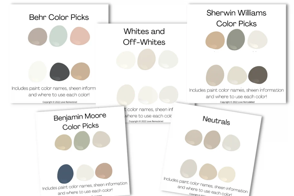
Get the 2022 curated paint color palettes now!Need some help picking a paint color? Pick up my 40+ page e-book, containing 30 of the hottest shades for 2022. These paint colors have been specially selected to help you choose from colors that are in style, and teaches you how to use them in your house!

Final Thoughts on Greige Paint Colors
Greige paint colors are a great choice for the home. They are neutral, range in depth from very light to very dark, and are easy to pair with accent colors.
Additionally, greige paint is very much in style right now. It is recommended by designers and realtors due to its versatility, and is favored by homeowners. Warm greiges aren’t going out of style any time soon, so pick up some paint today!
Want to see all your paint options in one convenient place? Click here to get everything you need to start painting, including Sherwin Williams and Benjamin Moore paint color decks!


Have a question? Leave me a comment! Remember to check back for a response – it may take me up to a week or two depending on how busy I am, but I’ll try my best to get back to you!
Want to show off your project? Join the discussion in Love Remodeled’s Facebook group!
Janis Dellman
Monday 20th of February 2023
Hi Lauren,
What are the undertones in Duron’s “Estate Greige” W8682? I want a light greige and this looks like it might be a nice all purpose color for our small beach condo.
Thanks for your feedback,
Janis
Lauren
Monday 3rd of April 2023
Hi Janis! I'm not familiar with Duron's colors. Sorry I can't help!
Wanda Kemp
Sunday 19th of February 2023
Hi Lauren I have SW Snowbound throughout my open floor plan1500 sq ft home. My walls are Alpaca which are much to purple, violet which I don’t like. I am keeping the Snowbound but want to change the wall color. My furnishings are more contemporary with a lite Grey table and chairs, brushed nickel fixtures, white cabinets, brown/grey wood flooring, light greenish/blue accent chairs, sofa it’s off white taupe accents with wood trim, hale navy accent table. The kitchen, dining & living room space are all South facing. Wondering on a Griege to compliment the Snowbound .. without purple undertones Wondering about BM Edgecomb Grey, Gossamer Veil or Worldly Grey? Just worried about the undertones of these with the Snowbound? Wondering ur thoughts and suggestions?
Thanks much for ur input, Wanda
Jeanette Schade
Thursday 28th of April 2022
Hi, I ordered the color pallette thinking it would give more to choose from but it seems to have more of what I see on the internet. I'm looking for what colors that look good with Revere Pewter other than more greys and whites for trim. Looking for rug, cushions and curtain colors to go with it. Can you help with that?
Lauren
Sunday 1st of May 2022
Hi Jeanette! I'm sorry that you weren't able to find the information you were looking for in the paint palettes! I don't think I discuss Revere Pewter in it at all, so I'm sure it was disappointing if that's what you were looking for. Revere Pewter goes really well with most shades of red and most shades of blue. It is a versatile shade that acts as a nice backdrop to many coordinating colors. As for colors for your rug, cushions and curtains, I would consider blues or reds and see how you like it. I also have a whole post on Revere Pewter that you can check out it you want. Good luck!
abby
Tuesday 25th of January 2022
hi, i actually have agreeable gray in my bathrooms and it looks grey but when i paint in my living room it’s looking more on the green side. Any recommendations?
Lauren
Tuesday 25th of January 2022
The first thing I would try is changing the light bulbs in the living room to see if you can get it to turn more gray. A cooler light should help.
Mechele Wright
Sunday 16th of January 2022
Hello...I am redecorating my office. So, first, I redid my formal dining room to be a "sitting room" and the trim is white, walls are Dorian Gray and the floors are a cherry wood. The adjoining area is an entryway that is open to the sitting room and open to my office on either side. The entryway is a basic beige...very beige. My office is an lighter olive green wall color with dark wood trim. So, what I wanted to do is lighten up the entryway and my office. I am trying to coordinate the colors with the dorian gray. With the sitting room I have a huge window and my office I have one window, but with 12' ceilings in the sitting room, entryway and office. Can you help with coordinating colors?
Lauren
Tuesday 8th of February 2022
Hi Mechele! Check out my post on Dorian Gray! It has a couple of color schemes that coordinate with Dorian Gray.