
Agreeable Gray paint color, by Sherwin Williams, is one of the most popular paint colors in 2023, and has been for years. If you ask a painter what color the use the most, almost all will say Sherwin Williams Agreeable Gray. This is because it is a versatile shade that goes in any style of home.
Agreeable Gray SW 7029 is the perfect go to color for painting a living room, dining room, or hallway, but it can really be used anywhere in the house.
I have used Agreeable Gray in several homes, and loved it every time. It always looks perfectly neutral and timeless.
Let’s dive into all the important details about Agreeable Gray, such as how this gorgeous neutral looks in different lighting, where you should use it, and why its still so popular.
This post may contain affiliate links. If you have any questions, please see my disclaimer page.
What Color is Agreeable Gray?

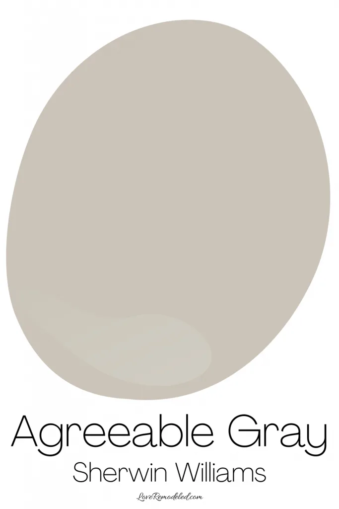
Agreeable Gray is a greige color, which means it is a mix of gray and beige. Greige colors are very popular because they work well in rooms with other warm shades.
SW Agreeable Gray isn’t a dark paint color, but it isn’t the lightest greige around either.
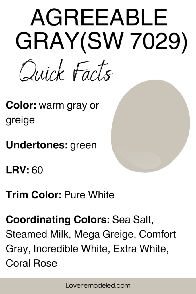
Agreeable Gray has an LRV (Light Reflectance Value) of 60, meaning it reflects a fair amount of light. It isn’t an airy sort of paint color though. It will show up as an actual color on your wall.
Remember that when you look at pictures of paint colors on the internet, oftentimes the pictures are edited to appear lighter and brighter. This will significantly throw off how the paint color looks.
In real life, Agreeable Gray has some depth to it. In dim lighting, it can look a tiny bit dingy compared to many popular greiges that fall more into the off-white category such as Aesthetic White or Kestrel White.
But when Agreeable Gray is supported by adequate lighting, it looks warm and soft. Not too dingy at all.
Agreeable Gray in Different Lighting
While we’re on the topic, the lighting in the space where you use Agreeable Gray is going to make a big difference in how it looks.
As a general rule of thumb, Agreeable Gray will look more gray in morning sun, or in rooms that face North or East due to the cooler lighting.
Agreeable Gray will look more beige in rooms with afternoon sun, or in rooms that face South or West due to the warmer lighting.
Agreeable Gray is a paint color that shifts a lot with different lighting.
For example, in this North facing bedroom Agreeable Gray looks pretty gray.
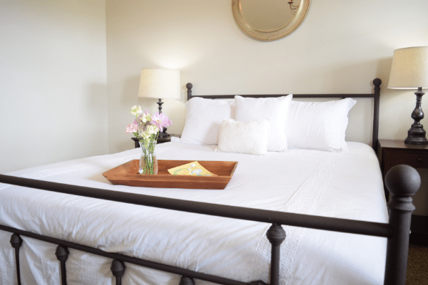

Sure, it still has a warmth to it, but it is a more subtle warmth.
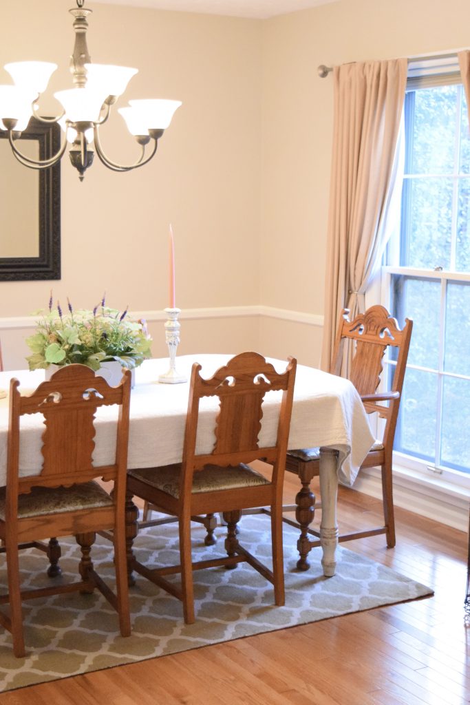
In this dining room with warm Southern light, you really see how warm Agreeable Gray can look. The beige in Agreeable Gray takes center stage.

Agreeable Gray Undertones
Agreeable Gray doesn’t have strong undertones, but does have a hint of green mixed in with its beige and gray tones.
The green is Agreeable Gray is very understated and Agreeable Gray won’t look fully green in your space. If your room has lots of pink in it, you may see just a hint of green though.
Sometimes Agreeable Gray can pick up a bit of a pink look in bright sunlight as well, but this is very rare, and not nearly as frequent as some other popular offenders like City Loft.
Where You Can Use SW Agreeable Gray

Because Agreeable Gray is a greige, it goes with almost anything.
It can pair with wood or white trim, goes well with all warm colors, and serves as a neutral backdrop for furnishings and accessories.
This color reminds me of an art gallery wall. It is soothing and does not make much of a statement on its own, leaving the furniture and accessories to really stand out.
So really, Agreeable Gray is great anywhere in the house. You can use it in living rooms, dining rooms, entry ways, bedrooms, and even bathrooms.
It is a great all-over paint color that can serve as a foundation for the color scheme in your whole home. Or you can use it in just one space. It is perfect for either use.
Last, Agreeable Gray can work on home exteriors alongside stone or brick with similar tones, or in kitchens on cabinets.
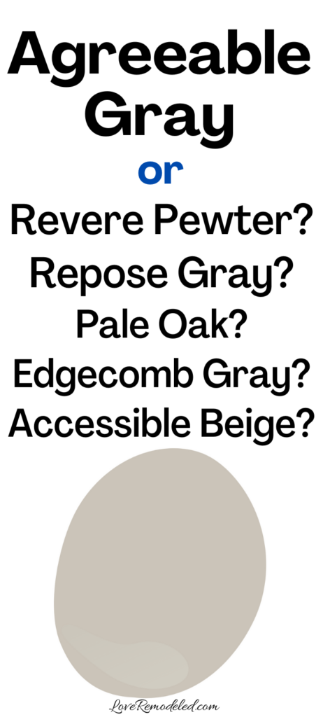
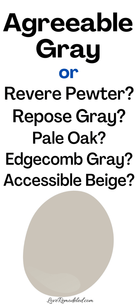
Colors Similar to Agreeable Gray
It can be difficult to choose the best greige color for your home because there are so many great ones. Some of the most popular greiges are Agreeable Gray, Repose Gray, Revere Pewter, Edgecomb Gray, Accessible Beige and Pale Oak.
If you’re considering Agreeable Gray, you may want to check out these other paint colors to make sure one of them isn’t better for you.
Agreeable Gray vs Repose Gray

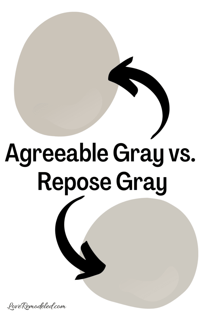
Repose Gray is a very popular Sherwin Williams color that leans more towards gray than beige.
Both Agreeable Gray and Repose Gray are gorgeous choices for your walls, but they have some important differences.
Agreeable Gray is a little warmer than Repose Gray, because Repose Gray has more gray in it than Agreeable Gray.
In addition, Repose Gray has blue undertones that make it cooler as well.
While they each have gray and beige undertones, Agreeable Gray tends to do a slightly better job at going with warm shades such as beiges or pinks, while Repose Gray does better with cool shades such as blues and grays.
With an LRV of 58, Repose Gray is not much darker than Agreeable Gray, but will look more like a true gray on the walls than Agreeable Gray will.
In choosing between Repose Gray and Agreeable Gray, think about whether you have more warm or cool tones in your space, and whether you prefer a more gray look to your wall or a more neutral look.
Click here for a full review of Repose Gray.
Agreeable Gray vs Revere Pewter

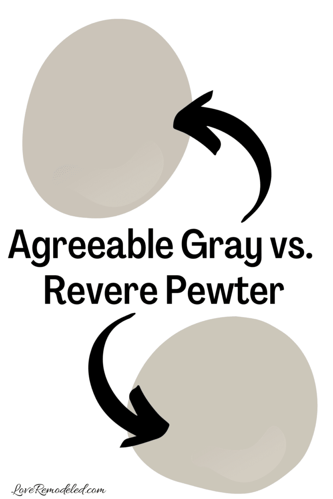
While Agreeable Gray is the most popular Sherwin Williams greige color, Revere Pewter may be the most popular Benjamin Moore greige color.
Both are included on almost all of the lists of the most popular gray paint choices (even though they are actually greiges).
Agreeable Gray and Revere Pewter are similar shades, but Revere Pewter has more beige in it and looks a little more muddy.
With an LRV of 55, Revere Pewter is also a slightly darker shade than Agreeable Gray.
Revere Pewter was particularly popular several years ago when beiges were more in style, and is having a resurgence in popularity with the recent rise of warm earthy tones in home design.
But, the depth of Revere Pewter makes it a little harder to work with in some homes, as it needs a good bit of light to really shine.
Check out a full color review of Revere Pewter here!
Agreeable Gray vs. Edgecomb Gray

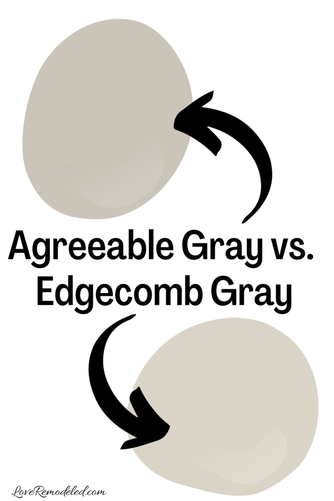
Edgecomb Gray is another highly popular Benjamin Moore color that straddles the line between beige and gray.
When comparing the two, you can see that Edgecomb Gray has more beige, while Agreeable Gray has more gray.
Both are amazing greige options, but Edgecomb Gray will be lighter and more airy on your walls then Agreeable Gray will be. It has a slightly higher LRV of 63, and will reflect more light into the room.
Really, Edgecomb Gray is sort of like a lighter Agreeable Gray in many ways. If you like Agreeable Gray but are afraid it may be a little too dark, Edgecomb Gray should be one you consider.
Check out a full color review of Edgecomb Gray here!
Agreeable Gray vs. Accessible Beige

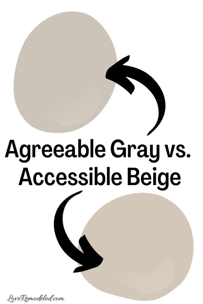
Accessible Beige, by Sherwin Williams, is another very popular paint color choice for people who want a light neutral wall.
Accessible Beige is still a greige, but has much more beige in it than gray. I always think of Agreeable Gray and Accessible Beige as different sides of the same coin. Where one has more gray, the other has more beige.
These two paint shades have very similar depths and LRVs though, and the deciding factor between them is whether you want more or less beige in your wall color.
Check out this post for all the details on Accessible Beige.
Agreeable Gray vs. Pale Oak
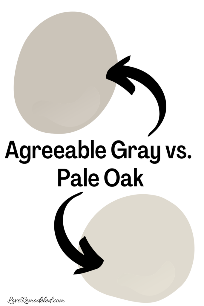

Pale Oak is another great greige by Benjamin Moore. It is considerably lighter than Agreeable Gray, with an LRV of 70.
This means that Pale Oak is considered an off-white, while Agreeable Gray is more of a true color.
Pale Oak has slightly more beige in it than Agreeable Gray does, and can almost look a little creamy on walls.
The undertones between Pale Oak and Agreeable Gray are very different as well. While Agreeable Gray has a green undertone, Pale Oak has a warmer pink undertone.
So, if your room has lots of pink tones in it, Pale Oak is the better pick. The pink will highlight the green in Agreeable Gray, but blend with the pink undertone in Pale Oak.
For a lighter, more airy greige, go with Pale Oak.
Check out a full color review of Pale Oak here!
Wondering How To Pick the Perfect Paint Color?
I have the best solution for you!
Samplize sells peel and stick paint samples in almost every paint color.
These no-mess, peel and stick sheets are made from real paint, so they will show you exactly what the paint color will look like.
Simply place them on your walls next to your trim, furnishings or fixed elements, and easily see which paint color works best in your space and with your lighting.
Then, peel the sheet off your wall and reapply it somewhere else if you like. You can try several different paint colors with no mess, no fuss and no cleaning paint brushes.


Oh, and you can have them in your home by tomorrow with OVERNIGHT shipping!
As a bonus, be sure to use the code LoveRemodeled10 at check out to get an extra 10% off! Samplize sheets are cheaper than a sample can of paint, and way less work.
They are the easiest (and fastest!) way to try a paint color in your home, with no hassle.
Agreeable Gray Color Palettes
As I mentioned before, Agreeable Gray is a great paint color to use as a foundation for a whole house color scheme.
In fact, when I was painting my first house, I chose Agreeable Gray as the main paint color because it set the canvas for my house, and all the other colors I chose flowed from it.
Because of how neutral and versatile Agreeable Gray is, there are many coordinating colors that go well with it.
Here are a few coordinating color palettes for Agreeable Gray that you can use in your own home. These whole house colors schemes for Agreeable Gray make it easy to paint your home in shades that go perfectly together.
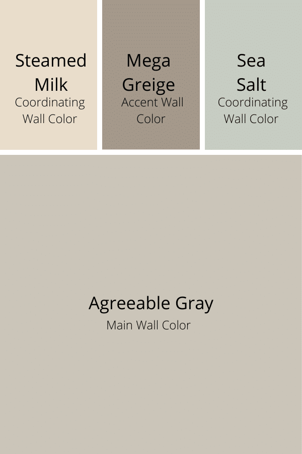
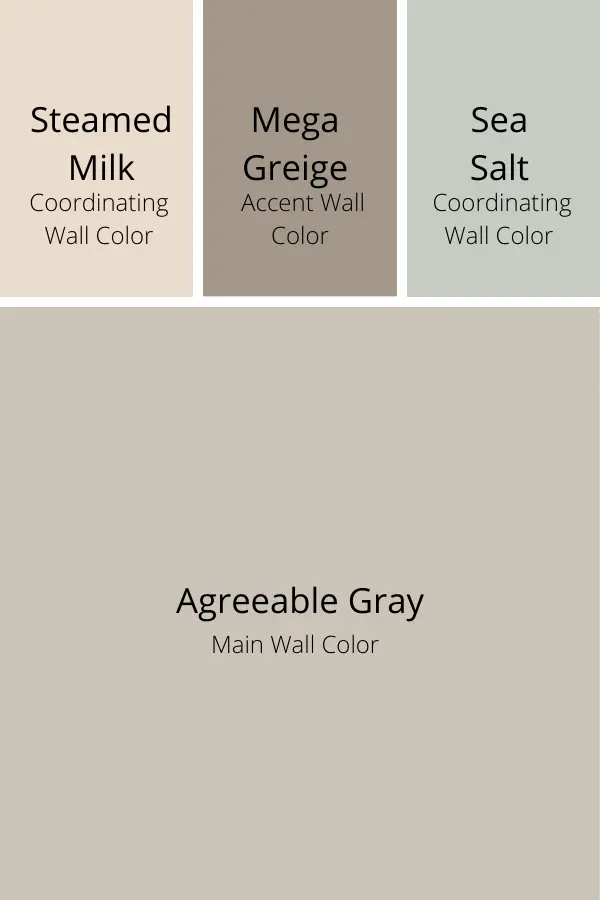
Farmhouse Coordinating Colors for Agreeable Gray
My favorite farmhouse style coordinating colors for Agreeable Gray are Sea Salt, Steamed Milk, and Mega Greige.
Because the colors go well together, the transitions between rooms is very understated.
Pick up your Samplize sheet of Agreeable Gray.
Coordinating Color for Agreeable Gray – Sherwin Williams Sea Salt
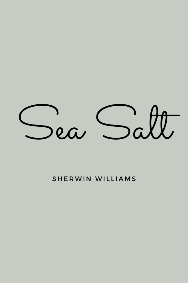
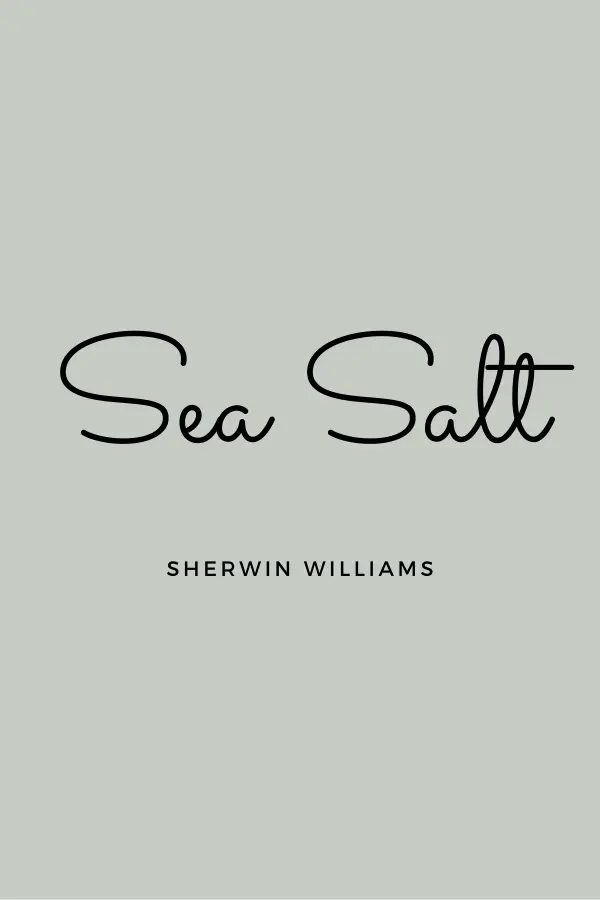
This dreamy blue/green is my favorite color for a bathroom or even a kitchen.
Sea Salt is still considered to be a “neutral,” even though it has a little more pop to it.
It can look more green or blue depending on your lighting, and coordinates perfectly with the other colors listed.
It is also one of Sherwin William’s most popular colors, so you know that it has a wide appeal.
Pick up your Samplize sheet of Sea Salt.
If you like Sea Salt, but want something with a little more depth, Comfort Gray is another gorgeous blue green that goes well with Agreeable Gray.
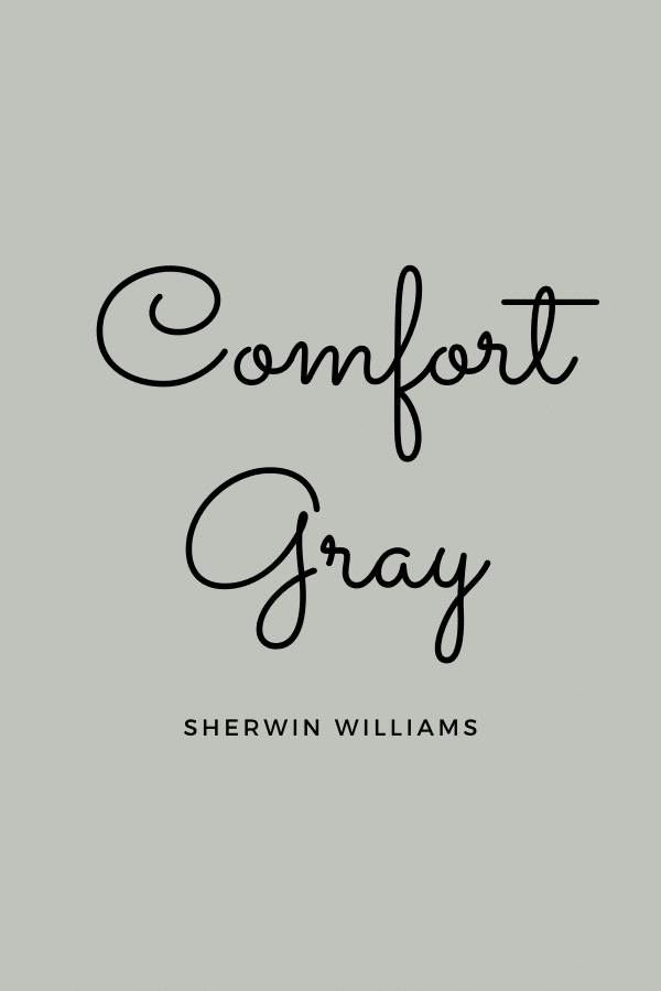
While Sea Salt is a neutral, Comfort Gray has always appeared more of a color to me when it is on a wall.
It looks absolutely amazing in a bedroom with dark wood furniture and wide white trim.
Pick up your Samplize sheet of Comfort Gray.
Coordinating Color for Agreeable Gray – Sherwin Williams Steamed Milk
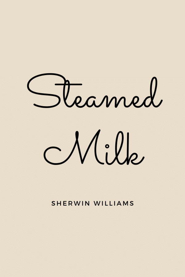
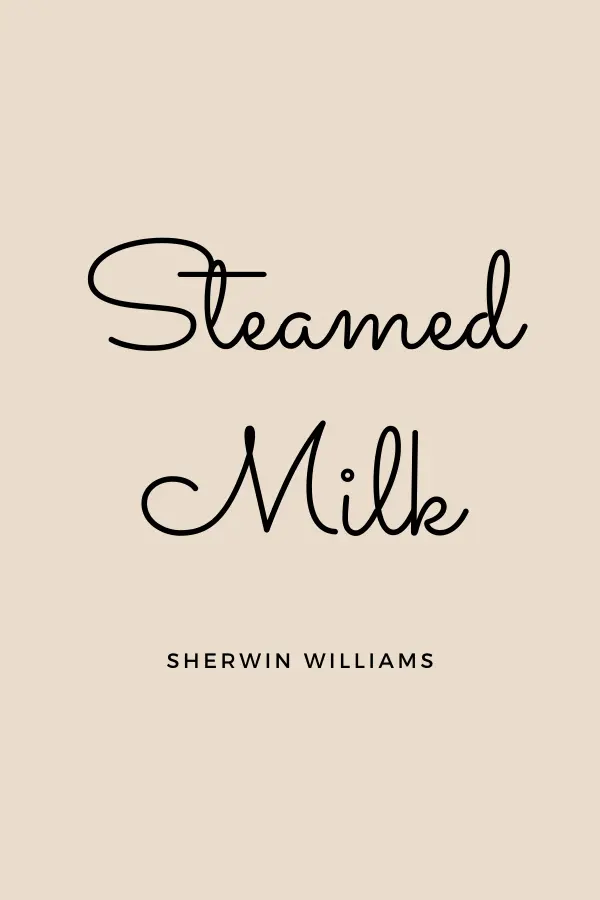
Steamed Milk is my favorite color for a room that does not have a lot of natural light coming in.
In a sunny room, it comes across as not particularly interesting. But in a dark room, it is pure heaven.
It stands out against white or wood trim, and it makes the whole room feel warm and inviting.
I painted my super high staircase walls with Steamed Milk using an extension pole. Since I had never used one before, I chose this color because it was light enough that it wouldn’t be noticeable if I hit the ceiling with the paint. Thankfully, I didn’t get paint on the ceiling. This tool made painting that tall wall really easy!
It is also a great paint color to go with oak cabinets as well.
You can get a Samplize sheet of Steamed Milk here.
Coordinating Color for Agreeable Gray – Sherwin Williams Mega Greige
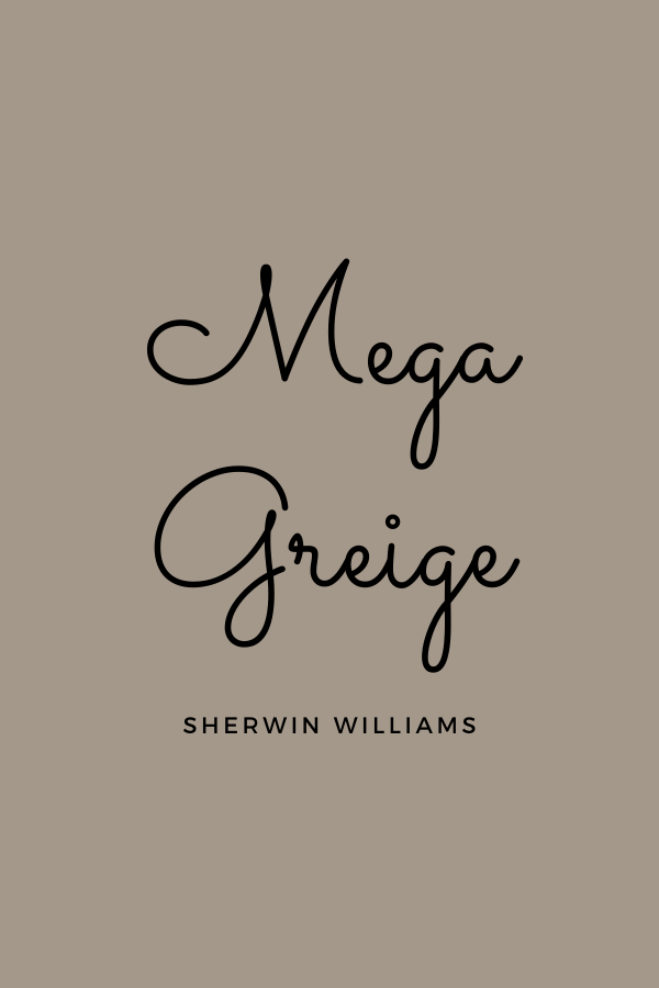
This beige-brown is a great color for a room that you want to have a little more impact, such as an entryway.
Like Agreeable Gray, it has the perfect combination of gray and brown, making it very versatile.
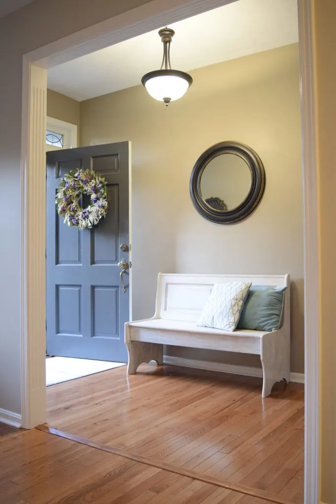
You can see Mega Greige here in an entry way, and an edge of Agreeable Gray in the room leading into it.
They almost look like the same color due to the lighting. But Mega Greige is much darker. This is a great example of how lighting can affect the way a paint color looks.
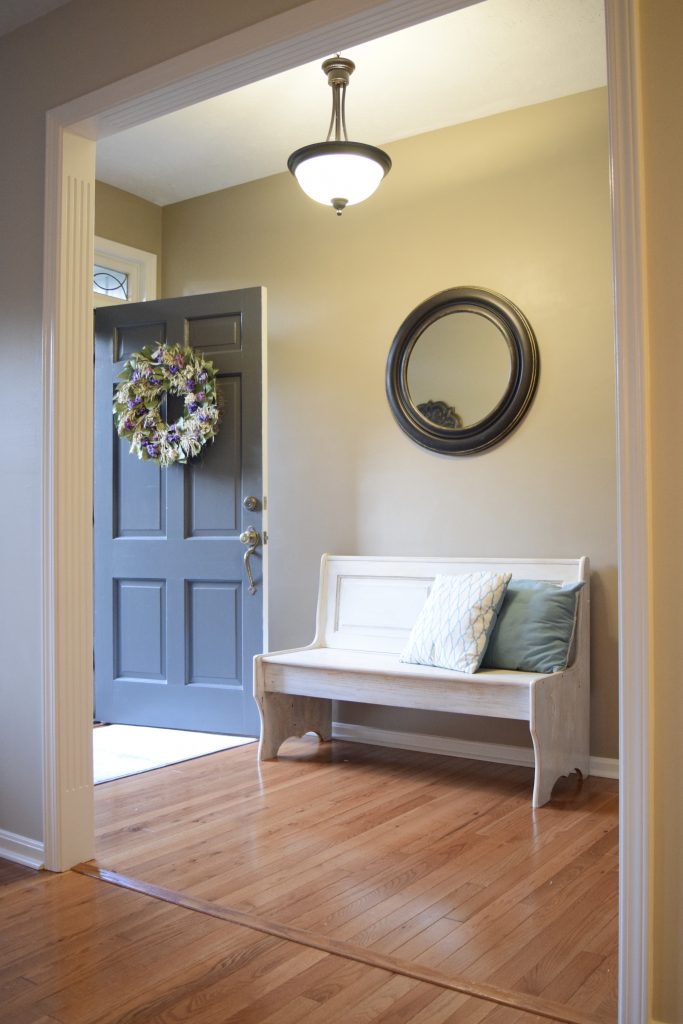
Mega Greige easily coordinates with the other colors and brings some depth to the paint colors on the list.
Mega Greige Samplize squares are found here.
Sherwin Williams’ Picks for Coordinating Colors for Agreeable Gray
This is the color scheme that Sherwin Williams lists for Agreeable Gray.
Agreeable Gray is the main color for the home or room.
I like to call this the anchoring shade, because it serves as an anchor for the other elements of the room.
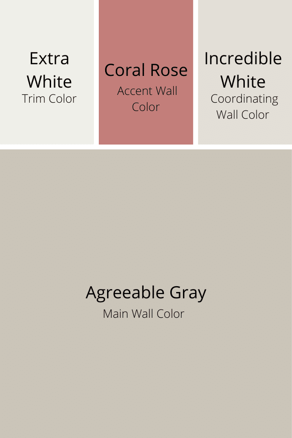

A good trim color is Extra White, which is a bright white color that goes with many paint shades. It is a bit stark to use in a whole room next to Agreeable Gray, but is great on trim.
For an accent wall, Coral Rose could give a good pop of color.
Finally, Incredible White is a good shade to put in nearby rooms, as it will blend nicely with Agreeable Gray. It is lighter and brighter than Agreeable Gray, so it is a good color to use in the spaces where you have less lighting.
Other great coordinating colors for Agreeable Gray are Naval, Copen Blue, Romance, Iron Ore, and Alabaster.
Love Remodeled’s Picks for Coordinating Colors for Agreeable Gray

If you are looking for an updated, neutral color scheme for Agreeable Gray, check out my curated paint palette for Agreeable Gray.
It includes 8 hand-picked paint colors that will elevate the look of your home while coordinating perfectly with Agreeable Gray.
Trim Color for Agreeable Gray – Sherwin Williams Pure White
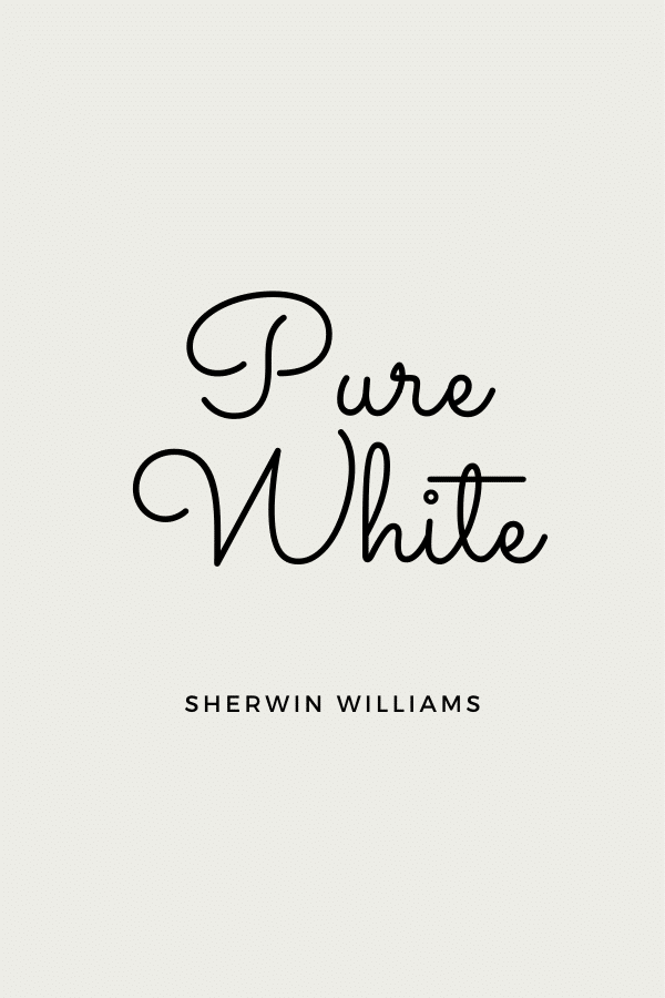
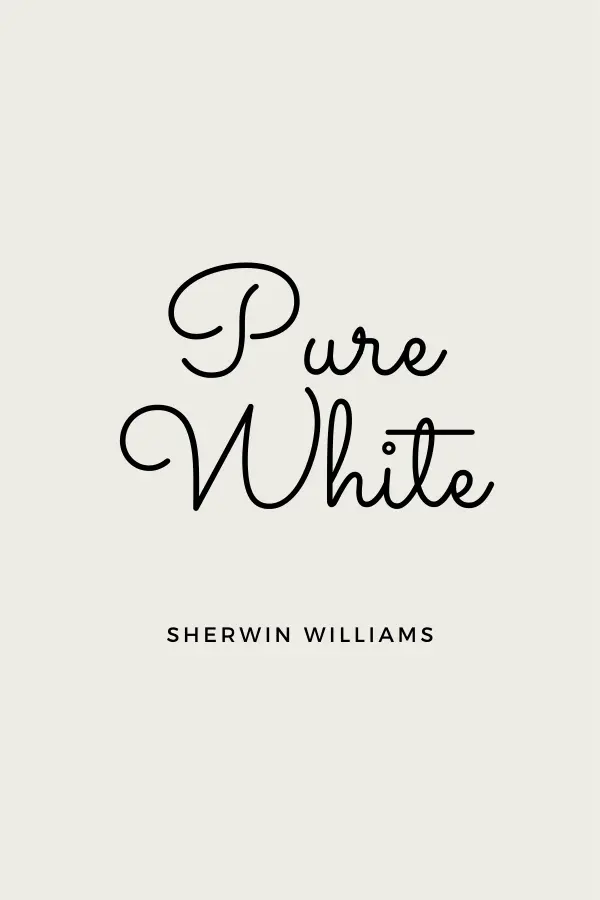
If you want to paint your trim to go with Agreeable Gray, Pure White is a great color to choose.
As the name implies, it Pure White will look white next to Agreeable Gray walls. It has a softness to it, so it won’t look stark.
Pure White is the perfect trim color to complement Agreeable Gray.
Is Agreeable Gray Popular in 2023?
Sherwin Williams has a list of their most popular colors on their website, and for years the first color listed has been Agreeable Gray. It isn’t in the number one spot right now, but it is still within the top 5.
Due to its versatility, Agreeable Gray has been chosen by homeowners and designers as the go-to color for years. It goes with lots of other shades, and generally just works in most homes.
In fact, it is so versatile that many realtors recommend it as the best color to paint your walls if you are selling your home. It is the kind of paint color that doesn’t have too much personality, and allows a buyer to envision their own family and stuff in the space.
In my mind, this is what makes Agreeable Gray so agreeable – it gets along nicely in almost any situation you put it in.
If you look at all the Pinterest pins of the top paint colors for 2023, you won’t see Agreeable Gray listed. It has been popular for so long that designers and paint bloggers want to identify the next big trends and leave it out.
But, if you ask any painter or Sherwin Williams employee, they will tell you that what they use or sell most of is Agreeable Gray.
So in my opinion, Agreeable Gray is still very popular in 2023.
Pros And Cons of Agreeable Gray
To summarize, here are the pros and cons of using SW Agreeable Gray in your home.
Pros of Agreeable Gray:
- Neutral
- Versatile
- Works in most rooms
- Great for whole home
- Coordinates well with other paint colors
- Looks like a true color (not off-white)
- Warm and inviting
- Works with wood or white trim
Cons of Agreeable Gray:
- Can look dingy in low lighting
- Can be too dark if not adequate light in room
- May clash with cool gray tones in room
Agreeable Gray Final Thoughts
Agreeable Gray is one of my favorite paint colors for walls. It is the perfect mix of gray and beige, and will compliment most furnishings and accessories perfectly.
It is a timeless paint color that will always be in style because of its neutral look.
If you want a color that will go with anything, is light but still noticeable, and is perfectly neutral, Agreeable Gray should definitely be on your short list!
Pick up an Agreeable Gray Samplize sheet here or a modern Agreeable Gray whole house color scheme palette here.
Sharon
Friday 7th of April 2023
I have a lot of honey oak trim through out my home. I am trying to down-play the trim due to the color, but I’m not ready to paint it. Is there a fairly neutral wall color that will help take away from the honey, yellow, orange color of the trim? I would use it on most of the walls of my house. Thanks so much! BTW, I live in the PNW, but I do have a lot of glass and the house faces E&W.
Lauren
Wednesday 19th of April 2023
Hi Sharon! I like a creamy white to update the space without painting the honey oak trim. The creamy yellow in the wall color will help to downplay the orange in the trim. Something like Creamy or Westhighland White might be nice! I also have always liked Agreeable Gray with honey oak trim as well. It won't downplay the orange quite so much, but has some beige in it that will help. Good luck!
Kelly
Saturday 25th of March 2023
ing what color, I like agreeable gray, I have small home with wooden 2 beers on the ceiling,,kitchen has white cabinets and back lash behind stove white tile,,I have mainly alot of brown, gold furniture,,cream tile on the floor,,,what colors should I use to make it look bigger,dinning room is connected in the living room, kitchen is separate with a small window hollow connected in the living room, then another area that is connected with the kitchen and living room
Lauren
Monday 3rd of April 2023
Hi Kelly! Painting all the space the same color will definitely help make it look bigger. Agreeable Gray isn't the lightest color, but it is very neutral, which will help. If you love AG, you could lighten it by 50% for a lighter version of it. Or, you can check out some other light greiges like Pale Oak or Balboa Mist. Good luck!
Kathryn
Friday 7th of October 2022
Thank you for sharing all your expert knowledge about this paint! I have a question. We just bought a small manufactured home. The house a bit dark and I what to lighten it up! What color paint should I use for the ceilings for this small home? thank you! Kathryn
Lauren
Thursday 13th of October 2022
Hi Kathryn! THanks for your sweet comment! For the ceiling, you can go with Benjamin Moore Chantilly Lace or just get a can of Eminence. Eminence is Sherwin Williams ceiling paint, and it comes in a bright, crisp white that looks great on ceilings. Congrats on the new home purchase!!
Vicki
Friday 23rd of September 2022
I'm so sick of gray. It's everywhere, in all my friend's homes, in all new homes on the market, even sweet little cottages that are for sale. I'll be so glad when this fad passes. I'm a Kelly Moore Oyster fan. It goes with everything and is warm and welcoming.
Lauren
Thursday 6th of October 2022
Gray has been THE trendy color for years! I can understand why you're getting sick of it :). Designers are pushing more beiges now, but that gray trend is definitely still hanging on. And Agreeable Gray is a particularly amazing gray, which is why its had such staying power!
Kimmy
Sunday 14th of August 2022
Do you think it would be too dark, or too much to paint the whole house in sea salt with pure white ceilings, crown molding and trim?
Lauren
Friday 19th of August 2022
I think this would be beautiful and would create a really cohesive look. It definitely wouldn't be too dark, but just make sure you really love Sea Salt before committing your whole house to it.