
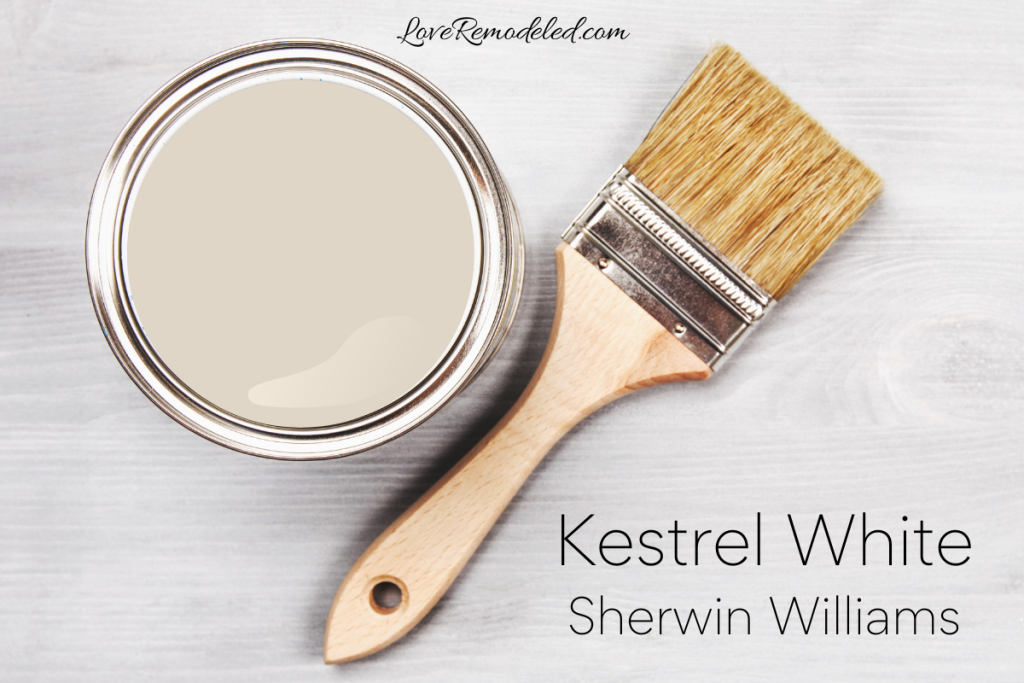
Kestrel White is a soft, warm taupe paint color by Sherwin Williams. Kestrel White hasn’t traditionally been one of the most popular off-white paint colors by Sherwin Williams, but it is growing in popularity.
Kestrel White has been included in the Pottery Barn Collection and the Living Well Collection at Sherwin Williams.
If you are interested in a very light taupe shade for your walls, keep reading for all the details on Sherwin Williams Kestrel White.
This post may contain affiliate links. If you have any questions, please see my disclaimer page.
What Color is Kestrel White, by Sherwin Williams?
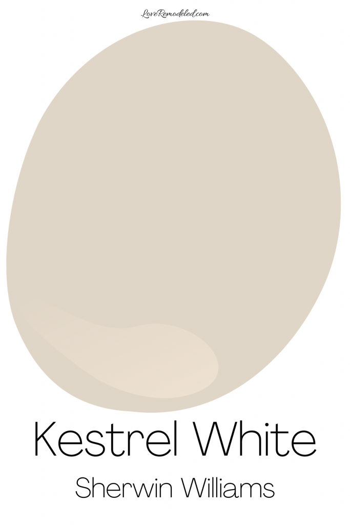

Kestrel White is a very light taupe paint color. Taupe paint colors are gray and beige blends.
Some taupes lean more gray, while others lean more beige. Kestrel White tends to have a little more beige in it than gray, but frequently, how it really looks depends on the lighting.
In a north-facing room, Kestrel White may look a little grayer and have a little more depth. In a south-facing room, Kestrel White will be a little brighter and warmer, looking a little more beige due to the warmth of the sunshine.
Kestrel White is a refined shade that can look sophisticated and mature. It lends a bit of elegance to a space. It also can feel warm and comfortable, without being stuffy.
Are Taupe Paint Colors Popular?
Taupe paint colors are becoming increasingly popular, as designers and homeowners are seeking warm neutrals.
Warm neutrals tend to give a cozy, comfortable feeling to a space.
As homes have evolved into being spaces where people are living, working, exercising, and more, wanting a space that exudes comfort is a priority for many.
Kestrel White Undertones

Taupe paint colors are gray/beige blends with purple undertones.
As such, Kestrel White is a gray beige blend with purple undertones.
The purple in Kestrel White isn’t terribly prounounced, so don’t let this to you from using it.
Instead, make sure it works in your space by picking up a Samplize sheet before you paint the whole room. More on Samplize sheets later.
Is Kestrel White Warm or Cool?
With its considerable amount of beige, and the purple undertones, Kestrel White is a warm paint color.
Now, that being said, it isn’t the warmest taupe shade you can find, and this makes it somewhat more versatile than other beiges. Kestrel White strikes a good balance, not being too warm that it feels stuffy.
Kestrel White LRV
Kestrel White has an LRV of 68. LRV stands for Light Reflectance Value.
Technically speaking, the LRV is a scale used to provide information about how much light a paint color will reflect back into a room. But a simpler way to say that is that the LRV gives us information about how light or dark a paint color is.
An LRV of 68 means that Kestrel White is a light shade that will reflect a lot of light back into the room.
It isn’t so high on the LRV scale that we would consider Kestrel White a true white, but it is light enough that it can work in about any room. It can even be used in basements or hallways that have no natural light.
Kestrel White Complimentary Colors
Kestrel White is a paint color that goes well with creamy white shades, grieges with warm undertones, blush pinks, purples, mauves, navys, blue-greens, and blacks.
Specifically, Sherwin Williams pairs Kestrel White with Greek Villa, Gris Morado, and Downy.
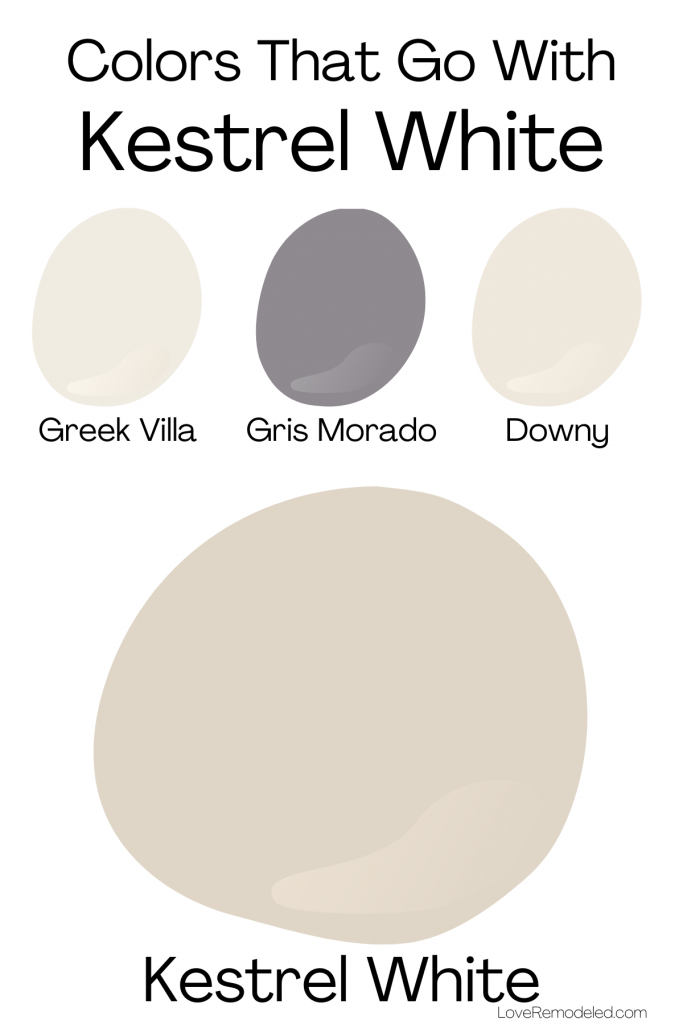
Greek Villa is a warm white shade with yellow undertones. Alongside Kestrel White, Greek Villa could be used on adjacent rooms, as an accent wall, or on trim if you like a creamy trim color.
Gris Morado is a mid-tone purple paint color that has a lot of gray in it. Gris Morado goes well with Kestrel White because of the purple undertones in Kestrel White.
In fact, when you pair Kestrel White with a shade like Gris Morado, you actually notice the purple in Kestrel White less because the purple in Gris Morado cancels it out.
Gris Morado would work well as an accent color, or as a wall color in an adjacent room to Kestrel White.
Downy is a warm off-white paint color with pink undertones. Downy is lighter than Kestrel White, and could work as an accent wall or as a part of a whole house color scheme with Kestrel White.
Lastly, Kestrel White also goes well with Sherwin Williams 2023 Color of the Year: Redend Point. This pick paint color pairs beautifully with Kestrel White, due to Kestrel White’s warm undertones.
Trim Color for Kestrel White

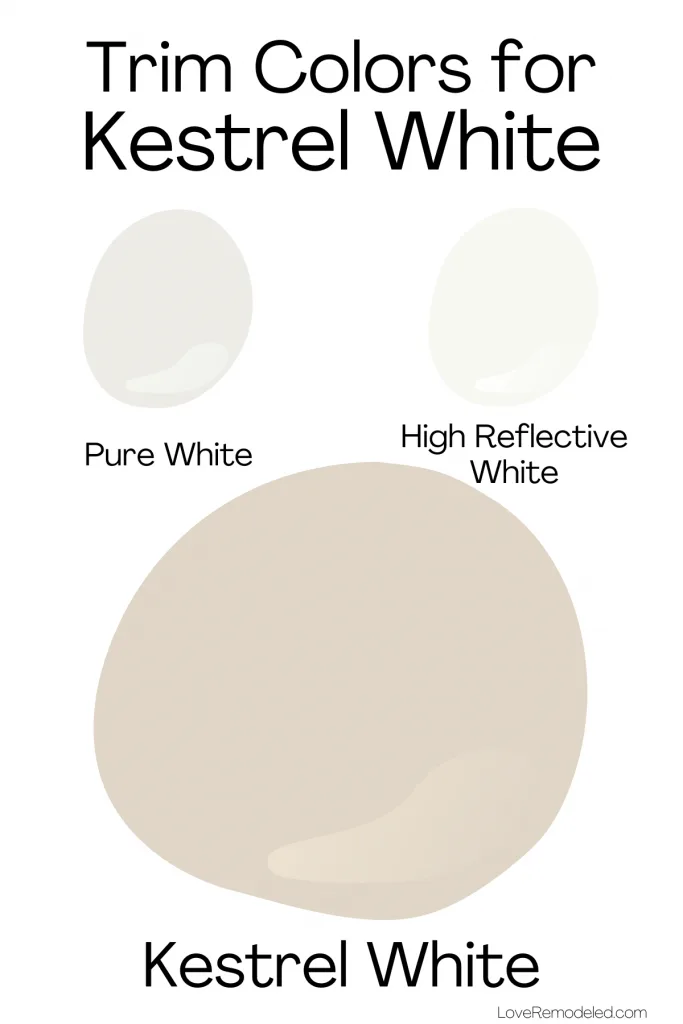
Kestrel White is a soft off-white paint color, so it needs to have a pretty light white trim shade to show a contrast. Because of this, the best two trim colors for Kestrel White are Pure White and High Reflective White.
Pure White is a white paint color that has yellow and gray undertones. It is a softer white shade that looks white on your trim, but doesn’t look stark.
High Reflective White is a very bright white paint color that has almost no undertones. It is super clean and looks very white on your trim. It shouldn’t look too chilly, but will not have any creamy notes in it.
Where Can I Use Kestrel White?
Kestrel White is a great paint color to use all over the house as a part of a larger whole house color scheme. It is light enough that it can work in any space. Specifically, Kestrel White can be used in living rooms, dining rooms, bedrooms, bathrooms, kitchens, basements, offices, and more.
Kestrel White is also a good paint color for cabinets, if you’re looking for a warm, off-white that doesn’t lean yellow or orange at all.
Kestrel White works in traditional, farmhouse, coastal, or transitional style homes.
Lastly, Kestrel White is a great paint color to use in a room that has dark cherry wood furniture, or any wood furniture with a red undertone. It also works with light-colored wood, though it isn’t the best shade to pair with wood with an orange undertone.
Sherwin Williams Kestrel White Compared to Other Paint Colors
When I do a full color review, I always like to compare the paint shade I’m discussing with other paint colors that are either in the same family (in this case, light taupes), or that have the same uses.
Since people often use Kestrel White as a neutral foundational color for a color scheme, this means that people frequently want to see how it compares to other neutral paint colors.
So, for Kestrel White, let’s compare it to Accessible Beige and Balboa Mist.
Kestrel White vs. Accessible Beige
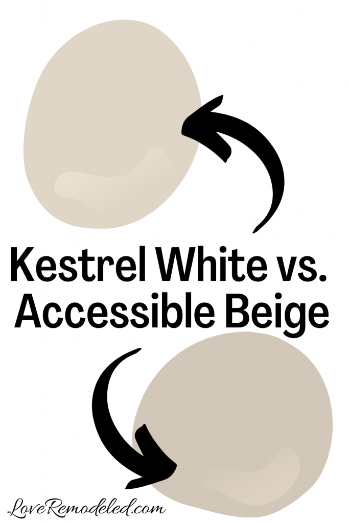

Accessible Beige is a neutral shade by Sherwin Williams. It is a greige paint color – a blend of gray and beige.
But, Accessible Beige is a slightly darker shade than Kestrel White, with an LRV of 58, as opposed to Kestrel White’s LRV of 68. This difference means that Kestrel White will look much softer on your walls, while Accessible Beige looks like a true color.
Accessible Beige also comes across as more earthy, while Kestrel White looks more airy.
If you’re trying to decide between Kestrel White and Accessible Beige, it is important to think about how much you want the wall color to show up to the space. Kestrel White is more of a backdrop sort of color, while Accessible Beige makes more of a statement.
Both will work well with other warm shades, but Kestrel White will definitely be a little better with purples and pinks.
Kestrel White vs. Balboa Mist
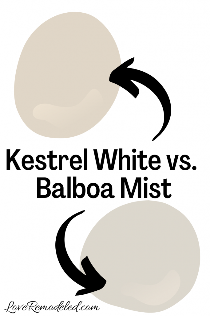

Balboa Mist is a very light taupe shade by Benjamin Moore. It is a similar color to Kestrel White, but has much more gray in it than beige.
Kestrel White tends to look more beige than gray, especially when compared to Balboa Mist. Balboa Mist is also a cooler taupe shade than Kestrel White.
Both are technically warm paint colors, but when you see them next to each other you see how Balboa Mist definitely takes on a cooler purple undertone than Kestrel White does.
Kestrel White and Balboa Mist are about the same depths, so they both have that soft quality on your walls, acting as a neutral backdrop.
If you’re trying to decide between Kestrel White and Balboa Mist, consider whether you want a paint color that leans more gray or more beige.
If you want a more beige look, Kestrel White will be your go-to choice here. For a more gray look, go with Balboa Mist.
Wondering How To Pick the Perfect Paint Color?
I have the best solution for you!
Samplize sells peel and stick paint samples in almost every paint color.
These no-mess, peel and stick sheets are made from real paint, so they will show you exactly what the paint color will look like.
Simply place them on your walls next to your trim, furnishings or fixed elements, and easily see which paint color works best in your space and with your lighting.
Then, peel the sheet off your wall and reapply it somewhere else if you like. You can try several different paint colors with no mess, no fuss and no cleaning paint brushes.


Oh, and you can have them in your home by tomorrow with OVERNIGHT shipping!
As a bonus, be sure to use the code LoveRemodeled10 at check out to get an extra 10% off! Samplize sheets are cheaper than a sample can of paint, and way less work.
They are the easiest (and fastest!) way to try a paint color in your home, with no hassle.
Final Thoughts on Sherwin Williams Kestrel White
Kestrel White is a beautiful, soft taupe paint color that gives rooms a warm, welcoming appearance.
It brings a touch of elegance, without being stuffy. It is also a great color for someone who wants a warm off-white paint color that doesn’t have any yellow in it.
If you are looking for a light gray beige blend for your walls, Kestrel White should be on your shortlist.