
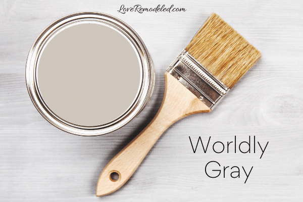
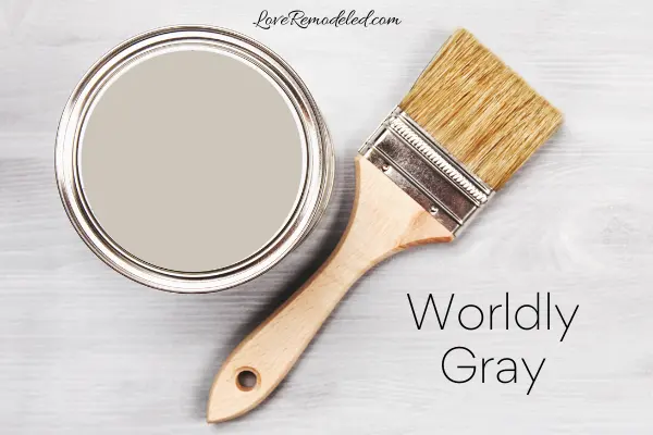
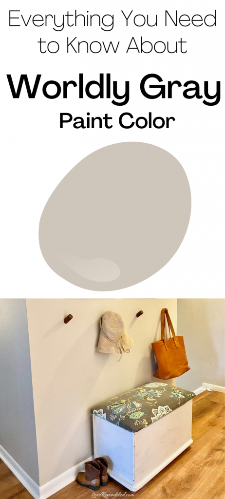
Worldly Gray is a popular Sherwin Williams neutral paint color. It is included in Sherwin Williams’ top 50 paint colors. This honor goes to the best selling paint colors, as chosen by designers and homeowners.
Worldly Gray is also featured in Pottery Barn’s Spring/Summer 2021 collection and Sherwin Williams’ Living Well – Unwind collection.
This post may contain affiliate links. If you have any questions, please see my disclaimer page.
Worldly Gray Details


Worldly Gray is a greige paint color. That means that it is a blend of gray and beige. Like other greige paint colors, Worldly Gray is versatile, functional, and easy to pair with other colors.
As greiges go, Worldly Gray isn’t quite as popular as some of its counterparts, such as Agreeable Gray and Repose Gray. This is likely because it is tends to have a little more beige than them.
Additionally, Worldly Gray doesn’t tend to look quite as appealing on that tiny Sherwin Williams swatch as Agreeable Gray and Repose Gray.
Don’t let this stop you from considering Worldly Gray though. On a large scale, Worldly Gray is a beautiful color that looks great in a lot of homes.
It is definitely in the top 10 (maybe even top 5) of Sherwin William’s light greiges.
Overall, Worldly Gray is a classic type of paint color that is flexible. It can go well in a farmhouse style home, a contemporary style home, a traditional style home or even a modern style home. Additionally, it isn’t terribly fussing about the colors you put around it.
Worldly Gray can be sophisticated or fun, depending on your accents. And, it doesn’t look too dark or moody on your walls.
Undertones of Worldly Gray
Worldly Gray is a fairly neutral greige. It has mostly gray and beige, but also has some green undertones.
This green undertone can show up more in north facing rooms, but tends to be pretty passive most of the time. Worldly Gray shouldn’t ever look too green on your walls though, since the green undertones are fairly faint.

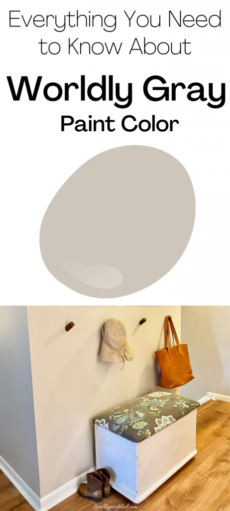
In this picture, you can see how Worldly Gray looks like a soft greige on the closest wall. And you can also see that slight green undertone in the far wall.
I have also seen Worldly Gray take on a purple undertone, even though it does not actually have purple in its mix. So unlike some greiges that can look purple because they have purple undertones in them, Worldly Gray can take on a purple look for other reasons.
Worldly Gray (and a lot of other gray paint colors) can look purple when you have flooring or furnishings with yellow tones. Since yellow and purple are across from each other on the color wheel, the presence of one can make the other look more intense. So, when I saw a purple undertone in Worldly Gray, it was likely due to having very a light beige/yellow carpet, or perhaps even from having the wrong lightbulbs in the fixtures.
Worldly Gray’s LRV
Worldly Gray has an LRV (Light Reflectance Value) of 57. This means that it is still considered in the “light” range, but it is pretty low on the light scale. It will definitely show up as a color on your walls.
Even though Worldly Gray has a similar LRV to many of the other top greiges, it can tend to feel a bit heavier on your walls.
With Worldly Gray being decidedly out of the off-white range, it is important that you use it in a room that has a fair amount of natural or artificial light. For example, in a dark hallway, it won’t bounce a lot of light around, and Worldly Gray can look a little drab. So it is important to enough light to support this paint color.
Worldly Gray Coordinating Colors
Worldly Gray is very versatile.
It goes well with other neutrals, such as creams, whites, and some other greige colors.
It also pairs well with muted blues and greens.
You can even put Worldly Gray with some browns and gray.
When doing this though, it should be noted that pairing Worldly Gray with brown will likely make it take on a more gray look. And conversely, pairing Worldly Gray with a truer gray will cause it to take on a more beige look.
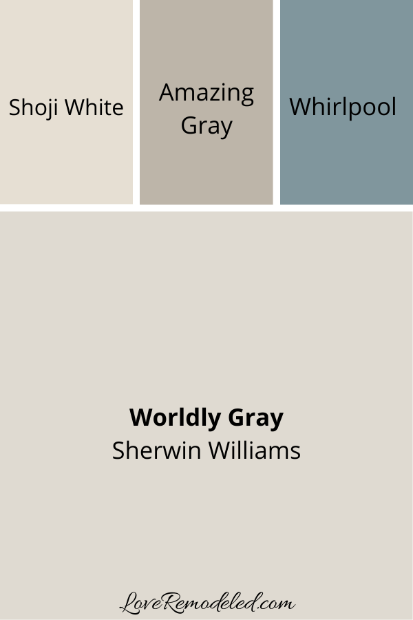
Here is a coordinating color scheme for Worldly Gray from Sherwin Williams.
It features Shoji White – a gorgeous soft off-white, Amazing Gray – a greige shade that shares a color strip with Worldly Gray, and Whirlpool – a muted grayish blue paint color.

Worldly Gray Comparision
When I review a popular paint color, I always like to compare it to other paint colors. Sort of like a, “If you’re considering this paint color, you may also be considering this one as well.”
So here are the paint colors that people frequently try to choose between when they are thinking about painting their home in Worldly Gray.
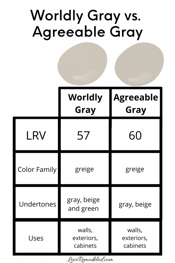
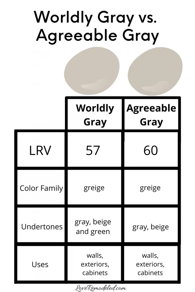
Worldly Gray vs. Agreeable Gray
By far, the most frequently considered color alongside of Worldly Gray is Agreeable Gray. Agreeable Gray is Sherwin Williams most popular color. It is light, neutral, and beautiful.
Where Worldly Gray feels a bit heavier on your walls, Agreeable Gray can take on an airy look almost. They have simliar LRVs, but their depth and weight vary more than you’d expect if just looking at their LRVs.
Agreeable Gray does have a soft green undertone, like Worldly Gray does, but Worldly Gray has a lot more beige in it.
Both Agreeable Gray and Worldly Gray have similar uses, but I do find that Agreeable Gray tends to be just a bit more… well… agreeable. That little bit of extra gray in Agreeable Gray makes it come across as more passive than Worldly Gray. This makes it just a hint more usable for many people.
It is not a clear case though. You may love a shade of greige that has a bit more beige in it. If you do, Worldly Gray could be a clear winner for you.
Click here if you would like to read a full paint color review on Agreeable Gray.
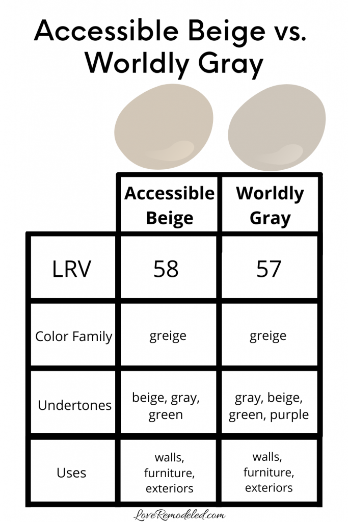
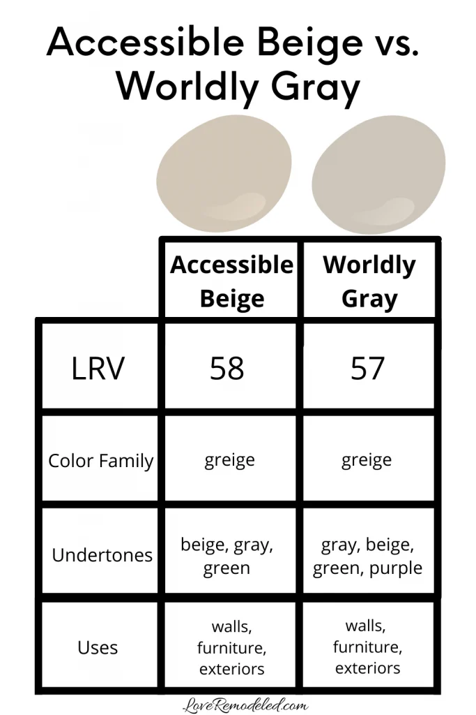
Worldly Gray vs. Accessible Beige
Now, if you look at Worldly Gray and realize that you want even more beige in your greige paint, you may want to consider Accessible Beige.
Accessible Beige is also considered a greige color, but it it much more of a beige greige than Worldly Gray. When you compare the two together, Accessible Beige looks like a true beige, rather than one with gray in it. It tends to take on a bit more of an orange tone, even though it doesn’t have a lot of orange in it.
Again, Accessible Beige and Worldly Gray have all of the same uses. Their LRVs are similar, and their weight on your walls feels more similar than we discussed with Agreeable Gray.
Click here if you want to know all the details on Accessible Beige.
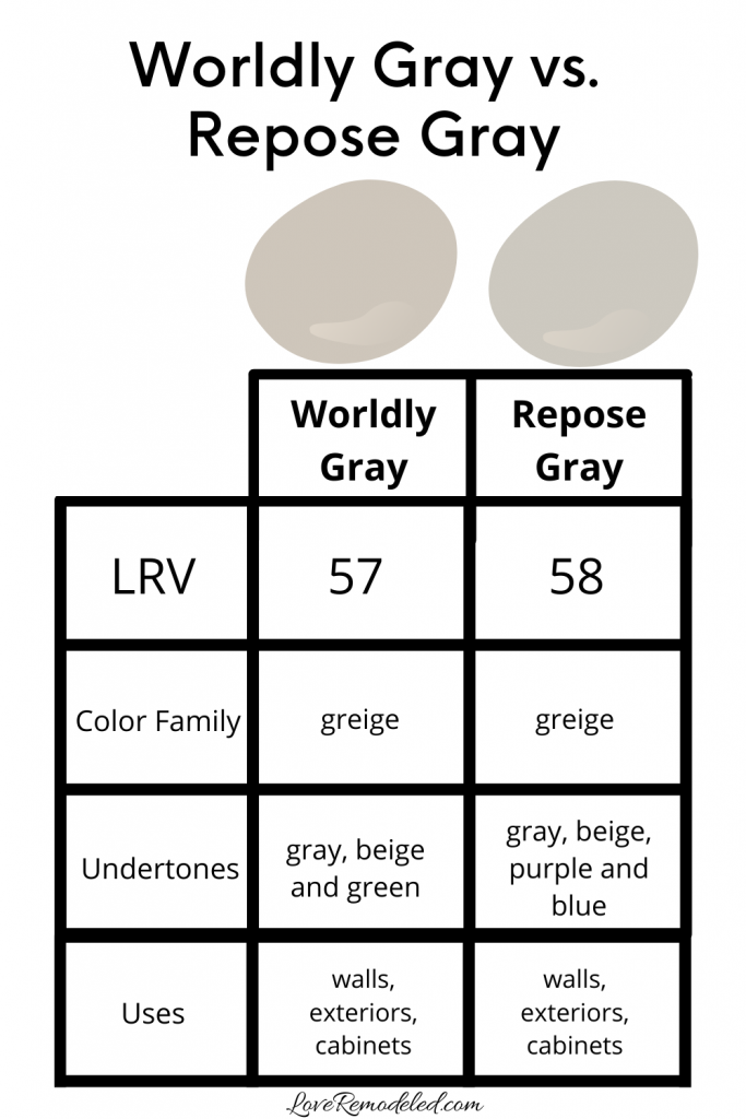
Worldly Gray vs. Repose Gray
Repose Gray is another super popular greige. It has a good bit more gray than beige in it, making it sort of on the opposite end of the greige spectrum from Worldly Gray.
When you compare Worldly Gray to Repose Gray, Worldly Gray’s green undertone becomes instantly apparent. In comparison, Repose Gray looks more like a true, cool, bluish gray, even though it is a greige paint color.
Repose Gray and Worldly Gray have very close LRVs, and very similar weights. Neither feels too terribly heavy on your walls, but both definitely have some depth to them.
If you want a greige paint color that feels warmer, you’ll want to go with Worldly Gray. But if you want a cooler toned greige paint color, you should check out Repose Gray.
Click here for all the details on Repose Gray.

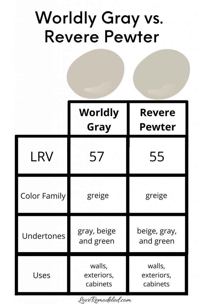
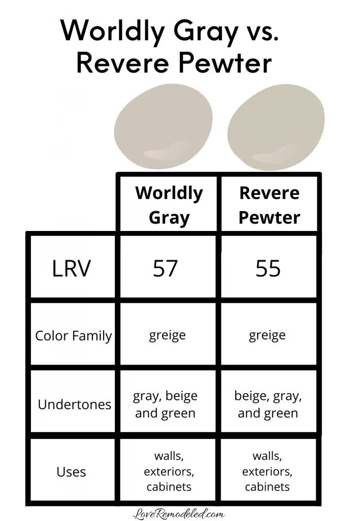
Worldly Gray vs. Revere Pewter
For our last color review, we will consider Revere Pewter. Revere Pewter peaked in popularity a few years back, but is still one of the go-to colors for many people.
Revere Pewter is a greige paint color that favors beige. Like Worldly Gray, Revere Pewter has green undertones that are very passive.
In many ways, Revere Pewter and Worldly Gray are very similar. Almost like Worldly Gray is the Sherwin Williams version and Revere Pewter is the Benjamin Moore version of the same paint color. In fact, both of these greiges with green undertones can sometime hint purple, as I mentioned above. But, they do have some differences.
First, Worldly Gray has just a hint more green than Revere Pewter. Second, Revere Pewter has just a hint more gray.
As always, all of these paint color nuances need to be tested in your own home. Worldly Gray can take on a purple tone in my home, but look completely neutral in yours. For this reason, it is really important to test each paint color in your own space to determine which paint shade is just right.
Click here for all the details on Revere Pewter.
Wondering How To Pick the Perfect Paint Color?
I have the best solution for you!
Samplize sells peel and stick paint samples in almost every paint color.
These no-mess, peel and stick sheets are made from real paint, so they will show you exactly what the paint color will look like.
Simply place them on your walls next to your trim, furnishings or fixed elements, and easily see which paint color works best in your space and with your lighting.
Then, peel the sheet off your wall and reapply it somewhere else if you like. You can try several different paint colors with no mess, no fuss and no cleaning paint brushes.


Oh, and you can have them in your home by tomorrow with OVERNIGHT shipping!
As a bonus, be sure to use the code LoveRemodeled10 at check out to get an extra 10% off! Samplize sheets are cheaper than a sample can of paint, and way less work.
They are the easiest (and fastest!) way to try a paint color in your home, with no hassle.
Where Can I Use Sherwin Williams Worldly Gray
Worldly Gray is most commonly used on walls, due to its neutral, pleasant shade. It doesn’t have a huge impact in a room the way a darker shade will, but has more oomph than an off-white.
Worldly Gray can also be used on cabinets, furniture, and exteriors, though it isn’t used as frequently as some others.
Final Thoughts on Worldly Gray
Worldly Gray is a great paint color that is probably a bit undervalued due to being compared to some greige greats. Agreeable Gray, Revere Pewter, and Repose Gray tend to get a bit more fame than Worldly Gray.
But, Worldly Gray is a great option for someone who wants a neutral shade that leans beige, but has a bit of gray to neutralize it. The green undertone in Worldly Gray is very slight, and probably this paint color probably won’t ever look truly green in your house.
If you are nervous about this undertone, remember to pick up your Samplize sheets and see how this color looks in your home, in your lighting, with your furnishings.
Worldly Gray should be on the short-list for anyone who wants a greige paint color that goes well with a lot of other colors, such as neutrals, blues and greens. It is flexible and sophisticated, without being overly dramatic.
Want to see all your paint options in one convenient place? Click here to get everything you need to start painting, including Sherwin Williams and Benjamin Moore paint color decks!


Have a question? Leave me a comment! Remember to check back for a response – it may take me up to a week or two depending on how busy I am, but I’ll try my best to get back to you!
Want to show off your project? Join the discussion in Love Remodeled’s Facebook group!
Lisa Hopper
Thursday 27th of February 2025
Hi! I have worldly gray on my kitchen walls and I am wondering what color would be a good color for kitchen cabinets without looking yellow. I have an east facing kitchen. I was thinking eider white but not sure if those 2 colors go together.
Thanks, Lisa
Lauren
Saturday 28th of June 2025
Hi Lisa! Eider White is a nice color, but it has a purple undertone that may not work with Worldly Gray. I would see what you think of Sherwin Williams White Heron. Good luck!
Belen
Saturday 18th of January 2025
Hi! I’m from Argentina so I’m sorry if my English is not the best. :) I’m between worldly gray and accesible gray to paint a furniture which I will put on my kitchen. I’m afraid of worldly gray to be sooo gray/cooler color . Just to let you know my kitchen is white and the floor is made of wooden. What do you think about it ?
Thank you so much!
Lauren
Saturday 8th of February 2025
Hi Belen! Your English is great :). If you don't want a cooler color, I'd go with Accessible Beige. Worldly Gray can flash purple at times, and definitely looks more gray than Accessible Beige. Either would be pretty, but if you want a layered warm look, I'd go with Accessible.
Adrienne P
Sunday 14th of January 2024
We’re building a new home and using Worldly Gray for the walls in the large open areas on our main floor. Also using this in the lower level rec room since this can be seen from the main level. They’ve already painted the first coat of Worldly Gray and I love it! We have nice crown molding and would like to pick a ceiling color that will go with WG and make the crown pop. Crown and all trim will be SW Pure White. Have large south facing windows in this rec room with ten ft ceilings. Wanted to paint ceiling WG but husband not keen on this. So have been considering either SW Shoji White or using a 75% Worldly Gray. What would you suggest?
Lauren
Sunday 14th of January 2024
Hi Adrienne! Sounds like the room is coming along nicely! I tend to think that painted ceilings look nice when they present a contrast in depth with the wall. In the painted ceiling trend, typically this is done by painting the ceilings dark and the walls light. Since Worldly Gray has a good bit of color to it (not too much, but its definitely not terribly light), I think it may be best to go with a lighter ceiling rather than darker. I would hate for the space to end up feeling too dark. Also, I'm afraid that Shoji White will just look dingy next to the Pure White Trim. So, I would try Worldly Gray at 75% or less and see if you like it. Also, since ceilings tend to be shadier places, the ceiling will look darker in whatever formula you choose than it would if you painted that same formula on your walls. All that to say, painting your walls in WG at 100% and ceiling in WG at 75% may look about the same. You may not see a big difference in them. So, maybe get a few sample cans of WG in 75%, 50%, etc. and see which contrast looks the best before doing the whole ceiling. Painted ceilings are a bold style decision, so no one can say for sure whether you'll like the results. But I sure hope you and your husband both love it when its done! Hope this response is helpful to you - good luck!
Jeanne B
Thursday 9th of November 2023
If I have to transition from worldly gray to repose gray on a staircase inner corner, will the colors clash next to each other? One short wall would be worldly and the adjoining long wall at the corner that flows down the staircase onto the first floor would be repose.
Lauren
Friday 5th of January 2024
Hi Jeanne! They shouldn't clash. They'll probably look pretty similar, and like they are the same but look different due to a shadow or something. I'd test it first in a small spot just to make sure though. If you were putting them next to each other on a flat wall I'd say no way, but on a corner I think you can get away with it.