Each year, Sherwin Williams selects one paint color to be their Color of the Year.
This paint color is one that is determined by designers who have their pulse on the trends in the home design world, and are a prediction of what will be popular in the coming year.
Sometimes the Color of the Year becomes a popular shade, loved by many. Other times, the paint shade is sort of a miss, and doesn’t really catch on.
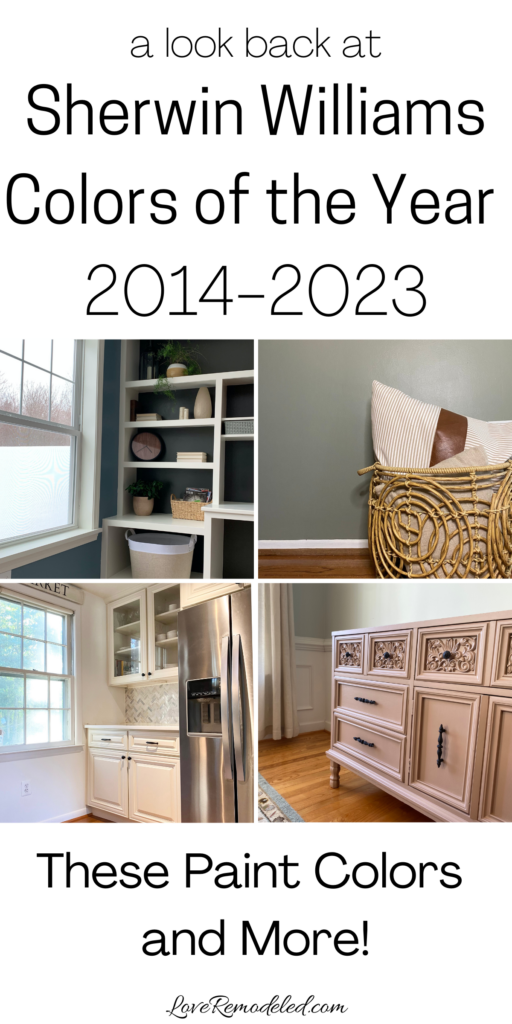
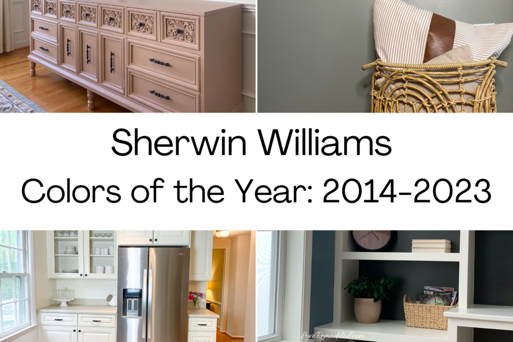
Here is a look back at the last 13 years of Sherwin Williams’ Colors of the Year.
Take a look and see what you think of Sherwin Williams’ top picks over the years.
This post may contain affiliate links. If you have any questions, please see my disclaimer page.
2026 Sherwin Williams Color of the Year: Universal Khaki

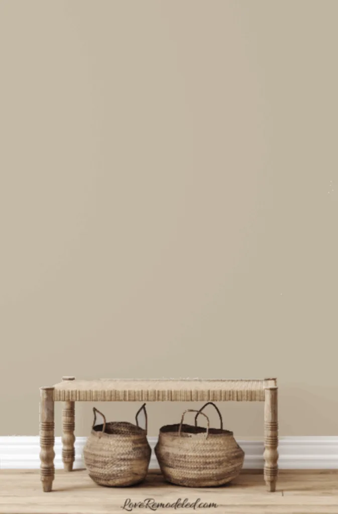
In 2026, Sherwin Williams chose Universal Khaki as their Color of the Year. Universal Khaki is a very versatile paint color that can be used in any type of home.
Universal Khaki is the definition of a refined earthy tone. It is warm and inviting, but also elegant in its simplicity.
Universal Khaki works with whites and creams for a soft neutral look, earth tones for a natural vibe, or as a foundation for color with light blues and yellows.
Click here for a full paint color review of Sherwin Williams Universal Khaki.
2025 Sherwin Williams Color Capsule of the Year
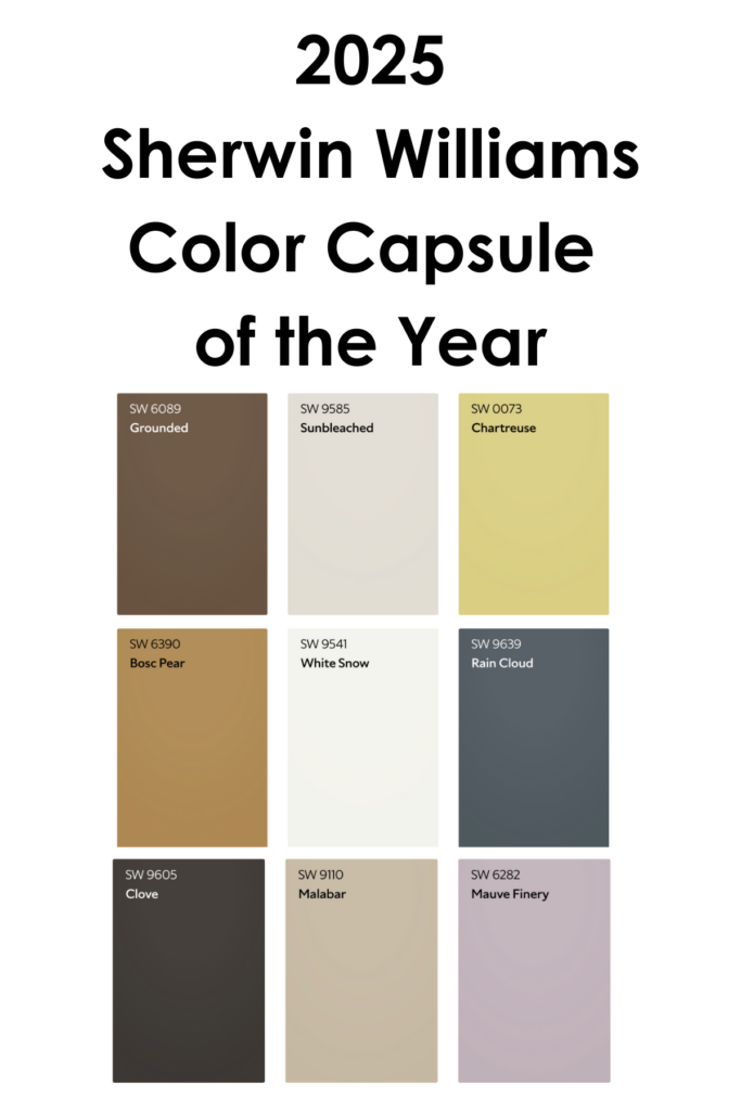

In 2025, Sherwin Williams tried something new by announcing a Color Capsule of the Year instead of an individual color.
The Color Capsule included colors for anyone and everyone. The colors included: Grounded, a warm brown; Sunbleached, a soft grayish off-white; Chartreuse, a greenish yellow; Bosc Pear, a warm tan; White Snow, a cool white; Rain Cloud, a dark grayish blue; Clove, a dark brown; Malabar, a medium beige, and Mauve Finery, a soft grayish purple.
2024 Sherwin Williams Color of the Year: Upward
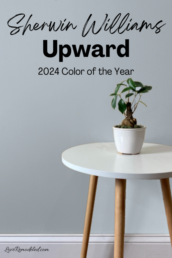

In 2024, Sherwin Williams chose Upward as their Color of the Year.
Upward is a soft blue paint color with purple undertones. It has a soft elegance that feels cool and relaxed.
Upward was very on trend with the coastal design trend that was popular in 2024 and beyond. Given that it has a good bit of gray in it, Sherwin Williams actually classified it as a neutral, though there was no denying that it was a blue.
Click here for a full paint color review on Sherwin Williams Upward.
2023 Sherwin Williams Color of the Year: Redend Point

Redend Point is a unique blend of pink, brown, beige and gray tones.
Together, these shades create a soft and earthy color that looks warm and subdued.
Redend Point is most easily classified as a pink paint color, but it isn’t any sort of juvenile or bubblegum pink.
Instead, Redend Point is daring and refined. It is a mature paint color that gives a strong nod to the boho look that was popular in 2022.
Click here for a full color review on Sherwin Williams Redend Point.
2022 Sherwin Williams Color of the Year: Evergreen Fog

Evergreen Fog is a grayish green paint color that is subtle and sophisticated.
This paint color makes a statement. It is a lush green that feels earthy.
After a tumultuous previous year, it was chosen to inspire calmness and a feeling of being centered.
Like Redend Point, Evergreen Fog is a great paint color for a boho scheme, but also works in traditional and transitional homes as well.
Click here for a full color review on Sherwin Williams Evergreen Fog.
2021 Sherwin Williams Color of the Year: Urbane Bronze

Urbane Bronze is a dark brown paint color.
It is a blend of brown and black with a hint of green. These various undertones round it out to make it a perfectly earthy color.
Urbane Bronze is a very bold and dramatic shade. It provides definition to trim, or a daring pop of color as an accent wall.
Urbane Bronze is also a great paint color for a home exterior. It works in any style home.
While Urbane Bronze will always be a great color for trim, cabinets, and exteriors, it never really seemed to catch too much of a following as a wall paint color.
Click here for all the details on Sherwin Williams Urbane Bronze.
2020 Sherwin Williams Color of the Year: Naval
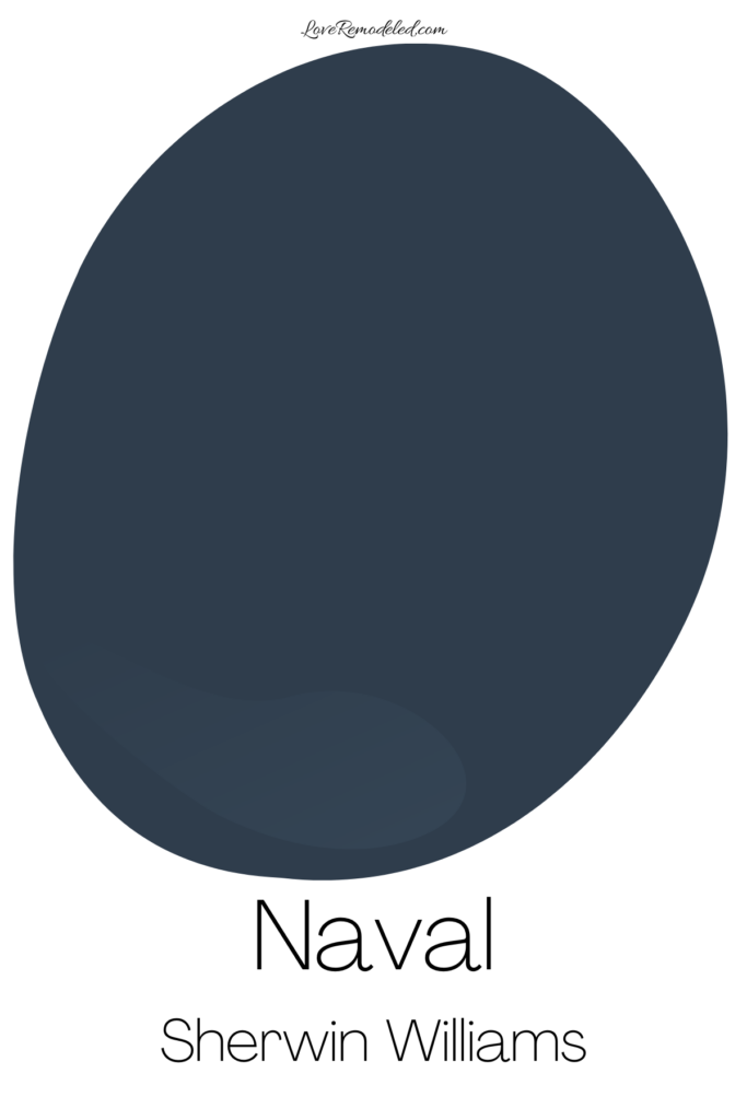

Naval is a classic navy blue paint color.
This very traditional shade is a great paint color for an accent wall, cabinets, woodwork, furniture or home exteriors.
Navy was a huge color in home design in 2020. Navy cabinets began being used in two tone kitchens, where cabinet bottoms or kitchen islands would be painted navy with uppers being done in white.
Naval, and navy blue paint colors, are still popular now, though we’re starting to see a bit of a decline in its trendiness. Navy will always be used, since it is such a classic neutral, but it isn’t the hot shade at the moment.
Click here for all the details on Sherwin Williams Naval.
2019 Sherwin Williams Color of the Year: Cavern Clay

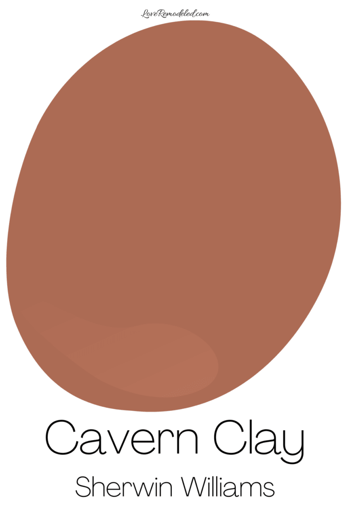
Cavern Clay is a dark, reddish orange paint color. It is earthy and remniscent of clay, as evidenced by the name.
Cavern Clay has a good bit of gray in it, but still tends to look bright. It is definitely a statement color, but when used in a well designed space, can provide a nice pop.
Like some of the other shades on this list, Cavern Clay never gained a lot of popularity.
2018 Sherwin Williams Color of the Year: Oceanside
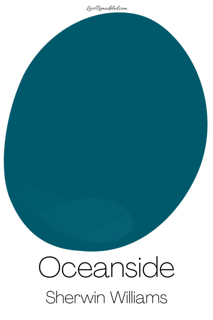

Oceanside is a deep, teal blue paint color. Despite being dark, Oceanside also has some brightness to it when the light hits it.
Oceanside is great for an accent shade, but a bit too dark for a whole room.
While Sherwin Williams included Oceanside in their Colormix Forecast collections for 2019 and 2020, it isn’t exactly widely acclaimed.
2017 Sherwin Williams Color of the Year: Poised Taupe

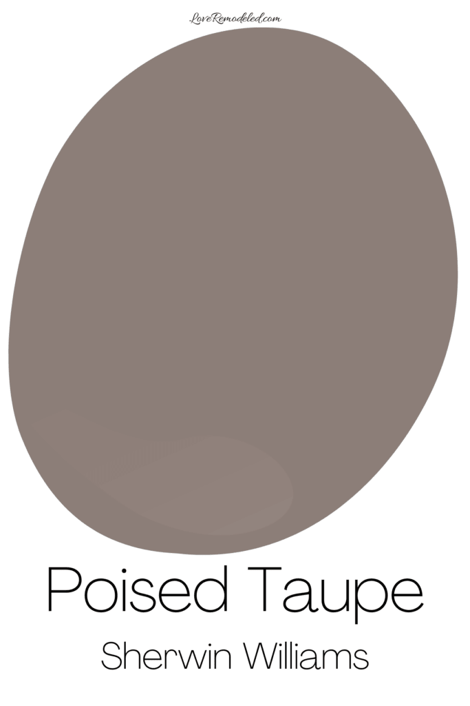
Poised Taupe is a muddy purple paint color. It is a blend of brown, gray, and purple.
Taupes were said to becoming in fashion for a lot of years. And, in some ways, they did.
Lighter taupes, such as Balboa Mist or Pale Oak are very popular. But a dark taupe like Poised Taupe takes a lot of daring to use in a space.
2016 Sherwin Williams Color of the Year: Alabaster

Alabaster is a super popular white paint color by Sherwin Williams. It has been one of the top white paint colors they sell for years.
Alabaster is fairly white and right, but has enough yellow and gray in it to soften it from being too stark.
Alabaster works anywhere – on trim, walls, cabinets or home exteriors. It is very versatile and usable.
When Sherwin Williams chose Alabaster for their 2016 Color of the Year, they definitely got it right. All white kitchens and rooms became popular in the subsequent years, and Alabaster is a great choice for either of those spaces.
Click here for all the details obn Sherwin Williams Alabaster.
2015 Sherwin Williams Color of the Year: Coral Reef
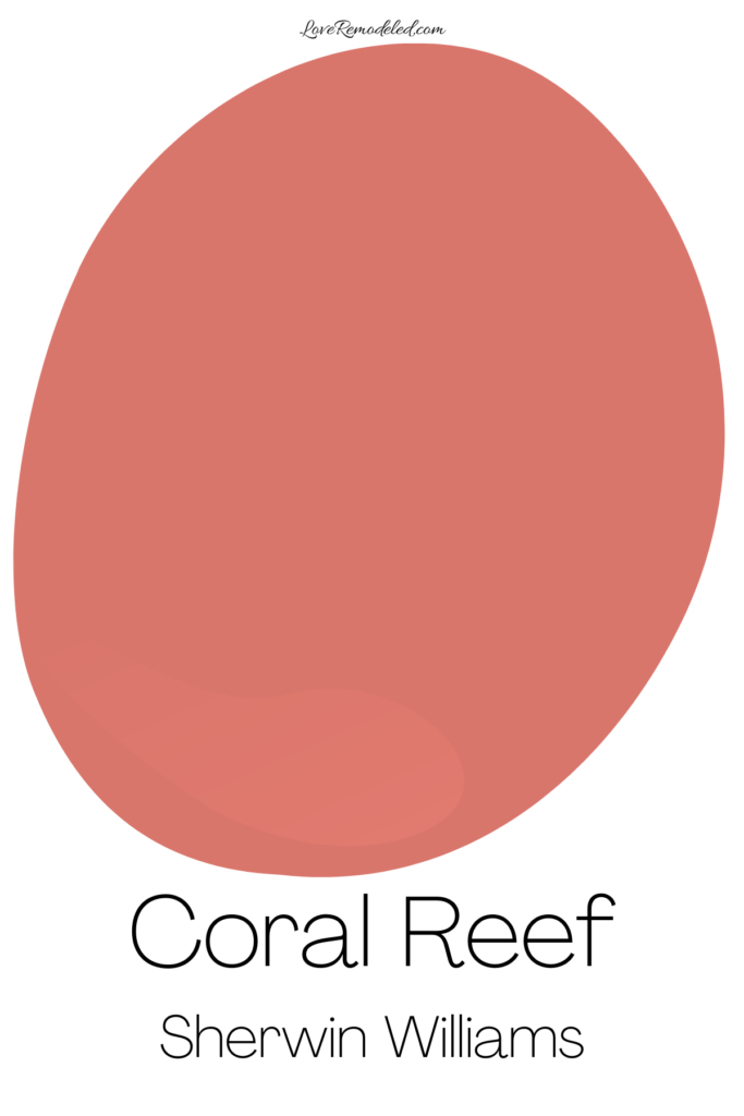

Coral Reef is a deep pink paint color. Sherwin Williams defines Coral Reef as a “vitalizing coral red.”
As with all pink paint colors, Coral Reef brings a lot of warmth to a space.
It is a mid-tone that is probably a bit too bright for most homeowners living spaces, but could work well in girl’s bedrooms.
Overall, Coral Reef is not a shade that we see a lot of on walls. It works better as an accent shade on throws or pillows than a wall paint color.
2014 Sherwin Williams Color of the Year: Exclusive Plum

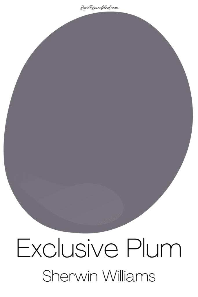
Exclusive Plum is a smokey purple paint color. With a lot of gray in it, Exclusive Plum is a mature purple that lends an aire of refined elegance to a space.
Exclusive Plum is a great shade for someone who really loves purple, but it didn’t catch mass appeal.
This is because purple is a very polarizing color. People either love it or hate it.
Still, if you like purple, Exclusive Plum is about as gorgeous as a purple as you can get.
Wondering How To Pick the Perfect Paint Color?
I have the best solution for you!
Samplize sells peel and stick paint samples in almost every paint color.
These no-mess, peel and stick sheets are made from real paint, so they will show you exactly what the paint color will look like.
Simply place them on your walls next to your trim, furnishings or fixed elements, and easily see which paint color works best in your space and with your lighting.
Then, peel the sheet off your wall and reapply it somewhere else if you like. You can try several different paint colors with no mess, no fuss and no cleaning paint brushes.


Oh, and you can have them in your home by tomorrow with OVERNIGHT shipping!
As a bonus, be sure to use the code LoveRemodeled10 at check out to get an extra 10% off! Samplize sheets are cheaper than a sample can of paint, and way less work.
They are the easiest (and fastest!) way to try a paint color in your home, with no hassle.
Final Thoughts on Sherwin Williams’ Colors of the Year

Sherwin Williams’ Colors of the Year aren’t actually my favorite shades to start with for the average person.
On a whole, they tend to be bold and striking colors that are better on a small scale, or as an accent.
Many of the earlier colors on this list are just too dark for the average room (looking at you, Cavern Clay, Oceanside, Exclusive Plum and Coral Reef). And, each of these colors would be better in a lighter, more usable shade.
But, in more recent years, Sherwin Williams has included classic neutrals such as Naval, Alabaster and Urbane Bronze, which are very versatile.
Finally, the most two recent colors are bold, but still usable. I’ve actually used both these shades in my own homes, and found them to be lovely paint colors.
Overall, if you view these shades and think about the years when they were predicted to be popular, you can get an idea of the overall trending designs for that time.
So, what do you think? Does Sherwin Williams hit it out of the park with their Colors of the Year? Or do you find them to be just a bit too daring? Leave me a comment and let me know!
Have a question? Leave me a comment! Remember to check back for a response – it may take me up to a week or two depending on how busy I am, but I’ll try my best to get back to you!
Want to show off your project? Join the discussion in Love Remodeled’s Facebook group!
Want to see all your paint options in one convenient place? Click here to get everything you need to start painting, including Sherwin Williams and Benjamin Moore paint color decks!