
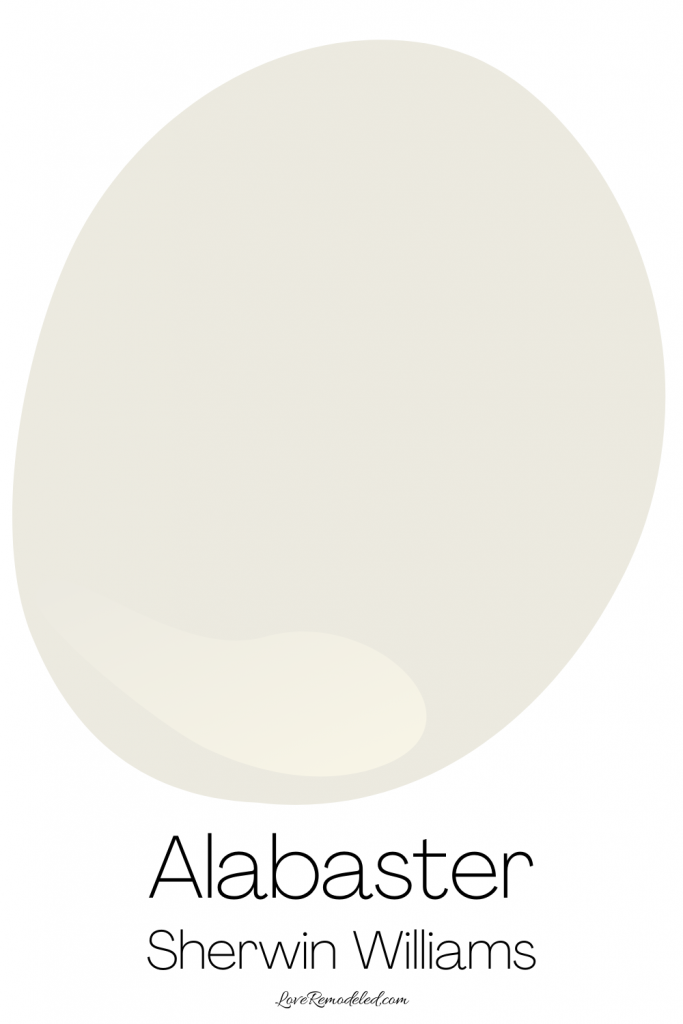
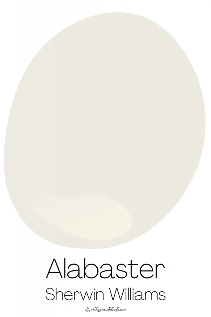
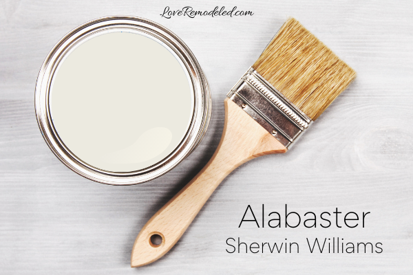
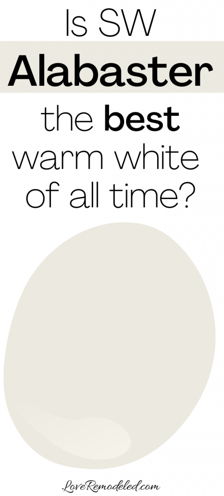
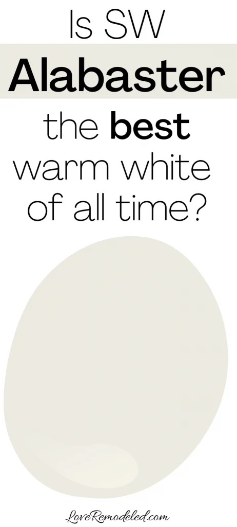
Alabaster (SW 7008) is a soft, creamy white. It is not as stark as a true white, but still white enough that it will always look white, in any light and on any surface.
Alabaster has a Light Reflectance Value of 82, meaning that it will reflect back a lot of light into the room. This makes it a good choice for any room that you want to have a bright, cheery look.
Alabaster’s Popularity
Sherwin Williams Alabaster color is one of the most popular white paint colors that Sherwin Williams has.
It has been a best seller for many years, and was actually named by Sherwin Williams as their Color of the Year in 2016.
In addition, Alabaster has been featured in Pottery Barn’s Spring/Summer 2019 collection, Pottery Barn Kids’ Spring/Summer 2019 collection, and PBteen’s Spring/Summer 2019 collection.
Is white in style for home decor right now?
Based on Alabaster’s appearance in all of the major collections that Pottery Barn put out in 2019, it is safe to say that SW Alabaster has not declined in popularity in the last several years.
In fact, white walls are trending right now on Pinterest in a big way.
While gray walls ruled for a long time, white walls are becoming the color of choice for homes now.
When you look at Alabaster, it is easy to see why it is so popular, yet not at all trendy.
Trendy colors come in and out of fashion depending on current styles. Timeless colors that are popular are more classic in their appeal.
Sherwin Williams’ Alabaster color is the perfect, timeless white.
It has a bit of warmth without being too yellow, too blue or too beige. In addition, it pairs well with both warm or cool colors.
Sherwin Williams Alabaster Color Undertones
The undertones of Alabaster are subtle. Alabaster doesn’t lean strongly towards any one color, and almost has a greige undertone.
This means that it has both a beige and gray base, though it mostly just comes off as white.
What is thought of as a true white typically has cool undertones, and can almost lean towards blue.
If you look at Extra White or Pure White by Sherwin Williams, you will see that this cool, bluish white is what many would consider a real white.
Without a visual comparison to a real true white though, Alabaster will look completely white.
If Alabaster is going to lean one way it another, it tends to pull towards yellow. More often than not though, I find that this is because of the lighting in the room. Yellow toned (warm) light bulbs can really throw a yellow look on your Alabaster walls. If you paint your walls Alabaster white, but you’re only seeing yellow, you may want to consider changing your light bulbs to see if it helps tone it down.

Sherwin Williams Alabaster Color Compared
When I do a full paint color review, I like to compare the paint shade I’m discussing to other popular paint colors that are in the same color family. This can be helpful for readers who are trying to decide between different paint colors.
For Alabaster, we will compare it to Extra White, Greek Villa, Swiss Coffee, White Dove, Snowbound, and Dover White.
This post may contain affiliate links. If you have any questions, please see my disclaimer page.
SW Alabaster Vs. Extra White
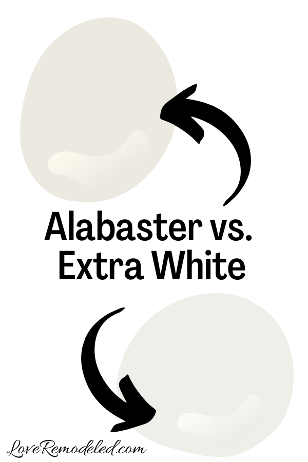

Take a look at SW Alabaster next to a cool white (Extra White) and a warm white (Greek Villa), and see how it compares.
When set against a color such as Extra White, you will notice Alabaster’s warm hints.
Both will look white if you are painting a whole room in the color, but Alabaster will look a little cozier than Extra White will.
Click here for more information about Extra White.
SW Alabaster Vs. Greek Villa

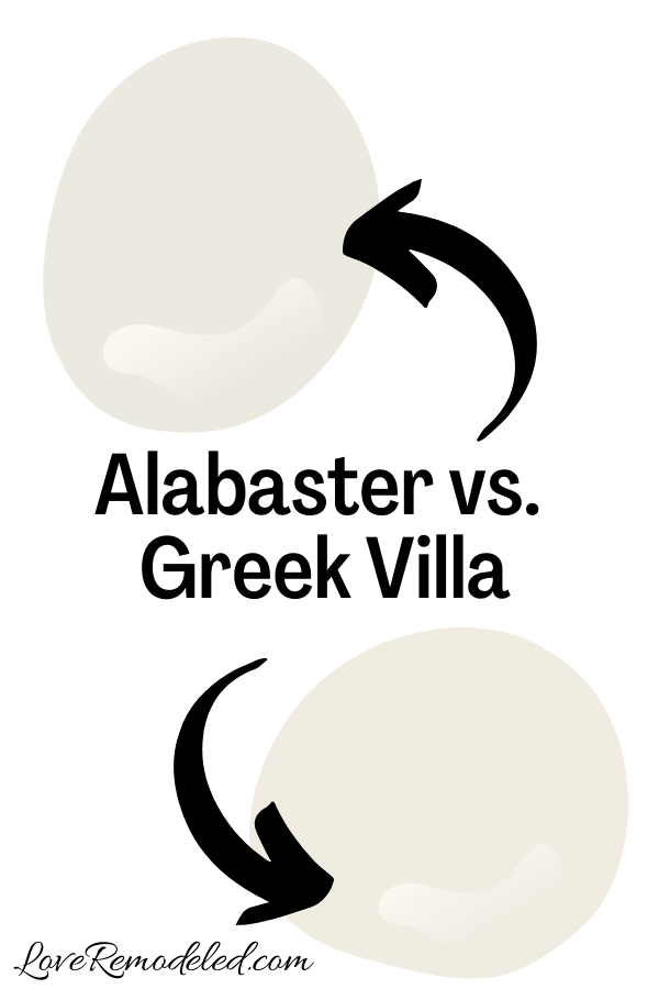
When you compare Alabaster with Greek Villa, you will see how Alabaster leans more gray, while Greek Villa leans more yellow.
Both are warm colors, and both will look pretty white when painted on the wall.
But Alabaster looks a little more muted than Greek Villa.
Click here for a full color review on Greek Villa.
SW Alabaster vs. Swiss Coffee

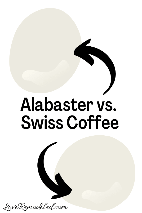
Swiss Coffee is a creamy paint color by Benjamin Moore. It is very similar to Alabaster, but lacks the gray that Alabaster has. Swiss Coffee is light an airy, without any shading to it.
These paint colors are so similar that if one works in your home, the other probably will as well. But, there are subtle differences between them, and you may find that you like one better than the other.
I recommend sampling both to determine whether you like Swiss Coffee or Alabaster better.
Click here for more information about Swiss Coffee.
SW Alabaster vs. White Dove
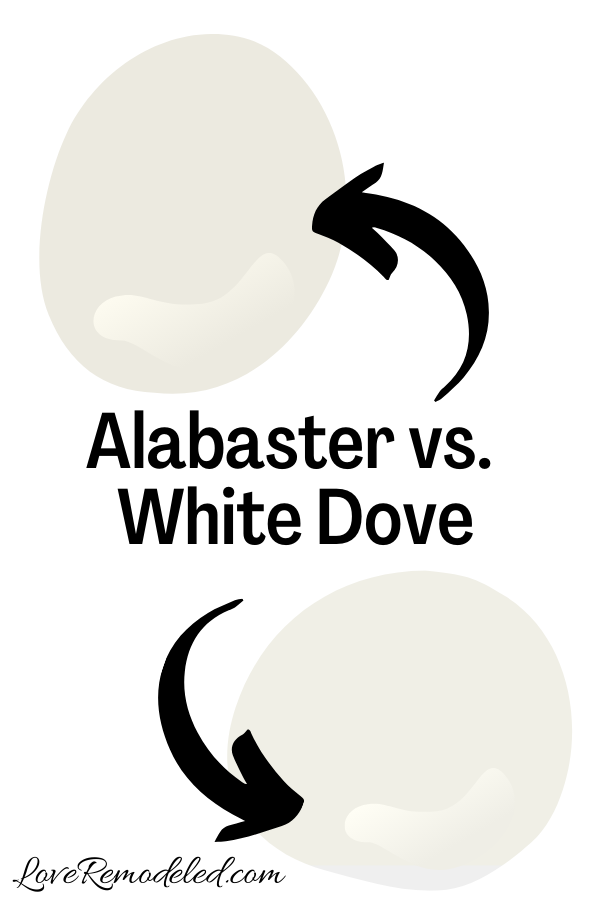

White Dove is a very popular off-white paint color by Benjamin Moore.
I always think of White Dove as Benjamin Moore’s Alabaster (and vice versa). White Dove Benjamin Moore’s most popular soft, creamy white paint color, while Albaster is Sherwin William’s most popular soft, creamy white paint color.
Despite this, they aren’t exactly the same paint colors. Alabaster has a bit more of a beige quality to it, where as White Dove is more yellow its undertones.
White Dove can be used on trim and woodwork, like Alabaster.
While both may work in your home, you may find that you like one better than the other. The way to choose is going to be to pick up a Samplize square of these two shades and try them out in your space. I’ll explain more about Samplize squares later in this post.
Click here for more information about White Dove.
SW Alabaster vs. Snowbound
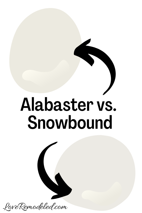

Snowbound is a warm paint color with pink and purple undertones. This make it a different kind of warmth than Alabaster.
Alabaster’s yellow undertones bring a creamy look to the paint, while Snowbound’s pink/purple undertones bring a cozy softness to the shade.
Snowbound and Alabaster have similar depths. Snowbound can also work on trim, but it isn’t a common shade for trim.
Snowbound is a good paint color if you prefer taupe colored shades. It is a great option for someone who wants a warm paint color that doesn’t have any yellow in it.
Click here for more information about Snowbound.
SW Alabaster vs. Dover White

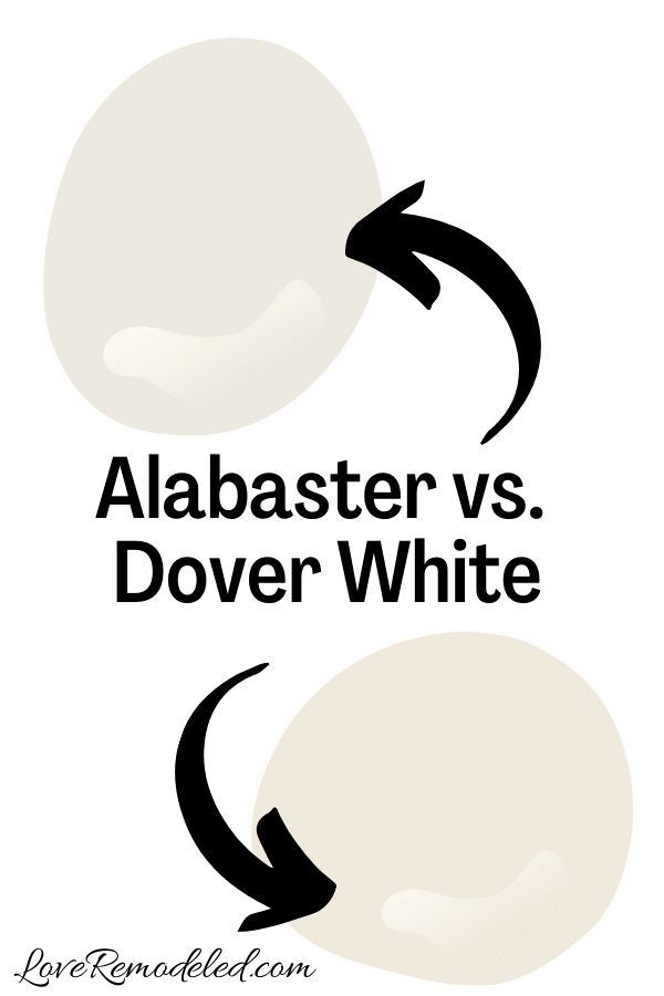
Dover White is a creamy paint color by Sherwin Williams. When comparing Dover White to Alabaster, Dover White has a bit more orange in it, and and a bit less gray in it.
Alabaster is also a bit lighter than Dover White. It has a higher LRV, making it a shade that can also work on trim if you want a soft white trim color. Dover White would probably be a bit too much color for trim for most people.
Dover White might be a good choice who wants a creamy look to the room, but has a lot of cool, northern lighting. Where Alabaster might come off looking more white, Dover White will bring a little more warmth to the space.
But, if you have a lot of warm light in your space, Dover White may look a bit too warm, and Alabaster might be perfect.
Click here for more information about Dover White.
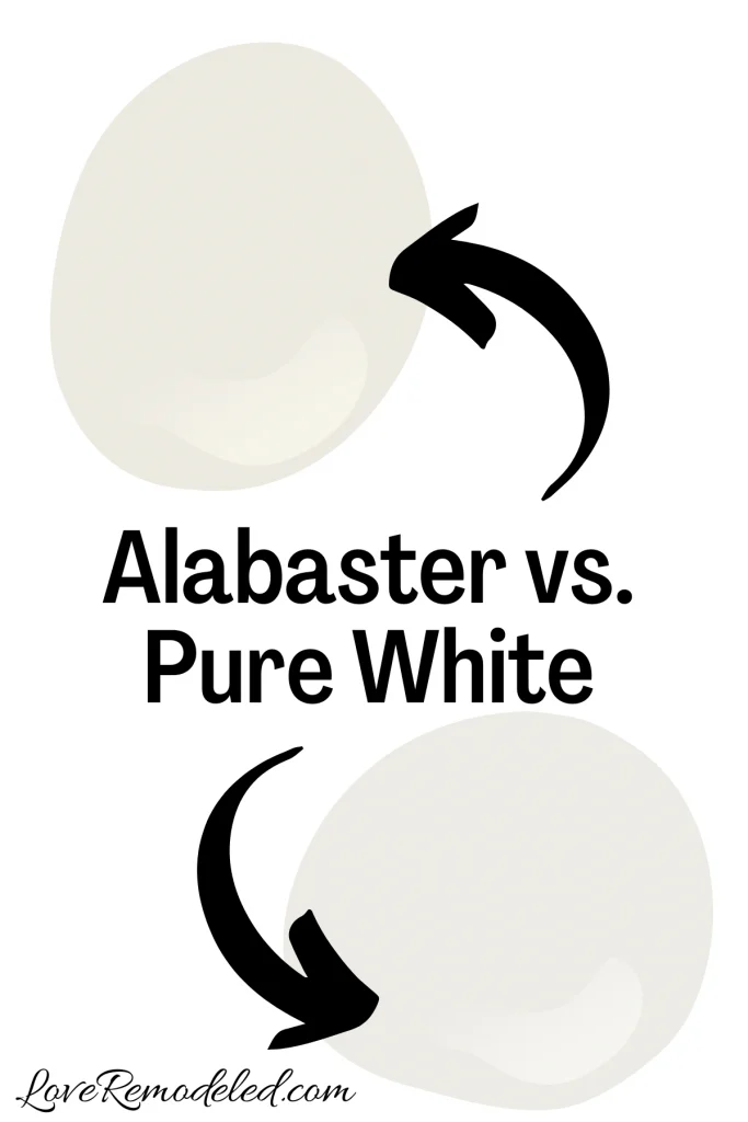
SW Alabaster vs. Pure White
Pure White is a very popular paint color by Sherwin Williams. In fact, it is one of my go-to paint colors for trim if I am using Sherwin Williams paint.
This is because Pure White is a white paint color that works with almost any other shade. White it is still bright, it isn’t stark at all. Pure White is lighter, and has a higher LRV, than Alabaster. And, it has less color in it than Alabaster does.
Pure White has gray and yellow undertones, but they are pretty understated. Next to Alabaster, Pure White will look very white. But, when you compare Pure White to a cleaner white, such as High Reflective White, you’ll see the gray in Pure White.
The gray just lends a bit of softness, while the yellow makes Pure White a little warm.
So, Alabaster is a much creamier and warmer white paint color when comparing it to Pure White.

So, is SW Alabaster color a warm or cool color?
If you look at Alabaster compared to other whites, it is easy to see what it is a warmer white.
Though the greige undertones make it very versatile, it is not as stark as many of Sherwin Williams’ cooler whites.
If Alabaster is a warm white, is it cream or white?
SW Alabaster is a creamy white. But while Alabaster does have almost a creamy look to it, it is considered to be white, and not a cream color.
Alabaster white is a soft look. It is airy and warm, but not too yellow.
Where should I use Sherwin Williams’ Alabaster Color?

Alabaster white is a perfect choice in many different settings.
Because it is a solid white with just a hint of color, it can go anywhere that you want a clean, bright look.
You can use Alabaster on the walls as a crisp, clean backdrop to your decor.
You can use Alabaster on your trim as a warm white contrast to colored walls.
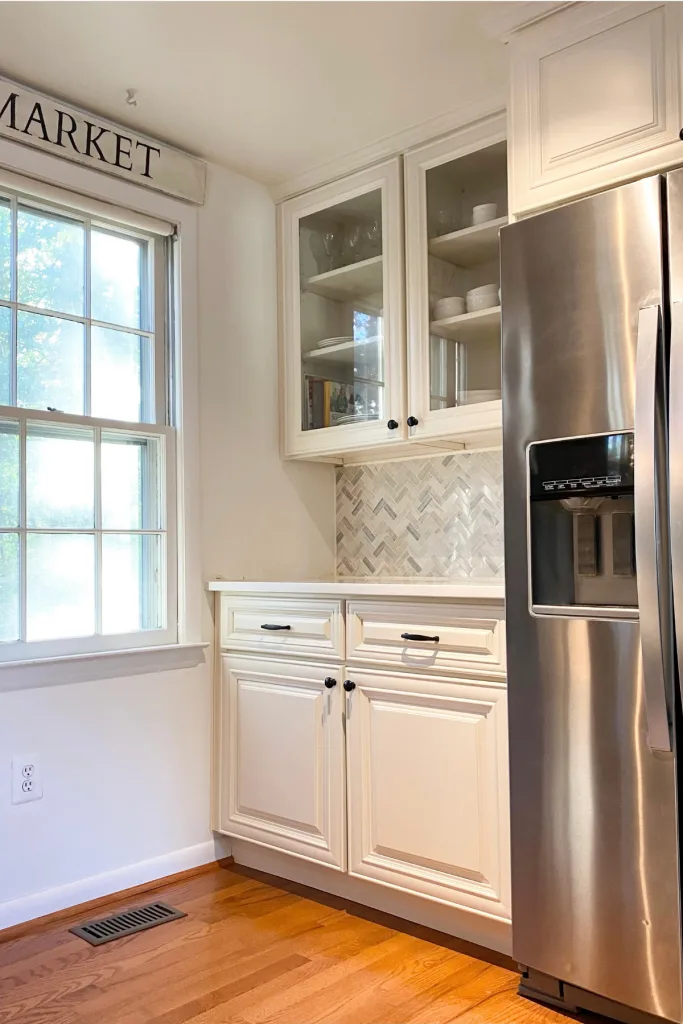
You can use Alabaster on your cabinets, for a perfect white kitchen.
And Alabaster is a top choice for a white paint color on shiplap.
Complimentary Colors for Alabaster Paint
Alabaster goes with many other paint colors. Because it is a warm neutral, it goes well with many other warm neutrals. Additionally, it works with many blues and greens.

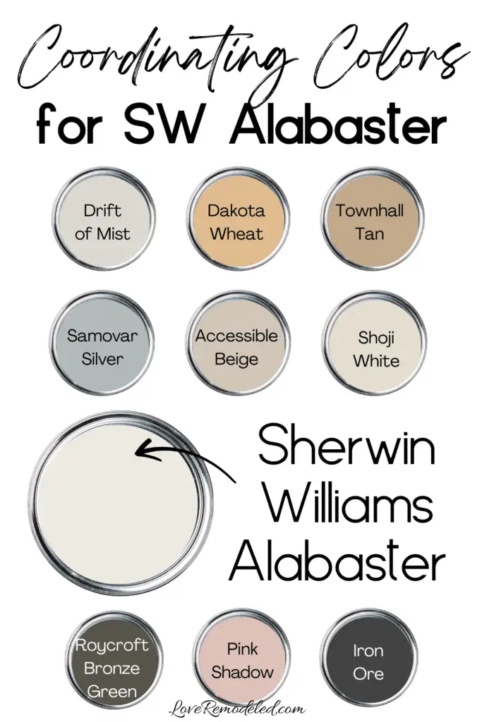
There are so many shades that go with Alabaster. Some great options are: Drift of Mist, Dakota Wheat, Townhall Tan, Samovar Silver, Accessible Beige, Shoji White, Roycroft Bronze Green, Pink Shadow, and Iron Ore.
For specific color schemes, I like the following color combos:
- Alabaster, Iron Ore, Pink Shadow and Shoji White
- Alabaster, Dakota Wheat and Townhall Tan
- Alabaster, Accessible Beige and Roycroft Bronze Green
- Alabaster, Samovar Silver and Drift of Mist
Curated Paint Palette for Alabaster

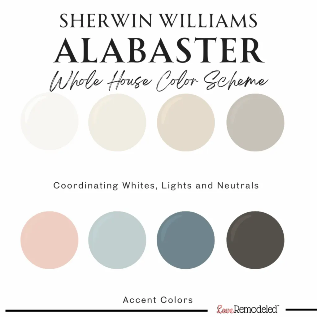
Looking for more coordinating paint colors for Sherwin Williams Alabaster? Check out my curated paint scheme for Alabaster. This paint palette includes two coordinating white paint colors, two coordinating neutral paint colors, and four coordinating accent colors. Each color goes perfectly with Alabaster.
Having a coordinating color palette makes choosing your paint color scheme easy. This curated Alabaster color palette will elevate the look of your home.
Trim Colors for Alabaster
I get a lot of questions about a trim color for Alabaster, so I thought I’d include a section for you on this very topic.
When you have white walls, there are two ways you can go with your trim.
First, you can paint your walls and your trim the same white, and differentiate them by sheen.
For example, you can paint your walls Alabaster in a satin finish, and paint the trim Alabaster in a semi-gloss finish. This will still make the trim stand out because of how the light bounces off it a semi-gloss sheen more than a satin sheen.
The trim will look brighter than the walls, but all the undertones will match perfectly.
If you want to see how it looks to have Alabaster walls with Alabaster trim, join my Facebook group and search “Alabaster”. There is a great example with pictures of someone who painted their kitchen in all Alabaster white. The cabinets and trim are a higher sheen of Alabaster, while the walls are a lower sheen. It looks gorgeous!
Alabaster Walls with Pure White Trim
Second, you can paint your walls one white paint color and paint your trim in a coordinating white paint color.
For example, you can paint your walls Alabaster and your trim Pure White.
Here is a picture of walls in Alabaster and trim in Pure White.
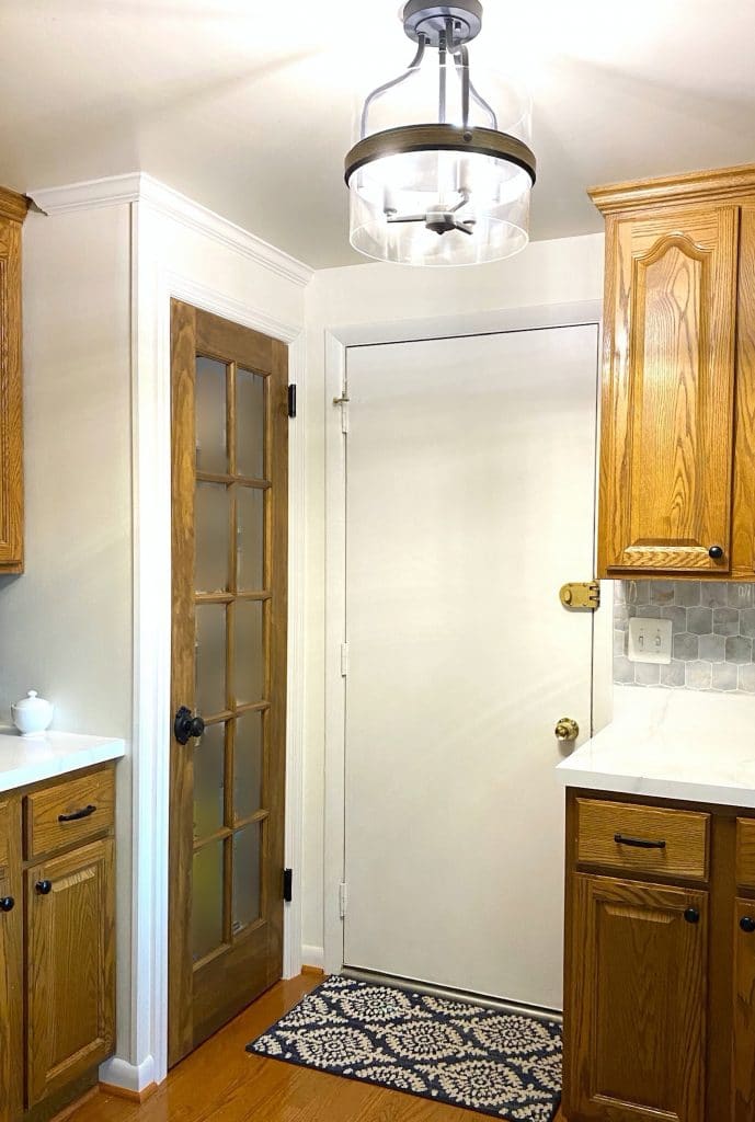
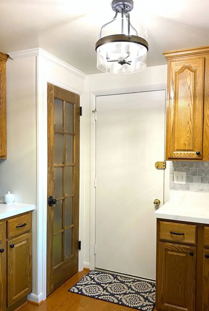
As you can see, the walls have that creamy white color, while trim and door look slightly brighter and more crisp.
There is not a huge difference in how they look.
If you want a brighter white trim color, High Reflective White is a good option.
Ceiling Colors for Alabaster Walls
People frequently want to know what color they should paint their ceiling if their walls are Alabaster white.
My top recommendations are going to be similar to my trim color guidance.
Alabaster is a perfectly fine color to use on your wall and your ceiling. It is light and bright enough that it won’t make your ceiling look dingy, but also will give the room a bit of softness if you use it for a ceiling shade.
If you have plans to repaint someday though, I would advise going with a brighter and more versatile white paint color that will go with anything if you change the wall color.
For example, Pure White, High Reflective White and Chantilly Lace are all white paint colors that will go with Alabaster walls. The ceiling will be brighter than the walls, but it won’t make too much of a splash, because ceilings are shady areas of a room anyways.
Final Thoughts on Alabaster Paint Color
Choosing a white paint color for your walls can be challenging, but Alabaster is a go-to paint color for anyone who wants warm, bright and airy white walls.
Overall, Alabaster is a really gorgeous white and is perfect for anywhere in your home.
It is a great choice in a room of any style, from modern to farmhouse, and will highlight the decor of the room.
Wondering How To Pick the Perfect Paint Color?
I have the best solution for you!
Samplize sells peel and stick paint samples in almost every paint color.
These no-mess, peel and stick sheets are made from real paint, so they will show you exactly what the paint color will look like.
Simply place them on your walls next to your trim, furnishings or fixed elements, and easily see which paint color works best in your space and with your lighting.
Then, peel the sheet off your wall and reapply it somewhere else if you like. You can try several different paint colors with no mess, no fuss and no cleaning paint brushes.


Oh, and you can have them in your home by tomorrow with OVERNIGHT shipping!
As a bonus, be sure to use the code LoveRemodeled10 at check out to get an extra 10% off! Samplize sheets are cheaper than a sample can of paint, and way less work.
They are the easiest (and fastest!) way to try a paint color in your home, with no hassle.
Want to see all your paint options in one convenient place? Click here to get everything you need to start painting, including Sherwin Williams and Benjamin Moore paint color decks!


Want to see some other white paint choices? Check out the best whites from Sherwin Williams!
Have a question? Leave me a comment! Remember to check back for a response – it may take me up to a week or two depending on how busy I am, but I’ll try my best to get back to you!
Want to show off your project? Join the discussion in Love Remodeled’s Facebook group!
Tami
Wednesday 6th of September 2023
Hello, I am getting so many great tips about which white is right. I am planning to paint the knotty pine walls as it is too dark with little natural light. It is an open concept kitchen dining and living room area. The ceilings are only just over 7 ft. I am getting new kitchen cabinets I would like in a white or slightly off-white and my countertop will be quartz with a blue/grey veining. The home is on a lake, the most light I get is later in day from a west facing window. After reading the comments, I think that alabaster would probably not be the best choice with the countertops. Any suggestions? Thank you!
Lauren
Saturday 23rd of September 2023
Hey Tami! Alabaster has a slight yellow undertone. Its not much, but it will look very warm next to a cooler countertop or cabinet. I think you need to sample a few colors next to your cabinets and countertops to make sure you pick the right white. Its too hard to just guess when you're trying to match whites. Sorry I don't have a definite answer on Alabaster for you!
Winnie
Monday 3rd of July 2023
Hi Lauren. I have a South facing kitchen. My shutters and cabinets are Silk White (WL003). My countertop is grey granite and white tiled backsplash with grey grout. I am thinking of using Alabaster for my doors and trims and Snowbound for the walls. Would that be a good choice? Looking forward to your advice. Thank you.
Lauren
Tuesday 1st of August 2023
Hi Winnie! Unfortunately, I really can't help much with this without seeing the white that the cabinets and backsplash are. They could be very cool or have pink undertones, etc. As for pairing Alabaster and Snowbound together, I would steer away from this combo. Alabaster has yellow undertones, and Snowbound has pink/purple undertones. I would start by getting samples of all the colors you're thinking about and putting them next to eachother and the cabinets and backsplash and see what looks like it works. Sorry I can't be more helpful!
Todd
Monday 13th of March 2023
Hello, we are renovating our Kitchen & currently have Alabaster ceilings throughout the house. Was planning on doing Snowbound walls, cabinets & trim (and kitchen Celing) with Island in Grizzle Gray. We are considering Alabaster in lieu of Snowbound. Your thoughts on Alabaster paired with Grizzle Gray?
Lauren
Monday 3rd of April 2023
Hi Todd! I would definitely go with Alabaster over Snowbound in this situation. Snowbound has a purple/pink undertone that is going to be more apparent next to Alabaster ceilings. And Alabaster will be fine next to Grizzle Gray. Good luck!
Kimberly Mattern
Saturday 21st of January 2023
Good day! Lovely work you do! I have the open concept, high ceilings, lots of windows, southern exposure, lakeside, with slightly orange tinged wood trim, wood floors, and medium dark wood kitchen cabinets. I’m looking for a white that will work best. I’m not entirely a gray fan, but very much a fan of griege. I need help! In advance I would like to say - Thank you very much for taking the time to answer!
Lauren
Thursday 26th of January 2023
Hi Kimberly! Thanks so much! For your home, I would go with a warm white, but not too yellow since you have that southern exposure. Alabaster is a great choice. If you want it to look more like a true white, you can go with Pure White too. It'll warm up a bit with the sun, but won't be too yellow. Hope this helps!
Deb
Monday 8th of August 2022
I just read your post on SW Alabaster which is what I would like to paint the walls in my home. I am thinking about painting my trim and interior doors a different color than a creamy white. My trim now is white but I wanted to do something different. I wanted a contrast but I don’t want it to be a stark contrast.
Lauren
Sunday 4th of September 2022
Hi Deb! Are you looking to go slightly darker? Edgecomb Gray would look pretty with Alabaster, and would give some contrast but not too much. Good luck!