
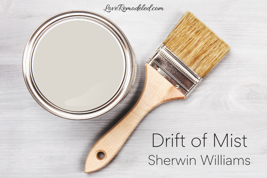
Drift of Mist is a neutral Sherwin Williams paint color.
It is rising in popularity, due to many people looking for neutral shades that have a bit eof color. But, it can sometimes be a tricky color to make work in your space.
Sherwin Williams Drift of Mist is part of the following color collections: Color ID (Creative), Living Well (Renew), Top 50 Colors, and Finest Whites & Neutrals (Finest Whites).
If you’re interested in a soft, neutral paint shade, keep reading for all the details on Sherwin Williams Drift of Mist to find out whether it will be a good shade for your home.
Drift of Mist Paint Color Characteristics
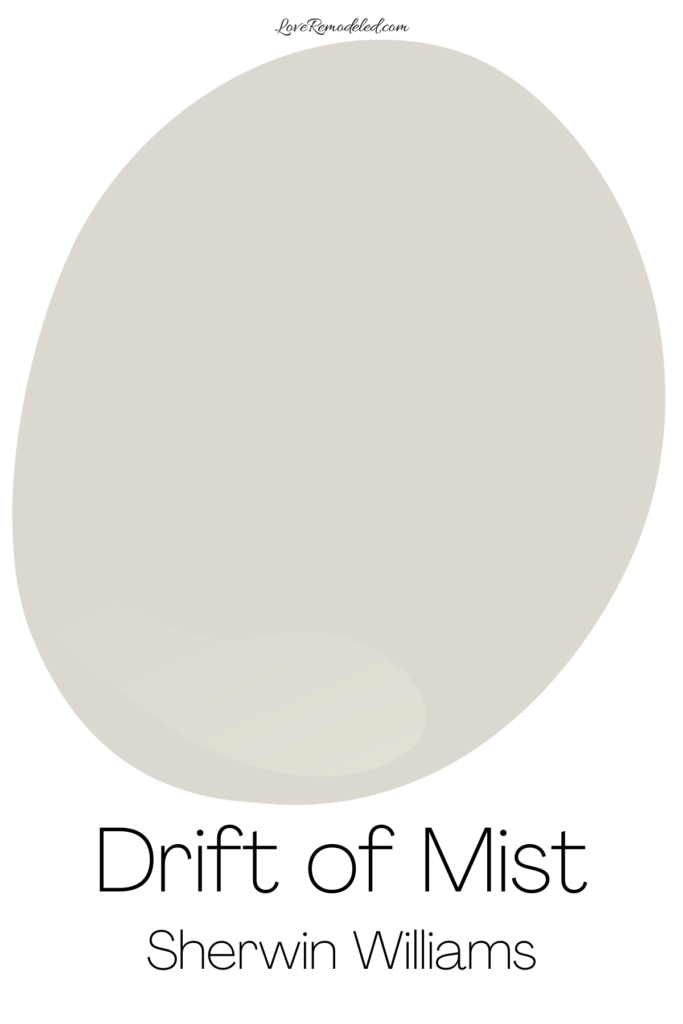

Sherwin Williams Drift of Mist is an interesting, chameleon sort of paint color. If you just glanced at it, you would call it a light gray.
But, when you really look at it and compare it to other warm or cool grays, you find its a bit more nuanced than that.
Before we get into the specifics of Drift of Mist, let me tell you some generalities about it.
Drift of Mist is in the neutral color family.
It is a light paint color, and Sherwin Williams calls it “airy” and “inviting.”
So, based on this information, it sounds like it could work in most spaces, right?
Not too light, not too dark, neutral and inviting… well, truth be told, Drift of Mist is not the easiest paint color to make work in a space.
That doesn’t mean it won’t be perfect in your space though. Here is what you need to know about Drift of Mist.
Drift of Mist Undertones
Drift of Mist is a blend of gray and beige, commonly called a greige. Greiges tend to be warm grays, but Drift of Mist is sort of an exception to this.
Drift of Mist also has a green undertone. The green undertone paired with the gray in Drift of Mist can make it come off considerably more cool than many greiges do.
When you compare Drift of Mist to warm grays, it tends to look like more like a cool gray. The warmth in Drift of Mist will recede a bit and, in comparison, it will look a bit more cool.
When you compare Drift of Mist to cool grays, you see the warmth come back out again, and it can take on a bit more of its beige look.
This makes it hard to pair with other grays in the space, because the grays need to have the same undertones to work together.
Drift of Mist LRV

Sherwin Williams Drift of Mist has an LRV of 69.
LRV stands for Light Reflectance Value, and it provides information about how light or dark a paint color appears.
The LRV scale goes from 0, which is completely black, to 100, which is completely white. So, an LRV of 69 is fairly high on the list.
This means that Drift of Mist will reflect a good amount of light back into the space, and it will have the general appearance of a lighter paint color.
But, Drift of Mist isn’t super light. Because of its LRV, it not so light that we would consider it an off-white. Drift of Mist has enough color in it to show up and make itself known on your walls.
Is Drift of Mist Warm or Cool?
Drift of Mist sort of straddles the line between warm and cool. While I would say it leans more warm than cool, it can definitely take on a cool look.
For example, in a North facing room, Drift of Mist tends to look more like a cool gray.
However, in a South facing room, Drift of Mist leans into its warmth and looks more like a warm gray.
Where Can I Use Sherwin Williams Drift of Mist?
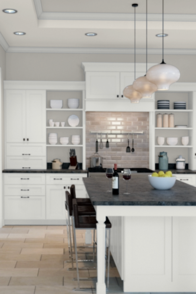
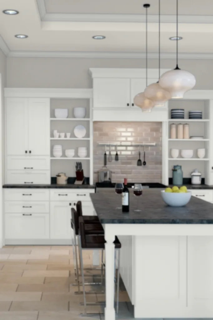
Drift of Mist is a great color for walls. It provides a neutral backdrop for furnishings and accessories, as long as you’re not trying to pair it with too many other grays.
Drift of Mist can also be used on kitchen cabinets, if you have the right tones in your countertop and flooring. If your countertop is a clean white marble, Drift of Mist will likely look a bit dingy.
But, if you have bit of variation in the tones in your countertop like is common in granite, Drift of Mist can be a good option.
Lastly, I wouldn’t necessarily recommend Drift of Mist on a home’s exterior. It isn’t light enough to look like a white or off-white, and if you are looking for a gray exterior color, the bright light of the outdoors can wash out the color it does have.
Accent Colors for Drift of Mist
Drift of Mist can be a slightly difficult paint color to pair with other paint shades, because of those trick undertones.
Drift of Mist goes well with lighter or darker grays with similar undertones, some whites and off-whites, some greens, and dark shades such as black and charcoal.
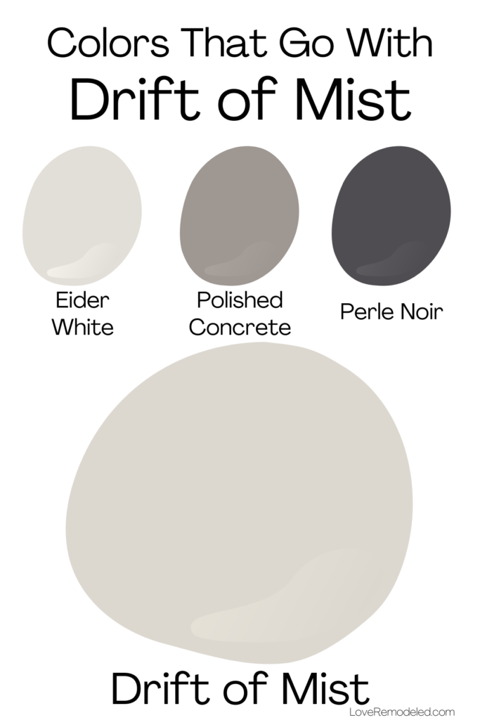

Specifically, Sherwin Williams pairs Drift of Mist with Eider White, a soft off-white paint shade, Polished Concrete, a mid-tone gray paint color, and Perle Noir, a dark black.
If you’re looking for other colors that go with Drift of Mist, check out my Etsy shop. Here, you can find a curated paint palette for Drift of Mist that is perfect for creating a whole house paint color scheme in your home.
Trim Colors for Drift of Mist
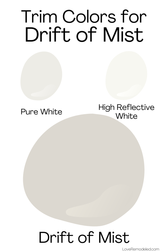
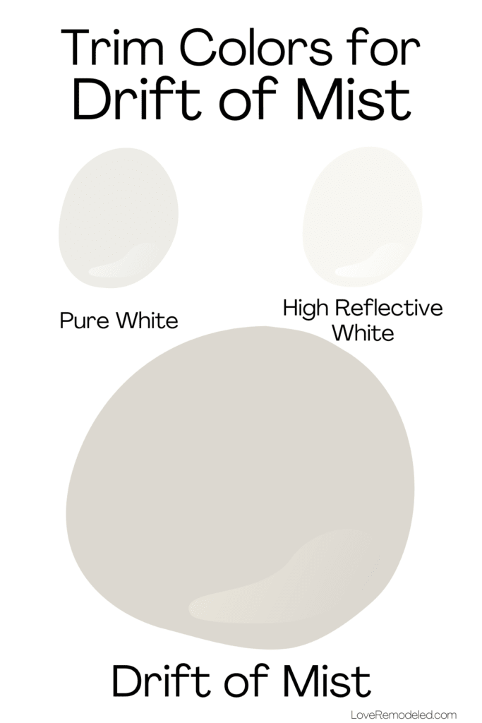
If you planning on painting your walls in Drift of Mist, I have two trim color suggestions for you.
First, Drift of Mist pairs nicely with Pure White.
Pure White is a soft, white paint color with gray and yellow undertones. The gray and yellow undertones in Pure White are not very noticeable, but it gives Pure White a little less crispness and some other white paint colors.
Its a great option if you like a white trim but don’t want something that may look stark.
Second, Drift of Mist goes well with High Reflective White.
High Reflective White is Sherwin Williams’ brightest and lightest white paint color. It is clean and crisp, and almost undertone free.
If you love a super white trim, High Reflective White may be a good option for you.
Sherwin Williams Drift of Mist Compared to Other Paint Colors
When I do a full paint color review, I am always aware that you are probably not considering only this paint color. Instead, you may also be looking at other, similar paint colors and trying to decide between them.
So, here are some other options that are like Drift of Mist, but may work better in your space.
Drift of Mist vs. Agreeable Gray
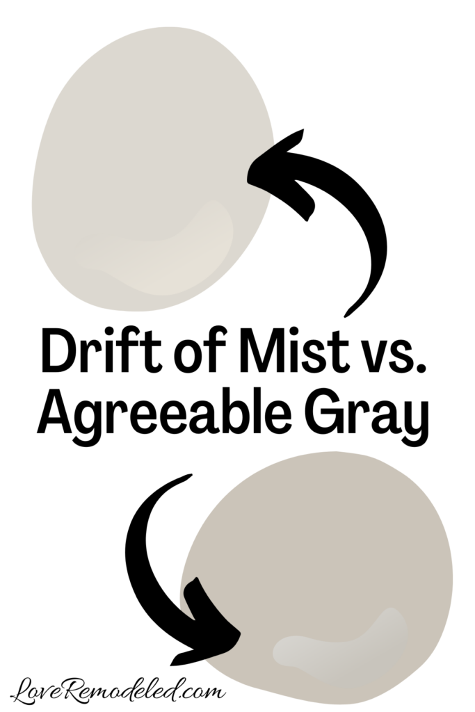
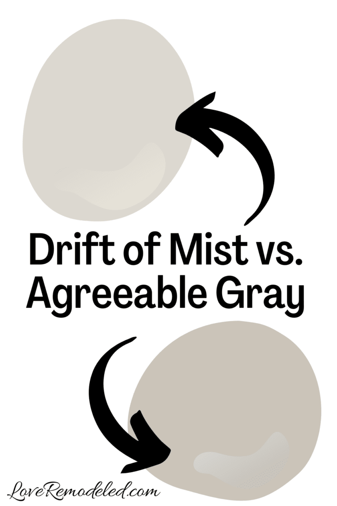
Agreeable Gray is a popular Sherwin Williams greige paint color. In fact, it has been one of the most popular Sherwin Williams paint colors for years.
Agreeable Gray is a blend of gray and beige with green undertones.
With an LRV of 60, it is a good bit darker than Drift of Mist. Additionally, it is a bit warmer than Drift of Mist.
Agreeable Gray has more color to it, and just tends to work well in a lot of spaces. While Drift of Mist is a tricky shade, Agreeable Gray just tends to be agreeable.
Drift of Mist and Agreeable Gray aren’t exactly interchangeable. Drift of Mist is going to be better in a room that isn’t super bright, since it may get washed out. Agreeable Gray can handle a bit of brightness because it has more color.
Drift of Mist vs. City Loft
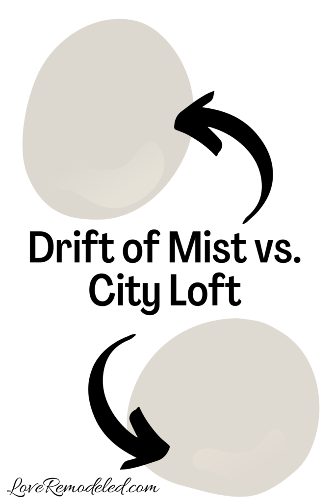

City Loft is a soft, greige paint color with warm undertones. Unlike Agreeable Gray, City Loft and Drift of Mist actually are pretty similar at first glance.
While Drift of Mist has green undertones, City Loft has more red or purple undertones to it. The two paint colors have about the same depth though.
If you have a lot of warm colors in your space, City Loft may be the better choice between the two. But, if you have more cool tones, Drift of Mist may work better for you.
Drift of Mist vs. Gossamer Veil
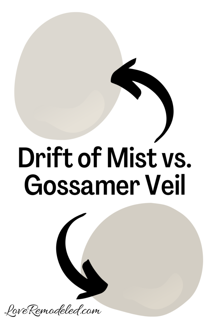

Gossamer Veil is a gray paint color that shares a color strip with Drift of Mist.
Gossamer Veil has a bit more color to it than Drift of Mist though and looks more saturated.
Like Drift of Mist, Gossamer Veil has a green undertone.
Gossamer Veil tends to be a better shade for when you have a super bright room because it has just a bit more depth to it.
Where Drift of Mist may get a little washed out due to its high LRV, Gossamer Veil holds its own better.
Drift of Mist vs. Repose Gray
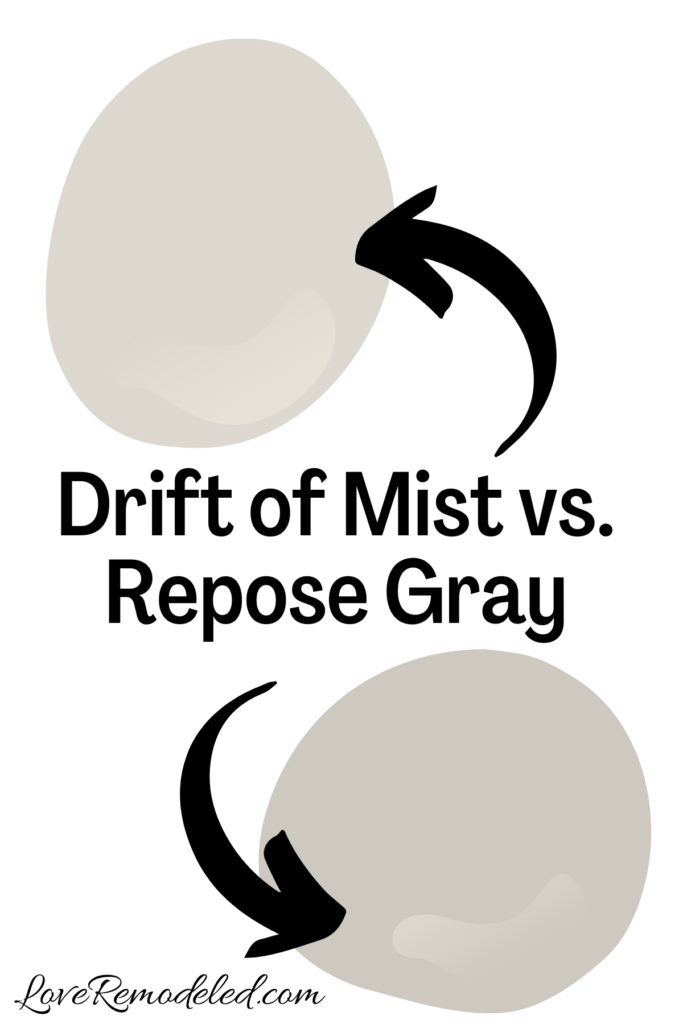

Repose Gray is another popular Sherwin Williams greige paint color. It has a bit more gray and beige in it, and blue undertones.
Despite some of these cool tones in it, it still has enough beige to be considered a warm gray.
Repose Gray is a good bit darker than Drift of Mist. It works well in brighter room, and in rooms with more cool tones like blues. It is also a bit more versatile than Drift of Mist.
Drift of Mist vs. Crushed Ice

Crushed Ice is a light gray paint color from Sherwin Williams. Like Drift of Mist, it also sort of straddles the line between warm and cool.
Crushed Ice and Drift of Mist have about the same depth, but look a bit different.
Drift of Mist has a lot more green and beige in it than Crushed Ice, while Crushed Ice shows a bit of purple when compared to Drift of Mist.
If you know you want a really pale gray or greige color, these two colors should both be sampled to see which will be better with your fixed elements and furnishings.
Wondering How To Pick the Perfect Paint Color?
I have the best solution for you!
Samplize sells peel and stick paint samples in almost every paint color.
These no-mess, peel and stick sheets are made from real paint, so they will show you exactly what the paint color will look like.
Simply place them on your walls next to your trim, furnishings or fixed elements, and easily see which paint color works best in your space and with your lighting.
Then, peel the sheet off your wall and reapply it somewhere else if you like. You can try several different paint colors with no mess, no fuss and no cleaning paint brushes.


Oh, and you can have them in your home by tomorrow with OVERNIGHT shipping!
As a bonus, be sure to use the code LoveRemodeled10 at check out to get an extra 10% off! Samplize sheets are cheaper than a sample can of paint, and way less work.
They are the easiest (and fastest!) way to try a paint color in your home, with no hassle.
Final Thoughts on Sherwin Williams Drift of Mist
Drift of Mist may just be the perfect color in your home, but this is definitely one that you should sample before painting the walls.
Have a question? Leave me a comment! Remember to check back for a response – it may take me up to a week or two depending on how busy I am, but I’ll try my best to get back to you!
Want to show off your project? Join the discussion in Love Remodeled’s Facebook group!

Suz
Saturday 14th of September 2024
Hi! Thank you for your post! I am currently changing a lot about my kitchen and living room. New floors, new fireplace, new dining space, etc. We have an open space with the kitchen island near the living room. Kitchen cabinets will be white and island will be navy blue. Would drift of mist be a good color for my north-facing (low natural light though) living room? I am also painting the new dining room a different color. It’s right off the kitchen but separate from the living room. It’s also north facing and will have lots of natural light. If I did drift of mist for the living room, what would be a good coordinating color for the dining? Any help is appreciated!!
Lauren
Wednesday 18th of September 2024
Hi Suz! It is hard to say without knowing the color of your flooring. Drift of Mist will look cooler in a northern facing room, more gray. It tends to go well with navy and white, so it sounds like its okay based on the information you've provided. You'll definitely have to check it in your space to make sure though. Some good coordinating colors for Drift of Mist for the dining room could be Stonington Gray, Gossamer Veil or Sea Salt. Good luck with your project!
Elizabeth
Monday 27th of May 2024
Hi! Paint colors confuse me so much!! Looking for a neutral for a small powder bathroom! No windows! Is drift of mist ok?? Thanks so much!
Lauren
Friday 14th of June 2024
Hi Elizabeth! Drift of Mist could work very well, but it depends on the other colors in the bathroom. If you have a white sink and white toilet, then Drift of Mist should be okay. If its wood, another shade may be better. If you want, hop onto the Love Remodeled Facebook group and you can post a picture so we can discuss it more.