
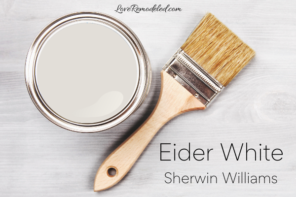
Eider White is a popular, off-white paint color by Sherwin Williams. It has become popular in recent years, due to its soft and approachable appearance.
Eider White, SW7014, is included in the following Sherwin-Williams collections: 2020 Haven, Living Well – Unwind, Top 50 Colors, and Cool Whites.
This post may contain affiliate links. If you have any questions, please see my disclaimer page.
Sherwin Williams Eider White Paint Characteristics
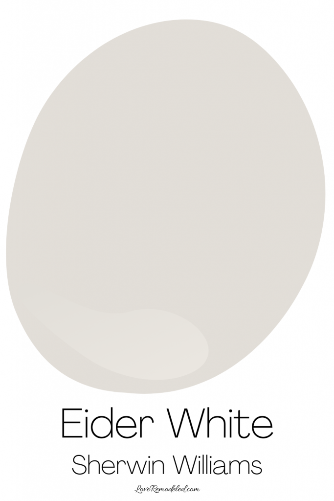
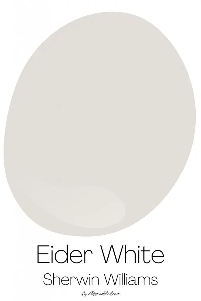
Eider White is a soft paint color that is included in Sherman Williams Off-White collection. While Eider White is called a “white” paint, it is not a true white.
Instead, Eider White is more of a gray paint. It is a very light gray, approaching a white. But if you want a true white paint, Eider White is not the paint color for you.
Eider White Paint Undertones
In addition to its gray base, Eider White also has purple undertones.
At first glance Eider White will not look like a purple paint color. But when painted on your wall, Eider White can definitely take on a purple hue.
The lighting in the room, the fixed elements in the space, and the other colors present can draw out this purple undertone in Eider White.
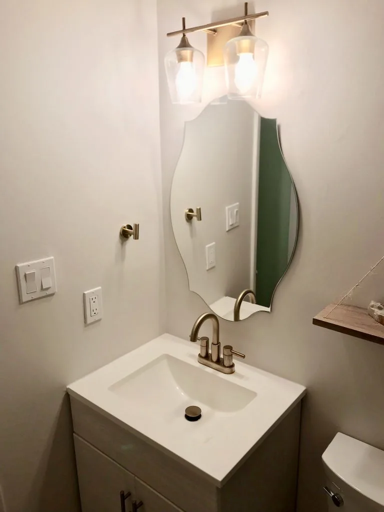
I painted my downstairs bath Eider White. In some areas of the room Eider White looks like a very soft gray. But, it is hard to shake that nagging purple undertone.

This doesn’t mean that Eider White is a bad color. All paint colors have undertones.
Instead, it’s important to recognize the undertones, and to make sure that you are comfortable with them.
For some people, a purple undertone is absolutely lovely. For others, they might hate the thought of a faint purple hue on their walls.
Is Eider White Paint Warm or Cool?

With its purple undertone, Eider White is a cool white.
Despite it technically being classified as a cool white (by Sherwin Williams themselves!), Eider White also has a bit of a warm look to it.
For example, when you compare it to really cool paint color, such as Nebulous White, it is easy to see the warmth in Eider White.
This white paint color tends to evoke a feeling of calm and relaxation.
Eider White Paint LRV
Eider White has an LRV (Light Reflectance Value) of 73.
This puts it in the light category of colors. It means that Eider White will reflect a good amount of light back into the room.
While an LRV of 73 will not save a dark room, it is high enough that you can use it in almost any space.
The LRV scale goes from zero, which is completely black, to 100, which is completely white. So as you can see, Eider White is a fairly light, soft paint color.
Where To Use Eider White
Eider White is a great color to use anywhere in the home. It can be used in living rooms, dining rooms, bathrooms, bedrooms, play rooms, hallways and more.
When choosing Eider White for a space, it is important to consider the light in the room.
For example, in a Northern facing room, you might find that Eider White takes on a bit of a cooler look from the cool colored light coming in from outside.
Conversely, in a southern facing room, the warm sunlight will bring out the warmth in Eider White.
Eider White can also be used on cabinets.
Lastly, Eider White can be used on a home’s exterior, though the soft purple undertone might make me opt for a more neutral gray paint color.
Sherwin Williams Eider White Coordinating Colors
Eider White can be a little bit pickier about which colors it wants to be paired with, especially considering the fact that it is such a light gray.
It looks great with clean whites, some blue and purple paint colors, and some neutrals.
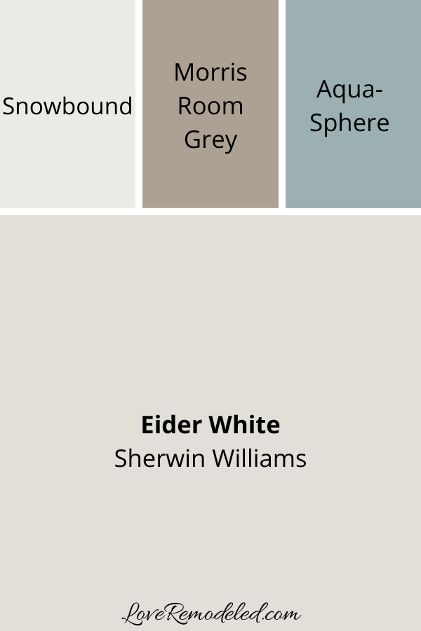

For example, Sherwin Williams pairs Eider White with Snowbound, which is a white paint color with very light gray undertones.
For a pop of color, Sherwin-Williams lists Aqua-Sphere as a coordinating shade for Eider White as well.
Last, Morris Room Gray is included as a light brown neutral to go with Eider White.
Trim Colors for Eider White Paint
Because Eider White is so light, you need a particularly bright white trim to go with it.
For instance, some people use Snowbound on their trim.
While the tones of Snowbound go very well with Eider White, this is probably not the best choice for your trim because there is not a huge difference in depth between Eider White and Snowbound.
You run the risk of a very monotone look, but nothing to really set Eider White off.
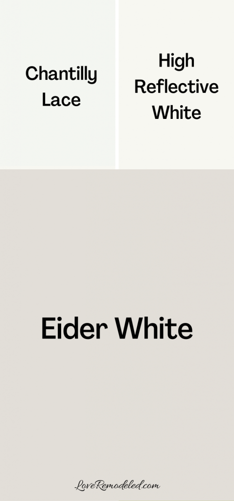
Instead, I like to pair Eider White with very clean, bright white trim.
High Reflective White, by Sherwin Williams, or Chantilly Lace, by Benjamin Moore, are great trim color choices for Eider White.
Sherwin Williams Eider White Compared
When I look at paint colors, I always like to compare them to other popular paint colors that people might be trying to decide between. Comparing paint colors is a great way to decide which paint color is right for your space.
Interestingly enough, people tend to consider Eider White alongside other popular paint colors that are not necessarily that similar to it.
In effort to answer people’s most frequently asked questions, let’s take a look at Eider White and compare it to Repose Gray, Alabaster, Agreeable Gray, and Toque White.
Eider White vs. Repose Gray
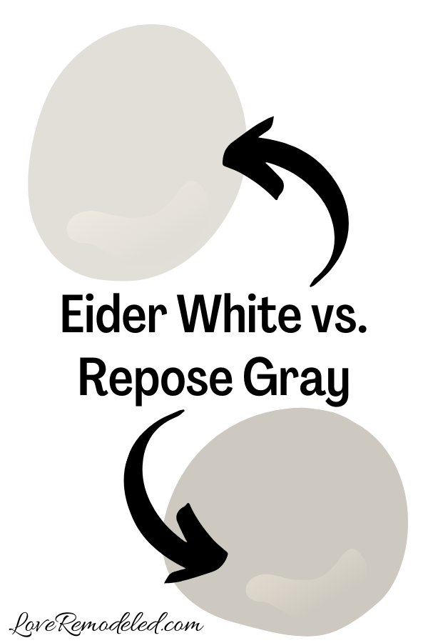

As I mentioned earlier, Eider White is technically a cool gray, but it frequently comes off as warm. Repose Gray is technically a warm gray, that has some cool undertones.
Repose Gray is a greige paint color. This means it is a blend of gray and beige. It is one of SherwinWilliams most popular paint colors.
Repose Gray also has blue undertones, they keep it from being too warm.
While both Repose Gray and Eider White are technically in the gray family of colors, they are pretty different paint colors.
To start, Repose Gray is a much darker paint color. It is still in the light category of colors, but it has a lot more depth and a lower LRV than Eider White.
Additionally, while Eider White is light enough to work almost anywhere in the home, Repose Gray needs an adequate amount of light to support.
Because of this, it might not be the best for a bathroom, basement, hallway, or somewhere else that does not have windows or good artificial lighting.
Both Eider White and Repose Gray are great paint colors though.
If you are looking for a paint color that is going to bring a light and airy look to a space, Eider White is the better choice.
But if your room has a lot of natural lighting, and you are looking for something with more versatility in terms of what colors it can be paired with, Repose Gray is the better choice.
Click here for more information on Repose Gray.
Eider White vs. Alabaster

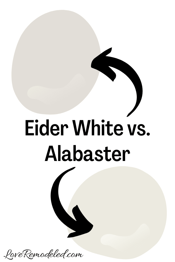
Alabaster is another highly popular paint color by Sherwin-Williams.
Like Eider White, Alabaster is in their Whites and Off-Whites collection.
But, while Sherwin Williams classifies Eider White as a cool white, Alabaster is a warm white. It has soft yellow undertones.
Truly, Eider White and Alabaster are not very similar paint colors. But people tend frequently debate between the two when choosing a paint color, so we will discuss them together.
Alabaster has an LRV of 82, so it is a bit lighter than Eider White.
Alabaster is frequently used on trim and cabinets, and it is also a popular wall color. Eider White is a good color for cabinets and walls, but would rarely ever be used on the trim because it has too much gray in it.
If I was debating between Alabaster and Eider White, I would consider the overall tone that I want in the room.
If I was looking for a brighter white look with a bit of softness, I would go with Alabaster. But if I wanted a cool, sophisticated grey paint color, I would go with Eider White.
Additionally, if I was looking for a very versatile paint color that can go with anything, I would choose Alabaster over Eider White.
Click here for more information on Sherwin Williams Alabaster.
Eider White vs. Agreeable Gray
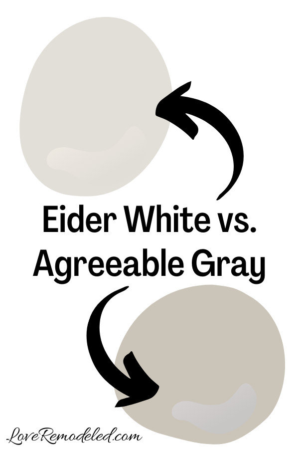

Agreeable Gray is Sherwin Williams’ most popular paint color.
Like Repose Gray, it is a greige paint color. This means it is it is it is a blend of beige and gray. It also has soft green undertones.
Altogether, Agreeable Gray is a warm paint color.
Agreeable Gray is a good bit darker and a good bit warmer than Eider White. It has enough depth to look like a color on your walls, but not so much that looks dark.
Like Eider White, Agreeable Gray is a good all-over-the-house paint color. You can use it just about anywhere, and it looks good.
But, Agreeable Gray is more, well, agreeable than Eider White.
Eider White’s purple undertone shows itself fairly frequently, while the green undertone in Agreeable Gray is much more subtle. Agreeable Gray is just a more flexible color.
If I was between Agreeable Gray and Eider White, I would choose Eider White if I wanted a cooler, more subdued paint color.
But, if I was on the fence about how the tones in Eider White would work with the fixed elements or furnishings in my room, I might go with Agreeable Gray.
Click here for more information on Sherwin Williams Agreeable Gray.
Eider White vs. Toque White
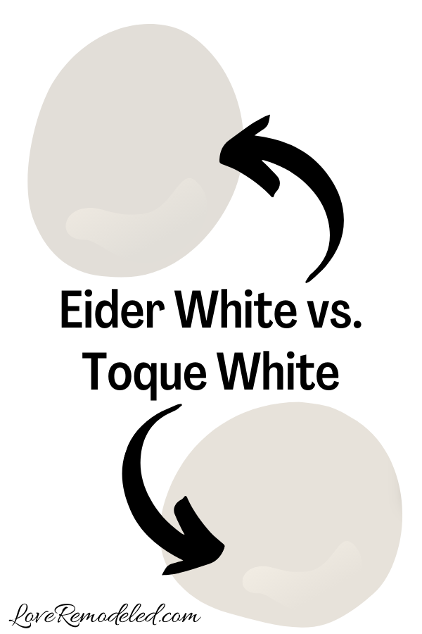

Toque White is a nice warm paint color that has a blend of beige and gray. It has a hint of pink in it, but not too terribly much. Overall, it comes across as a neutral paint shade.
Toque White has an LRV of 76, and roughly the same depth as Eider White.
Both work well on walls, cabinets, or exteriors. Eider White and Toque White are similar in a lot of ways.
If I was looking for a soft off-white paint color that leans warm, I would choose Toque White.
But if I wanted a soft off-white paint color that came across more as a cooler gray, I would go with Eider White.
Wondering How To Pick the Perfect Paint Color?
I have the best solution for you!
Samplize sells peel and stick paint samples in almost every paint color.
These no-mess, peel and stick sheets are made from real paint, so they will show you exactly what the paint color will look like.
Simply place them on your walls next to your trim, furnishings or fixed elements, and easily see which paint color works best in your space and with your lighting.
Then, peel the sheet off your wall and reapply it somewhere else if you like. You can try several different paint colors with no mess, no fuss and no cleaning paint brushes.


Oh, and you can have them in your home by tomorrow with OVERNIGHT shipping!
As a bonus, be sure to use the code LoveRemodeled10 at check out to get an extra 10% off! Samplize sheets are cheaper than a sample can of paint, and way less work.
They are the easiest (and fastest!) way to try a paint color in your home, with no hassle.
Final Thoughts on Sherwin Williams Eider White
Eider White is a beautiful paint color for the right room.
It is not one that I would choose without being sure to get a sample can or a Samplize square of first. I would be sure to check it in all sorts of lighting, at different times of the day, and against the other elements in my room before painting.
But if it checked out, I would definitely use this soft gray to create a calming space in my house.
Want to see all your paint options in one convenient place? Click here to get everything you need to start painting, including Sherwin Williams and Benjamin Moore paint color decks!


Have a question? Leave me a comment! Remember to check back for a response – it may take me up to a week or two depending on how busy I am, but I’ll try my best to get back to you!
Want to show off your project? Join the discussion in Love Remodeled’s Facebook group!
Lena M McKee
Monday 21st of March 2022
agree...i painted my whole home this color without testing on walls first because i had only 3 days to decide. the color is way cooler and more gray than I would have liked. Especially in darker rooms.
Alos if office and last home were not apinted gray ten yrs ago..i would probably be more pumped...i did choose to paint a joining room reliable white to add some warmth in to the space. also paintng the trims, and doors etc the same eiderwhite to cut down on its contrast
Lauren
Sunday 27th of March 2022
I'm so sorry you don't love it, Lena! Thanks for sharing your experience, it'll help others as they try to find the right color!