
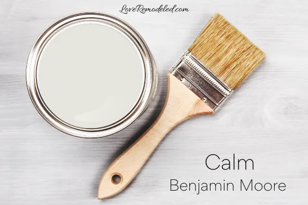
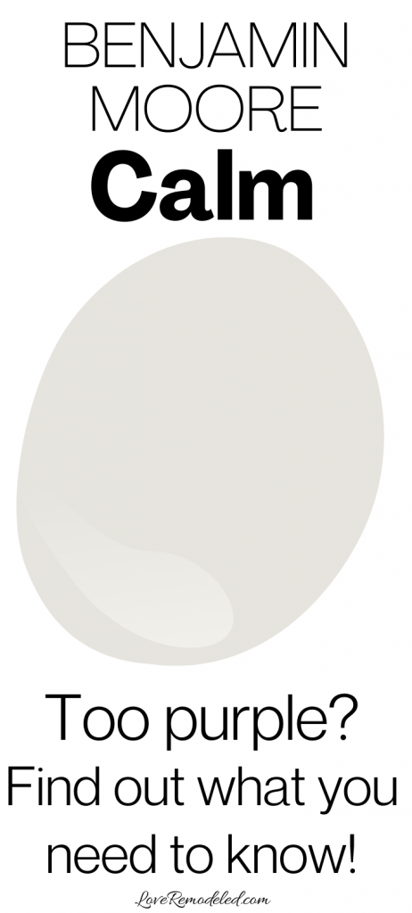
Calm is an off-white paint color by Benjamin Moore. It is included as one of Benjamin Moore’s top 75 paint colors, due to its popularity.
Benjamin Moore Calm is a light paint shade that is soft and refined. As a wall color, Calm looks sophisticated and muted. But, Calm may not be the most versatile off-white paint color.
Keep reading for all the details on Benjamin Moore Calm, so you can decide whether is paint color is right for your home!
This post may contain affiliate links. If you have any questions, please see my disclaimer page.
Benjamin Moore Calm Color Characteristics

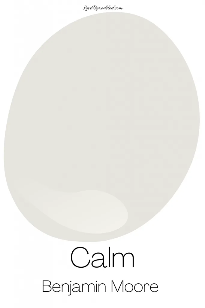
Calm is a pale gray paint color. It is muted enough to fade into the background, but has enough color in it that it definitely isn’t white.
Benjamin Moore Calm Undertones
All paint colors have undertones, and Calm has a fairly pronounced one. Benjamin Moore Calm has purple undertones.
In some spaces, such as north-facing rooms, Calm will tend to show up more as a gray. But, with warmer light, such as southern-facing light, Calm can its true colors more, appearing like a purplish gray.
If you want a feminine sort of shade, this purple undertone may be a welcome addition. But, if you are looking for more of a true gray, Calm may not be the best color for you. Don’t count it out yet though!
Benjamin Moore Calm is just one of those shades (alright, they’re basically all one of those shades) that needs to be tested in your home first. More on the best way to do that later!
Is Benjamin Moore Calm Warm or Cool?
With its hint of purple, Calm is a warm paint color. Warm paint colors tend to make a space feel cozy and comfortable.
Benjamin Moore Calm LRV

Calm has an LRV of 77. LRV is the Light Reflectance Value. The LRV scale goes from 0, which is completely black, to 100, which is completely white. An LRV of 77 is pretty high up, meaning this is a pretty light paint color.
In fact, an LRV of 77 means that Calm can work in almost any room. While it will need enough light to support it and make it look nice, it can work in darker spaces more than a lower LRV color can.
What Number is Calm, by Benjamin Moore?
Calm was originally included in Benjamin Moore’s Color Preview collection. In the Color Preview collection. every paint color has a set of 7 shades that are just lighter or darker versions of eachother. Calm was given the identifier 2111-70 for this collection, meaning it is the lightest version of its color. At its darkest is a shade called Deep Taupe.
Later, Benjamin Moore also included Calm in their Off-White Color collection. At this time, Calm was given an additional identifying number, OC-22.
Don’t let this confuse you though. Whether you ask your Benjamin Moore rep for 2111-70 or OC-22, you’ll get the same paint color!
Where Can I Use Benjamin Moore Calm?
Benjamin Moore Calm can be used in bedrooms, bathrooms, living rooms, dining rooms, hallways, entryways, basements and more. You can also use Calm on cabinets as well.
Due to its prominent purple undertone though, it is probably not the best paint color for an exterior, as the shifting sunlight may make it look different than you’re expecting.
I am not mentioning the purple undertone to talk you out of painting your space with Calm. It is more to make you aware of it. Despite this undertone, Calm is one of Benjamin Moore’s more popular paint colors. So clearly, it works well in many spaces, just not in all spaces.
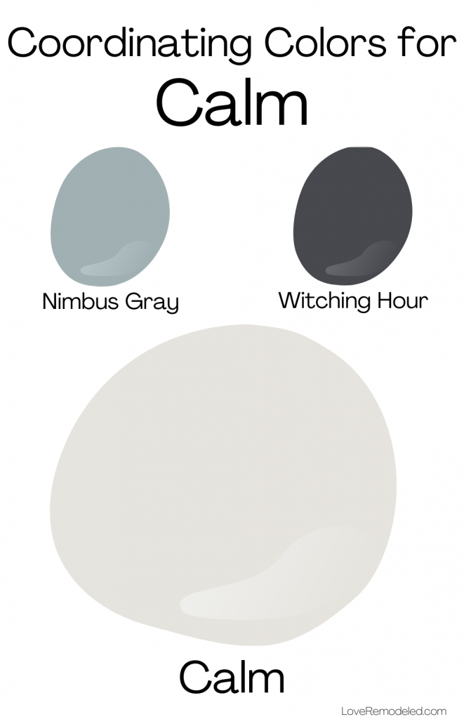
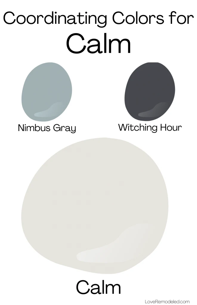
Coordinating Colors for Benjamin Moore Calm
Calm can go with a variety of different coordinating colors.
Benjamin Moore has put together two colors pallets for Calm.
In the first, Calm is paired with Nimbus Gray, a bluish gray, and Witching Hour, a dark charcoal black. This color scheme demonstrates how Calm can work with cool shades.
For a second color scheme, Benjamin Moore pairs Calm with Algonquin Trail, a dark yellowish brown, an Equestrian Trail, a grayish brown. This warm color scheme demonstrates how Calm, a warm color, can work with other warm shades as well.
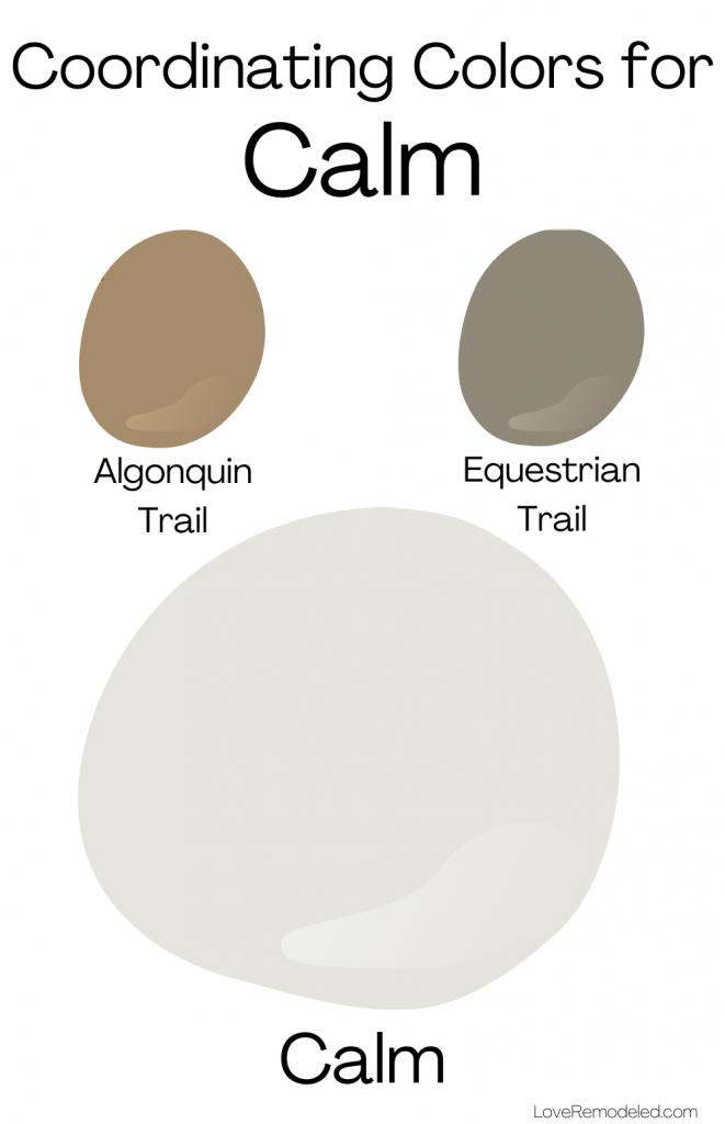
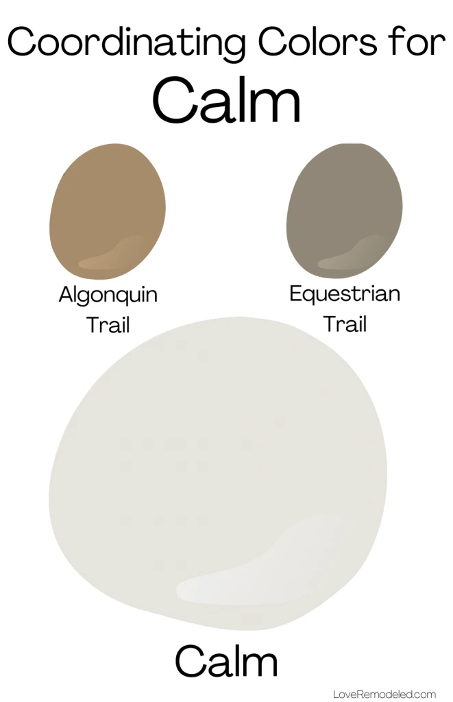
Calm is actually more versatile than it would seem at first glance. With a fairly heavy purple undertone, you would think that it would work mainly with other purples, pinks, or purple grays. But as you can see, there are a variety of shades that Calm can work with.
Trim Colors for Benjamin Moore Calm Paint Color
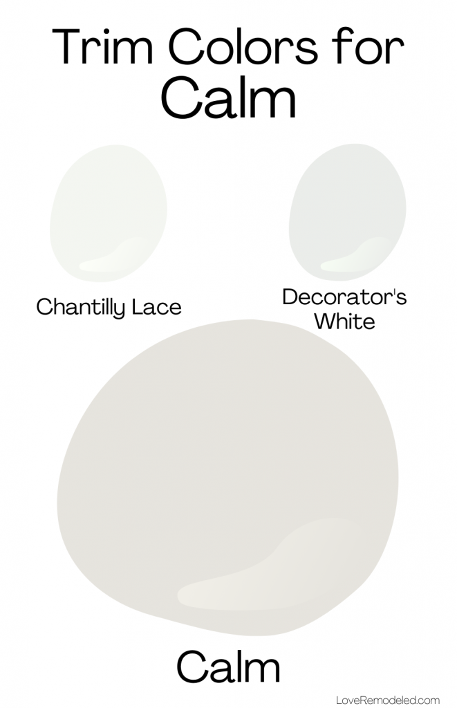
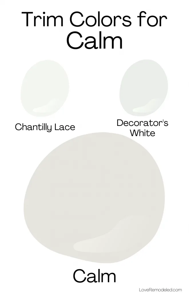
If you are thinking about painting your walls in Calm, you are probably interested in finding out what white paint colors go with Calm.
Calm is a little bit tricky when it comes to being paired with white paint colors. Two good options for white paints that goes with Calm are Chantilly Lace and Decorator’s White.
Chantilly Lace is a clean, bright white paint color. It is one of Benjamin Moore’s brightest whites, and works as a trim color for just about any other paint color. Chantilly Lace will give the trim or woodwork in your room a very white look without being too stark.
Click here for more details on Chantilly Lace.
If you like a softer white trim color, Decorator’s White might work for you. Like Calm, it has soft purple undertones. This look would be much more tone-on-tone than if you chose Chantilly Lace to go with Calm. While Decorator’s White isn’t grayish looking, it does have some color in it when compared to a cleaner white paint.
Click here for more details on Decorator’s White.
Benjamin Moore Calm Compared
No paint color review is complete without also looking at other paint colors that are similar. When people are trying to choose a paint color, they are often comparing them to other paint colors that are in the same color family, or have similar uses. In looking at these paint colors together, it may help you decide which one is right for your home.
So, in this review of Benjamin Moore Calm, lets take a minute to compare it to Pale Oak, Classic Gray and White Dove.
Benjamin Moore Calm vs. Pale Oak
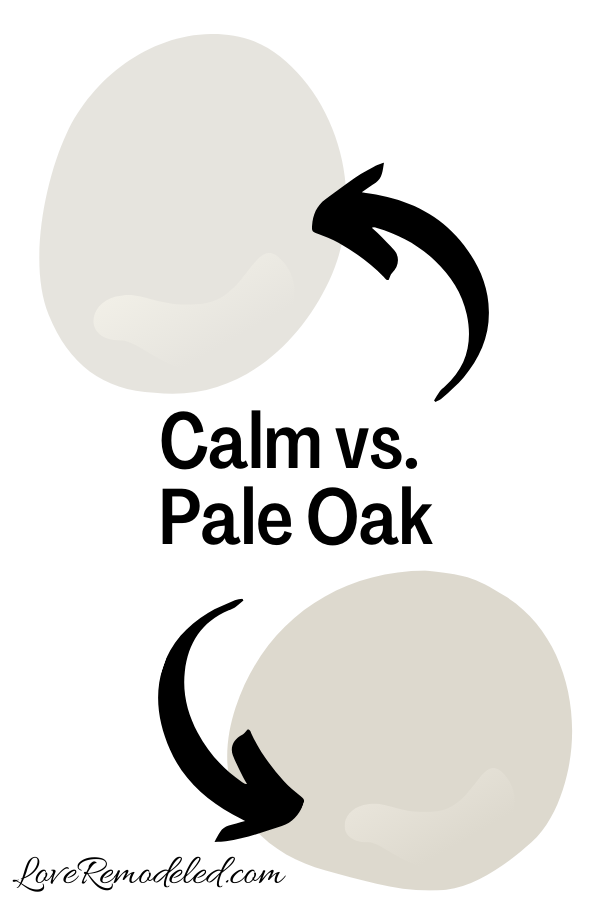

Pale Oak is a popular taupe or greige paint color by Benjamin Moore. It is a blend of gray and beige, with pink/purple undertones.
Pale Oak is a bit darker than Calm. It will definitely show up as more of a color on your walls. But the colors are similar in their objectives – both are warm neutrals.
If you are wanting a light, very pale paint color, you will probably want to go with Calm. But, if you want a shade with a little more depth, that will more likely show up like a color on your walls, Pale Oak is a good choice.
Click here for more information on Pale Oak.
Benjamin Moore Calm vs. White Dove
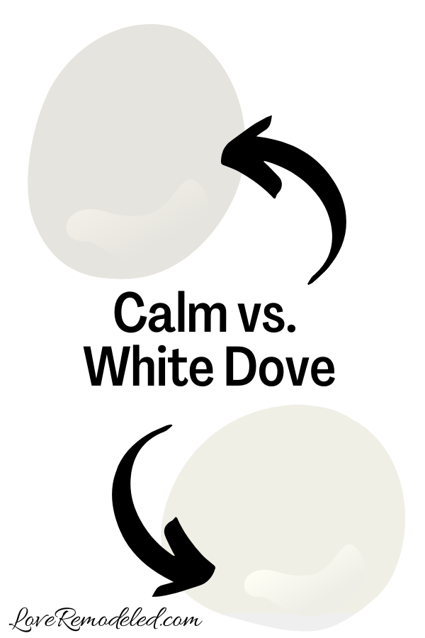

White Dove is a very popular, warm white paint color by Benjamin Moore. More accurately, it is an off-white paint color. This shade is used on walls and trim when someone wants a creamy white look.
White Dove actually isn’t very similar to Calm, but it has a lot of the same uses. Like Calm, White Dove is a versatile neutral paint color that allows the furnishings and fixed elements in the room do the talking (so to speak). Both are light and fade into the background, instead of making a big statement on their own.
But, White Dove is a good bit lighter than Calm. In fact, White Dove can actually works as a trim color and be paired with Calm. On trim, White Dove won’t provide a huge amount of contrast to Calm, but the paint shades look nice together.
Click here for more information about White Dove.
Benjamin Moore Calm vs. Classic Gray

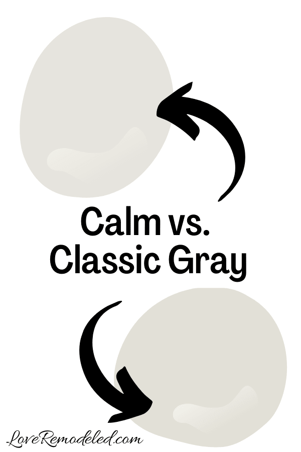
Classic Gray is a soft gray paint color with purple undertones, very similar to Calm.
Classic Gray is probably the more popular of the two shades, as it has a little less purple in it than Calm does. In addition, Classic Gray has a bit of beige that makes it a little bit more versatile.
But, Classic Gray and Calm have nearly identical depths and LRVs, and both are warm grays.
If I were trying to choose between Classic Gray and Calm, I would definitely want to see both in my home. But, as a general rule of thumb, Classic Gray is probably the safer choice.
Click here for more information on Classic Gray.
Wondering How To Pick the Perfect Paint Color?
I have the best solution for you!
Samplize sells peel and stick paint samples in almost every paint color.
These no-mess, peel and stick sheets are made from real paint, so they will show you exactly what the paint color will look like.
Simply place them on your walls next to your trim, furnishings or fixed elements, and easily see which paint color works best in your space and with your lighting.
Then, peel the sheet off your wall and reapply it somewhere else if you like. You can try several different paint colors with no mess, no fuss and no cleaning paint brushes.


Oh, and you can have them in your home by tomorrow with OVERNIGHT shipping!
As a bonus, be sure to use the code LoveRemodeled10 at check out to get an extra 10% off! Samplize sheets are cheaper than a sample can of paint, and way less work.
They are the easiest (and fastest!) way to try a paint color in your home, with no hassle.
Final Thoughts on Benjamin Moore Calm
Benjamin Moore Calm is a lovely, pale gray paint color with purple undertones. It is soft and feminine, sophisticated and elegant.
While Calm isn’t perfect for all rooms, it might be the perfect shade for your home. Be sure to pick up a Samplize sheet and check it out today!
Have a question? Leave me a comment! Remember to check back for a response – it may take me up to a week or two depending on how busy I am, but I’ll try my best to get back to you!
Want to show off your project? Join the discussion in Love Remodeled’s Facebook group!

Lysane
Saturday 14th of January 2023
Can inhae calm to redo my kitchen cabinets? I cannot find any pics online. I'm worried with the purple undertones
Donna
Sunday 11th of February 2024
@Lysane, I redid my oak cabinets with calm and I love it. I have never noticed a purple undertone. My walls are a light gray so maybe that is why.
Lauren
Sunday 15th of January 2023
Hi Lysane! Calm can work on kitchen cabinets, but I can't say for sure whether it will work in your space. If you're worried, pick up a Samplize square and move it around on your cabinets at different times of day. That should help you decide whether you're seeing those purple undertones come out or not. Good luck!