Ready to paint your living room, but not sure which paint color to avoid?
Choosing a paint color for a room can be a difficult thing to do. There are no hard and fast rules about what paint colors work where, but there are some general considerations to note before painting your living room.
This post may contain affiliate links. If you have any questions, please see my disclaimer page.
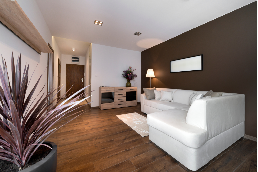
Living Room Paint Color Considerations
To start, consider how you use the room.
Living rooms are spaces that are used by the whole family for relaxation, recreation, discussion and more. They are multi-use rooms that should be functional spaces.
So, when picking your paint color for your living room, you should think about the way the room functions for you.
This will lead you to your next consideration: what sort of mood you want the room to have.
The mood of the room is heavily influenced by the colors in it. More specifically, the feeling that a room imparts is influenced by whether you use warm or cool paint colors.
A warm paint color is a red, pink, orange, or yellow paint shade, or a neutral with these undertones. Warm paint colors make a space feel energetic and cozy.
A cool paint color is blue, green, or purple paint color, or a neutral with these undertones. Cool paint colors tend to make a space feel expansive and welcoming.
Thinking about the function of your living room, and considering the mood you would like your living room to have are great ways to begin to choose a paint color.
Check out this post if you would like more info on how to choose a paint color.
Paint Colors to Avoid in a Living Room
Now that we discussed how to select a paint color for your living room, here are my thoughts on what paint colors to avoid in your living room.
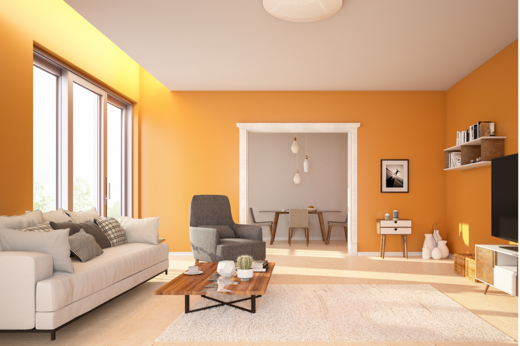
Orange Paint Colors
Orange is a shade that is bright and can be visually jarring when used on a large scale.
Orange paint colors are warm shades that evoke a bright and cheery look, but they can be a bit overwhelming to the senses.
While pops of orange on throw pillows can bring a fun ambiance, orange paint on your walls typically doesn’t work well in a living room.

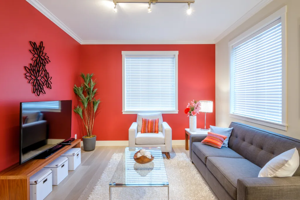
Red Paint Colors
Similarly, red is another color to avoid in the living room.
As a paint color, red can come across as a bit too offensive. Red evokes strong emotions in people, and living room paint colors should just be generally agreeable since it is a common space in the home.
Red accent walls were pretty common in the early 2000s, but they aren’t in style any more.
If you love red, you can incorporate it into your design but adding soft textiles or art with red shades in them.

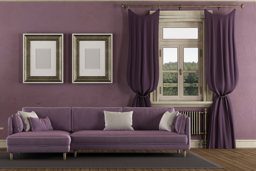
Purple Paint Colors
A third paint color that doesn’t work well in a living room is purple.
Purple is a shade that tends to feel a bit juvenile. Most people want their living room to feel inviting and relaxing, and purple paint brings an energy that tends to be the opposite of that.
Light purple paint colors, while beautiful, are best reserved for little girls bedrooms or nurseries. And darker purple paint colors tend to be a bit too bold in a living room.
If you love purple though, consider painting your room a taupe paint color. Taupe shades are blends of gray and beige with purple undertones. They are very in style right now, and just sort of give a nod towards purple without screaming it.

Golden Beige Paint Colors
Another paint color to avoid in a living room is a golden beige.
Beiges are actually coming back in style at the moment, but the most popular beiges for 2022 are actually ones that have some gray in them.
Greige is the new beige. Greige paint colors are beige gray blends. They have the warmth of beige paint shades, but without so much yellow.
And there are many beige paint colors that have hints of gray in them, making them a great choice for a neutral living room wall.
If you do choose a beige paint color for your living room, stay away from beiges that have strong gold, yellow or pink undertones. These sort of beige shades really dates your home to the early 2000s.
Here are my favorite, updated, beige paint colors.

Brown Paint Colors
Lastly, browns are also a color to avoid in the living room. They can feel drab and dull.
Like golden beiges, brown paint colors were more popular in the early 2000s.
This doesn’t mean that all dark colors are bad in a living room though. If love the idea of a rich paint color to use in a living room, consider a black, charcoal gray or navy blue accent wall instead.

Final Thoughts on Living Room Paint Colors for Avoid
Overall, it is important to think about how you want your space to feel, and what sort of activities you will be doing in your living room.
If the main purpose of your living room is to relax, consider blues and greens.
If you want to make your living room a spot for more lively activities, yellows or taupes may be a good option for you.
And lastly, neutrals are a perfect choice for a living room. Gray, greige and white paint colors are always in style, and make a perfect backdrop for any furnishings or accessories you may want to add.
As an easy rule of thumb, avoid red, orange, golden beige, purples and brown paint colors for your living room. If you love those shades, you can always add them in with furnishings, soft textiles or even a wallpaper accent wall. But, my advice is to avoid painting your whole living room in these colors.
Get the 2022 curated paint color palettes now!Need some help picking a paint color? Pick up my 40+ page e-book, containing 30 of the hottest shades for 2022. These paint colors have been specially selected to help you choose from colors that are in style, and teaches you how to use them in your house!

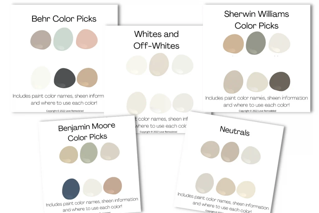
Want to see all your paint options in one convenient place? Click here to get everything you need to start painting, including Sherwin Williams and Benjamin Moore paint color decks!


Wondering How To Pick the Perfect Paint Color?
I have the best solution for you!
Samplize sells peel and stick paint samples in almost every paint color.
These no-mess, peel and stick sheets are made from real paint, so they will show you exactly what the paint color will look like.
Simply place them on your walls next to your trim, furnishings or fixed elements, and easily see which paint color works best in your space and with your lighting.
Then, peel the sheet off your wall and reapply it somewhere else if you like. You can try several different paint colors with no mess, no fuss and no cleaning paint brushes.


Oh, and you can have them in your home by tomorrow with OVERNIGHT shipping!
As a bonus, be sure to use the code LoveRemodeled10 at check out to get an extra 10% off! Samplize sheets are cheaper than a sample can of paint, and way less work.
They are the easiest (and fastest!) way to try a paint color in your home, with no hassle.
Have a question? Leave me a comment! Remember to check back for a response – it may take me up to a week or two depending on how busy I am, but I’ll try my best to get back to you!
Want to show off your project? Join the discussion in Love Remodeled’s Facebook group!