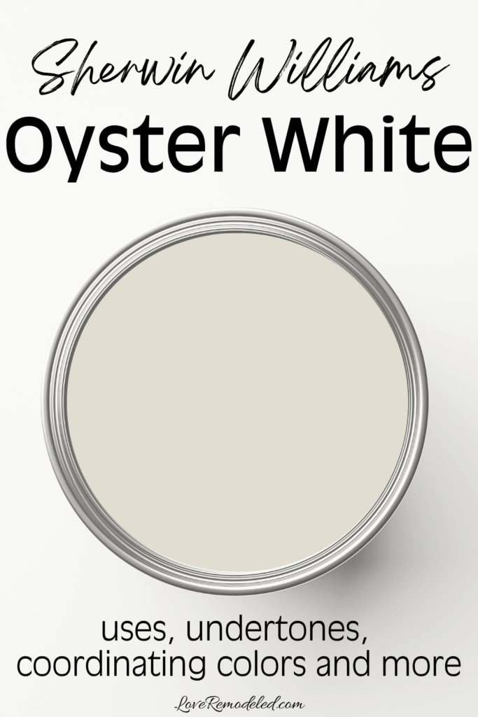
Sherwin Williams Oyster White is a soft, off-white paint color. This paint color has been around for a while, and maintains a timeless quality to it that makes it always in style.
Sherwin Williams has included Oyster White in a number of their color collections, including their Top Exterior Colors.
While Oyster White is in the white color family, it has a bit more color to it than true whites, and many would say it isn’t really white at all.
You will have to be the judge for yourself though, to determine whether this off-white is just the soft neutral you are looking for, or if it has a bit too much color for your taste.
Sherwin Williams Oyster White Color Details
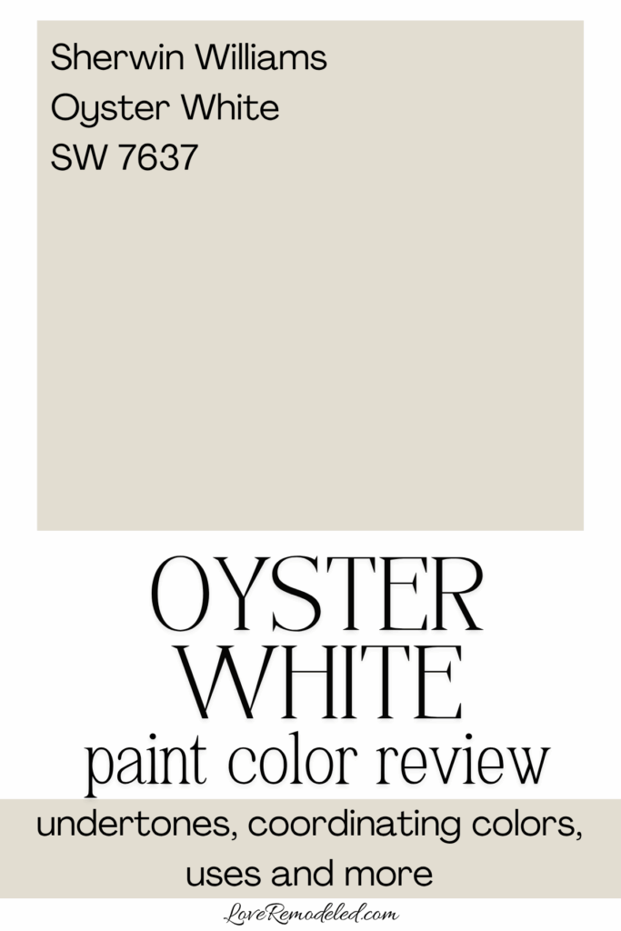
Sherwin Williams calls Oyster White, SW 7637, a creamy white with a “green-beige undertone.” This statement can be overwhelming to process, so let me break it down for you.
A creamy white means that it has a soft quality to it that comes from a bit of yellow in the base. The light tan undertone gives it a little more depth and pulls it away from looking yellow, more into the beige category.
And that green undertone sounds scary, but don’t be too worried. This just gives it a little bit of complexity.
All these undertones combine together to create a neutral off-white with just a hint of depth.
The Nitty Gritty Technical Details on Oyster White
Oyster White has an LRV of 72. LRV is a scale of how much light a color reflects back into the space. To understand it easier, consider it a measure of how light or dark a paint color is. The scale goes from 0 to 100, with 0 being completely black and 100 being completely white.
A LRV of 72 is pretty light, but not completely white. It means that Oyster White is light enough to be considered a “white” as far as the scale goes, but doesn’t have so much depth that it gives any substance to the walls. It will reflect a lot of light back into the room and works in most spaces because of this.
Overall, Oyster White is a calming sort of color that is classic and understated.
This post may contain affiliate links. If you have any questions, please see my disclaimer page.
Oyster White on Interior Walls
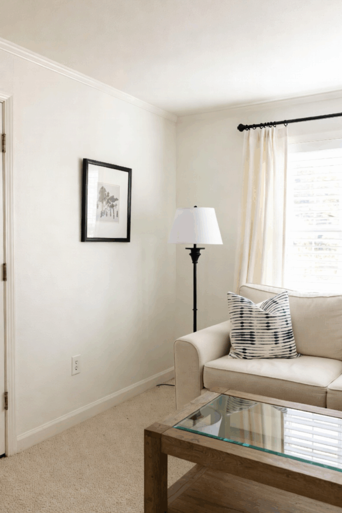
Oyster White is a good paint color for an open floor plan or in individual rooms. It works nicely as a foundational color that sets the tone for the house, and then has adjacent rooms in coordinating colors that come off of the main space.
Oyster White works in living rooms, dining rooms, bedrooms, and more.
Oyster White on a Home Exterior
Oyster White is a great home exterior paint color. Since all paint colors look lighter and brighter when they are exposed to direct sunlight, Oyster White has enough depth that it looks like a soft white outside, and not at all stark.
In fact, if you want your house to look like a soft white, you need to choose a color like Oyster White that has a slightly lower LRV. An actual soft white such as Alabaster or Westhighland White can end up looking like a true white in the bright sunlight. And a true white can end up looking almost blinding in that bright sun.
Oyster White hits that perfect balance of looking muted but not muddy.
If you are looking to use Oyster White as a home exterior paint color, you should check out this post. It has a number of pictures of Oyster White on a home exterior, and will give you a great idea of whether this paint color will work for you.
What Colors Go With Oyster White?
With those green undertones, Oyster White goes really nicely with blues and greens. It also works well with soft mauves, browns, or midtone neutrals with similar undertones.
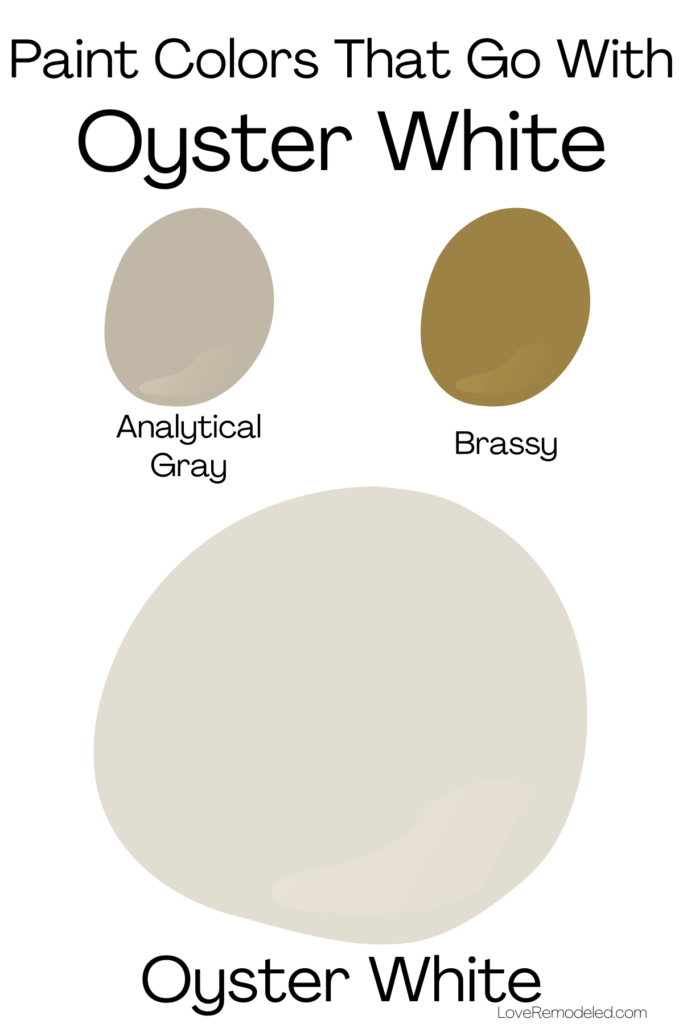
Sherwin Williams pairs Oyster White with Analytical Gray, a light-medium greige color, and Brassy, a dark golden brown.
If you are looking for more modern coordinating colors, the 2025 Sherwin Williams Wellspring Color Capsule gives some great options.
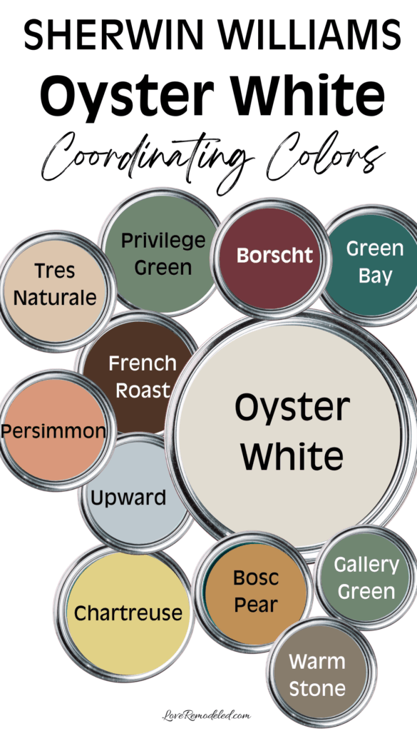
These coordinating colors for SW Oyster White include:
- SW 7032 Warm Stone – a dark greige
- SW 6339 Persimmon – a midtone pinkish orange
- SW 7578 Borscht – a deep pinkish red
- SW 6390 Bosc Pear – a tannish orange
- SW 6069 French Roast – a deep brown
- SW 9109 Tres Naturale – a warm beige
- SW 6239 Upward – a soft grayish blue
- SW 6251 Outerspace – a deep gray
- SW 0073 Chartruese – a greenish yellow
- SW 6481 Green Bay – a bluish green
- SW 0015 Gallery Green – a grayish green
I wouldn’t recommend choosing all of these colors together in a home palette as you would end up with a very colorful space that may feel a bit disjointed, but any of these shades indiviually would work nicely alongside Oyster White.
Here are a few examples of how I would use the some of the shades in this palette with Oyster White.
- Oyster White as a foundational color that is used in most spaces, including living rooms, hallways, and other common spaces, Gallery Green for rooms that you want to give a little more atmosphere such as an office or dining room.
- Oyster White as a foundational color and a dark neutral like French Roast or Warm Stone on accent areas such as doors, fireplaces, or railings.
- Oyster White as a trim color and Warm Stone on the walls of a space you want to look maximalist yet neutral.
- Oyster White as a home exterior main color with a front door in Persimmon and shutters in Warm Stone.
- Oyster White as a home exterior main color with a front door in Borscht and shutters in Outerspace.
- Oyster White as a foundational color and Upward in adjacent rooms.
Trim Colors for Oyster White
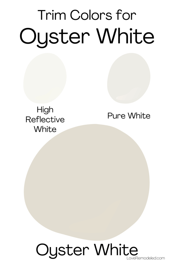
Oyster White is light enough that it requires a trim color with a very high LRV to show any contrast between the trim and the walls.
Some of my favorite trim colors for Oyster White are Pure White, my go-to white trim color that isn’t too stark or too creamy, or High Reflective White, a very white paint color that is bright and clean.
And while we’re on the topic, while some off-whites also work as trim colors, I wouldn’t recommend using Oyster White itself as a trim color. It has too much color and will likely look more dingy that you were expecting.
Final Thoughts on Sherwin Williams Oyster White
Sherwin Williams Oyster White is a great off-white paint color that is soft, classic, and comfortable. It doesn’t look too stark in most spaces, and hits that perfect balance that people tend to want when they want an off-white.
Additionally, it is a good off-white for someone who wants a warm white but doesn’t want one that leans particularly yellow (such as Alabaster or Ivory Lace).
If you are on the hunt for a versatile off-white paint color that is subtle and pleasant, Oyster White is a solid choice for many homes.
Wondering How To Pick the Perfect Paint Color?
I have the best solution for you!
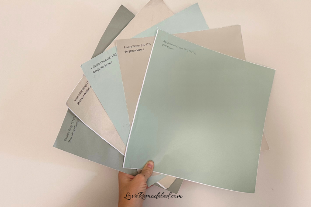
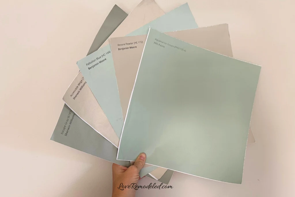
Samplize sells peel and stick paint samples in almost every paint color.
These no-mess, peel and stick sheets are made from real paint, so they will show you exactly what the paint color will look like.
Simply place them on your walls next to your trim, furnishings or fixed elements, and easily see which paint color works best in your space and with your lighting.
Then, peel the sheet off your wall and reapply it somewhere else if you like. You can try several different paint colors with no mess, no fuss and no cleaning paint brushes.
Oh, and you can have them in your home by tomorrow with OVERNIGHT shipping!
As a bonus, be sure to use the code LoveRemodeled10 at check out to get an extra 10% off! Samplize sheets are cheaper than a sample can of paint, and way less work.
They are the easiest (and fastest!) way to try a paint color in your home, with no hassle.