
The biggest question that people have when they are planning to paint their space is, “What color should I choose?”
Every year, all the major paint companies (and some fashion companies as well) choose a color of the year. This paint color is chosen by an educated panel of designers to both reflect and define where paint color trends are going.
Some times, the paint companies choose colors that appeal to the masses, are usable, and are completely on trend. A recent example of this was Sherwin Williams’ 2022 Color of the Year Evergreen Fog. This color wasn’t quite everywhere yet when they chose it, but shortly after, everyone was using green in their homes.
Other times, companies choose colors that really miss the mark. A good example of this is Benjamin Moores’ 2023 Color of the Year Raspberry Blush. At the time, I couldn’t even come up with a piece of furniture in my home that I thought would look good in this color, let alone a whole room.
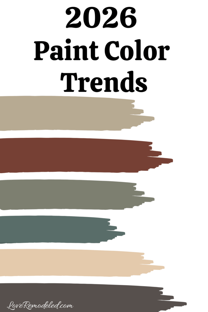
So, how did they do this year? Let’s take a look at all of the 2026 Colors of the Year by Sherwin Williams, Benjamin Moore, Valspar, Behr, Dutch Boy, Glidden and Minwax.

Sherwin Williams 2026 Color of the Year – Universal Khaki
Universal Khaki is a midtone khaki paint shade. It has a tan base with green and yellow undertones that give it a more khaki look than a true tan.

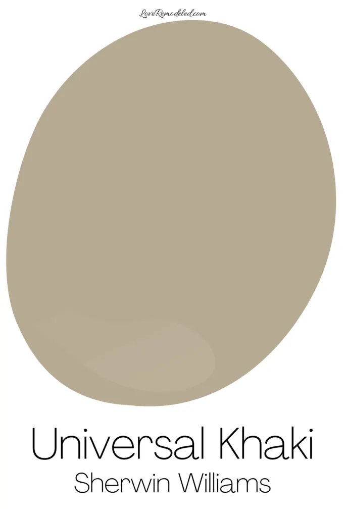
Universal Khaki was chosen with a nod to the current trends in the fashion world, where all things are moving toward warm neutrals.
This color is classic and refined, and will give your home an earthy feel.
Because it is a midtone, it has more usability than some of the darker shades on this list. It would be great on home exteriors as well.
You can check out all the details on Sherwin Williams Universal Khaki here.
Benjamin Moore 2026 Color of the Year – Silhouette
Like Sherwin Williams, Benjamin Moore also chose a paint color that mirrors current fashion trends.
Silhouette is a dark charcoal paint color with brown and reddish undertones. It is warm and rich feeling, and gives a luxurious vibe.

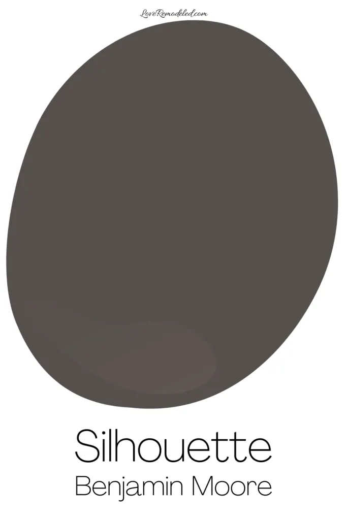
This paint color is said to exude refined elegance, and given the right surface, I agree with this statement. I find it to a bit dark to work in most homes though, and while it may gain standing as an shade on cabinets, home exteriors or other accent spaces, I don’t anticipate that too many people will paint whole rooms in their home in Silhouette.
There are a few circumstances where I would consider Silhouette as a whole rooms space though. Click here if you want to find out all the details on Benjamin Moore Silhouette, including how to best use it.
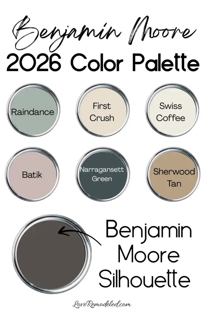
In addition to choosing Silhouette as their Color of the Year, Benjamin Moore also introduced a Color Palette of the Year. The palette has everything from pale pastels to rich midtones. It is perfect with Silhouette, or as a stand along color palette for a home.

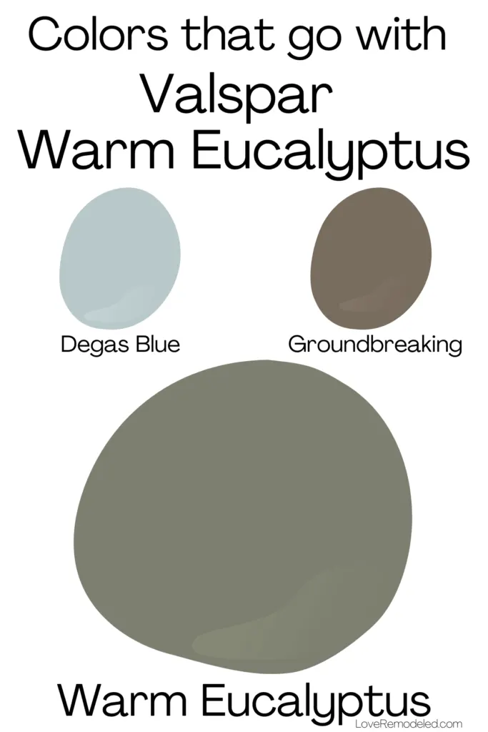
Valspar 2026 Color of the Year – Warm Eucalyptus
Valspar Warm Eucalyptus, 8004-28F, is a cool green paint color with blue and gray undertones. It is a dark midtone paint color that has a lot of depth and saturation.


Warm Eucalyptus is described by Valspar as, “naturally restorative and serene.” While it is a green shade, it is the sort of green that can almost work as a neutral, due to its gray undertones that keep it from being too bright.
This nature inspired color goes well with other organic materials, such as wood and ceramics, and gold accents.
Valspar lists two colors that coordinate with Warm Eucalyptus: Groundbreaking, a dark true brown; and Degas Blue, a smokey pale blue. Together, these colors create a color scheme that feels cozy and restful.

Behr 2026 Color of the Year – Hidden Gem
Behr Hidden Gem is a smokey blue paint color with gray and green undertones. It is a confident shade, with a lot of depth.


Hidden Gem is described as being a serene color, but I think it also has a bit of energy to it. It is also being described as a neutral, but I see a bit too much chroma in it to use it in as a neutral.
It is the sort of paint color that you can use in a color drenching way, or as an accent shade. It will definitely set the tone for the space, bringing a sense of moodiness and expressiveness. Unlike many neutrals, Hidden Gem is best used in a thoughtful way, as a part of a very well designed room. It is not the sort of shade that you can just throw on the walls and have work without a bit of planning.
If you like Hidden Gem, you should also check out the color palette that Behr has chosen to pair with it. It will help give you an idea how to use this color in an intentional manner.


Dutch Boy 2026 Color of the Year – Melodious Ivory
Dutch Boy Melodious Ivory, 313-2DB, is a creamy paint color that blends yellow and tan to create a soft neutral.


Melodious Ivory is a bit like a throwback shade to me. It feels cozy and nostalgic. Melodious Ivory is the kind of paint color that is classic, pairing well with other neutrals, nature-inspired tones, or blues.
It can work in both interior and exterior spaces, and can easily be used as a whole room color.
Dutch Boy also introduced three color palettes for how to use Melodious Ivory: Rekindle, Heartland and Serendipity. You can check them out here.
Glidden/PPG 2026 Color of the Year – Warm Mahogany
Glidden Warm Mahogany, PPG1060-7, is a deep red paint color with brown undertones.

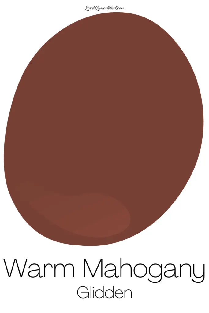
This rich shade creates a warm and cozy atmosphere that feels classic and grounded.
While it has different undertones, it reminds me of Behr’s 2025 choice for Color of the Year, and is similar Glidden’s 2025 Color of the Year Purple Basil.
As much as the some of the major paint companies are trying to push these deep, rich reds, I just don’t see them catching on. To me, Warm Mahogany feels very 2000s where the dark red accent wall was all the rage. And although some trends are coming back, I don’t see this as one of them.
I wouldn’t be surprised if we start seeing classic reds like this as accent shades, but painting a whole room in red doesn’t appeal to most people. Time will tell if I’m correct on this one.
Minwax 2026 Color of the Year – Special Walnut
For the first time, Minwax has announced a Color of the Year. They aren’t a paint company, though. They make stains. This year, they designated a stain color to define where wood shades are going in the coming year.
Special Walnut is a mid depth stain color that has warm brown tones. It has actually been my favorite stain color for years now, because it isn’t too light, isn’t too dark, doesn’t pull red and blends with other wood tones in the room easily.


I wholeheardedly agree with this choice. It is a bit darker than I would have expected given the light wood tones that have been popular in recent years, but Minwax is predicting a return of more midtone wood colors, and I’m excited for the shift.
2026 Colors of the Year Summarized
Overall, I see a real trend among the 2026 Colors of the Year. In fact, you could put almost all of them together and create a color palette that works pretty well together.


So, although I don’t think that all of these paint colors are going to be huge hits, I think that they are all on-trend.
I wouldn’t paint my walls in some of them but I would definitely use all of the shades in some capacity in a home, and maybe even together!
Paint color trends for 2026 seem to be moving pretty definitively in the direction of earth tone colors, based on what designers have selected for this years’ colors of the year.
Check out this post if you’re interested in other earth tone paint colors that are on trend and will give your home a modern look.
Or, If you are wondering which paint shades people are actually using the most , check out the most popular Benjamin Moore paint colors for 2026, or the top paint colors by Sherwin Williams for 2026
Have a question? Leave me a comment! Remember to check back for a response – it may take me up to a week or two depending on how busy I am, but I’ll try my best to get back to you!
Want to show off your project? Join the discussion in Love Remodeled’s Facebook group!