
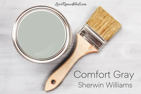
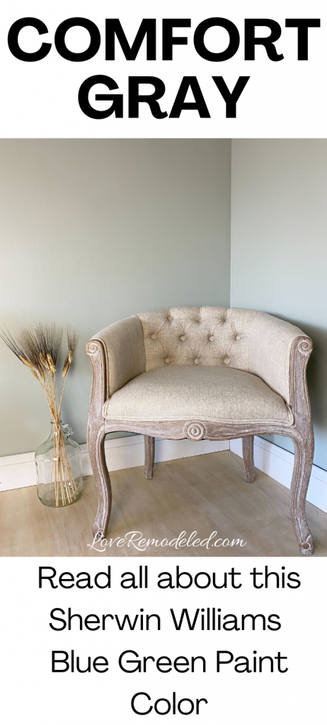
Comfort Gray is a beautiful green paint color by Sherwin Williams. It is a medium light paint color that is soothing and relaxing.
Sherwin Williams Comfort Gray is part of the Living Well – Recharge color collection. Additionally, it is included in the Neutrals section of the fan deck.
This post may contain affiliate links. If you have any questions, please see my disclaimer page.
Sherwin Williams Comfort Gray Paint Color
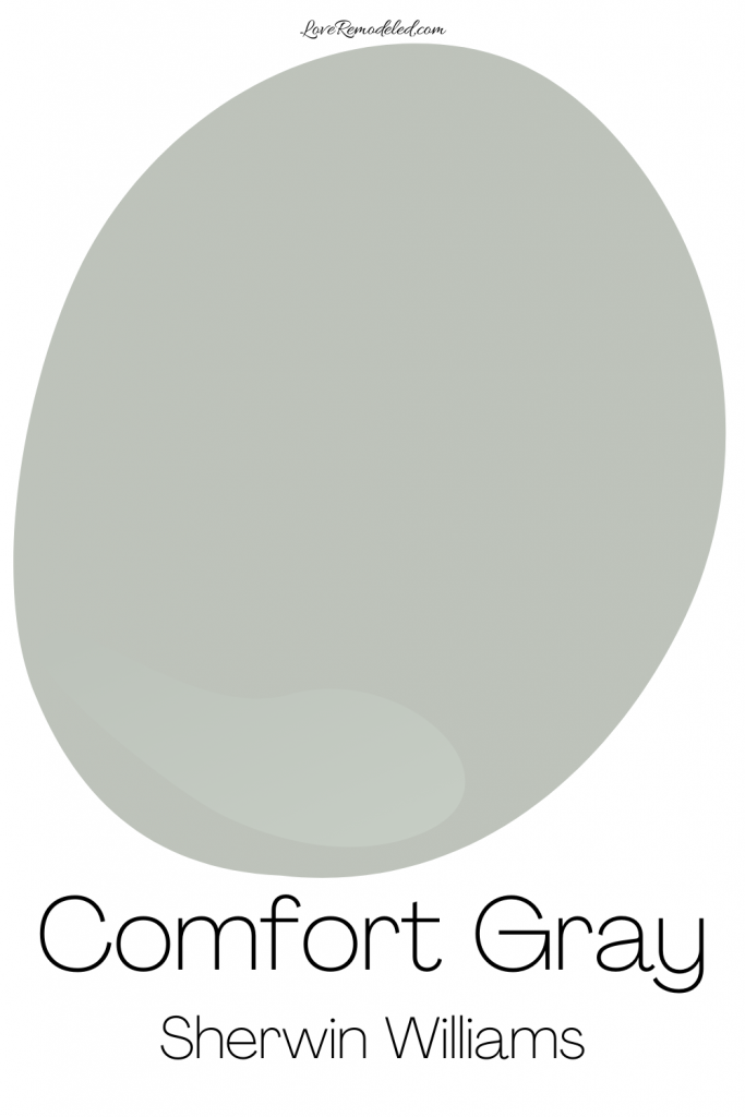
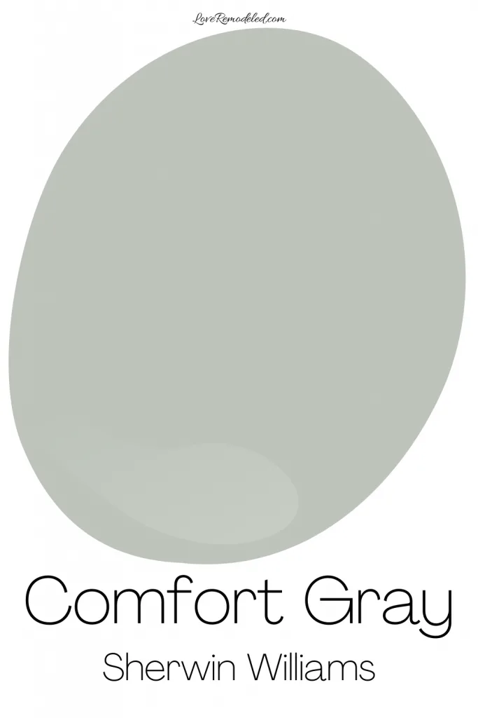
Comfort Gray is a green paint color with a lot of blue and gray in it. It isn’t actually a true green, but it is most easily classified as a green. Truly, Comfort Gray is more of a blue green paint color with gray undertones.
The gray in Comfort Gray keeps it from being too bright. Instead, it is like a muted, softened version of a blue green paint color.
Like most blue green gray paint colors, Comfort Gray can look more blue, more green or more gray in your house at different times of the day. Cooler, northern light may bring out the gray in Comfort Gray, while southern light may make it look more green.
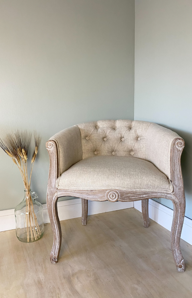

Comfort Gray has enough depth to it that it doesn’t wash out in the light, which makes it nice a very bright room.
Comfort Gray LRV
Comfort Gray has an LRV of 54. LRV means Light Reflectance Value. It basically tells you how light or dark a paint color is. An LRV of 0 is completely black, while an LRV of 100 is completely white.
An LRV of 54 means that Comfort Gray is technically a light paint color in Sherwin Williams’ book. But, in my book, Comfort Gray is more of a medium light paint color. It doesn’t have that light and airy look that a true light paint color has.
Comfort Gray has a bit more body to it. It will show up on your walls in a pronounced way, but isn’t too overly bold.
Is Comfort Gray Warm or Cool?
With its blue and green tones, Comfort Gray is a cool paint color. Cool paint colors make a space feel expansive, welcoming, and calming.
Where Can I Use Sherwin Williams Comfort Gray?

Like most cool paint colors, Comfort Gray looks amazing in a bathroom or bedroom because it gives a serene, relaxing feel to the space.
But, Comfort Gray isn’t a paint color that only works in bedrooms and bathrooms. It is also great in living rooms, dining rooms, kitchens and more.
Comfort Gray works in traditional, farmhouse, cottage, coastal, and contemporary style homes.
It is a perfect paint color for someone who wants a hint of color, but doesn’t want anything bright.
Comfort Gray can also be used on cabinets and home exteriors.
I also love how Comfort Gray works with white trim and wood trim.

Trim Colors for Sherwin Williams Comfort Gray
If you are looking for a white paint color to go with Comfort Gray, you have a lot of options. Comfort Gray can work with both warm and cool white paint colors.
My favorite trim colors for Comfort Gray are High Reflective White and Pure White. High Reflective White is Sherwin Williams cleanest, brightest white paint color. It is perfect for trim and goes with just about any wall paint color. Pure White is also super versatile. It has a hint of yellow and gray in it though, and this makes it a softer sort of trim color.
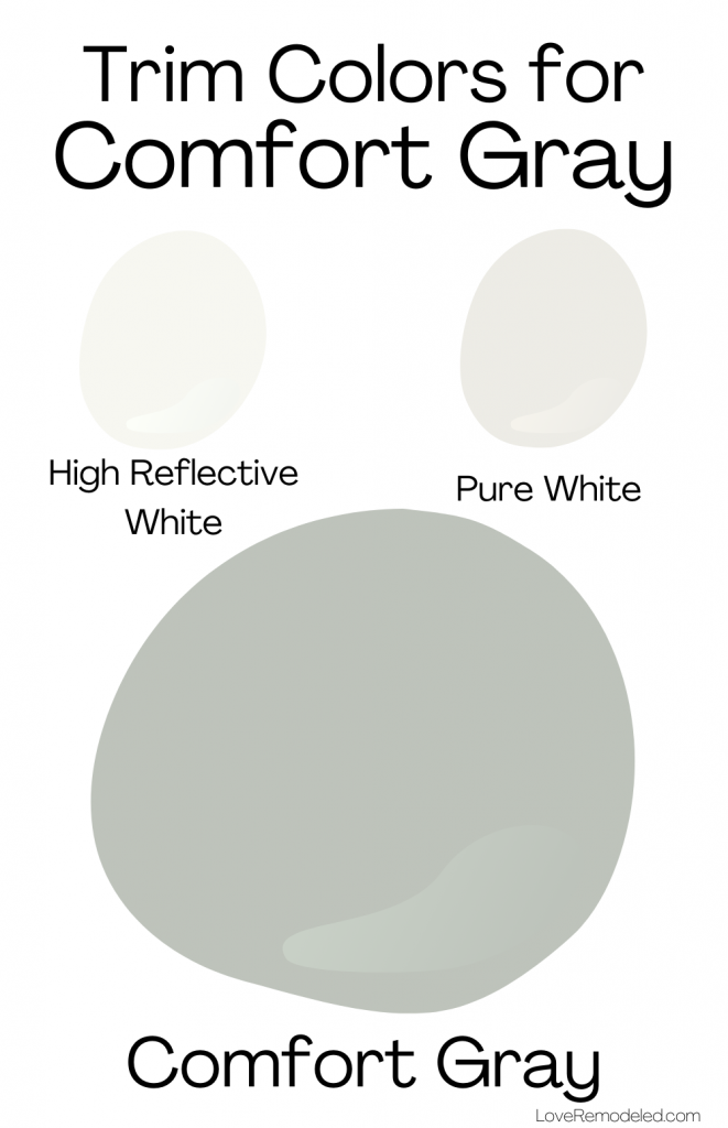
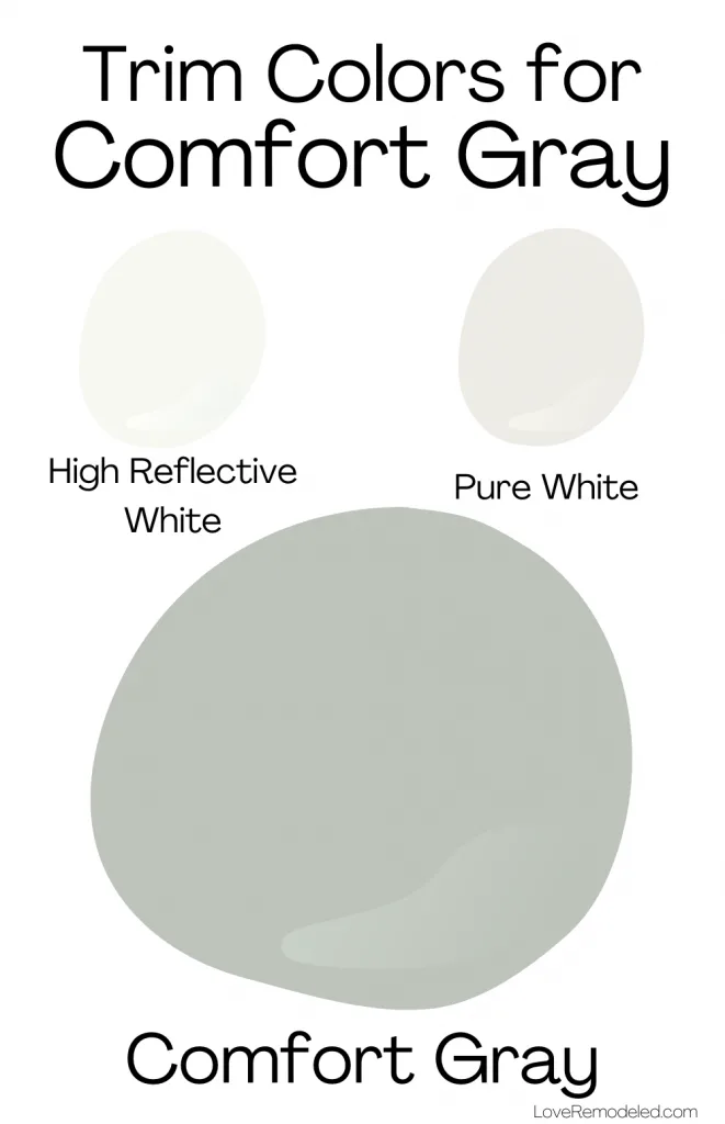
If you want a cool trim color to go with Comfort Gray, check out Extra White. Its blue undertones work nicely with Comfort Gray’s blue green tones. If you want a warmer trim paint color to go with Comfort Gray, check out Alabaster. It has even more yellow in it than Pure White, and some gray as well.
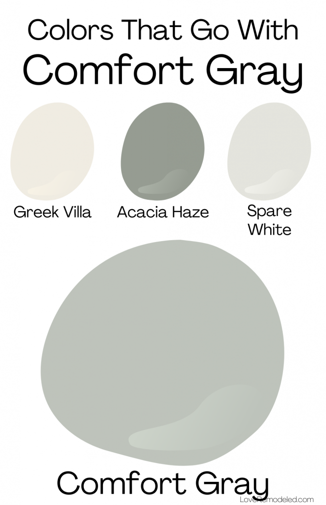
Coordinating Colors for Sherwin Williams Comfort Gray
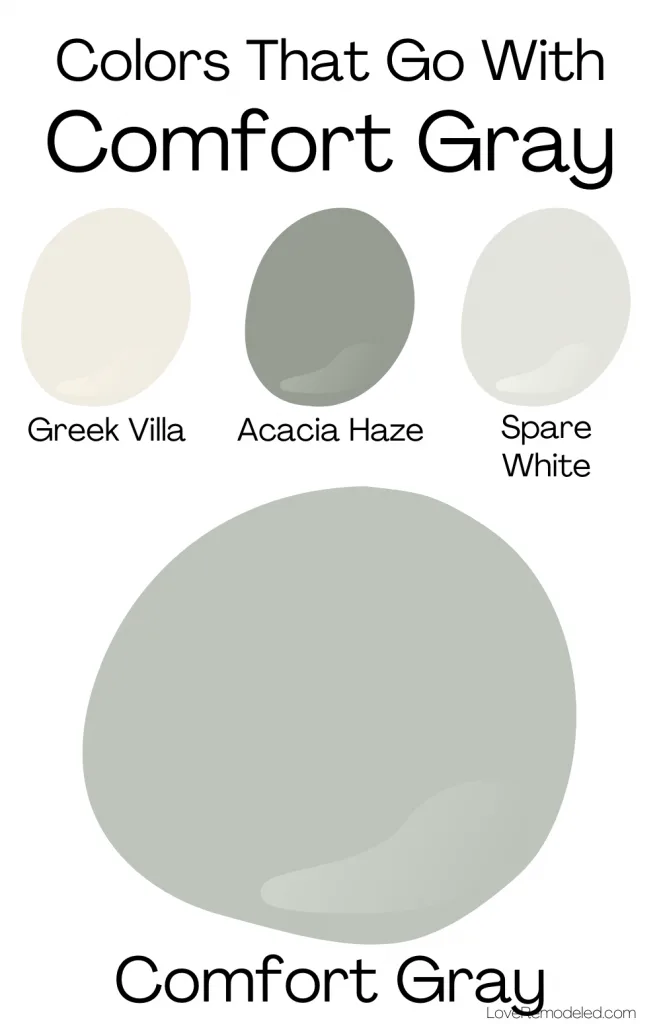
Comfort Gray goes well with neutral colors, such as white, cream, grieges, browns and blacks. It can also work with true colors, such as lighter or darker blue greens with similar compositions to itself, yellows, some pinks, and navys.
Sherwin Williams pairs Comfort Gray with Acacia Haze, a darker blue green paint color, Spare White, a grayish off-white paint color, and Greek Villa, a yellowish off-white paint color.
Comfort Gray Color Strip
Comfort Gray shares a color strip with a few other big names by Sherwin Williams.
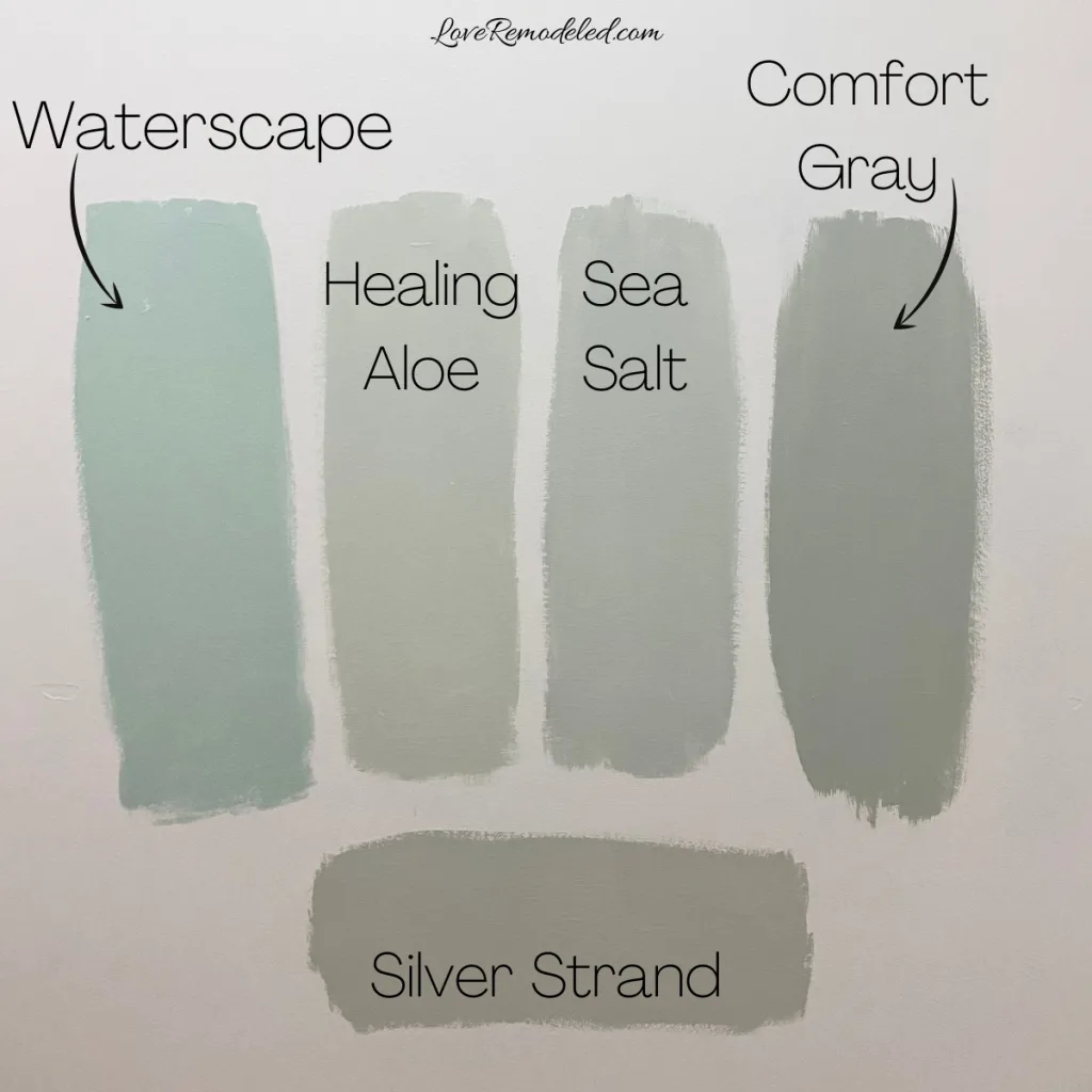
First, you see that Comfort Gray is one shade under Sea Salt, one of Sherwin Williams most popular blue greens. It also shares a color strip with Oyster Bay and Acacia Haze, some medium depth paint colors, and Retreat, Pewter Green and Ripe Olive.
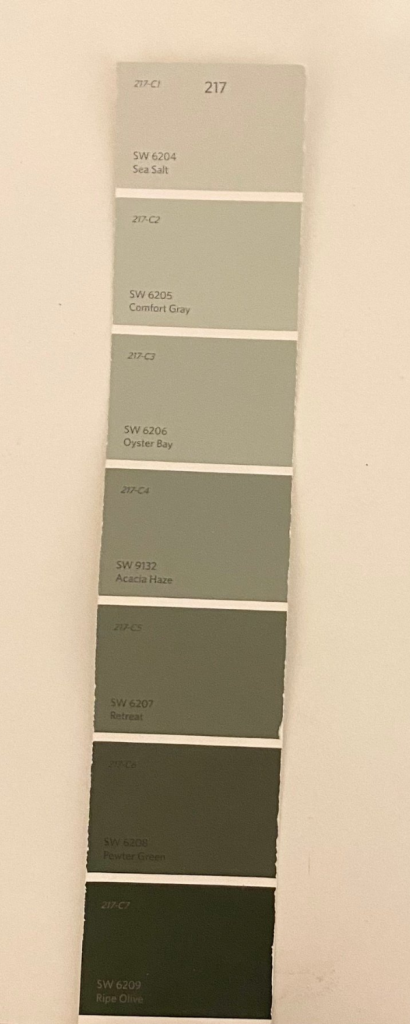
Some people would tell you that these paint colors are all just lighter or darker versions of each other. While this is true for some of Benjamin Moore’s collections, it is not true for Sherwin William’s fan deck.
Instead, Sherwin Williams includes colors that are in the same color family on their color strips. So, some may have more blue, some more green, and some more gray, but they all tend to be green/blue/gray blends.
If you’re looking for a darker or lighter color to use as an accent color to Comfort Gray, this color strip is a great place to start.
For example, you could use Comfort Gray in your bedroom and Sea Salt in your bathroom for a coordinated color scheme. Or, you could use Acacia Haze for an accent wall in a room with Comfort Gray paint.
Comfort Gray Compared
When I do a full paint color review, I always include a section where I compare the paint color to other paint colors that people may be considering. These paint colors tend to be either in the same color family, or have the same uses.
For Comfort Gray, I’ll compare it to Sea Salt and Silver Strand, as these two paint colors are often considered alongside of Comfort Gray. I’ll also compare it to Agreeable Gray, as people tend to use these two paint colors in the same types of places.
Comfort Gray vs. Sea Salt
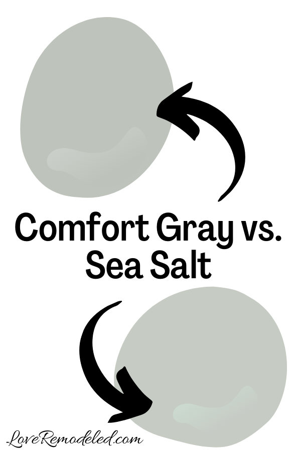

As I mentioned earlier, Sea Salt and Comfort Gray share a paint strip. They are both softer, blue green gray blends that give a spa-like feeling to a space.
Sea Salt is a bit lighter than Comfort Gray though. And, while many consider Sea Salt to be more of a neutral because of how light it is, Comfort Gray tends to be more of a color.
Sea Salt has that light and airy feel to it that a light paint color does. In this way, it may be a bit more versatile than Comfort Gray. But, Comfort Gray is better if you want to give a space a more saturated look.
Overall, the look of these colors is pretty different. Comfort Gray looks more earthy, while Sea Salt looks more coastal. Both are gorgeous shades, but their uses aren’t necessarily interchangeable.
Click here for more information on Sea Salt.
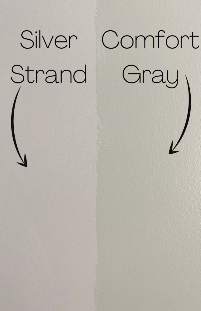
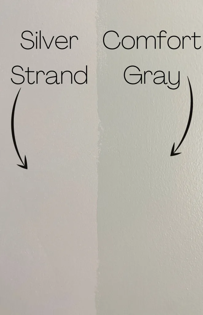
Comfort Gray vs. Silver Strand
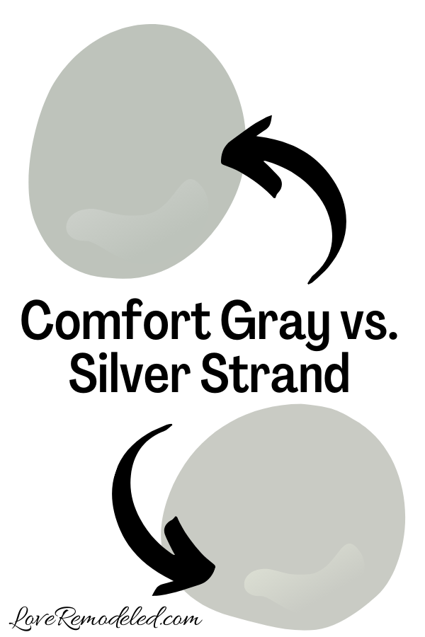
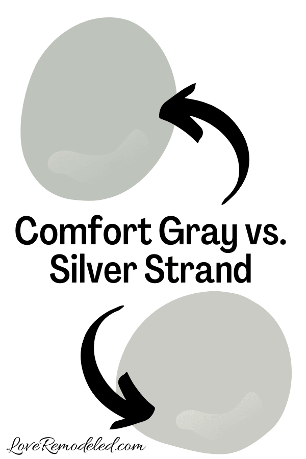
Silver Strand is another popular blue green gray paint color by Sherwin Williams. Silver Strand has more gray in it though, which makes it a bit more of a neutral than Comfort Gray is.
Silver Strand is also actually a tiny bit lighter than Comfort Gray, though it is hard to tell that without knowing the LRV. Comfort Gray tends to look a bit brighter than Silver Strand though, even though Comfort Gray is really not a bright color at all.
Overall, Silver Strand and Comfort Gray will have the same weight on your walls.
If you want a paint color that has more gray, and will more frequently look neutral on your walls, Silver Strand is the better choice here. But, if you want a paint color that has more of that green blue look, go with Comfort Gray.
Click here for more information on Silver Strand.
Comfort Gray vs. Agreeable Gray
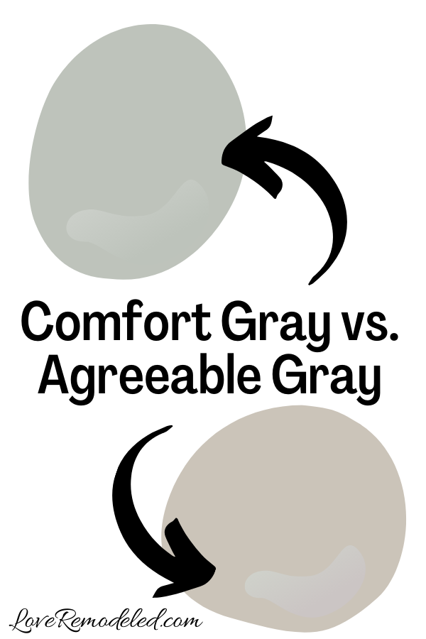

Agreeable Gray is probably Sherwin Williams most popular paint color. It is the go-to choice for people who want a neutral paint color that goes with everything.
Truthfully, Agreeable Gray and Comfort Gray are not that similar. But, people frequently consider them for the same spaces, so we’ll look at them here.
Agreeable Gray is a greige paint color. This means that it is a gray and beige blend. It also has a slight green undertone to it. It is a warm gray.
Alternatively, Comfort Gray is a cool paint color with a good bit of gray in it.
Agreeable Gray is a lighter paint color than Comfort Gray as well. It tends to not really make much of a statement on your walls, while Comfort Gray is a bit more imposing (but not too imposing).
Altogether, Agreeable Gray is much more versatile than Comfort Gray.
If you want a paint color that goes with everything and recedes into the background, go with Agreeable Gray. But, if you want to give your space a relaxed, expansive feel, go with Comfort Gray.
Click here for more information on Agreeable Gray.
Wondering How To Pick the Perfect Paint Color?
I have the best solution for you!
Samplize sells peel and stick paint samples in almost every paint color.
These no-mess, peel and stick sheets are made from real paint, so they will show you exactly what the paint color will look like.
Simply place them on your walls next to your trim, furnishings or fixed elements, and easily see which paint color works best in your space and with your lighting.
Then, peel the sheet off your wall and reapply it somewhere else if you like. You can try several different paint colors with no mess, no fuss and no cleaning paint brushes.


Oh, and you can have them in your home by tomorrow with OVERNIGHT shipping!
As a bonus, be sure to use the code LoveRemodeled10 at check out to get an extra 10% off! Samplize sheets are cheaper than a sample can of paint, and way less work.
They are the easiest (and fastest!) way to try a paint color in your home, with no hassle.
Final Thoughts on Sherwin Williams Comfort Gray
Sherwin Williams Comfort Gray is a personal favorite paint color for me. It has enough color to make a statement, but not so much that it looks bright at all. I wouldn’t necessarily use it in place of a neutral, but I would definitely use it alongside my neutrals to bring a bit of interest to a space.
Comfort Gray is a beautiful green with lots of blue and gray in it. Pick up a Samplize square and try it in your home today!
Click here if you’re interested in other blue green paint colors!

Want to see all your paint options in one convenient place? Click here to get everything you need to start painting, including Sherwin Williams and Benjamin Moore paint color decks!


Have a question? Leave me a comment! Remember to check back for a response – it may take me up to a week or two depending on how busy I am, but I’ll try my best to get back to you!
Want to show off your project? Join the discussion in Love Remodeled’s Facebook group!
Mary Hostetter
Sunday 22nd of January 2023
I’m not sure how often you check this site but I have a question on using this on the exterior of a house. I love the color. We have painted the back and sides and it can appear grey in some light or light green grey at other times. We need to find a dark color that we can use on a horizontal line that spans the front of the house. Comfort gray will be above and below this line. The line is raised from the house (stucco) and is about 3 ft from the ground. The color of the line would be used for the garage door color as well. I don’t want too much green because it will bring out the green in comfort gray and I want to tone down the green a little. Do you have any suggestions on what dark color (preferable Sherwin Williams) we should go well? If I go greenish, I’m looking at Retreat (SW6702) but I’m not sure that’s dark enough or that it doesn’t have too much green. Thanks for any suggestions you may have!!! (PS: we are in SW Florida if that helps)
Lauren
Friday 17th of February 2023
Hi Mary! Comfort Gray is a gorgeous shade. I understand what you're thinking about toning down the green, but actually using a green against it is what will tone down how green Comfort Gray looks. You're still bringing more green to the space, but a green accent will make Comfort Gray look more like a neutral, while a neutral accent will make Comfort Gray look more like a blue/green. Retreat is a great option or Illusive Green. You could also go with a warm greige like Felted Wool or Keystone Gray, but again, you run the risk of accentuating the blue green in Comfort Gray. I think Retreat will look really nice. Good luck!
Kay
Tuesday 15th of February 2022
Thanks so much for all the info on Comfort Gray. I think I'm convinced that this is the color for me. I'm having my interior painted as well as replacing the flooring--probably luxe vinyl planks. I want to make sure the paint I choose and the flooring I choose are complementary. Do you have any thoughts on what color flooring would work well with a green-gray based paint such as Comfort Gray? Although I'm not color blind I am certainly color-challenged. Thanks for your help.
Lauren
Wednesday 23rd of February 2022
Hi Kay! You have lots of options! Light, medium or dark colored wood will all work, or grayish toned wood. You can even pair it with honey colored wood. Good luck! I'm sure you're better at it than you think :)