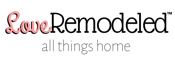
Palladian Blue is a popular, light blue green paint color by Benjamin Moore.
Palladian Blue is included in Benjamin Moore’s “Favorites” collection, which means that it is one of their top 75 paint colors.
If you are looking for a soft blue green paint color to brighten up your space, keep reading to find out all the details on Benjamin Moore Palladian Blue.
This post may contain affiliate links. If you have any questions, please see my disclaimer page.
Benjamin Moore Palladian Blue Paint Color Characteristics
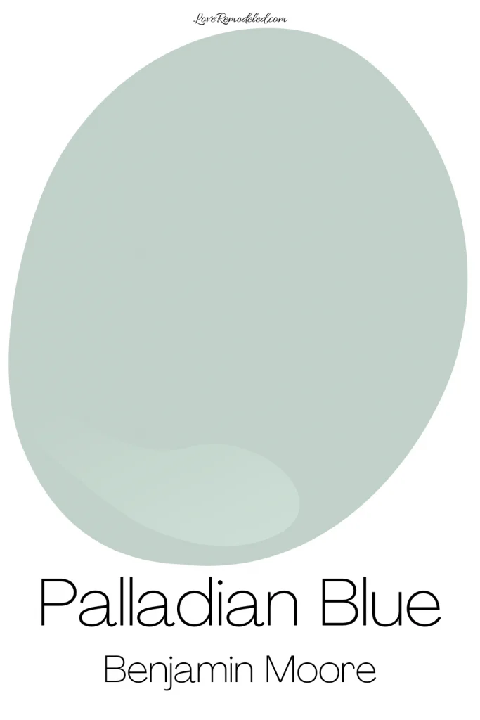
According to Benjamin Moore, Palladian Blue is reminiscent of the sky and mother of pearl.
Despite having the word blue in its name, Palladian Blue is not a true blue paint color.
Instead, it is a blue green shade that, in some lights, can lean more towards green than blue even.
Because of this, people frequently ask whether Palladian Blue is a green paint color? In short, no, Palladian Blue is not a green paint color. It is a shade that sits right in between blue and green.
In some lights, Palladian Blue will look more blue, and in some it will look more green.
Palladian Blue is a popular color because it is fairly timeless. While some paint colors go in and out of style, blues tend to remain favorites because they are just so appealing to many.
Palladian Blue is no exception. It has been popular for years, and despite the paint trends moving towards warmer and deeper shades, Palladian Blue holds its ranking as a top Benjamin Moore paint color.
Palladian Blue LRV
Palladian Blue has an LRV (Light Reflectance Value) of 60.
The LRV scale is an 100 point scale that provides information about how much light a color will reflect back into a space. An LRV of 0 is completely black, and an LRV of 100 is completely white.
As you can see, an LRV of 60 is close to the middle of the LRV scale. Palladian Blue is still classified as a light paint color, but it is edging towards the medium range.
Palladian Blue Undertones
I always include an undertone section in my full paint color reviews, but it isn’t so clear cut with Palladian Blue.
Is Palladian Blue a green with blue undertones? Or is it a blue with green undertones?
I can’t say!
This is because Palladian Blue shifts effortlessly between blue and green depending on the lighting in your home. It may look more blue in the morning, and more green in the evening.
Is Palladian Blue Warm or Cool?
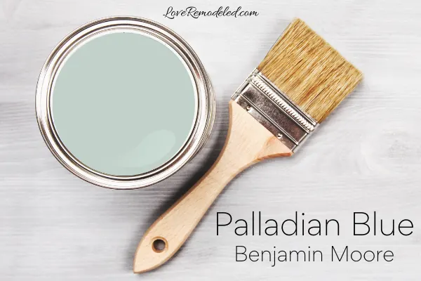
Cool paint colors are blues, greens and purples. They tend to give a space a calming and relaxing vibe. They can even make a room feel a little bigger because the walls seem to recede when painted in a light blue or green.
Warm paint colors are reds, oranges, and yellows. They give off an energetic, cozy feeling.
Since Palladian Blue has tones of blue and green, it is a cool paint color. And, it is a cool color in its truest sense.
Palladian Blue feels soft and soothing. It invites you to relax. And, it is one of those cool paint colors that can make the room look a bit bigger.
Benjamin Moore Palladian Blue Complimentary Colors
Palladian Blue is a great color to pair with neutrals. It isn’t a neutral itself, but it is nice pop of color to pair with more muted shades.
For example, Palladian Blue goes well with dark blues such as Van Deusen Blue and Hale Navy.
Palladian Blue also coordinates with dark browns, greiges, creams and whites.
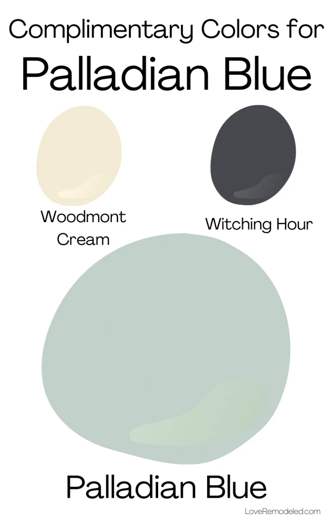
Benjamin Moore pairs Palladian Blue with Brandy Cream, a creamy tan paint color, and Rural Earth, a dark brown paint shade.
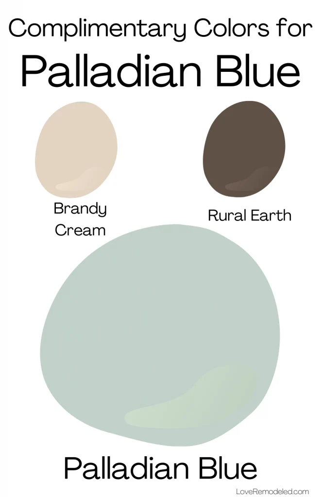
For another color scheme, Benjamin Moore suggests putting Palladian Blue with Woodmont Cream, a yellowy cream paint color and Witching Hour, a dark blackish brown.
Benjamin Moore Palladian Blue Trim Colors
If you are looking for a white paint color to go with Palladian Blue, check out Chantilly Lace and Snow White.
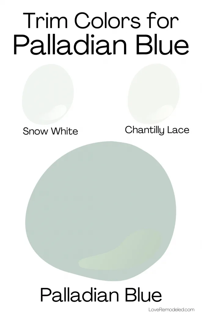
Chantilly Lace is a clean, bright white paint color with very little in the way of undertones. This makes it a great trim color for almost any paint shade. Against Palladian Blue, Chantilly Lace looks like a pure white. Together, they set each other off nicely.
Snow White is a softer white paint color that leans slightly cool. It is not quite as bright as Chantilly Lace, and some people prefer a more muted trim shade. Snow White’s cool undertones pair nicely with the cool tones in Palladian Blue.
Where to Use Benjamin Moore Palladian Blue
Palladian Blue is a light paint color, and light paint colors can typically be used anywhere.
Palladian Blue works well in living rooms, dining rooms, bedrooms, bathrooms, and basements. It can even be used on front doors, shutters and home exteriors.
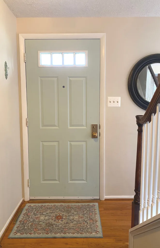
While Palladian Blue is gorgeous anywhere, it is commonly used in bedrooms and bathrooms. This is because people tend to associate these spaces with light blue green paint colors that are reminiscent of the ocean and the sky.
Spa-like paint colors, like Palladian Blue, are perfect for creating a relaxing environment.
Palladian Blue is a perfect paint color for a traditional, coastal, contemporary or farmhouse style home.
Palladian Blue Compared
When I do a color review, I always like to compare the paint color to other popular paint colors that are either in the same color family, or that have the same uses.
In this case, I will compare Palladian Blue to other popular blue green paint colors.
Palladian Blue vs. Woodlawn Blue
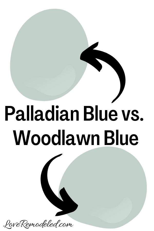
Woodlawn Blue is another beautiful blue green paint color by Benjamin Moore.
Woodlawn Blue and Palladian Blue have similar LRVs and similar depths. They also have about the same amount of brightness to them.
But Woodlawn Blue is a little more blue than Palladian Blue is.
If you like more of a blue paint color, you may want to go with Woodlawn Blue. But, if you want a paint color that shifts towards blue or green depending on the time of day or lighting, you might want to go with Palladian Blue.
To determine which paint color will be right in your home, you should sample each one. Their differences are ever so slight, but one may go better with your fixed elements or furnishings than the other will.
Palladian Blue vs. Wythe Blue
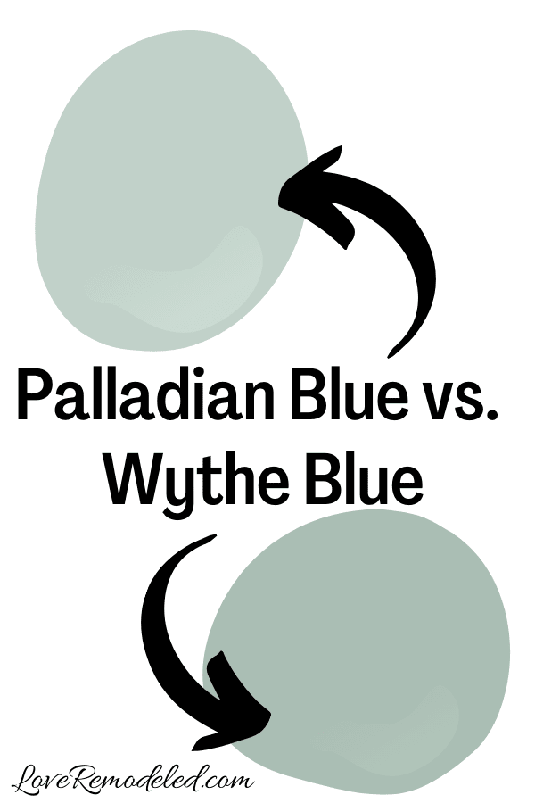
Wythe Blue is a gorgeous Benjamin Moore blue green paint color.
It is a little darker than Palladian Blue though, falling more into the medium range of paint colors. While Palladian Blue isn’t exactly the lightest shade, Wythe Blue is definitely more of a color.
Like Palladian Blue, Wythe Blue has a good bit of green in it as well.
Both are beautiful, but because of the lower LRV that Wythe Blue has, Palladian Blue is a bit more usable. It can work in most any space, where as Wythe Blue needs a bit more light to support it.
Palladian Blue vs. Sea Salt
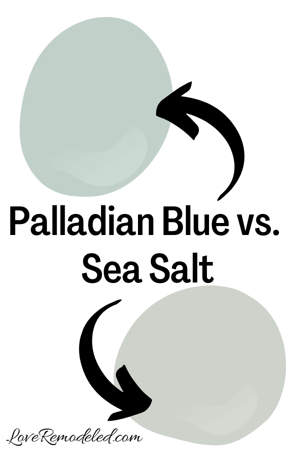
Sea Salt is a hugely popular Sherwin Williams paint color.
Like Palladian Blue, Sea Salt is a blue green paint color that shifts with the light. But, Sea Salt also has a fairly strong gray undertone in it.
This makes Sea Salt more of a neutral than Palladian Blue. Palladian Blue looks much brighter than Sea Salt does.
If you want a pop of color, but are afraid to commit to something that is truly a color, Sea Salt is a good bet. But, if you know you want a soft blue green, Palladian Blue is nearly perfect.
Click here for more information on Sea Salt.
Palladian Blue vs. Rainwashed
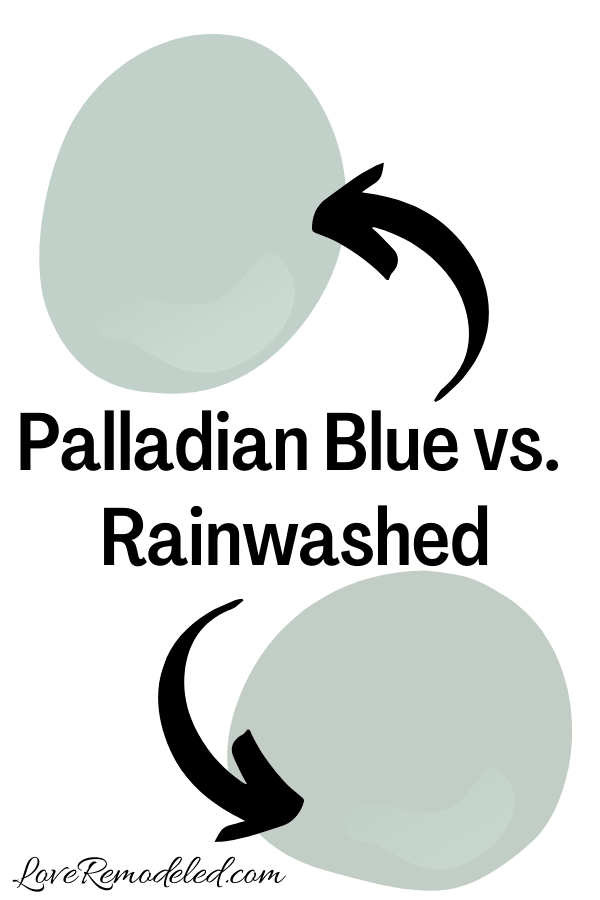
Rainwashed is another blue green paint color by Sherwin Williams. Where Sea Salt leans towards green, Rainwashed leans towards blue.
Rainwashed and Palladian Blue are actually very similar paint colors. While no Sherwin Williams and Benjamin Moore paint colors are the same, Rainwashed and Palladian Blue come close.
One tiny difference between Rainwashed and Palladian Blue is that Rainwashed has just a hint of gray in it. But it is very slight.
Rainwashed and Palladian Blue have very similar depths and LRVs.
To decide between these two shades, you really need to see them both in your space. Because they are so similar, there is no good differentiation between them, other than viewing them on your walls.
Click here for more information on Rainwashed.
Wondering How To Pick the Perfect Paint Color?
I have the best solution for you!
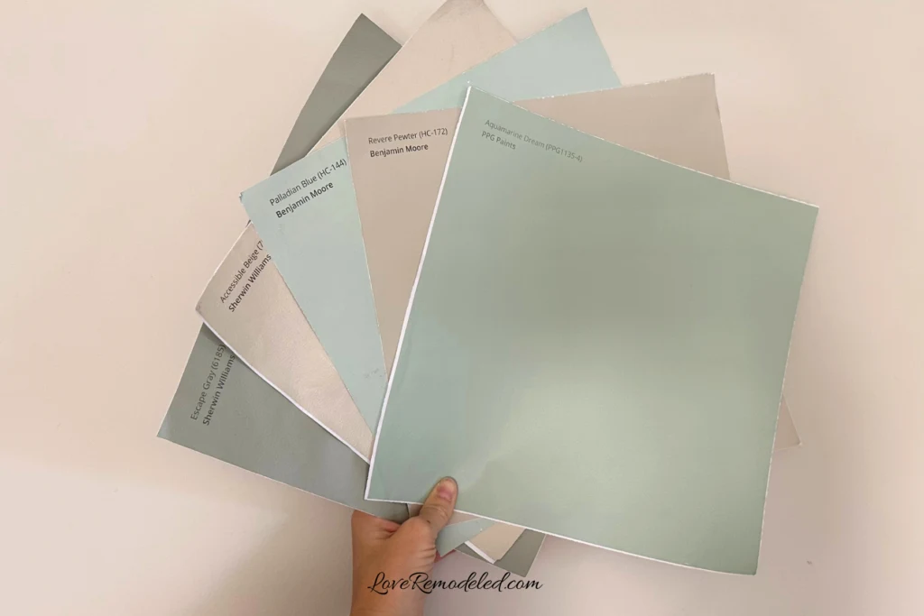
Samplize sells peel and stick paint samples in almost every paint color.
These no-mess, peel and stick sheets are made from real paint, so they will show you exactly what the paint color will look like.
Simply place them on your walls next to your trim, furnishings or fixed elements, and easily see which paint color works best in your space and with your lighting.
Then, peel the sheet off your wall and reapply it somewhere else if you like. You can try several different paint colors with no mess, no fuss and no cleaning paint brushes.
Oh, and you can have them in your home by tomorrow with OVERNIGHT shipping!
As a bonus, be sure to use the code LoveRemodeled10 at check out to get an extra 10% off! Samplize sheets are cheaper than a sample can of paint, and way less work.
They are the easiest (and fastest!) way to try a paint color in your home, with no hassle.
Final Thoughts on Benjamin Moore Palladian Blue
Palladian Blue is a gorgeous blue green paint color that is a perfect way to add a calming soothing element to your space.
It has a bit of brightness to it, which makes it a little more fun than some other popular blue green paint colors. But, its not so bright that you have to worry that it will look childish.
If you are looking for a paint shade that will elevate the relaxing feeling in your home, check out Palladian Blue.
Want to see all your paint options in one convenient place? Click here to get everything you need to start painting, including Sherwin Williams and Benjamin Moore paint color decks!
Have a question? Leave me a comment! Remember to check back for a response – it may take me up to a week or two depending on how busy I am, but I’ll be sure to get back to you!
Want to show off your project? Join the discussion in Love Remodeled’s Facebook group!
