
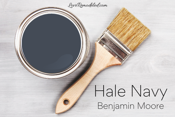
Hale Navy is Benjamin Moore’s top selling navy blue paint color. Because of its popularity, Hale Navy is included in Benjamin Moore’s “Favorites” fan deck, which includes the 75 most popular paint shades by Benjamin Moore.
Hale Navy is part of the Historical Collection of Benjamin Moore colors.
If you are interested in a dark navy blue paint color, keep reading for all the details on this classic and timeless shade.
This post may contain affiliate links. If you have any questions, please see my disclaimer page.
Hale Navy Paint Color Characteristics

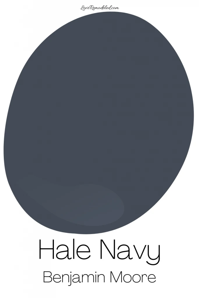
Hale Navy paint color is a dark navy shade. It is a very classic navy shade that is perfect in a lot of ways.
First, Hale Navy is not bright and not purple looking. Instead, it is dark and moody, leaning more towards the black and dark gray tones it carries.
Second, Hale Navy can look sophisticated, classy, industrial or modern.
Third, while it is a blue color, Hale Navy is so dark that it can be classified as a neutral, used as a great accent shade or as a bold wall color.
Hale Navy LRV
Hale Navy has an LRV (Light Reflectance Value) of 8.
The LRV scale goes from 0, which is completely black, to 100, which is completely white.
An LRV of 8 means that Hale Navy is very low on this scale. It is close to being completely non-reflective.
Because of this, you are going to need some level of natural or artificial light to make this color look good. Don’t let this scare you away too much though. All paint colors need ample light to make them look good.
Some people question whether Hale Navy will look black.
Hale Navy shouldn’t look black on your walls, furniture or cabinets, but the level of light will make a difference in how it looks. If you want to make sure your Hale Navy paint doesn’t look black, be sure to provide enough light to show off those blue tones.
Overall, a low LRV like this means that Hale Navy is very saturated, and very dark.
Hale Navy Undertones
Hale Navy has a ton of blue in it, but it also has some dark gray and maybe even a hint of green.
Hale Navy doesn’t look green, but when you compare it to navy blues that are brighter or have more purple, you see how Hale Navy just edges towards a green tone more than some others.
People frequently ask whether Hale Navy is too gray. Hale Navy does have a good bit of gray in it. This gray helps keep Hale Navy from looking too bright. It also helps ground the color, contributing to its ability to be perceived as a neutral instead of as a color.
But, in my opinion, Hale Navy isn’t too gray. It has enough to temper the blue, but not so much that it looks like a charcoal gray. Hale Navy still looks navy.
Is Hale Navy Warm or Cool?
Cool paint colors are blues, greens and purples. They tend to be calming and welcoming shades that give a soothing sort of look to a space.
Warm paint colors are reds, oranges and yellows. They give a space a cozy, energetic feeling.
Being a true blue shade, Hale Navy is a cool paint color.
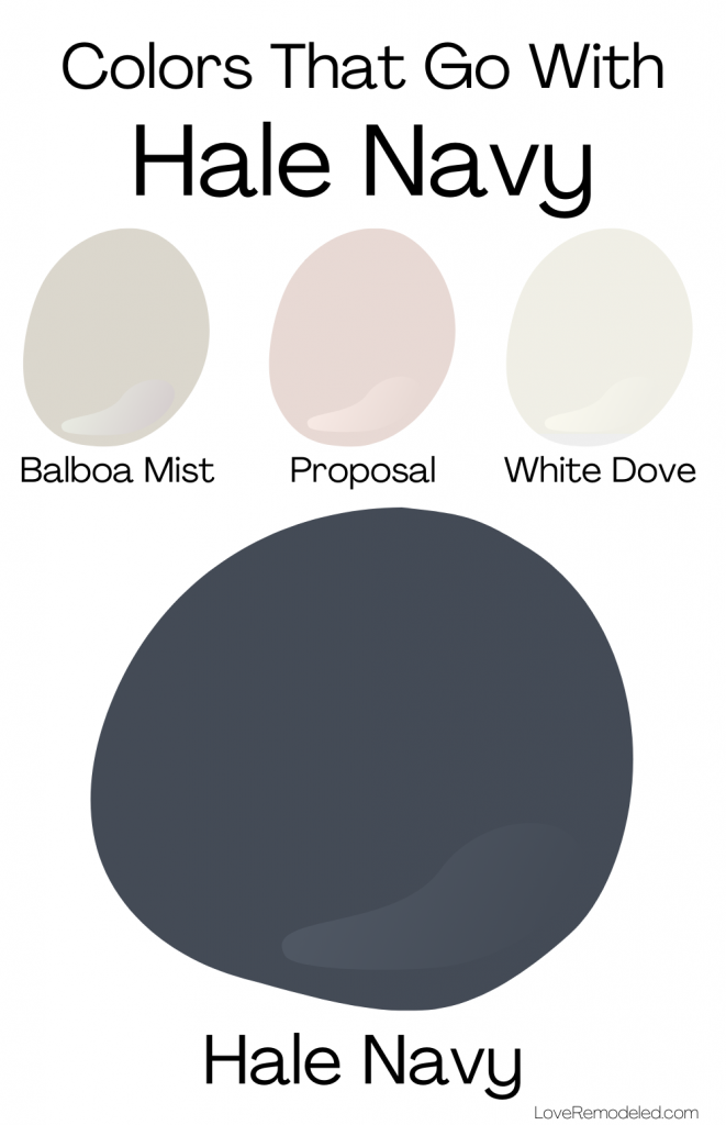
Hale Navy Coordinating Colors
Since Hale Navy is so dark and classic looking, it tends to go well with a variety of colors.
As I mentioned before, in many ways, Hale Navy is a neutral paint color, as opposed to an actual color. For this reason, it is very versatile in its ability to pair with coordinating shades.
Hale Navy looks good with white, cream, gray, blue/green, light greens, yellows, red, pink or gold shades.
Hale Navy Trim Colors
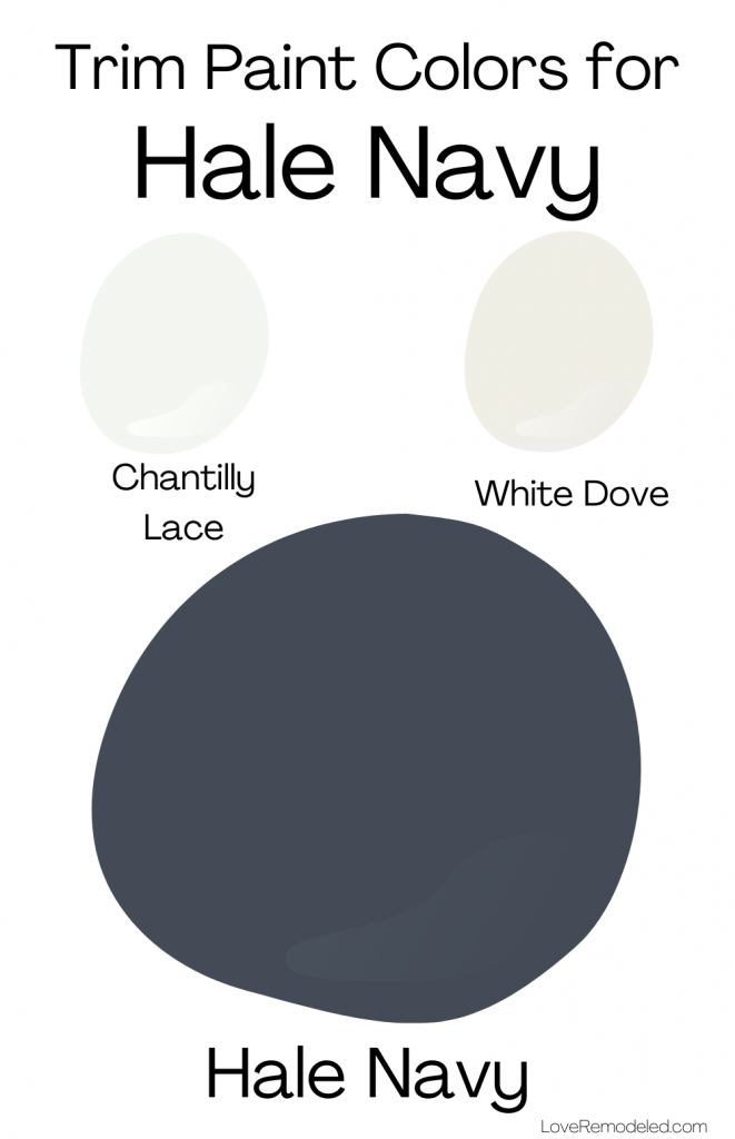
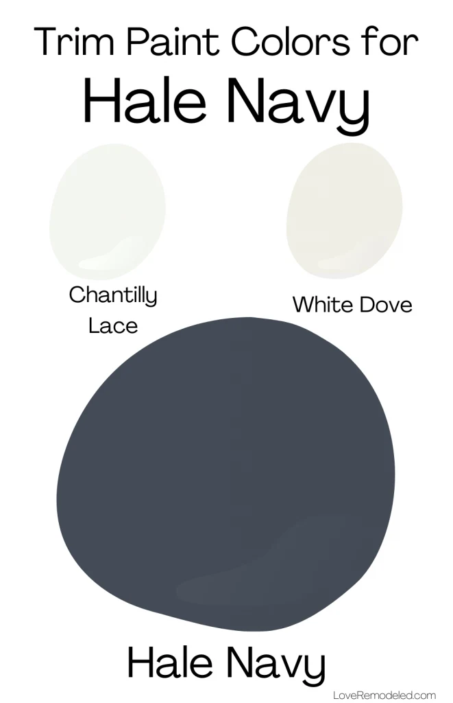
Hale Navy goes well with Chantilly Lace, a pure, clean white paint color by Benjamin Moore. Chantilly Lace is almost undertone free, and is one of my top choices for trim colors for almost any paint shade.
In addition, you could also pair Hale Navy with White Dove. White Dove is a soft, creamy white paint color. I almost never recommend painting your trim a soft, creamy white, because the current trend is for trim to be a bright, clean white. But, this is one instance when I do think that the shades will work together nicely.
Because Hale Navy is so cool and dark, it sets off beautifully against the soft warmth of White Dove, providing a bit of balance.
Hale Navy Color Palette
In addition to the coordinating colors listed above, Hale Navy looks amazing with these two color palettes by Benjamin Moore.
In the first color palette, Hale Navy is paired with Woodmont, a pale creamy yellow, and Hidden Oaks, a light brown paint color. Together, these shades demonstrate a very classic look for Hale Navy.
In the second color palette, Hale Navy coordinates with Spring Meadow, a light green paint color, and Butterfield, a soft yellow shade. This paint palette is a lighter, more colorful option for Hale Navy.
If you would like a more modern look, you can pair Hale Navy with Balboa Mist, a popular greige/taupe shade, and White Dove, a soft, warm white. Want a pop of warmth as well? Add in Benjamin Moore Proposal, a soft pink shade.
Where Can I Use Hale Navy?
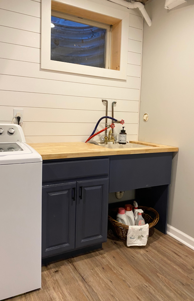
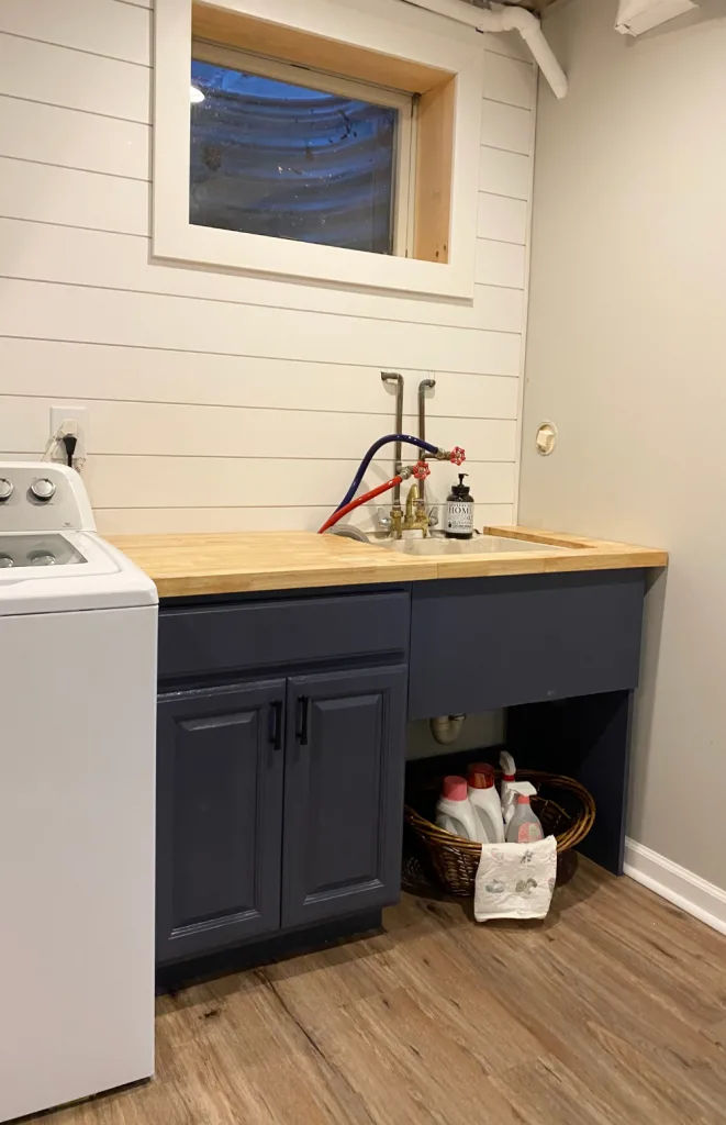
Hale Navy is a great color on cabinets, doors, furniture or even on walls.
Here is Hale Navy on some laundry room cabinets.
You can choose to use Hale Navy in a whole room, or just as an accent wall.
Hale Navy is also a popular front door color. Click here to learn what your front door color means for your house.
Hale Navy Compared
Every time I do a complete color review on a paint shade, I like to compare it to other popular paint colors that are either in the same color family, or that have the same uses.
I find that this helps readers determine which paint shade will be the right color for them.
In this case, I am going to compare Hale Navy to two other popular navy paint colors – Sherwin Williams Naval and Benjamin Moore’s Old Navy.
Hale Navy vs. Naval
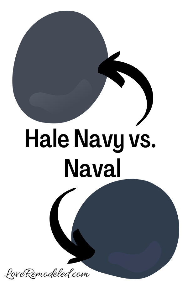

Naval is arguably Sherwin Williams’ top navy paint color. It is a deep, dark navy shade, but where Hale Navy has those gray undertones, Naval is absent in them. Instead, Naval looks more like a deep, true navy paint color that is more reminiscent of a royal blue.
In fact, when you compare the two to each other, Naval looks more like a navy than Hale Navy does. The charcoal undertone in Hale Navy comes out more in comparison.
This makes Hale Navy look more muted.
Despite this, Naval actually has the darker LRV, sitting at 4 (compared to Hale Navy’s 8).
Click here for more information on Sherwin Williams Naval.
Hale Navy vs. Old Navy

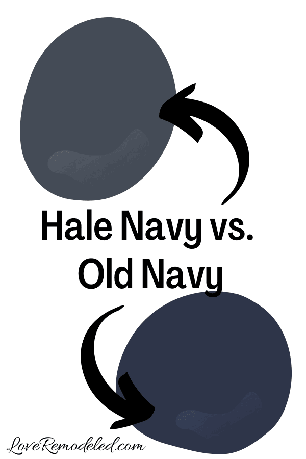
Benjamin Moore Old Navy is the lesser known navy paint color. Like Naval, Benjamin Moore Old Navy is more of a royal blue navy shade, instead of a charcoal gray navy shade.
It can be used in all the same ways as Hale Navy, but where Hale Navy can act as more of a neutral, Old Navy comes off as more of a color.
The color is definitely blue, and definitely dark, but Old Navy doesn’t have that same bold yet muted look that Hale Navy does. Instead, it just looks more bold.
What is the Sherwin Williams equivalent to Hale Navy?
This is a common question, but there is no real good answer here. Sherwin Williams and Benjamin Moore have their own paint shades, and they are never the exact same.
But, if you’re looking for a Sherwin Williams paint color that is close to equivalent to Hale Navy, here are a few to consider.
First, Charcoal Blue is an option. It is a bit brighter, and a bit less green than Hale Navy, but is a similar idea.
Second, Anchors Away is a good, very dark, very neutral navy blue. It doesn’t have purple or royal blue tones as much as some others, but also doesn’t carry the gray that Hale Navy does.
Last, consider Naval. It is the top navy choice by many Sherwin Williams fans for a reason.
Wondering How To Pick the Perfect Paint Color?
I have the best solution for you!
Samplize sells peel and stick paint samples in almost every paint color.
These no-mess, peel and stick sheets are made from real paint, so they will show you exactly what the paint color will look like.
Simply place them on your walls next to your trim, furnishings or fixed elements, and easily see which paint color works best in your space and with your lighting.
Then, peel the sheet off your wall and reapply it somewhere else if you like. You can try several different paint colors with no mess, no fuss and no cleaning paint brushes.


Oh, and you can have them in your home by tomorrow with OVERNIGHT shipping!
As a bonus, be sure to use the code LoveRemodeled10 at check out to get an extra 10% off! Samplize sheets are cheaper than a sample can of paint, and way less work.
They are the easiest (and fastest!) way to try a paint color in your home, with no hassle.
Final Thoughts on Benjamin Moore Hale Navy
Benjamin Moore Hale Navy is a beautiful navy blue paint color that is both classic and contemporary. It is a paint color that works in traditional, farmhouse, industrial, coastal, modern style homes and more.
If you are looking for a dark paint color to provide some depth and interest to your space, but don’t want to go with a black or gray, Hale Navy might be the right paint color for you!
Have a question? Leave me a comment! Remember to check back for a response – it may take me up to a week or two depending on how busy I am, but I’ll try my best to get back to you!
Want to show off your project? Join the discussion in Love Remodeled’s Facebook group!
Want to see all your paint options in one convenient place? Click here to get everything you need to start painting, including Sherwin Williams and Benjamin Moore paint color decks!


Sherrill
Wednesday 25th of January 2023
Looks nice.. like the tape idea. When doing small powder room that is square-accent wall . The solid wall as you walk in across from the door or the side wall with sink and laboratory. I was thinking the solid wall but you did one behind fixtures?
Lauren
Thursday 26th of January 2023
Hi Sherrill! I think you can do whichever you like. For me, I like how the sink and laboratory look crisp and clean against a dark accent wall, but you may have a really nice painting on the solid wall that you want to highlight. There is no right or wrong answer here :)