
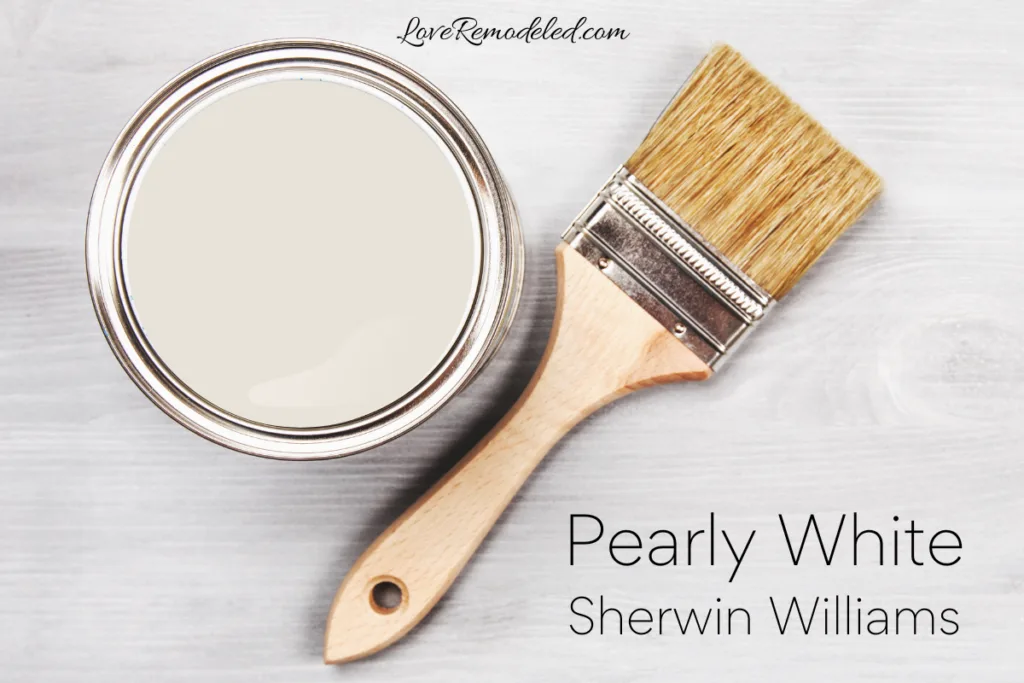
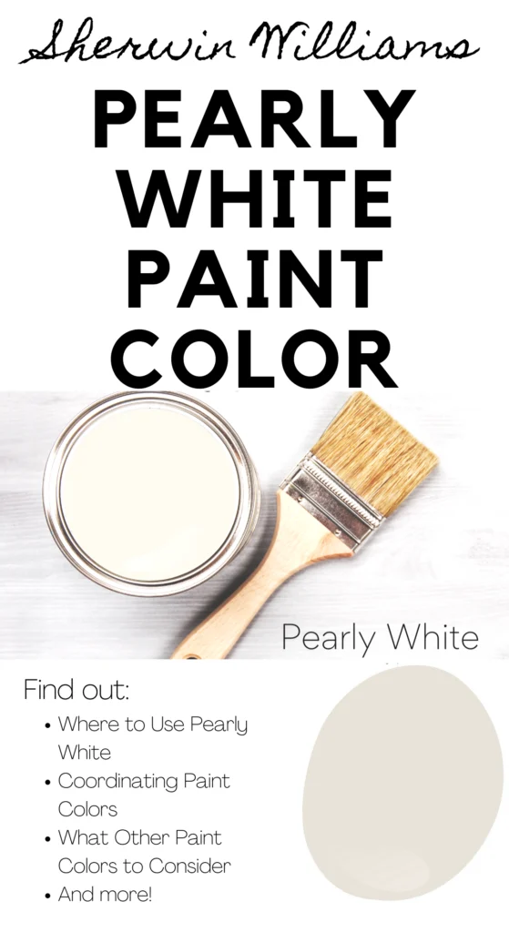
Pearly White is an off-white paint color by Sherwin Williams.
Pearly White is one of Sherwin Williams’ Top 50 Paint Colors and is a part of the Finest Whites and Neutrals collection. This means that it is very popular among both homeowners and designers.
This is because Pearly White is a neutral color that works well in a lot of spaces. It is gentle and light.
If you’re looking for a light off-white paint color that is neutral and subtle, keep reading for all the details on Sherwin Williams Pearly White.
This post may contain affiliate links. If you have any questions, please see my disclaimer page.
What Does Pearly White Look Like?
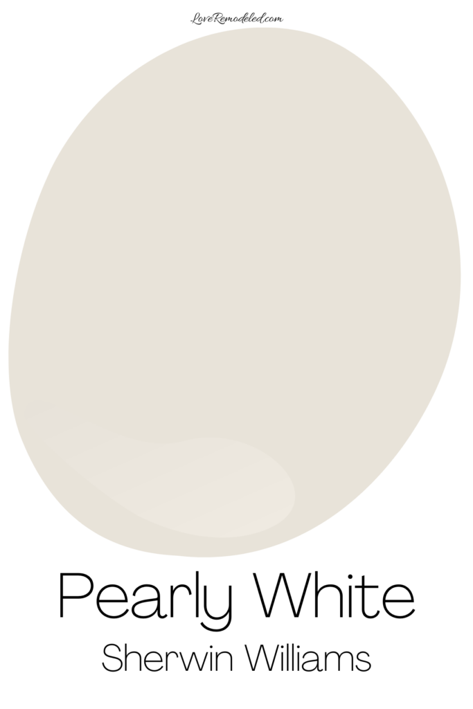

Pearly White is an off-white paint color that I would consider a greige shade. This means that it is a mix of beige and gray.
Pearly White is best classified as a gray because that is the most apparent color in the shade.
Pearly White LRV
Pearly White has an LRV of 77. LRV stands for Light Reflectance Value, and is a measure of how light or dark a paint color is.
The LRV scale goes from 0 to 100. An LRV of 0 is black, and an LRV of 100 is white.
So, you can see that Pearly White is a pretty light paint color.
What Undertone Does Pearly White Have?

Pearly White is a greige. This means that it is a blend of beige and gray. Pearly White also a bit of a green undertone in it.
Don’t let this concern you too much though. All gray paint colors have undertones, and as far as undertones go, Pearly White green undertone is fairly subtle.
If you have red accessories or furniture or flooring with red undertones, that green undertone is going to come out more. If you have red tones in your space, you definitely want to make sure you sample Pearly White in your home before you paint.
This will show you whether that green undertone is going to be too much for your taste or not. My favorite no-mess way to sample paint colors is with Samplize sheets. More on that later.
Is Pearly White Warm or Cool?
Pearly White tends to look warm due to its beige undertone. But, it does have that green undertone as well, so you can find that in Northern facing lighting it’ll take on a bit more of the green, which is a cool tone.
Pearly White definitely isn’t the warmest gray paint color, but doesn’t have the same warmth that other off-white paint colors with purple or yellow undertones can have.
Where Can I Use Pearly White?

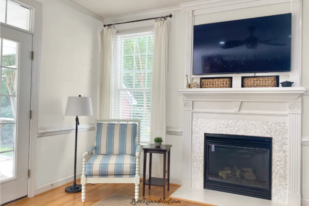
Pearly White is a great color for walls, but can also be used on cabinets or home exteriors.
Pearly White goes with just about any home style, and gives that gentle neutral look that helps to lighten and brighten a room.
Pearly White works best in rooms with adequate lighting, and runs the risk of looking a tiny bit dingy if it isn’t well supported.
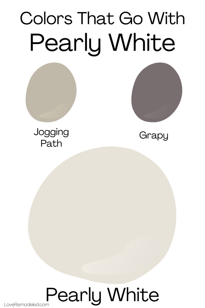
What Colors Go Well With Pearly White?
Pearly White works well with other warm gray paint colors with similar undertones, creams, off-whites, greens, and purples.
Specifically, Sherwin Williams recommends pairing Pearly White with Jogging Path, a greenish greige, and Grapy, a grayish purple.

Trim Colors for Pearly White
Pearly White goes well with many different white paint colors. If you want a trim color to go with Pearly White, my two favorite trim shades from Sherwin Williams are Chantilly Lace and High Reflective White.
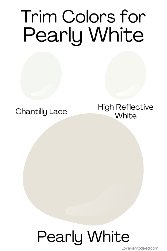
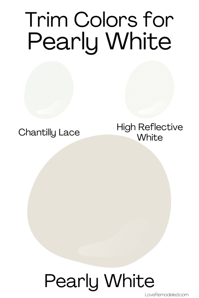
Chantilly Lace and High Reflective White are both very clean white paint colors with almost no undertones. They have very bright looks, and they go with any paint color.
I typically like to recommend a softer white for trim as well, but Pearly White is so light that it needs a very clean white if you are going to see any contrast between it and the trim color.
How Does Pearly White Compare to Other Popular Neutrals?
When I do a paint color review, I like to compare the paint color I’m discussing to other popular paint colors that are in the same family or have the same uses.
In this case, I’ll compare Pearly White with other popular neutral paint colors that have similar uses to Pearly White. Specifically, we’ll look at Pearly White compared to Alabaster, Dover White, and Eider White.
Pearly White vs. Alabaster

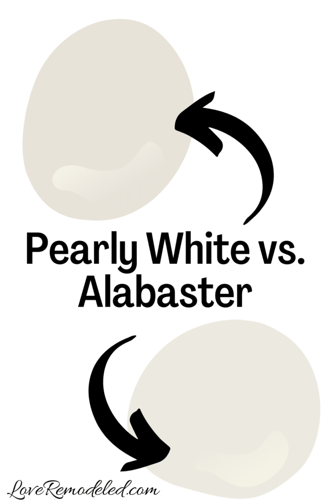
Alabaster is one of Sherwin Williams’ most popular white paint colors. It is a soft, gentle white shade that has yellow and gray undertones.
Alabaster is a bit lighter than Pearly White. In fact, many people like to use Alabaster as a trim color, while Pearly White has a bit too much color in to be really popular as a trim paint color.
Overall, Alabaster is a much more versatile and usable color than Pearly White. Pearly White has that green undertone, so you need to be a little careful about using it in a space with red tones.
Alabaster is more of a classic soft white, with the more expected yellow undertones. It just tends to play nicely in more spaces and with more coordinating colors than Pearly White does.
But, if you know you want a soft white with a bit of a gray look to it, Pearly White is the better choice. Alabaster does have a hint of a gray undertone, but it will never look gray on your walls.
Pearly White vs. Dover White
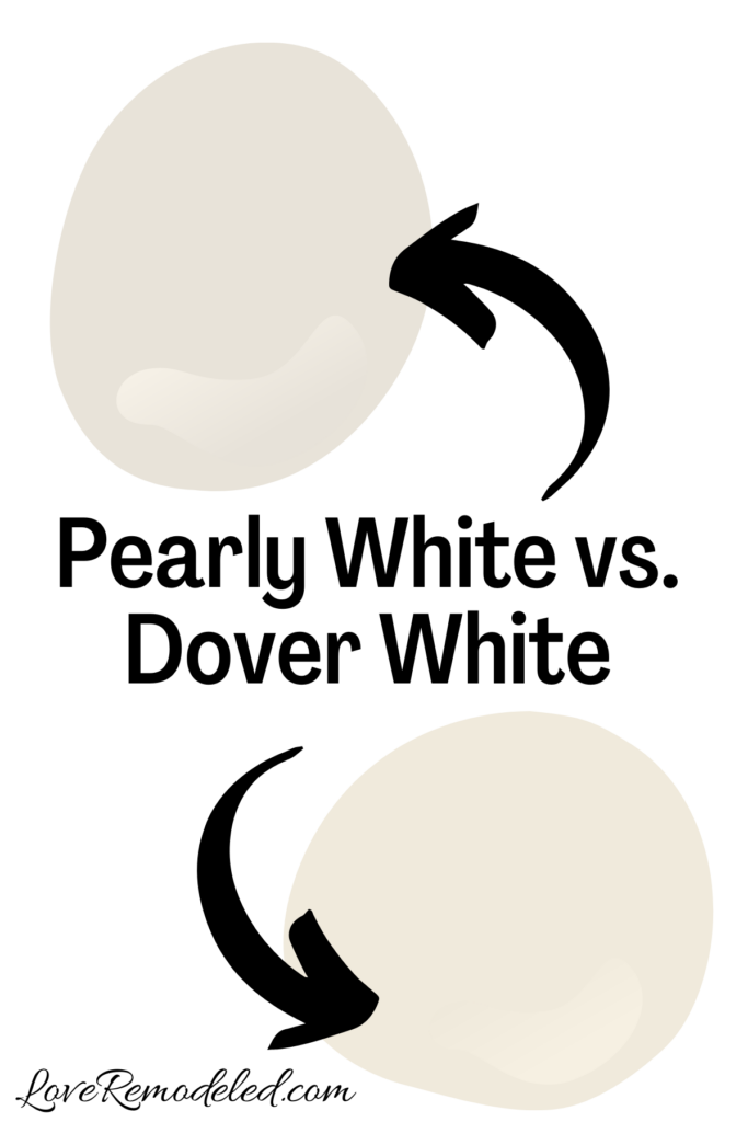
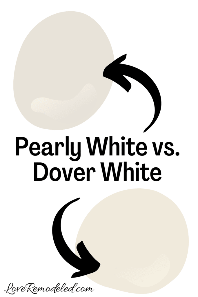
Dover White is a warm white paint color by Sherwin Williams. It is much warmer than Pearly White.
Dover White has yellow undertones that make it a very creamy white.
When you compare the two, Pearly White looks like a gray shade, while Dover White looks like a cream color.
If you have a lot of warm, southern-facing sun, Dover White may really take on that yellow undertone. This would mean that Pearly White might be the better choice between the two.
Conversely, in a northern-facing room, Pearly White may be too muted, making Dover White the better choice.
Pearly White vs. Eider White
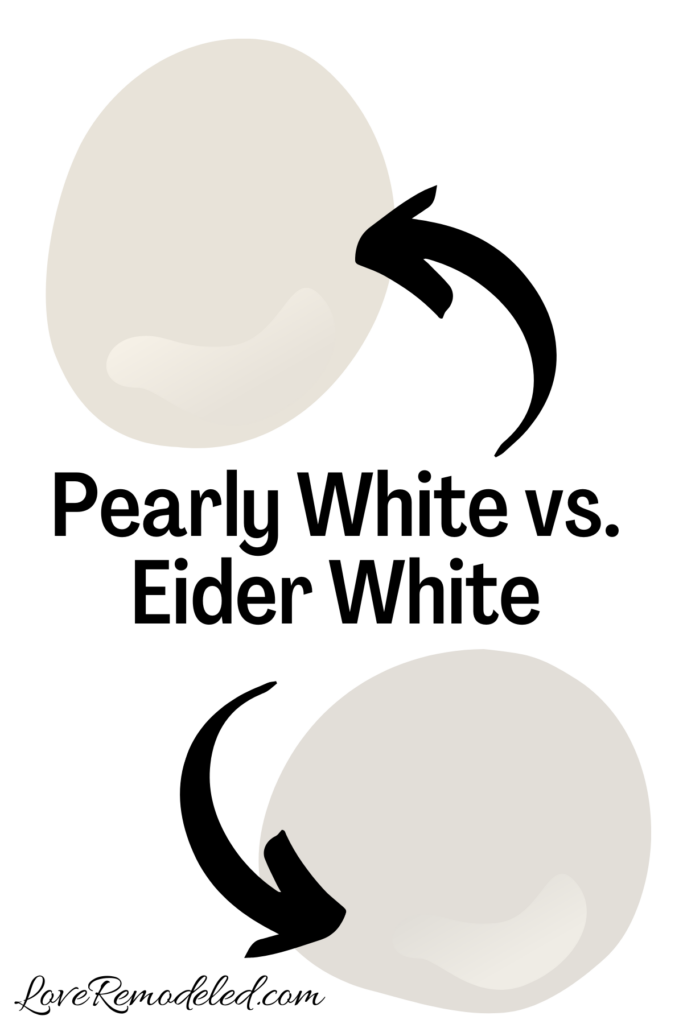

Eider White is a light greige paint color by Sherwin Williams. It has pink/purple undertones in it, making it a warm white, but warm in a different way than Pearly White.
Eider White looks a bit more like a true gray when you compare it to Pearly White. This is because the beige comes out in Pearly White and diminishes the beige look in Eider White.
Really, Eider White and Pearly White have a lot of similarities, but they are certainly not interchangeable. One may be great in a space while the other would be a completely bad choice.
If you have those red tones in flooring or furniture in your home, Eider White is going to be the better choice. The purple undertone in Eider White makes it great for pairing with red-toned wood.
If not, I would say that Pearly White is a bit more usable. The purple in Eider White can be pretty apparent, depending on the lighting and surrounding elements, while the green in Pearly White is fairly subtle.
Wondering How To Pick the Perfect Paint Color?
I have the best solution for you!
Samplize sells peel and stick paint samples in almost every paint color.
These no-mess, peel and stick sheets are made from real paint, so they will show you exactly what the paint color will look like.
Simply place them on your walls next to your trim, furnishings or fixed elements, and easily see which paint color works best in your space and with your lighting.
Then, peel the sheet off your wall and reapply it somewhere else if you like. You can try several different paint colors with no mess, no fuss and no cleaning paint brushes.


Oh, and you can have them in your home by tomorrow with OVERNIGHT shipping!
As a bonus, be sure to use the code LoveRemodeled10 at check out to get an extra 10% off! Samplize sheets are cheaper than a sample can of paint, and way less work.
They are the easiest (and fastest!) way to try a paint color in your home, with no hassle.
Final Thoughts on Sherwin Williams Pearly White
Pearly White is a popular gray paint color with green and beige undertones. It is great in a space with yellow or honey colored wood, and works well in most rooms of the house due to how light it is.
If you are looking for a soft off-white that isn’t too warm or too yellow, Pearly White is a great option to consider.
Have a question? Leave me a comment! Remember to check back for a response – it may take me up to a week or two depending on how busy I am, but I’ll try my best to get back to you!
Want to show off your project? Join the discussion in Love Remodeled’s Facebook group!
Want to see all your paint options in one convenient place? Click here to get everything you need to start painting, including Sherwin Williams and Benjamin Moore paint color decks!


Diane Gordon
Friday 14th of March 2025
What are your thoughts on using Pearly White as a wall color and paint trim and doors with Jogging Path?
Lauren
Saturday 28th of June 2025
Hi Diane! This combo works. I love the bold choice of going with Jogging Path trim and doors!
Vanessa
Wednesday 21st of February 2024
Hi there! I wish I could find this helpful post BEFORE pairing my old golden oak cabinets. We got many paint samples and I think we chose the worst color :( I’m so unhappy with the results. My kitchen now looks boring and blue while the rest of the house is on the creamy warm tones. We went with Pearly White for the kitchen cabinets, and a quartz countertops that have almost the same color as the paint this room is also north facing….. and the tiles are yellowish/orangish. We recently paint the walls in Behr Swiss Coffee (similar to sw alabaster). But now I think it’s going to be a bit more easy/cost effective to repaint the kitchen walls in a different color to make the ugly pearly white tone down/warm up. Besides the two colors that we recommends, which other warm greige tones do you think could help to fix this kitchen? Hope I can send you pics. Looking forward to getting your expert feedback. Thanks in advance
Lauren
Tuesday 12th of March 2024
Hey Vanessa! I'd love if you would post this question in my Facebook group so I can see pictures! Join it here and we'll talk! You could try a color like Jogging Path on the walls, but I'm not sure if that color goes with the tiles and quartz countertop. Hope to see you in the group!