
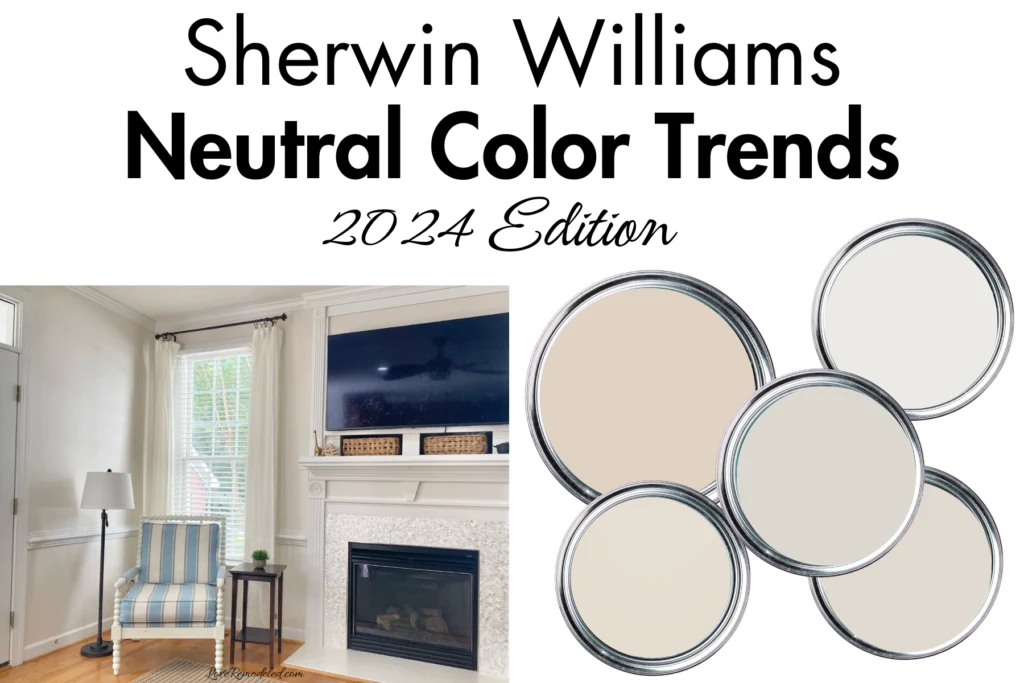
Neutrals are always in style, but which neural paint colors are hot for 2024?
The answer is warm neutrals. Cool neutrals, such as icy grays or chilly whites, are taking a backseat to shades like taupes and beiges.
If you are looking for which neutral colors are on trend for 2024, I have all the best ones right here.
Sherwin Williams Warm Neutrals

Right now, the top trending warm neutrals have a variety of different undertones. These undertones can really change how a paint color looks. So, to help you decide which warm neutral is best for you, let me give you a little bit of an explanation on them.
Warm neutrals can get their warmth from either a pink and purple undertone, a yellow or orange undertone, or a green undertone.
A pink/purple undertones tends to give off a soft, romantic sort of vibe. It goes well with red toned woods and other warm accents.
A yellow undertones feels more creamy and traditional. It works well in spaces that have various different kinds of wood tones, and in spaces with blues, greens, yellows, and other neutral colors.
A green undertone feels a little more earthy. Green undertones tend to be more present in beige paint colors, and they are great to use in rooms with a lot of earth tones.
Hopefully, this explanation of the different undertones in paint colors will help you narrow down which paint colors would be best in your space.
Sherwin Williams City Loft
City Loft, SW 7631, is a warm off-white paint color. It doesn’t have enough color in it to be considered a gray or a beige (or a greige), which is why I call it an off-white.
It looks neutrals and pleasant on walls, but it definitely has an undertone to consider.
Specifically, City Loft has red and beige undertones. The red in City Loft can come across looking pinkish at times, depending on your lighting.
You’ll see it more with warm lighting, such as really warm toned light bulbs or in rooms with southern facing windows.
The beige in City Loft gives it a greige look, making it a blend of gray and beige. If you just glanced at a wall in City Loft, you’d likely say, “Oh, that’s gray.” But, with deeper inspection, you will definitely find that beige and warm reddish undertone.

If you’re interested in Sherwin Williams City Loft, you can click on the link to find out what colors to with it, where it works best, and more.
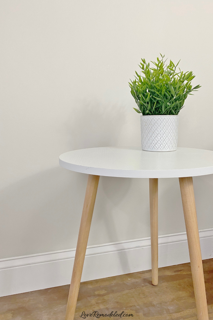
Sherwin Williams Snowbound
Sherwin Williams Snowbound is another warm neutral paint color. It is lighter than City Loft, with a bit less color in it.
Snowbound is a blend of gray and beige, with pink/purple undertones. The pink/purple undertones give it a soft and luxurious feeling.
If the pink/purple undertones in Snowbound make you nervous, remember that these can be pulled out more by the lighting in the space and the other tones that are around.
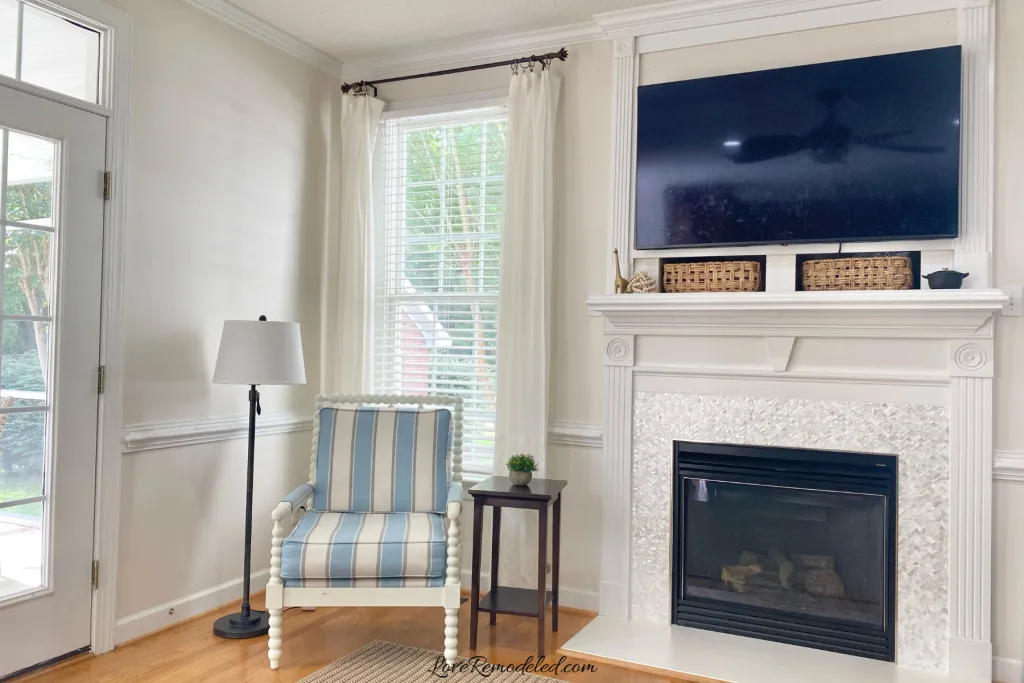
For example, look at this photo of Snowbound in a room.


You can see how the pink in Snowbound comes out above the door, but the light coming in from the window on the right give it more of a beige look in that space.
White City Loft tends to be reserved for walls, Snowbound can be used on trim, woodwork or walls.
If you are interested in Sherwin Williams Snowbound, you can click on the link to learn more about it.
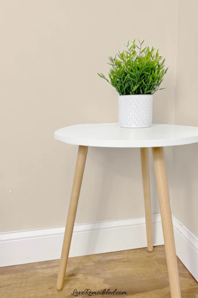
Sherwin Williams Natural Linen
Sherwin Williams Natural Linen is a great choice for someone who wants a beige paint color that is in style in 2024. Beiges can be tricky, and if you pick one with too much orange or pink in it, it will look outdated.
Natural Linen is great because it is modern and updated. It doesn’t give off those early 2000’s beige vibes that we want to avoid.
What makes Natural Linen feel updated is that along with its beige tone, it also has a bit of gray in it. The gray helps to tone down the beige. But, there isn’t so much gray in it that it transitions into a greige paint color.
Like many beiges, Natural Linen has an orange undertone, but sometimes it can also look a bit pinkish.
Overall, is you are looking for a beige, Natural Linen is a good one to try.

Click here if you want to learn more about Sherwin Williams Natural Linen.
Sherwin Williams Drift of Mist
Sherwin Williams Drift of Mist is a neutral paint color that is bit cooler than the other warm neutrals on this list.
Drift of Mist is a light, off-white shade. It falls most easily into the gray category, but it also has a bit of beige in it.
Even though Drift of Mist is a blend of beige and gray, it has a lot less beige than a lot of the others. Additionally, Drift of Mist has a green undertone that also contributes to its coolness.
But, when you compare Drift of Mist to cool paint colors, it is definitely warmer than they are. So, while Drift of Mist isn’t a true warm paint color, it is a good choice for someone who wants an updated neutral for 2024 but isn’t interested in a pink, purple, orange or yellow undertone.
Drift of Mist is best used as a wall paint color, and is a good paint color to use if you have very warm southern light and don’t want to end up with too much warmth (and by this I mean pink/purple, orange or yellow) coming through in the paint color.
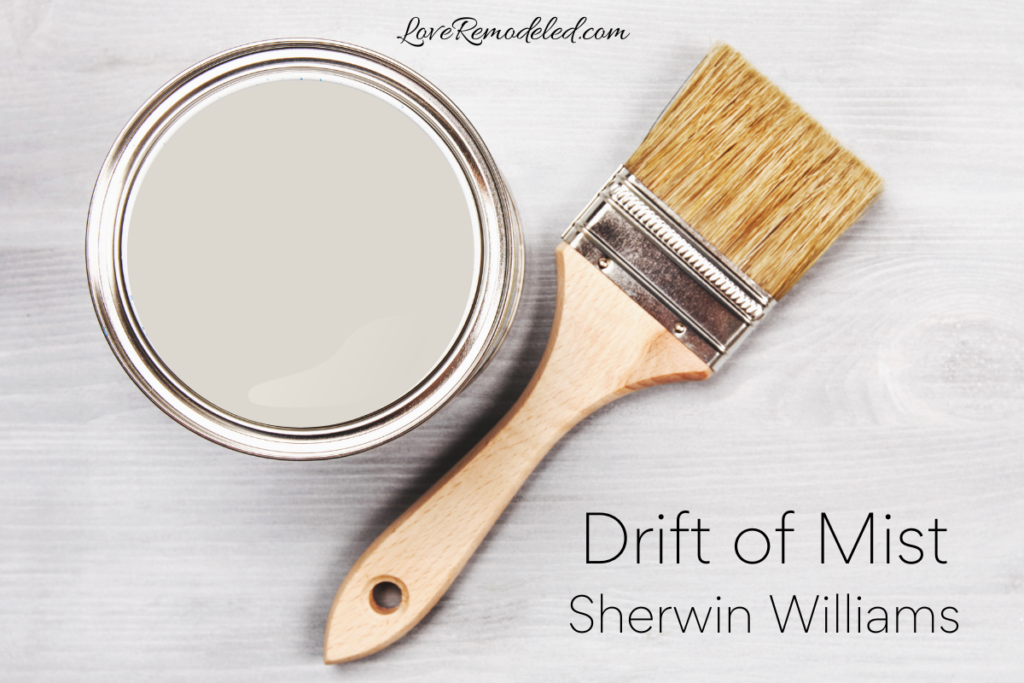

If you want to learn more about Sherwin Williams Drift of Mist, click here for all the details.
Sherwin Williams Shoji White
Sherwin Williams Shoji White is a creamy, off-white paint shade. It blends gray and beige, with a bit more beige in the mix.
Shoji White has a hint of a green undertone. But, truth be told, you can also see some pink in Shoji White at times.
Really, Shoji White comes off as very neutral. Its not too pink, too green, too beige or too gray.
Shoji White is popular because of its ease of use and flexibility. It goes well with a lot of other shades.

For more information on Sherwin Williams Shoji White, click the link.
Which 2024 Neutral Color is Right for You?
Choosing which neutral paint color is right for you is going to depend on a few things.
First, you should consider the other tones in your space. If you tend to lean towards blues or greens, shades like Drift of Mist or Shoji White may be right for you. If you prefer earthy tones, Natural Linen may be a good choice. Or, if you have a lot of pink and purples tones, a color like City Loft or Snowbound is the better pick.
Second, think about the main light sources in your room. If your space has a lot of windows that face the south, you’re going to get a lot of warm light in the room. This means that the warm tones in the paint will be more prevalent. In this case, choosing a neutral with a little less warmth may work in your favor. But, if you have a lot of north facing windows, the light will be cooler and your room will be more likely to handle a warm paint shade.
Third, remember that your preferences are important. If you really can’t stand the thought of your paint color looking yellow (or pink or orange), avoid paint colors with those undertones.
Overall, there are so many gorgeous Sherwin Williams neutrals. If you are still on the hunt after reading this list, check out this list of the most popular paint colors for 2025. It may help you find another shade not mentioned on this list that you absolutely love.
One more thought before you go. Sherwin Williams actually didn’t select a neutral for their Color of the Year in 2024. Want to see what they picked? Check out Sherwin Williams 2024 Color the Year here.
And for 2025, Sherwin Williams went a whole different direction by choosing a paint palette of colors. If you are interested in seeing what colors the are predicting will be trending this year, check out this article on all of the 2025 Colors of the Year.
Good luck and happy painting!
Wondering How To Pick the Perfect Paint Color?
I have the best solution for you!
Samplize sells peel and stick paint samples in almost every paint color.
These no-mess, peel and stick sheets are made from real paint, so they will show you exactly what the paint color will look like.
Simply place them on your walls next to your trim, furnishings or fixed elements, and easily see which paint color works best in your space and with your lighting.
Then, peel the sheet off your wall and reapply it somewhere else if you like. You can try several different paint colors with no mess, no fuss and no cleaning paint brushes.


Oh, and you can have them in your home by tomorrow with OVERNIGHT shipping!
As a bonus, be sure to use the code LoveRemodeled10 at check out to get an extra 10% off! Samplize sheets are cheaper than a sample can of paint, and way less work.
They are the easiest (and fastest!) way to try a paint color in your home, with no hassle.

