If you’re trying to pick a paint color for 2024, checking out Sherwin Williams top 20 paint colors is a great place to start.
Each year, paint companies predict what paint colors will be trending for the year. The choices are inspirational and aspirational, but are not necessarily a reflection of what people are actually painting their homes.
This year, Sherwin Williams chose Upward, a light blue paint color. But just because this shade was selected as Sherwin Williams 2024 Color of the Year doesn’t mean it is the most popular.
In reality, the most popular paint colors for 2024 are neutrals – grays, beiges, greiges, whites and creams. These are the colors that homeowners are selecting most often.
And, choosing a popular paint color means that you’re picking one that tends to work well in a lot of different homes, with varied lighting, and many different decor styles.
These are the colors actually being used in homes all across the United States.
Here are the top 20 Sherwin Williams paint colors for 2024, including a brief description of them.
I also go way more in depth about them in individual blog posts, so if you want to learn more about any of the paint colors, be sure to click on the links provided.
This post may contain affiliate links. If you have any questions, please see my disclaimer page.
Pure White SW 7005
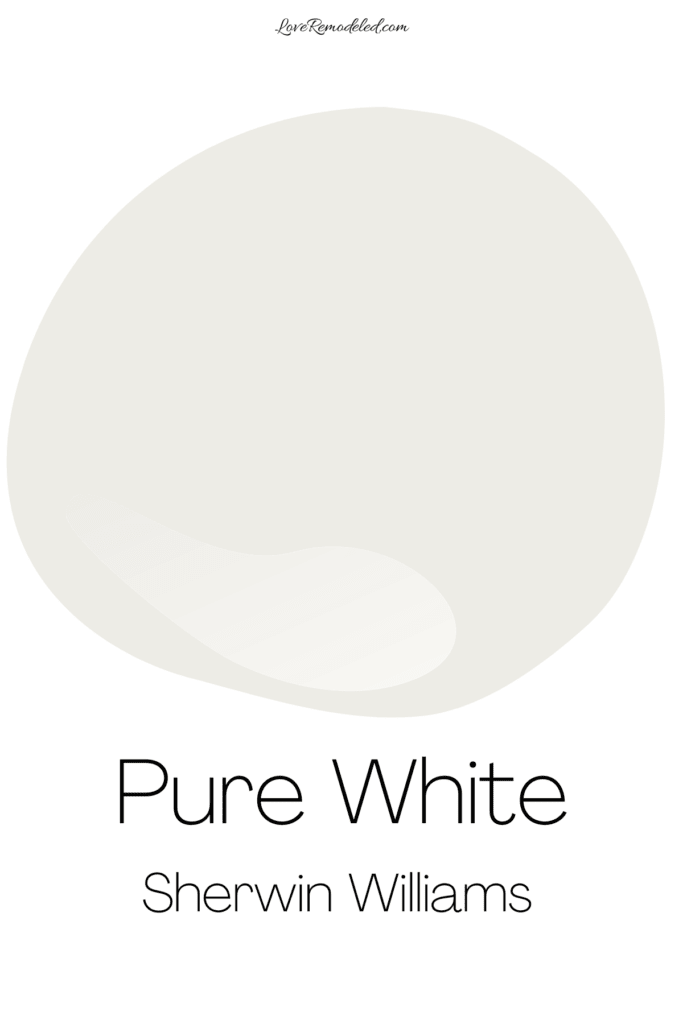
Sherwin Williams Pure White is a nearly perfect white. It isn’t too stark or too creamy, but tends to look a little more muted than some of the crisper whites.
This is because Pure White has a hint of gray and yellow in it. It will never look gray or yellow, but these undertones lend some softness.
It is Sherwin Williams’ most popular paint color in 2024 because people love it on trim and on walls.
Learn more about Pure White SW 7005.
Agreeable Gray SW 7029

Agreeable Gray is one of Sherwin Williams most popular paint colors and has been for years. For over 10 years now, if you ask any painter what color they use the most, they will tell you that it is Agreeable Gray.
Agreeable Gray is actually a greige paint color that blends gray and beige. It is subtle and pleasant, without too much in the way of offensive undertones. Technically speaking, Agreeable Gray does have a green undertone that gives it a big of an earthy look, but you won’t see the green on your walls.
Agreeable Gray can be used all over the house as it is a great neutral that isn’t too dark or too light.
If you want a nearly perfect neutral that goes with everything, Agreeable Gray is it.
Learn more about Agreeable Gray SW 7029.
Snowbound SW 7004
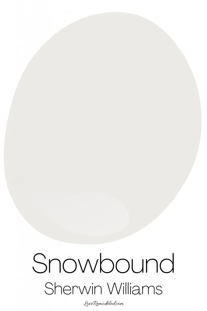
Sherwin Williams Snowbound is a soft, warm white paint color. It isn’t a pure white though. It has gray and pink/purple undertones.
These give Snowbound an understated warmth that feels cozy without being overbearing.
While some like Snowbound on trim or cabinets, my favorite place for Snowbound is on walls paired with light to medium wood accents.
Snowbound is a little more fickle in spaces because it can look pink or purple at times, but since people are loving the taupe trend, this doesn’t seem to be slowing its popularity in 2024.
Learn more about Snowbound SW 7004.
Alabaster SW 7008
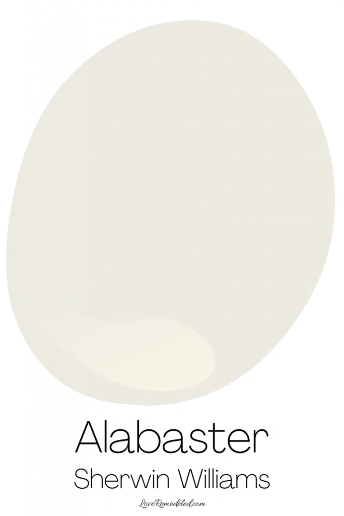
Sherwin Williams Alabaster is a gorgeous soft white paint color. It has faint yellow and gray undertones that come together to make a nearly perfect warm white.
Alabaster has enough warmth to not feel stark, but not too much yellow that it looks super sunny. It is subtle and understated.
A lot of people like Alabaster on their trim because it is a softer white. I love Alabaster on walls too.
Alabaster is timelessly popular. It is always gorgeous, soft, and subtle, which is why it is so popular in 2024.
Learn more about Alabaster SW 7008.
Repose Gray SW 7015
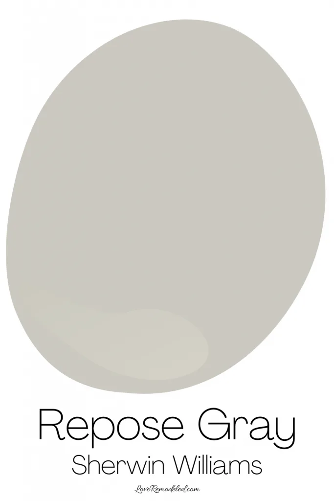
Repose Gray is a Sherwin Williams greige paint color. It is a blend of gray and beige. This means that it is a warm paint color, but it isn’t the warmest greige you can get.
This is because Repose Gray has blue undertones. So, Respose Gray still falls in the warm category of paint colors, but if you think of warmth as a spectrum, its definitely lower on the warmth spectrum than other greiges, such as Agreeable Gray.
Repose Gray is a great if you want a warm neutral, and have cool colors in your space, such as blues, steely metals, or crisp whites.
Learn more about Repose Gray SW 7015.
City Loft SW 7631
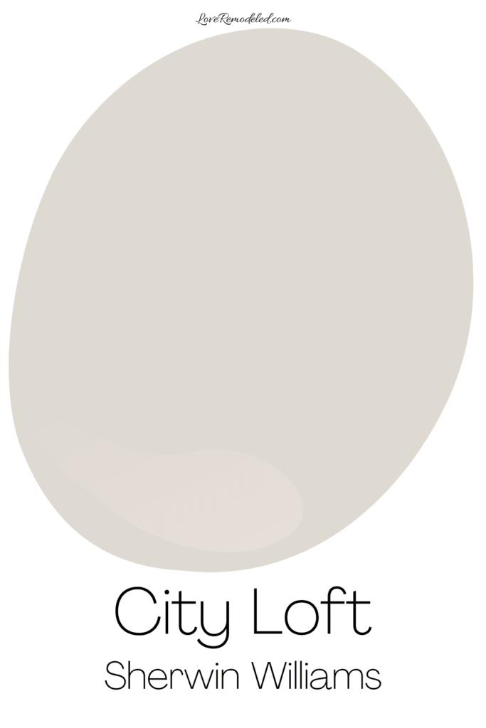
Sherwin Williams City Loft is a warm off-white paint colors that is sort of like a very light taupe shade.
City Loft is a blend of beige and gray, and has warm pink/purple undertones. City Loft is popular right now because people are loving taupe shades at the moment. But, fair warning… those pink undertones definitely come through from time to time.
City Loft pairs really nicely with warm whites with similar undertones, and other warm shades. It is a great color to pair with wood with reddish undertones.
Learn more about City Loft SW 7631.
Dover White SW 6385
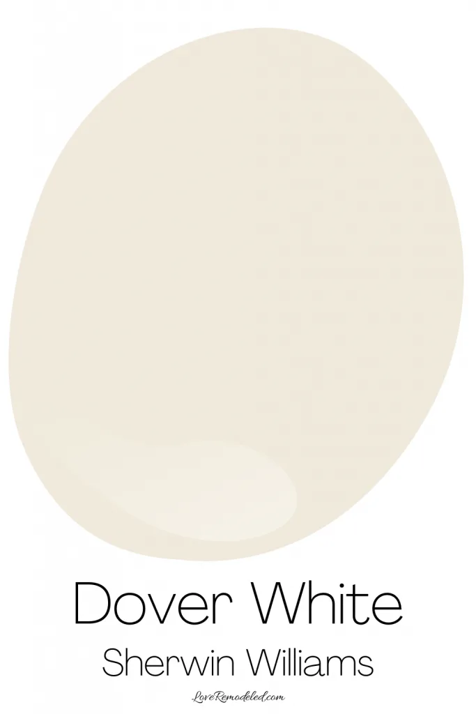
Dover White is a creamy, white paint color with yellow and gray undertones. The undertones in Dover White are a bit more pronounced than in Alabaster or Greek Villa, and it feels a little warmer than they do.
Sherwin Williams Dover White might be a good paint color for walls, but I wouldn’t use it on trim because it has a bit too much color for my taste. Also, if you want the all white look in your home, this isn’t the right warm white to use.
But if you want a white that approaches a cream paint color, Dover White is a good pick.
Learn more about Dover White SW 6385.
Accessible Beige SW 7036
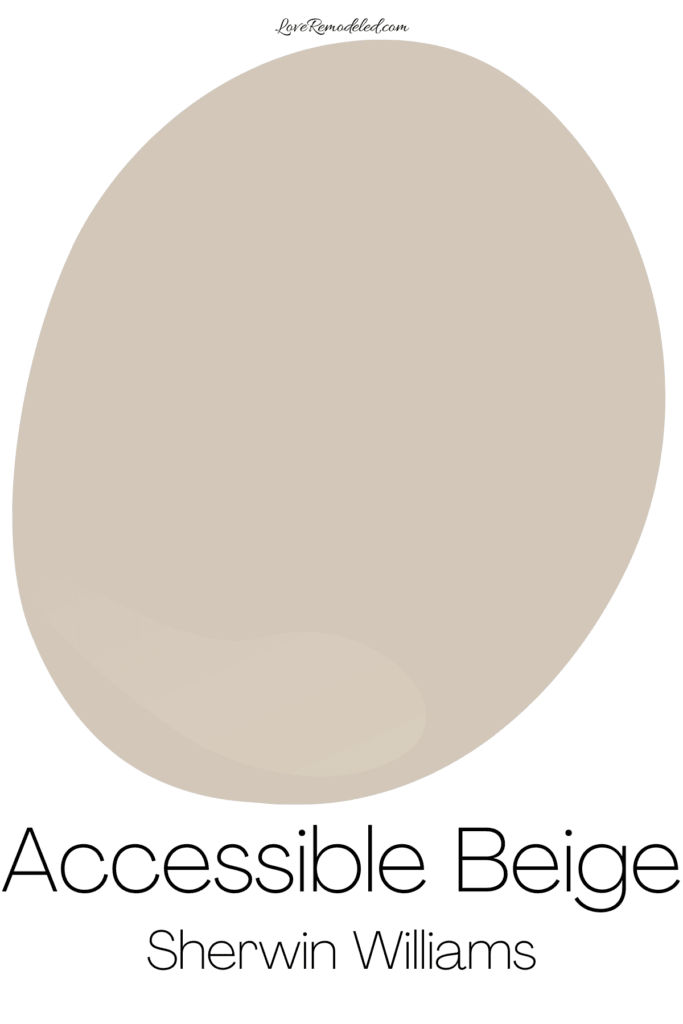
Accessible Beige is a long time favorite for many at Sherwin Williams. It is technically a greige paint color that favors beige. It has a bit of gray in it that helps to tone down the beige-ness of it, but is still maintains its beige look.
Accessible Beige is a modern sort of beige color. It doesn’t have that orange or pink look that many beiges have.
If you are looking for a beige to tie in some lingering early 2000s finishes in your home, or you want to transition away from the cool neutral grays that were so popular in the 2010s and still want a neutral, Accessible Beige is a great option.
Learn more about Accessible Beige SW 7036.
Greek Villa SW 7551
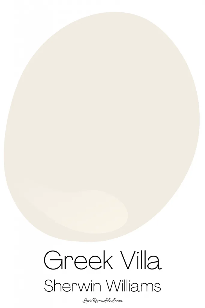
Sherwin Williams Greek Villa is a creamy white paint color. It is warm and lovely without being overly yellow.
Without any other brighter whites in the space, Greek Villa will look like a clean white. But when paired with crisper whites, you will see the yellow undertone in Greek Villa.
Greek Villa is a great paint color for someone who wants a warm white. It also works well on home exteriors for a creamy, white look.
Learn more about Greek Villa SW 7551.
Drift of Mist SW 9166
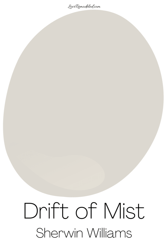
Drift of Mist is a neutral paint color that leans gray. It has a blend of gray and beige with a green undertone.
It tends to a shade that can look more warm or cool depending on what is around it. Additionally, Drift of Mist can be hard to pair with other grays, but looks great with creams or whites.
Learn more about Drift of Mist SW 9166.
Eider White SW 7014
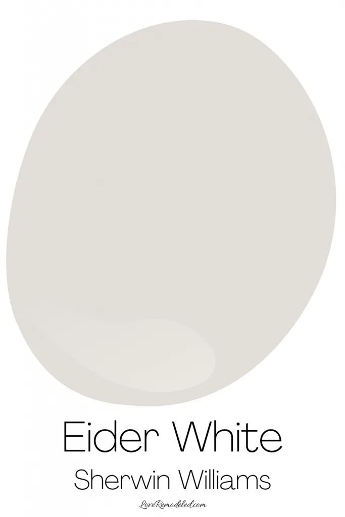
Eider White is an off-white paint color in the taupe family. It heavily favors gray, but also has some beige in it. As for undertones, Eider White has purple undertones that can make themselves known at times.
I wouldn’t pair Eider White with earthy tones, such as greens, oranges or browns, but it is a great paint color for homes with pink, purple, and even some blue accents.
Remember, this doesn’t mean that you need to have lots of pink in your space. I’m talking about undertones here. So, you can white marble with pink or purple undertones that will go perfectly with Eider White, even if your home has no pink pillows or purple curtains.
Learn more about Eider White SW 7014.
First Star SW 7646
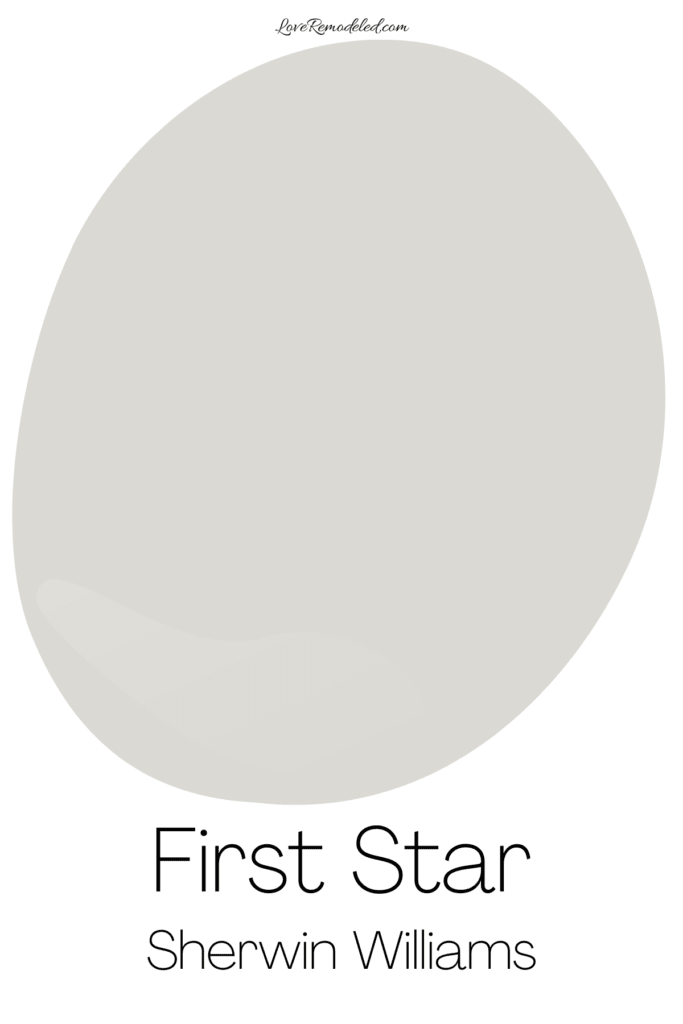
Sherwin Williams First Star is a cool, delicate gray. It is very light, off-white paint color.
First Star has blue undertones, making it feel more chilly than the greige paint colors on this list. But, it isn’t too cold feeling, and is a nice neutral for someone who wants a cool paint color.
Learn more about First Star SW 7646.
Worldly Gray SW 7043
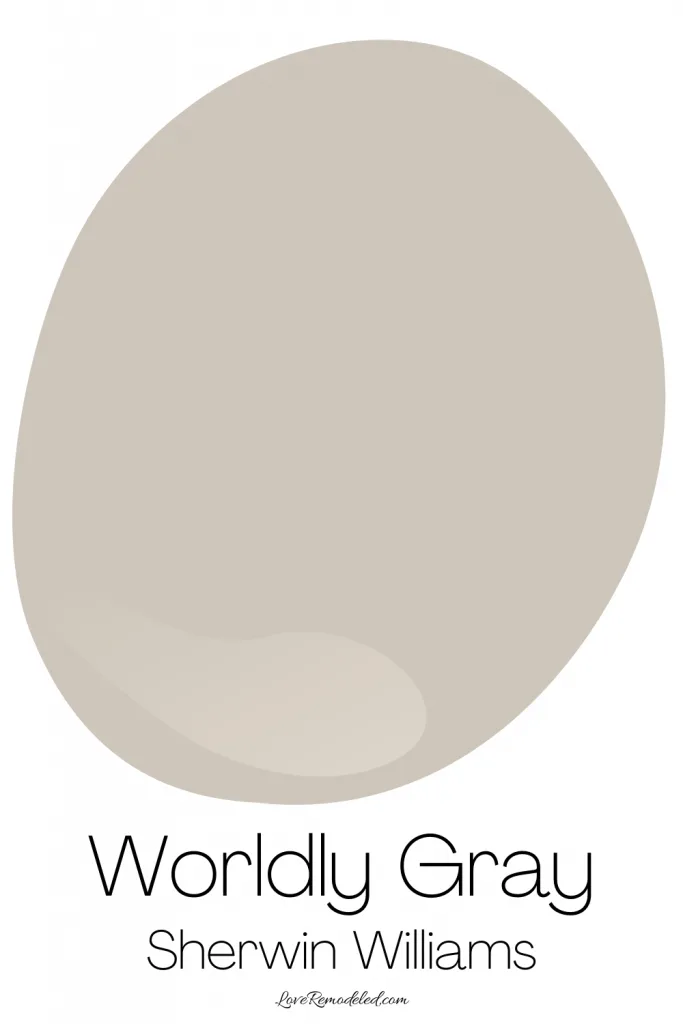
Sherwin Williams Worldly Gray is a greige paint color that leans more beige than gray. It has green undertones, but this tricky paint color can also show a bit of purple at times.
Worldly Gray is a shade that will probably be increasing in popularity at the moment because it has those warm beige tones that people are looking to dip their toes into, but not too much that it just looks beige.
The general population tends to still be a little afraid of embracing the beige trend that we’re seeing on design sites, but choosing a greige shade that leans beige is a good way to ease the transition.
Worldly Gray is a color, not just an off-white. It isn’t dark, but will definitely show up on your walls.
Learn more about Worldly Gray SW 7043.
Crushed Ice SW 7647
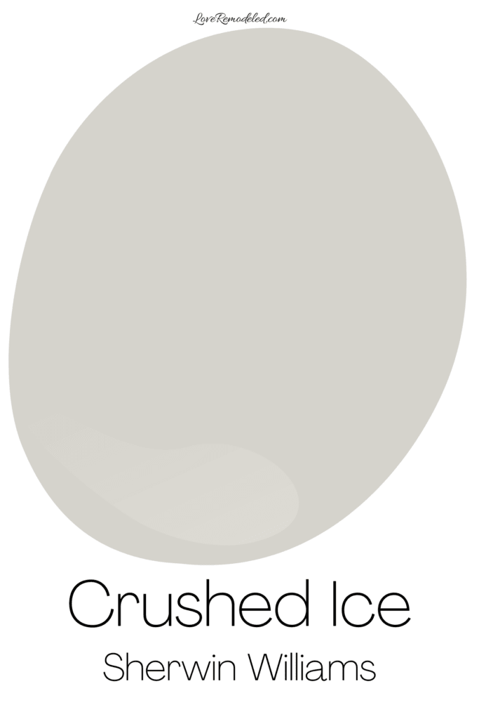
Crushed Ice is an off-white paint color that leans gray but has a bit of beige in it. It isn’t a cool gray, but it doesn’t exactly look like a warm gray either. It sort of shifts back and forth depending on the lighting.
Crushed Ice is part of the Sherwin Williams Whites and Off-Whites collection, so this means its a pretty light paint color.
Shoji White SW 7042
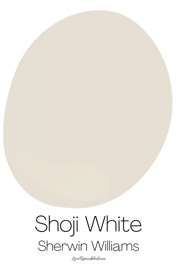
Sherwin Williams Shoji White is a warm, off-white paint color. It has more color to it than some of the other whites on this list like Alabaster or Greek Villa.
On your walls, Shoji White will stand out against white trim and look creamy and warm. It has a beige base with a good bit of gray in it, and even a hint of pink undertones.
The pink undertones are terribly noticeable, but if Shoji White is going to lean one way or another, you may see a tinge of pink in some circumstances.
Learn more about Shoji White SW 7042.
Ceiling Bright White SW 7007
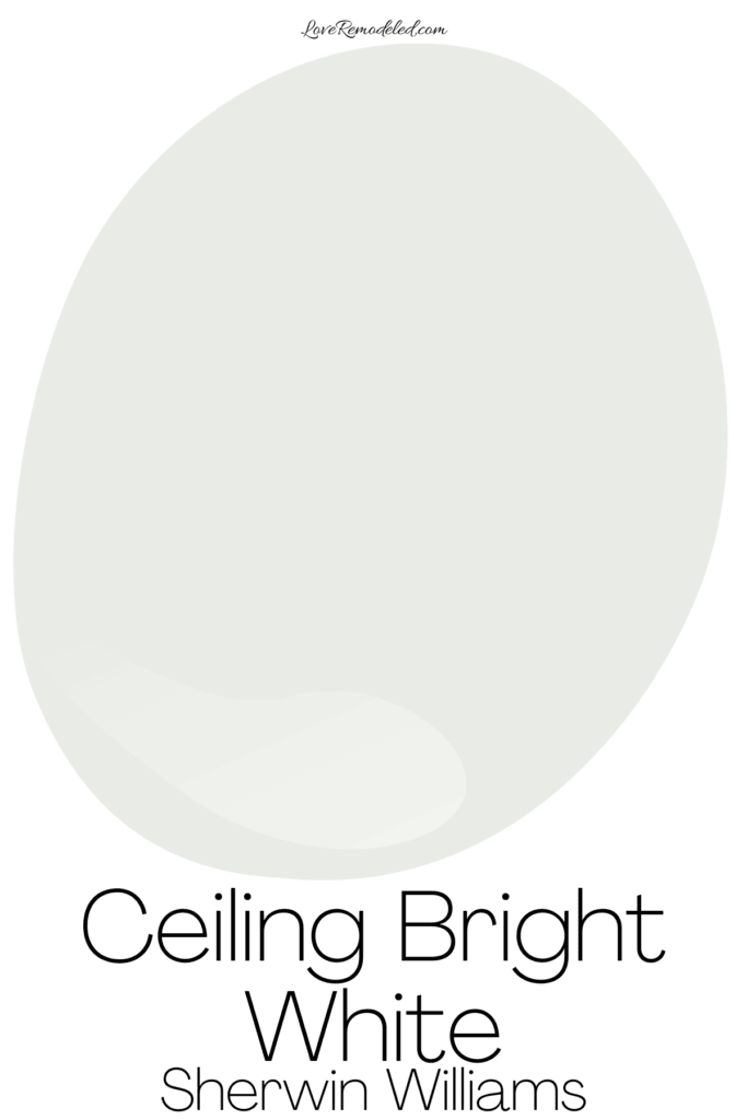
Ceiling Bright White is a paint color that is very commonly used on ceilings – no surprise there! But, Sherwin Williams Ceiling Bright White can also be used on walls or trim.
Ceiling Bright White is a very cool white paint color with blue undertones. It is crisp and clean looking. I wouldn’t use Ceiling Bright White with other warm whites, because those blue undertones may peek through, but it is great with other cool shades.
Shell White SW 8917

Shell White is a light, off-white paint color that has a peach undertone. This peach undertone makes it a little less usable than other white paint colors.
A peach undertone can be a little much for some people, but it works nicely if you have a lot of other warm tones in the space with similar tones or undertones. Also, the peach in Shell White isn’t hugely pronounced, but be aware that it is there, and you may see it when Shell White is next to other more true whites, or whites with different undertones.
So, if you’re just choosing a white paint color off this list without sampling them, I wouldn’t recommend picking Shell White.
Gossamer Veil SW 9165
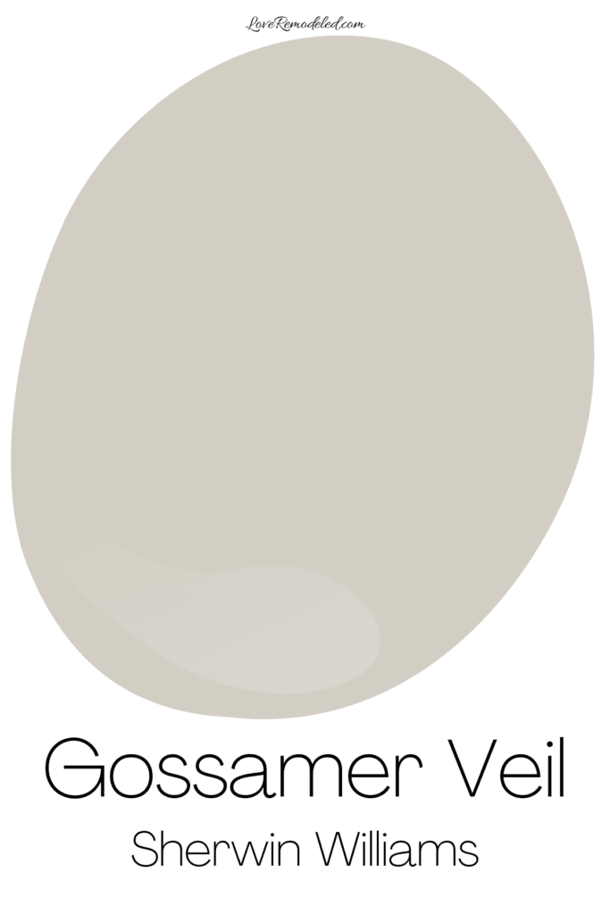
Gossamer Veil is greige paint color that has a bit of depth to it. It isn’t as light as the colors that I call “off-whites”, and will look like a color on your walls instead of just a whitish shade.
Gossamer Veil is a misty shade that straddles the line between gray and beige. It leans gray, but you can definitely see the beige if you put it next to a true gray.
Gossamer Veil may be a great choice for someone who wants a bit of neutral color on their walls, but doesn’t want their walls to be dark at all.
Aesthetic White SW 7035
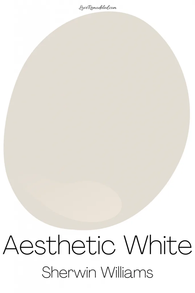
Sherwin Williams Aesthetic White is a soft and subtle greige paint color. It is a blend of gray and beige, with just a hint of purple undertones.
Aesthetic White is a neutral shade that can look gray or beige depending on the lighting. In northern or dimmer lighting, you’ll see more gray, but with warm southern lighting, you’ll pick up more of the beige.
Aesthetic White is a nice paint color for someone who wants a really light greige. It reminds me a bit of Agreeable Gray, but is a good bit lighter.
Learn more about Aesthetic White SW 7035.
Origami White SW 7636
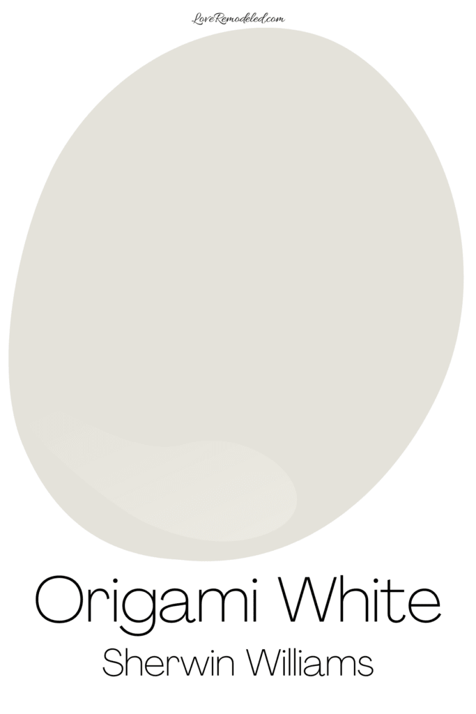
Origami White is a white paint color that is part of Sherwin Williams Whites and Off-Whites Collection. It is a blend of gray and beige, with a little more gray than beige.
It is very light though, and won’t show up too much on your walls.
Learn more about Origami White SW 7636.
Wondering How To Pick the Perfect Paint Color?
I have the best solution for you!
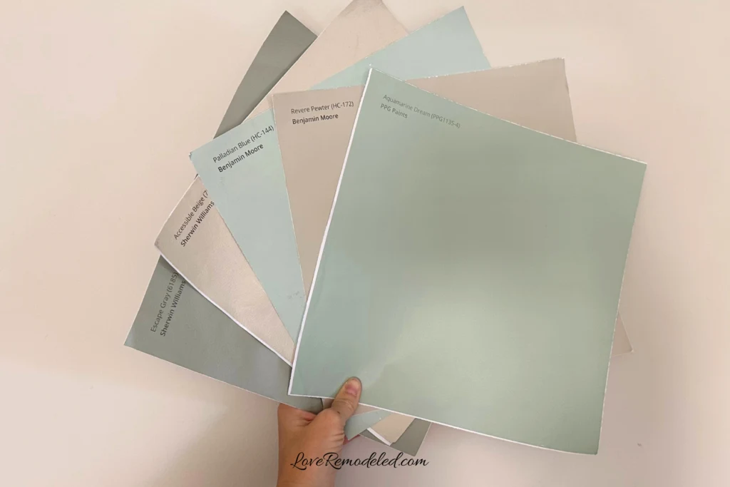
Samplize sells peel and stick paint samples in almost every paint color.
These no-mess, peel and stick sheets are made from real paint, so they will show you exactly what the paint color will look like.
Simply place them on your walls next to your trim, furnishings or fixed elements, and easily see which paint color works best in your space and with your lighting.
Then, peel the sheet off your wall and reapply it somewhere else if you like. You can try several different paint colors with no mess, no fuss and no cleaning paint brushes.
Oh, and you can have them in your home by tomorrow with OVERNIGHT shipping!
As a bonus, be sure to use the code LoveRemodeled10 at check out to get an extra 10% off! Samplize sheets are cheaper than a sample can of paint, and way less work.
They are the easiest (and fastest!) way to try a paint color in your home, with no hassle.
So there you have it, all of the top 20 paint colors for 2024 by Sherwin Williams.
The most popular paint colors for 2024 include grays, whites, greiges, beiges and creams.
Neutrals are classic and always in style. Plus they allow you to change the mood and look of a room just by changing out the furniture or throw pillows.
They are a great launching point for creating a well designed space, and tend to be versatile and functional.
If you’re interested in seeing Sherwin Williams 2024 Color of the Year, check out this article on Sherwin Williams Upward.
Have a question? Leave me a comment! Remember to check back for a response – it may take me up to a week or two depending on how busy I am, but I’ll be sure to get back to you!
Want to show off your project? Join the discussion in Love Remodeled’s Facebook group!

