
Calm coastal paint colors can turn your home into a relaxing retreat from the pressures of every day life.
During a recent trip to the beach, I visited the local Sherwin Williams to talk to the experts about their top selling paint colors.
The answer was unanimous.
Most beach home owners choose shades that are light blue or light green hues.
Blues and greens are seen as calming, relaxing and reminiscent of the ocean and sky.
The colors that are chosen for the interior of your beach home are meant to reflect the same colors you see when you are soaking up the sun.
They are classically beachy feeling, and impart a sense of peacefulness.
Coastal paint colors for the home are always in style.
They play on the hues of the ocean, the sky, the sun and the sand.
Paired with coastal decor, they give your home a perfectly casual and nautical feeling.
This post may contain affiliate links. If you have any questions, please see my disclaimer page.
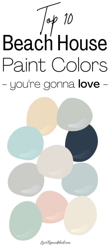
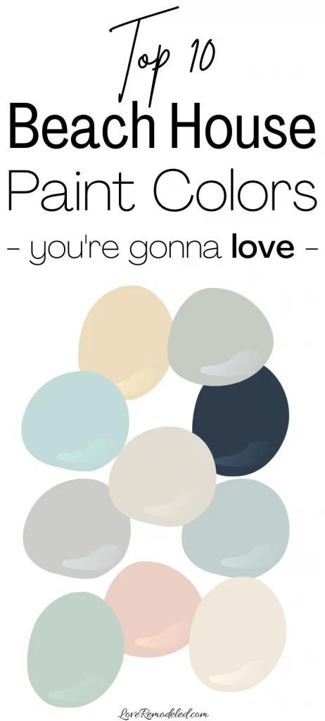
Here are my picks for the top ten coastal paint colors from Sherwin Williams.

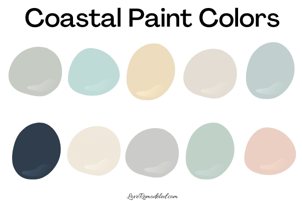
Hopefully this list will have something for everyone.
Whether you like neutrals, soft pastels, pops of color or deep navy shades, you can find a paint color on this list to bring just the right look and feel to your beach inspired home.
Tradewind

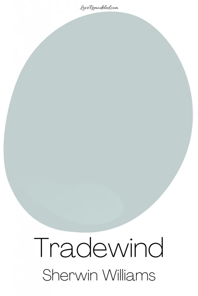
Tradewind is a designer favorite, and it is easy to see why.
Named by Coast Living Magazine as one of the best paint colors for a beach house bedroom, it has notes of blue and gray in it, with a touch of green.
This color tends toward the cool side, and is light enough to paint in any room.
As with all colors, it will look like a darker color in a small, windowless room, or may look almost like a neutral in a larger, well lit room.
It is a serene, beautiful shade that is reminiscent of the blue expanse of the ocean or of the clear sky.
Popular with both the average beach home owner and with designers, Tradewind is the number one choice to anchor your coastal design.
Click here for all the details on Sherwin Williams Tradewind.
Cottage Cream
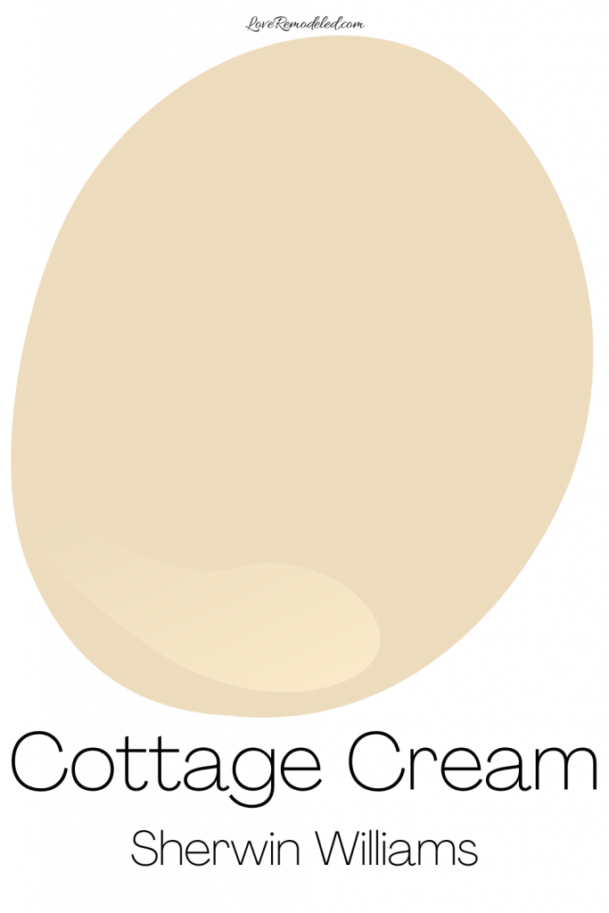

Cottage Cream is a great addition to a coastal color scheme.
What would a beach house be without a soft yellow?
This warm color is reminiscent of sunsets over the ocean and the sand beneath your feet.
This calming paint shade is subdued enough to be considered a beige, but has enough yellow in it to look like a color when it is on the wall.
Cottage Cream brings a bit of sunny brightness to this beach house color scheme without being too prominent.
Meander Blue
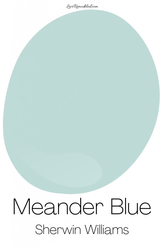

Meander Blue is a slightly brighter blue-green paint color that feels almost tropical.
While this cool beachy teal compliments the other shades in this coastal color scheme from Sherwin Williams, it would be best used in a stand alone room such as a small bathroom, or a sunny guest room.
It begs for some crisp white beadboard or white wicker furniture to accent it on the walls.
Meander Blue will give your home a sea glass inspired feel.
Passive
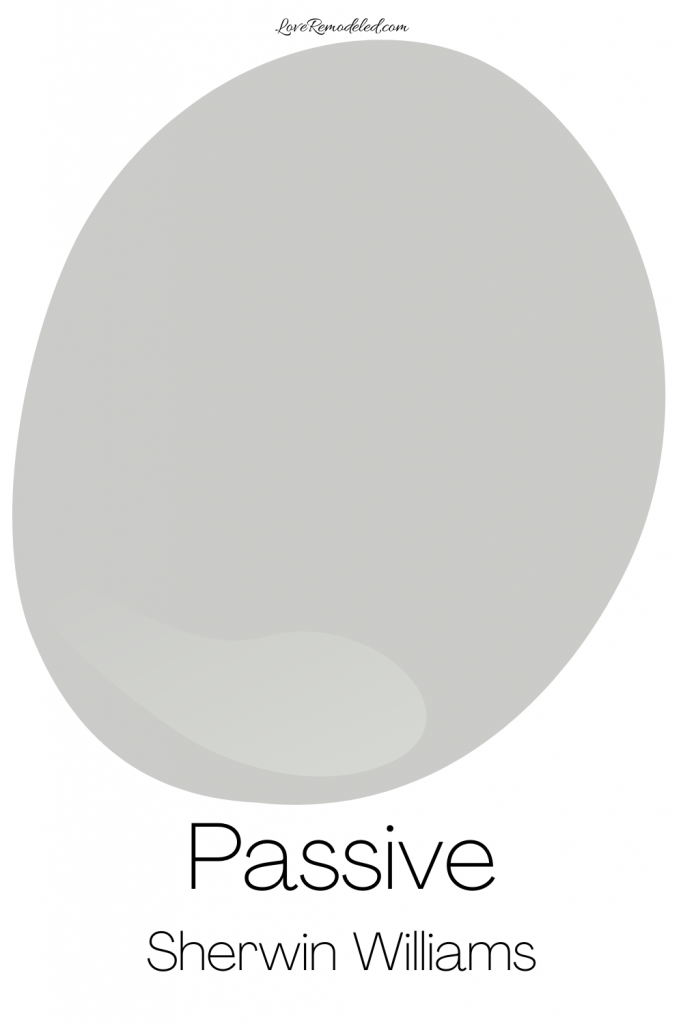
Passive is a classic gray.
It could be placed next to any color in this beach paint scheme, and blend in the home seamlessly.
It is another top pick for beach home owners, according to the local Sherwin Williams experts, because it can go with any style, and in any room. It is the color of the sky on a stormy day at the beach.
Click on this post for more information on Sherwin Williams Passive.
Waterscape

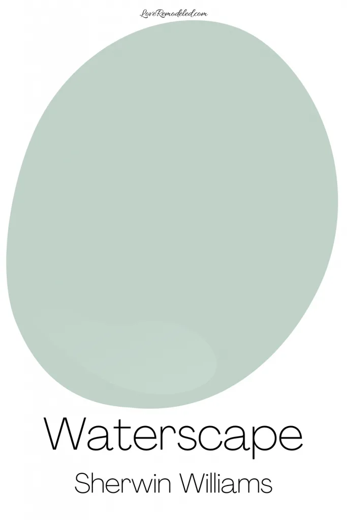
When I think of Waterscape, I think of tranquility.
As the name implies, Waterscape will remind you of the water.
It is a similar depth to Tradewind, but where Tradewind leans towards blue, Waterscape leans towards green.
Waterscape is another great choice for the main living areas of your home, for the bedrooms, or for any room where you want to hear the call of the ocean.
Naval
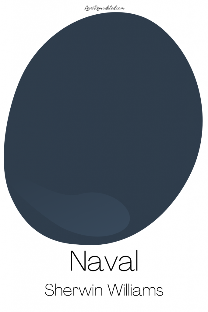

Some people like a more nautical look in their beach-inspired home.
To get this sort of look, Naval is a great choice.
Sherwin Williams Naval is a dark blue paint color.
This navy shade will give your space a deep, nautical feel.
Naval can be used in a whole room for a bold look, painted in thick stripes for an accent color, or on the top of white wainscoting.
One consideration when painting a room with a dark color like this is to make sure that you have enough natural and artificial light to support this shade.
Creamy
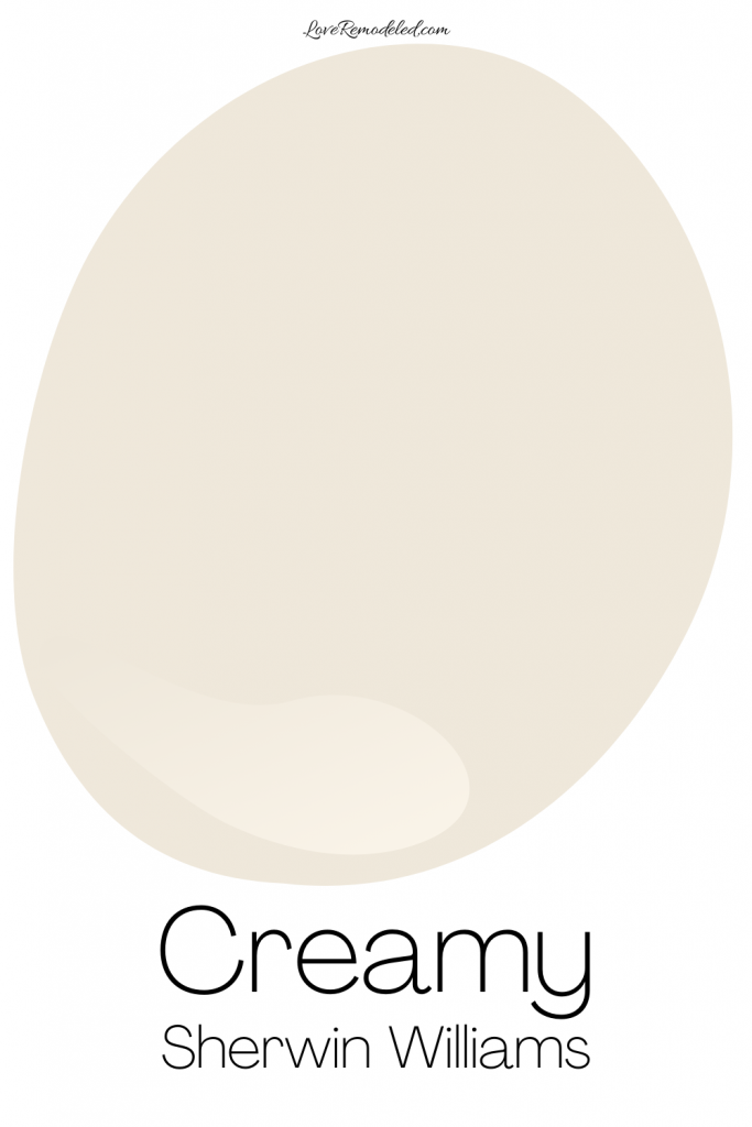
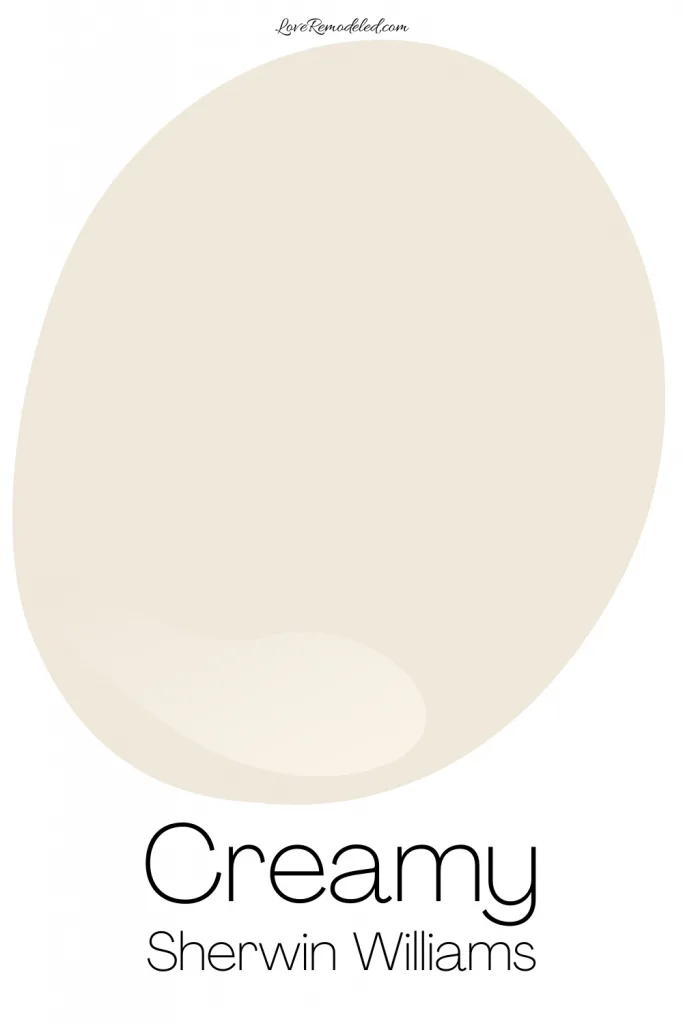
Creamy is a soft, neutral Sherwin Williams paint color.
It has a fair amount of yellow in it, which gives it a creamy sort of look. But, it doesn’t have nearly as much yellow as Cottage Cream.
This makes it a safer choice for a cream colored paint.
Creamy is light and airy, and looks like a neutral paint color on your walls, instead of like a color.
Click here for all the details on Sherwin Williams Creamy.
Romance

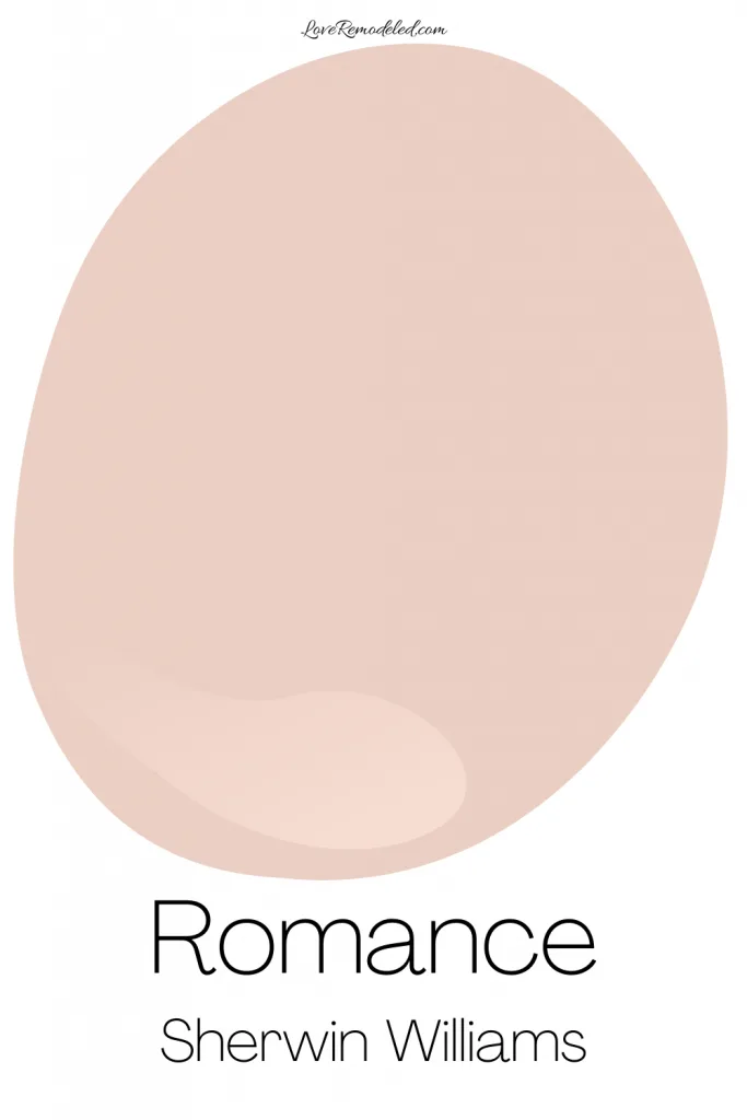
No beach house is complete without a pop of pink.
Pink can go with blue green accent colors, yellow accent colors, navy accent colors, and more.
Sherwin Williams Romance is a pink paint color that has a bit of a coral hue to it.
It is bright and fun, without being too bubblegum pink.
Romance can be sophisticated or whimsical on your walls, and is a great shade for a bedroom or bathroom.
Click here for more details on Sherwin Williams Romance.
Aesthetic White
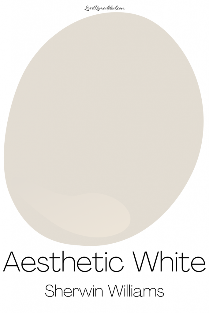

If you like a neutral paint color, but want something that has more gray in it, look no further than Aesthetic White.
Aesthetic White is a very light greige paint color.
It is also a light and airy color that serves as a neutral backdrop to whatever you put with it.
Aesthetic White can go with beach-inspired accent colors like blue greens, yellows, navys and more, so it is a perfect wall color for a coastal-inspired home.
Click here for more information about Aesthetic White.
But Sherwin Williams’ most popular calm coastal paint color…
…is Sea Salt.
Sea Salt is a soft blue green paint color that has a lot of gray in it.
While Sea Salt is a blue green paint color, it is frequently referred to as a neutral.
It has some color in it, but doesn’t look bright.
The gray in it calms it down, making it a bit understated.
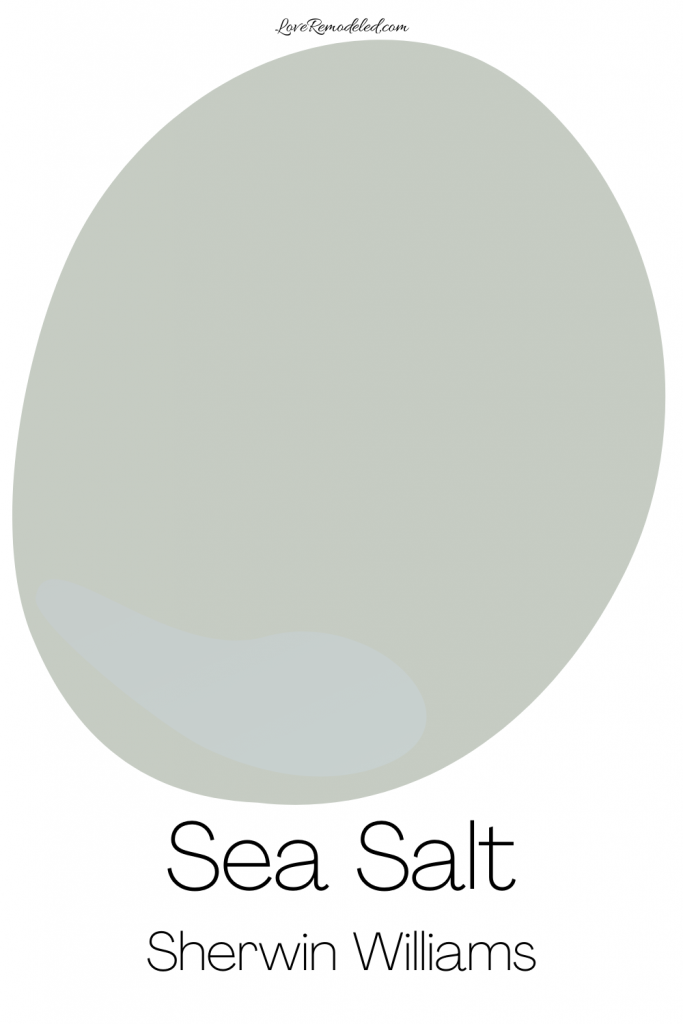
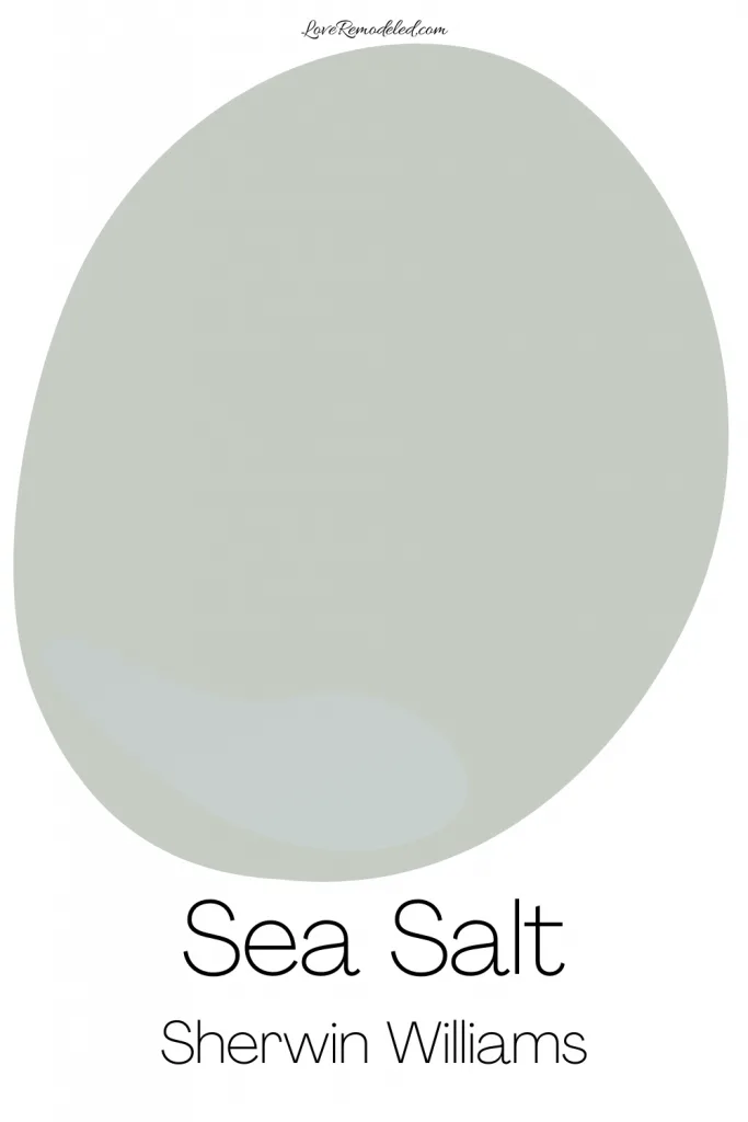
For a long time, it was the number one color on the coast, in the plains and anywhere in the nation for years.
I use it in my whole house color scheme, perfect for any home.
Learn everything you need to know about Sea Salt here.


If you haven’t found the right color on this list, or if you would rather have a set of colors that you can be sure all work together, check out my Coastal Home curated paint color palette. It includes 8 hand-picked paint colors that will elevate the look of your coastal inspired home or beach home.
Wondering How To Pick the Perfect Paint Color?
I have the best solution for you!
Samplize sells peel and stick paint samples in almost every paint color.
These no-mess, peel and stick sheets are made from real paint, so they will show you exactly what the paint color will look like.
Simply place them on your walls next to your trim, furnishings or fixed elements, and easily see which paint color works best in your space and with your lighting.
Then, peel the sheet off your wall and reapply it somewhere else if you like. You can try several different paint colors with no mess, no fuss and no cleaning paint brushes.


Oh, and you can have them in your home by tomorrow with OVERNIGHT shipping!
As a bonus, be sure to use the code LoveRemodeled10 at check out to get an extra 10% off! Samplize sheets are cheaper than a sample can of paint, and way less work.
They are the easiest (and fastest!) way to try a paint color in your home, with no hassle.
This beach house color scheme will make your home feel like it is steps from the ocean, even if it isn’t.
All of the colors are calming, relaxing, and beautiful shades that Sherwin Williams heralds as their most popular coastal colors.
Now, if you’re looking for paint colors for the new design trend Coastal Grandmother, be sure to check to this ultimate guide to Coastal Grandmother!
Let me know what your favorite coastal paint colors from Sherwin Williams are!
Top Beach House Paint Colors from Sherwin Williams
Deena
Saturday 2nd of December 2023
Hi,
I live in coastal NE Florida about 2 miles from the beach. I live in a modest 1 story stucco ranch style home with big beautiful walnut/maple/mahogany(?) wooden front double doors and want to paint the exterior of my home. I really loved the Silver Sage from Restoration Hardware for the interior of my tiny apartment in coastal southern CA and always thought I’d paint the exterior of my home in that color but they no longer make that paint unfortunately. I like SW paint and tested Sea Salt but it is too washed out. I was looking at Oyster Gray body with Oyster White or Alabaster trim but am not sure if that goes together or if the combination gives the coastal vibes I’m going for. The interior of my home is California Coastal style/decor and all the rooms have been painted BM White Dove, if that makes any difference. Do you have any recommendations for the body and trim? I will also be getting a new shingle roof in a few months so the current shingle color won’t limit my exterior color choices. I’m open to any to recommendations for color of roof shingles as well. TIA!
Lauren
Thursday 4th of January 2024
Hi Deena! I'm sorry that it has taken me so long to respond! I'm guessing that the computer autocorrected Oyster Bay to Oyster Gray, so I'm going to talk about Oyster Bay. If you really do mean Oyster Gray, disregard what I say because it may be completely wrong! My personal opinion is that anything on Oyster Bay/Sea Salt color strip is gorgeous! Oyster Bay is still going to look fairly light on an exterior because of all of the natural sunlight, but it won't be nearly as washed out as Sea Salt. You could even consider Acacia Haze and see if that doesn't give you more of the color that you're looking for. Before painting the whole exterior, I would definitely paint both colors on a large board to see which one you like. For the trim, either of those whites would work with Oyster Bay, but I do wonder Alabaster will give you a more beachy feel than Oyster White will. To me, the more color in your white paint, the more the color combo lends itself to more craftsman. For a beachy feel, I may go with Greek Villa or Alabaster. It will be light and bright, and still coordinate well, but without too much yellow/cream. For roof shingles, I always like a dark gray or light black, but I'm pretty traditional with my roof color choices. I think the house is going to look gorgeous in Oyster Bay! Good luck!
Ginny
Sunday 4th of June 2023
Live on water. Redoing color in all rooms. Help!
Lauren
Saturday 23rd of September 2023
Come join the discussion in our Facebook group and we can help figure out what colors may work for you!
Laura
Sunday 28th of May 2023
I used Moonstone by Behr in my bedroom and New Day for my en suite bathroom. Love them. They are an aqua, kind of like sea glass. I used Cottage cream in my living room and it’s the best cream color I’ve ever gotten.
Lauren
Tuesday 6th of June 2023
Sounds beautiful, Laura!!
Michelle
Tuesday 5th of July 2022
Hello Lauren- We are planning on repainting the exterior of our beach home from Koi to white. We are trying to grasp the LRV component, as the home is in direct exposure to the sun. We want it to appear white and not be blinding. We are unsure if aesthetic white will have that affect. Can you give some suggestions as well as complimentary white trim colour too? Thanks for the help.
Lauren
Friday 15th of July 2022
Hi Michelle! Outside, a white paint color is going to appear much brighter and lighter. Any paint color tends to do this because of the amount of light there is outside. So, if you want a color that will appear white but not be blinding, Aesthetic White might be a good one to try. It has enough colorant in it that it shouldn't be too stark. But, the best thing you can do is paint large poster boards to see white shade looks good. The colors around your house and the various light (morning, afternoon, evening) can change the way the color looks, so this is a decision that is best approached slowly to make sure you get the right color. Colors along the lines (LRV) of Aesthetic White that you should consider are Alabaster, White Heron, and Oxford White. For your trim, I would go with a shade like Pure White or Chantilly Lace, because these white trims shades will go with anything. They are light and bright. Pure White has a but of gray in it, so if you want the trim to look a bit softer, this will be the better choice. Good luck!
Jenny
Thursday 3rd of March 2022
Hi Lauren, a friend of mine forwarded this link to me. I love it, especially your analysis and all! We are building a home by the ocean with a red colored roof (Meta-roof, Hawaii Red), would love to get your suggestions as to what colors we should go with exterior as well as interior walls. Any suggestions would be greatly appreciated! Thank you!
Lauren
Monday 7th of March 2022
Hi Jenny! Thank you! I'm not sure what colors you typically like. With a red roof, I think of more blues, whites, blacks, and grays on the exterior. Without more info about what sort of look you're going for, I can't really recommend colors though. So sorry!! Feel free to hop on the Facebook page and we can have more of a discussion :)