
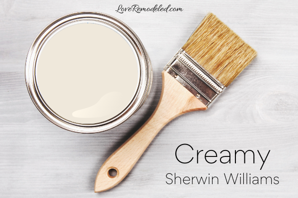
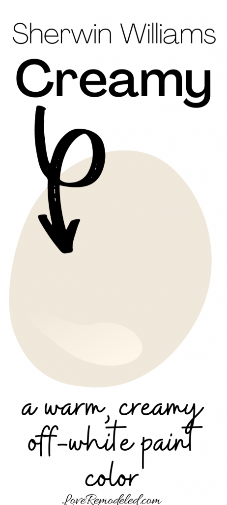
Sherwin Williams Creamy paint color is a cream colored paint shade. It is actually one of the more popular off-white paint colors by Sherwin Williams.
Sherwin Williams Creamy is included in the following paint color collections: Senior Living Warm Foundations, Cool Neutrals, Naturalist, Living Well, Top 50 Colors, and Warm Whites.
This post may contain affiliate links. If you have any questions, please see my disclaimer page.
Sherwin Williams Creamy Color Details
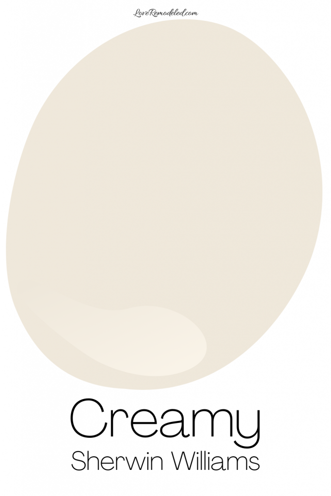
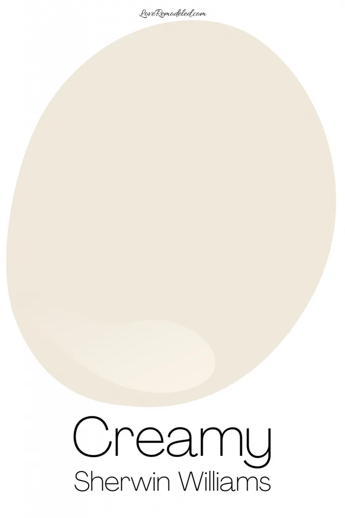
As the name implies, Creamy is a cream colored paint color by Sherwin Williams.
Cream paint tends to be an off-white shade that is very close to white but has a bit more color in it. Creams typically have yellow undertone, but some can also have a bit of gray, green, or orange in them.
Creamy Undertones
Sherwin Williams Creamy has a pale yellow undertone. It is a true off-white that will not look like a true white.
As far as cream paint colors go, Creamy doesn’t have too much of a yellow base to it though, which makes it a nice shade for a wall. In most lights, Creamy will look cream – not white, and not yellow.
In a Southern facing room, you may find that creamy takes on a bit more of a yellow hue. This is because Southern light has a warmer tone to it.
Creamy LRV

Sherwin Williams Creamy has an LRV (Light Reflectance Value) of 81. The LRV scale goes from 0, which is completely black, to 100, which is completely white. So, as you can see, an LRV of 81 is fairly high on the LRV scale.
Creamy will reflect a lot of light into the room, but like any paint color, you need to have enough natural or artificial light in the room to support it.
Is Sherwin Williams Creamy Warm or Cool?
Warm paint colors have red, orange or yellow undertones. Cool paint colors have blue, green or purple undertones.
With its yellow undertones, Creamy is a warm paint color.
Coordinating Colors for Creamy

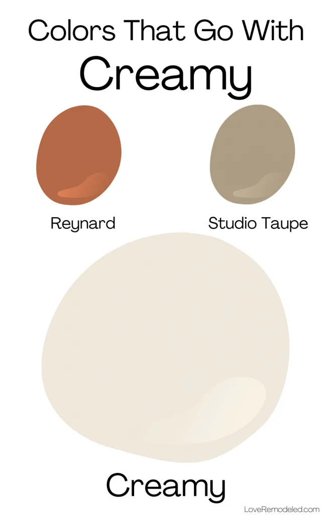
Creamy is warm paint color, and it tends to go well with other warm paint colors.
Sherwin Williams pairs Creamy with Reynard, an orangey red paint color that is reminiscent of fall. Additionally, Studio Taupe, a warm neutral paint shade, is a lovely accent to Creamy.
Trim Colors for Creamy

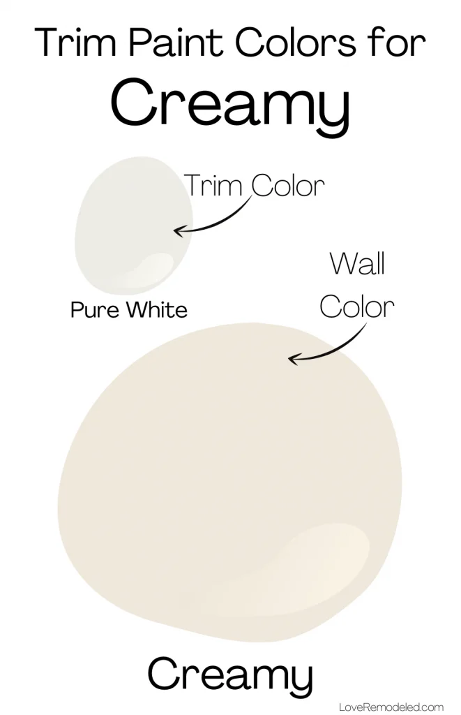
Creamy is a light off-white paint color, and while some may use it for trim, I find that it has a bit too much color in it for my taste.
Off-white trims were more popular in the 90s than they are today, with most people favoring bright white trim.
For Creamy, the best white color for trim is probably going to be Pure White.
Pure White is my go-to paint color for trim because it works so well with most paint colors. Click here if you want to learn more about Pure White.
Where Can I Use Sherwin William Creamy?
Creamy is classic, elegant, sophisticated paint color.
It works great in traditional, farmhouse, southwestern or contemporary style homes.
Creamy will not give your home that bright white wall look that is popular right now, but don’t count it out. It is more enduring than that – not a shade to go in and out of style easily.
Creamy is a great paint color for walls and cabinets that you want to have a soft, creamy look.
Sherwin Williams Creamy Compared
When I do a full color review on a paint color, I always like to compare it to other popular paint colors. I find that this helps people determine which paint color is the right one for their home or preferences.
So, lets take a few minutes to compare Creamy to a few other popular white and off-white paint colors.
Creamy vs. Alabaster

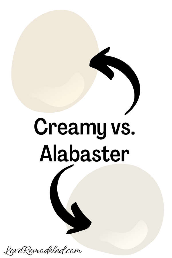
While Creamy is a true off-white, many would consider Alabaster to be more of a white paint shade (though it actually isn’t).
Alabaster is one of the most popular white (or off-white as the case my be) paint colors on the market. It is a classic type color that is used on walls, trim, cabinets and more.
Alabaster and Creamy are actually fairly similar. They are just one number off on their LRVs and they have similar depths.
Alabaster has a bit more gray in it than Creamy does, making it look more neutral on your walls, and less yellow. It won’t have quite the same glow in it that Creamy may.
If you want a paint color that looks like a cream, Creamy should be your pick. But if you want a paint color that is a warm white, I would recommend considering Alabaster.
Click here to learn more about Alabaster.
Creamy vs. White Dove
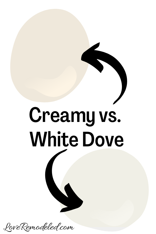
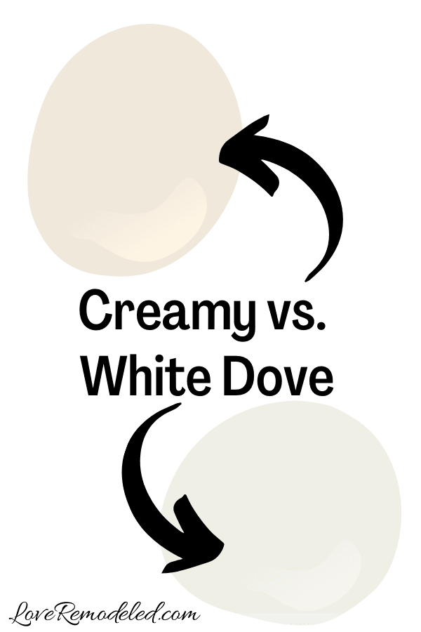
White Dove is a popular Benjamin Moore paint color. It is a white paint color with yellow undertones.
But, White Dove is significantly whiter than Creamy. Despite having an LRV that it only two points higher than Creamy’s, White Dove looks like a white next to Creamy. (Next to a true white, White Dove looks almost cream colored though, for comparison’s sake).
White Dove doesn’t have too much gray in it, like Alabaster does. It is a warm white with soft yellow undertone.
If you want a white paint color is warm but not yellow, White Dove is a good bet. But if you want a true cream paint shade, go with Creamy.
Click here to learn more about White Dove.
Creamy vs. Swiss Coffee

There are actually two different Swiss Coffee paint colors. One is a Benjamin Moore paint color, and one is a Behr shade.
The one we are going to discuss today is the Benjamin Moore Swiss Coffee.
Benjamin Moore Swiss Coffee is an off-white paint color with yellow, gray, and a hint of green undertones in it. It is also a cream colored paint.
Altogether, Swiss Coffee looks more neutral and less creamy than Creamy does though. Because of this, Swiss Coffee is a good choice if you want a neutral paint color that is warm, but not glowing.
Click here for more information on Benjamin Moore Swiss Coffee.
Creamy vs. Navajo White
Navajo White is a Sherwin Williams paint color that falls into the beige family. In fact, I discuss it on my post about the best tan and beige paint color.
With an LRV of 72, Navajo White is a much darker paint color than Creamy. In fact, it doesn’t really even fall into the off-white paint colors group.
Instead, Navajo White is a good paint color if you want a beige shade for your walls. It is particuarly good in a southwestern style home. It is not as flexible or as classic as Creamy though.
Creamy vs. Greek Villa

Greek Villa is one of my favorite off-white paint colors by Sherwin Williams. It is similar to Creamy in that it is a soft, warm off-white.
But, Greek Villa looks much lighter than Creamy, even though it is only a few points higher on the LRV scale.
Greek Villa will give off more of a white room look than Creamy will. So if you want a true cream paint color, Creamy is the pick. But, if you just want a warm shade of white, Greek Villa may be good for you.
Click here to learn more about Greek Villa.
Wondering How To Pick the Perfect Paint Color?
I have the best solution for you!
Samplize sells peel and stick paint samples in almost every paint color.
These no-mess, peel and stick sheets are made from real paint, so they will show you exactly what the paint color will look like.
Simply place them on your walls next to your trim, furnishings or fixed elements, and easily see which paint color works best in your space and with your lighting.
Then, peel the sheet off your wall and reapply it somewhere else if you like. You can try several different paint colors with no mess, no fuss and no cleaning paint brushes.


Oh, and you can have them in your home by tomorrow with OVERNIGHT shipping!
As a bonus, be sure to use the code LoveRemodeled10 at check out to get an extra 10% off! Samplize sheets are cheaper than a sample can of paint, and way less work.
They are the easiest (and fastest!) way to try a paint color in your home, with no hassle.
Final Thoughts on Sherwin Williams Creamy Paint Color
Creamy is a beautiful cream colored paint shade by Sherwin Williams. It is warm, soft and elegant, giving a room a classic cream look without being too yellow.
If you are looking for a paint color that will warm up a cold space without looking too yellow, Creamy should be on your shortlist!
Still on the hunt? Check out some other cream paint colors.
Want to see all your paint options in one convenient place? Click here to get everything you need to start painting, including Sherwin Williams and Benjamin Moore paint color decks!


Have a question? Leave me a comment! Remember to check back for a response – it may take me up to a week or two depending on how busy I am, but I’ll try my best to get back to you!
Want to show off your project? Join the discussion in Love Remodeled’s Facebook group!
Mariyana McCann
Sunday 26th of April 2026
Thank you very much for the info! I'm looking into combining SW Navajo White (satin) as a wall color with SW Creamy (semi-gloss) for trim and doors, and and ceiling (creamy matte) thoughout the house. I have natural hickory kitchen cabinets and marble (white-cream) tiles. What are your thoughts? Sending gratitude your way!
Lauren
Saturday 9th of May 2026
Hi Mariyana! Yes, I think this color combo will definitely work. I don't think that your trim will stand out too much though since Creamy has some color to it, and think that the contrast between the walls and the ceiling will be even less because the ceiling always looks a bit darker due to shadowing. If you want everything to have a sort of tone on tone look, which is very beautiful, this will be good. If you want the trim to look much brighter and lighter than the Navajo White walls, you'll want to go with a brighter white than Creamy such as Pure White. Good luck with your painting project!!
Matt
Monday 2nd of September 2024
Recommendations on the best complimentary colors for SW Creamy? Interior walls are creamy but looking for various other colors (natural) in a pallets to use. This is a beach house in Florida so going for that vibe. Thanks!
Lauren
Wednesday 18th of September 2024
Hi Matt! Creamy looks great with Amazing Gray, Colonnade Gray, Alabaster, Mega Greige or most any warm grays or greiges. Good luck!
Jackie Ward
Tuesday 30th of January 2024
We have carrera marble in our master bathroom with lots of natural light- currently have BM snowfall white on walls, cabinets and trim and it feels like an igloo😳. I prefer warmer whites/cream but need something to go with the carrera marble. Help!
Lauren
Wednesday 31st of January 2024
Hi Jackie! Carrera Marble tends to have cool undertones like blues and greens, so while it would work well with Snowfall White, it would make the space a little chilly!! Unfortunately, it is a bit hard to pair cool white stone with creams. The cream cabinets or walls just tends to look dingy and the cabinets/walls and counters will clash. If you can stand a cooler bathroom, a gray like Stonington Gray will probably work well, and should feel slightly less chilly than Snowfall White does. For a slightly warmer gray that may work, check out Repose Gray. It is technically a greige (so it has some beige in it and is warmer) but it has a blue undertone. And last, if you really want to go warm for the cabinets, get a swatch of some greiges like Accessible Beige or Agreeable Gray. Without seeing the marble you have, I can't say for sure if this will work, but you can look at them together in your lighting and see what you think. Good luck!!
Mary
Tuesday 10th of October 2023
Hello Lauren We have just had the exterior of our new build home painted in SW Creamy (trim also). I would like to paint the porch ceilings a very light, pale, blue. Do you think SW Topsail would coordinate well with Creamy? I do not want to make Creamy look any more yellow! We have a lot of direct sunlight! The house faces East, back porch faces West, and not many trees nearby. I realize that I'm trying to put a "cooler" color with a "warm" color... hence my dilemma 🙃 I really love the character that the blue ceiling provides! I so appreciate your help!!
Lauren
Wednesday 25th of October 2023
Hi Mary! Unfortunately, Topsail is going to bring out the yellow even more. I see your dilemma! To downplay the effect, it may be better to choose a blue that has a good bit of green in it. Since green is closer to yellow on the color wheel, it will lessen the effect of the yellow looking even more prominent. A color like Waterscape is a blue with a good bit of green. It is much darker than Topsail, but you could have your Sherwin Williams store tint it at 25% so it is lighter (they'd only put in 25% of the colorant). I think a blue porch ceiling is gorgeous! I'm sure your exterior will look amazing when you are finished.
Sian Cromer
Thursday 27th of July 2023
Hi! We recently painted our Bathroom walls, trim and ceiling in Creamy with different sheens. I had hoped I’d like the ceiling more than I do(would like it to be lighter). What are you thoughts about using Creamy on the ceiling (Flat sheen)? What color would you suggest to compliment the walls and trim?
Thank You, Sian
Sian Cromer
Saturday 29th of July 2023
@Lauren, thank you! Would you recommend a flat finish in those colors?
Lauren
Friday 28th of July 2023
Hi Sian! If the ceiling is too dark for you in Creamy in the current finish, a flat finish will make it even darker because there will be even less light reflecting off of it. For a lighter ceiling, try switching to Pure White or High Reflective White.