
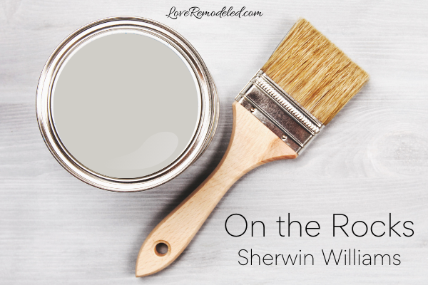
On the Rocks (SW7671) is an off-white paint color by Sherwin Williams. It is best and most easily classified as a gray paint color.
Sherwin Williams On the Rocks is included in the following color collections: Living Well – Reflect and Top 50 Colors.
This post may contain affiliate links. If you have any questions, please see my disclaimer page.
On the Rocks Color Characteristics
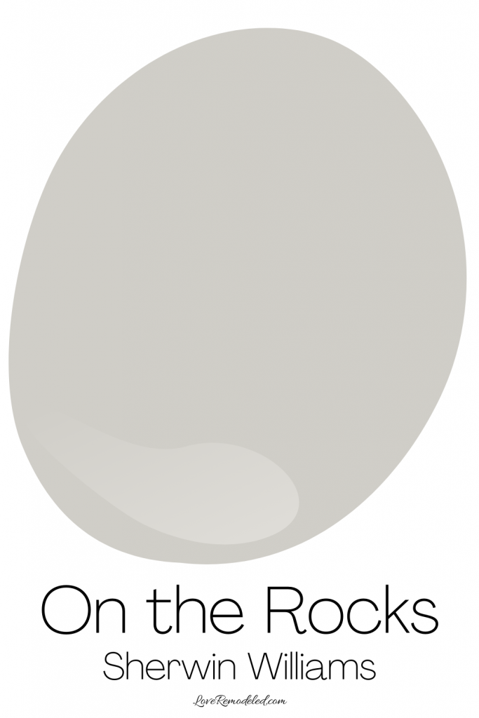

On the Rocks is a gray paint color. It is a very light paint color that is part of Sherwin Williams’ whites and off-whites collection.
Sherwin Williams On the Rocks can feel classic, sophisticated, elegant or industrial, depending on the furnishings around it.
Sherwin Williams On the Rocks LRV
On the Rocks has an LRV of 62. This means it is in the light range of paint colors, and it will reflect a fair amount of light.
While Sherwin Williams On the Rocks has a bit more depth to it than other paint colors in the whites and off-whites collection. It is almost a medium light shade (but not quite).
Sherwin Williams On the Rocks Undertones
On the Rocks is a gray paint color with very slight undertones.
While all paint colors have undertones, On the Rocks’ tend to be less than many other gray’s.
Sherwin Williams On the Rocks has a bit of purple and can carry a hint of blue in it when viewed in some Northern facing rooms. It doesn’t look too purple though, or too blue.
Overall, On the Rocks is a gray paint color that looks gray.
Is On the Rocks Warm or Cool?

Sherwin Williams On the Rocks tends to be a fairly neutral gray. It is not terribly warm or cool.
Warm colors have red, orange and yellow undertones. Cool colors have green, blue and purple undertones.
On the Rocks leans warmer with that purple undertone, but when you compare it to a warm gray, you can definitely tell that it doesn’t have nearly as much warmth as some other grays.
Where Can I Use Sherwin Williams On the Rocks
On the Rocks has a very livable color, LRV and depth. In all, Sherwin Williams On the Rocks is a very versatile paint color that can be used in a lot of places.
On the Rocks is great on walls in almost any room of the house. It can also be used on cabinets.
On the Rocks can even work on home exteriors.
It is important to note again though that On the Rocks has a purple undertone, and this hue can come out even more in exterior lighting.
So, On the Rocks probably wouldn’t be my first choice for an home’s exterior, as I would favor a gray that had more blue or brown undertones, because I can live with a blue or brown looking gray on the outside of my home a lot more easily than a purple looking gray.
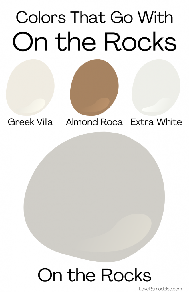
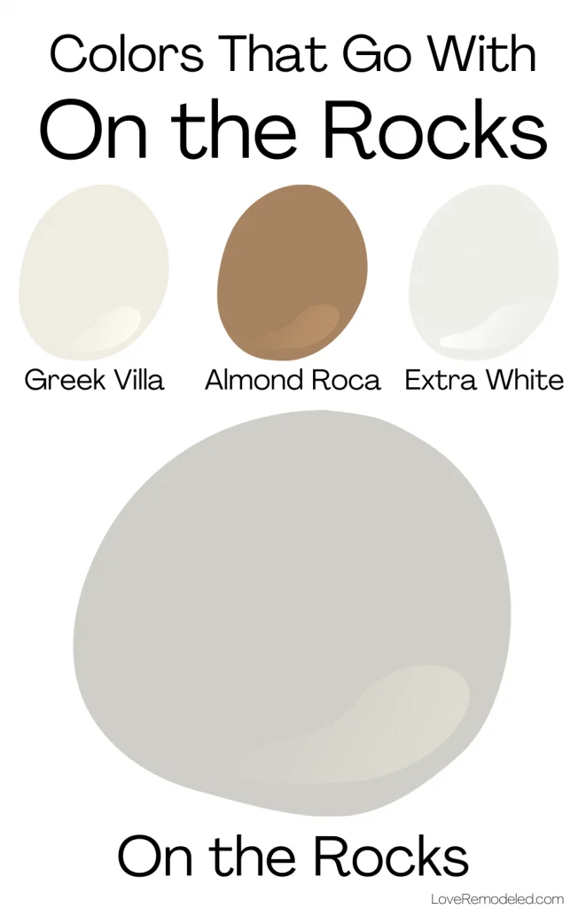
Coordinating Colors for Sherwin Williams On the Rocks
Sherwin WIlliams On the Rocks looks great with bright whites, medium toned grays, blues, blue greens and navys.
In particular, Sherwin Williams pairs On the Rocks with Greek Villa – a creamy warm white, Almond Roca – a medium depth brown, and Extra White – a bright, cool white.
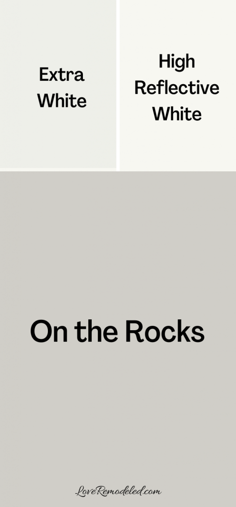
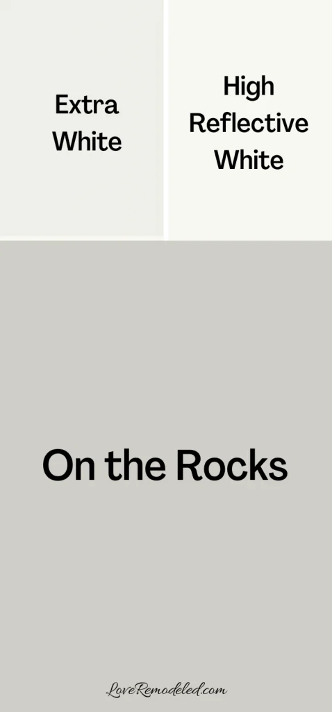
Trim Colors for Sherwin Williams On the Rocks
Because On the Rocks is an off-white paint color, it needs a cleaner white to make it really pop.
On the Rocks looks nice with High Reflective White, a neutral, bright white paint color. It also works very well with Extra White.
On the Rocks Compared
Each time I do a paint color review, I like to compare the color I am looking at to other popular paint colors that are in the same family.
I find that this helps readers determine which paint color is going to be best in their home.
For On the Rocks, people frequently compare it to Repose Gray and Agreeable Gray, two of Sherwin William’s most popular gray paint colors.
Let’s take a few minutes to see how Sherwin Williams On the Rocks stacks up to these two paint colors.
Sherwin Williams On the Rocks vs. Repose Gray
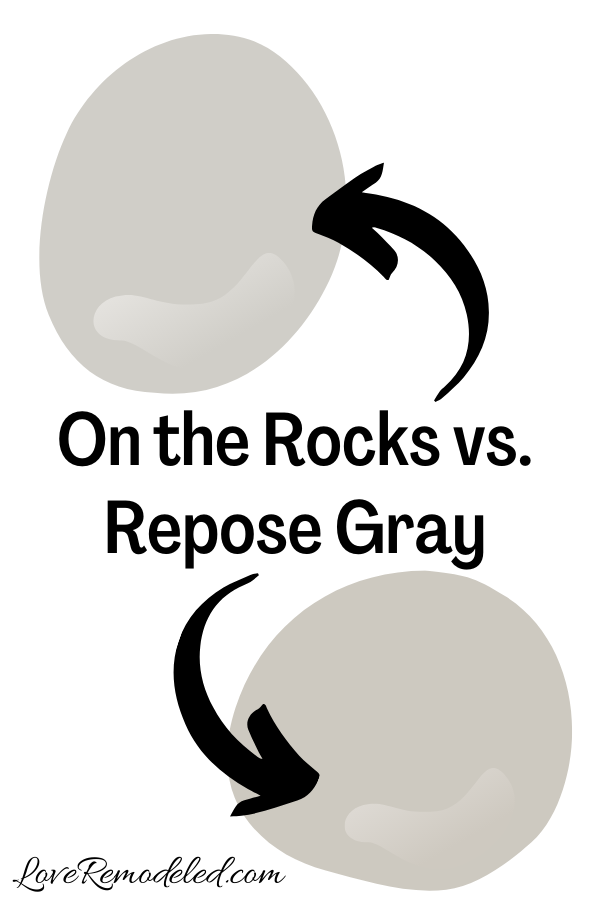

Repose Gray is one of the top greige paint colors by Sherwin Williams. Greiges are colors that have gray and beige in them.
Repose Gray is a warm gray, but has blue undertones that keep it from being too warm.
It looks gray when viewed in isolation, but when viewed against a truer gray, you can see that it leans warm.
On the Rocks and Repose Gray have similar depths and LRVs. Repose Gray looks a bit darker, but just a hair.
Again, Repose Gray has blue undertones, while On the Rocks has purple undertones. This distinction is important.
If you are nervous about a purple undertone, Repose Gray might be the better bet.
But, if you want a gray that is more of a true gray, On the Rocks is a good choice.
Click here for more information about Sherwin Williams Repose Gray.
Sherwin Williams On the Rocks vs. Agreeable Gray

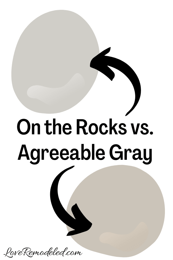
Agreeable Gray is Sherwin Williams top paint color. Like Repose Gray, it is actually a greige paint color – a blend of gray and beige.
Agreeable Gray has a bit more beige in it than Repose Gray though, and it is decidedly a warm gray. It has a green undertone that is not terribly pronounced.
When you compare Agreeable Gray to On the Rocks, you really see the beige in Agreeable Gray.
Overall, this makes Agreeable Gray a more versatile color. Because it straddles the line between gray and beige, it serves as a very neutral backdrop to different shades.
If you want a true gray, On the Rocks is going to be your paint shade. But, if you are looking for a very functional neutral paint color, Agreeable Gray will be the better choice.
Click here for more information on Sherwin Williams Agreeable Gray.
Wondering How To Pick the Perfect Paint Color?
I have the best solution for you!
Samplize sells peel and stick paint samples in almost every paint color.
These no-mess, peel and stick sheets are made from real paint, so they will show you exactly what the paint color will look like.
Simply place them on your walls next to your trim, furnishings or fixed elements, and easily see which paint color works best in your space and with your lighting.
Then, peel the sheet off your wall and reapply it somewhere else if you like. You can try several different paint colors with no mess, no fuss and no cleaning paint brushes.


Oh, and you can have them in your home by tomorrow with OVERNIGHT shipping!
As a bonus, be sure to use the code LoveRemodeled10 at check out to get an extra 10% off! Samplize sheets are cheaper than a sample can of paint, and way less work.
They are the easiest (and fastest!) way to try a paint color in your home, with no hassle.
Final Thoughts on Sherwin Williams On the Rocks
On the Rocks is a great gray paint color because it has very subtle undertones.
It is a neutral gray paint color that typically just looks gray. But, it doesn’t ever come across as a chilly gray, making it a welcoming, classic shade.
If you want a light gray that looks gray (and not blue or purple), you should definitely pick up a Samplize square of Sherwin Williams On the Rocks to see if it is the right paint color for your space!
Want to see all your paint options in one convenient place? Click here to get everything you need to start painting, including Sherwin Williams and Benjamin Moore paint color decks!


Have a question? Leave me a comment! Remember to check back for a response – it may take me up to a week or two depending on how busy I am, but I’ll try my best to get back to you!
Want to show off your project? Join the discussion in Love Remodeled’s Facebook group!