
Taupe of the Morning is a light taupe paint color by Sherwin Williams.
A taupe shade is one that is a blend of gray and beige, with pink or purple undertones. Taupe paint colors are very popular right now, due to a general shift in home design towards warm neutrals.
Taupes are similar to the greige paint colors that were so prevalent in the 2010s. But, while greige paint colors have a cool undertone of blue or green, taupes have a warm undertone.
If you are considering a warm neutral for your space, let’s dive into all the details about Sherwin Williams Taupe of the Morning.
This post may contain affiliate links. If you have any questions, please see my disclaimer page.
Everything You Need to Know about Taupe of the Morning
Taupe of the Morning, SW 9590, is a light neutral paint color that looks fresh and modern. It is part of the Sherwin Williams Designer Color Collection, which is a newer collection of paint shades that are really beautiful.
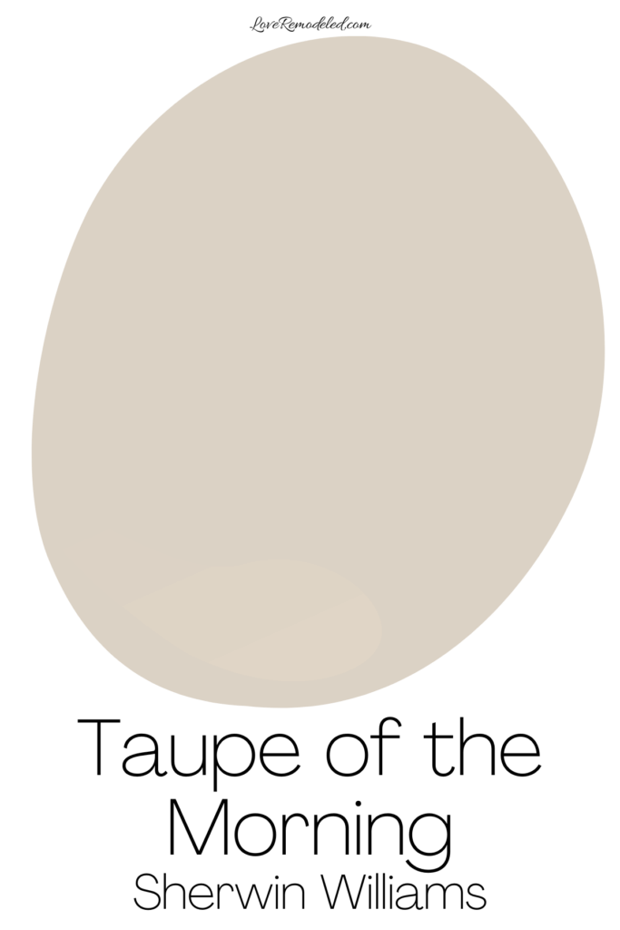
While it is a blend gray and beige with warm pink undertones, it really doesn’t show those off too much. Instead, it feels cozy and inviting without looking too feminine.
For me, for a taupe to be just perfect, it can only hint at pink or purple. If I see the pink or purple, it has too much of it. Taupe of the Morning hits this mark just right in my book.
In addition, with an LRV (Light Reflectance Value) of 65, Taupe of the Morning isn’t too light and it isn’t too dark.
Where To Use Taupe of the Morning


Taupe of the Morning can be used anywhere in the home. Because it is a neutral that isn’t too light or too dark, it can be used in most rooms. It looks best in small to medium sized rooms, but can be used in a large room as well if you want the paint color to fade into the background.
It works great in living room, bedrooms, dining rooms, kitchens, hallways and more.
In northern facing rooms or in morning and evening light, you may see a little more gray in it. In southern facing rooms or afternoon light, you may find that it leans into its warmth more.
I also like Taupe of the Morning on a home exterior, particularly white trim or a stone facade. Outside, it will look even lighter due to the bright light, so be sure to sample it first to make sure it is giving the look you want.
What Goes With Taupe of the Morning?
Taupe of the Morning looks good with:
- white trim
- black, silver, or gold accents
- warm wood with red or neutral undertones
- stone with similar undertones
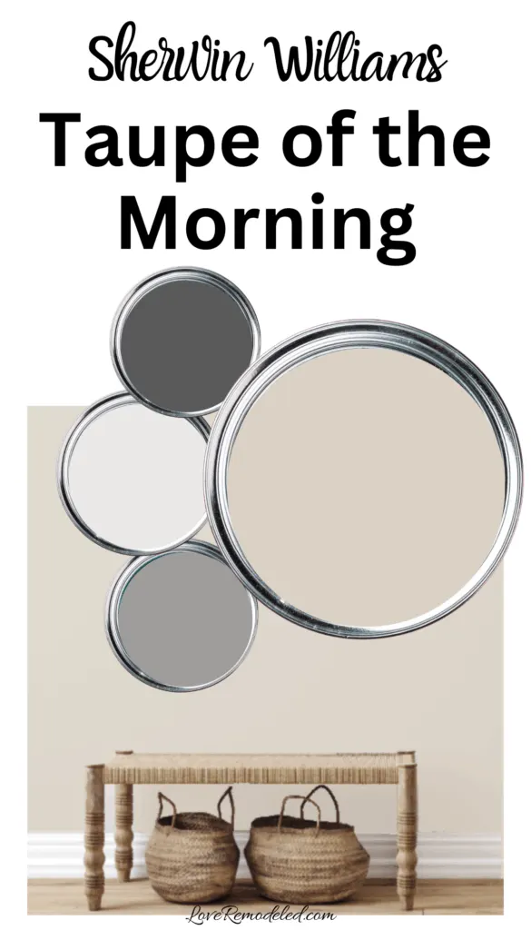
Sherwin Williams pairs Taupe of the Morning with the following coordinating colors:
- Natural White SW 9542
- Bedrock SW 9563
- Forged Steel SW 9565


It will also work well with pinks, purples, soft blue-greens, darker taupes, blues with gray undertones, whites, and dark neutrals.
For a trim color, Taupe of the Morning looks great with High Reflective White, Pure White or Natural White.


How Does Taupe of the Morning Compare to Other Paint Colors?
If you’re considering Taupe of the Morning in your home, you may also be thinking about other beiges and taupes.
Here is a comparison of some of the most popular shades that you may be wondering about.
Taupe of the Morning vs. Accessible Beige


Accessible Beige is a paint color that blends gray and beige together to make a greige paint color. So, while Taupe of the Morning is a taupe, Accessible Beige is a greige.
Taupe of the Morning has pink undertones. Accessible Beige has green undertones. This is an important distinction because it can help you determine which is better for your space.
If you have more warm tones in your home – reddish woods, pink or purple accents, or soft whites – Taupe of the Morning is likely to be the better choice.
If you have more earth tone colors, yellow or green toned woods, and creams, Accessible Beige may work better.
Taupe of the Morning is also a bit lighter than Accessible Beige. Both colors will look best with good lighting, but too much lighting on Taupe of the Morning may wash it out. In a really bright space, Accessible Beige may give you the look you want.
If you have less lighting, Accessible Beige may feel drab, and Taupe of the Morning may support a light and airy look.
Additionally, because it has more depth Accessible Beige may work better in larger spaces.
Taupe of the Morning vs. Shoji White

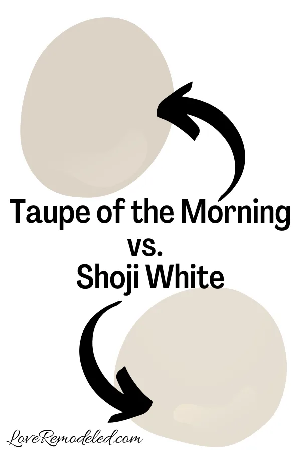
Shoji White is a light beige paint color with gray and pink undertones. It is a color that is similar to Shoji White in many ways. Both are soft neutrals with warm pink undertones.
Shoji White is lighter than Taupe of the Morning though. It looks a bit more creamy, and also has less gray in it.
If you want a warm shade that hits a little more gray, Taupe of the Morning is the better choice. If you want a creamy off-white, Shoji White is a good option.
Taupe of the Morning vs. City Loft


City Loft is a light taupe with warm pink/purple undertones. It is lighter than Taupe of the Morning, with an LRV of 70.
While they blend a lot of the same tones, City Loft looks more like a light gray than Taupe of the Morning. I also see a bit more of a purple undertone in City Loft than I do in Taupe of the Morning.
Altogether, I like Taupe of the Morning more. With less of the pink/purple undertone, it is more versatile than City Loft.
Additionally, City Loft has less beige, which means its more gray. It doesn’t carry the same warmth that Taupe of the Morning does. Since home paint trends are focused on warm neutrals right now, Taupe of the Morning is more in line with what is in style.
Wondering How To Pick the Perfect Paint Color?
I have the best solution for you!
Samplize sells peel and stick paint samples in almost every paint color.
These no-mess, peel and stick sheets are made from real paint, so they will show you exactly what the paint color will look like.
Simply place them on your walls next to your trim, furnishings or fixed elements, and easily see which paint color works best in your space and with your lighting.
Then, peel the sheet off your wall and reapply it somewhere else if you like. You can try several different paint colors with no mess, no fuss and no cleaning paint brushes.


Oh, and you can have them in your home by tomorrow with OVERNIGHT shipping!
As a bonus, be sure to use the code LoveRemodeled10 at check out to get an extra 10% off! Samplize sheets are cheaper than a sample can of paint, and way less work.
They are the easiest (and fastest!) way to try a paint color in your home, with no hassle.
Final Thoughts on Taupe of the Morning
Taupe of the Morning is a really versatile taupe paint color that perfectly falls in line with current trends without being too trendy.
While many taupes have too much brown, too much purple or too much depth, Taupe of the Morning doesn’t have any of the these things.
It creates an atmosphere that is soft, inviting, and neutral. It is the taupe we’ve been looking for, when others have fallen short.
If you are looking for an updated version of a modern neutral, Taupe of the Morning is a great choice.
Have a question? Leave me a comment! Remember to check back for a response – it may take me up to a week or two depending on how busy I am, but I’ll try my best to get back to you!
Want to show off your project? Join the discussion in Love Remodeled’s Facebook group!

Mary
Monday 6th of April 2026
Could you show exterior of a house in the sun with taupe of the morning
Lauren
Saturday 9th of May 2026
Hi Mary! I don't have a picture of that, unfortunately, but you can see Sherwin Williams rendition of what that would look like here.