
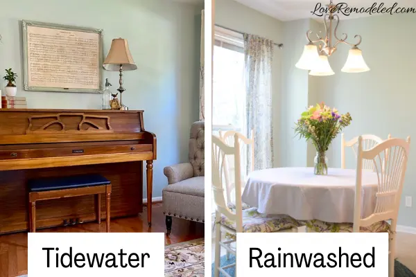
Sherwin Williams Tidewater is a gorgeous blue paint color, reminiscent of the pale blue green waters of the Gulf of Mexico.
Tidewater paint color is light and bright, and invokes a feeling of tranquility.
What color is Sherwin Williams Tidewater?
Tidewater is a blue paint color with green and gray undertones. It is a color in the aqua family of blues.
When you see Sherwin Williams’ Tidewater on its own, you may not necessarily see these undertones. Instead, Tidewater will look like a true blue.
However, if you put a swatch of Tidewater next to a blue, you will see its green undertones peeking through.
When placed next to a brighter blue, it is easy to see that Tidewater has a touch of gray in it as well. This gray helps to pull Tidewater back from being too bright, which can tend to make a paint color feel childish.
Despite its faint gray undertones, Tidewater will never look gray or like a true green on your walls.

This post may contain affiliate links. If you have any questions, please see my disclaimer page.
Sherwin Williams Tidewater LRV
Tidewater paint color has an LRV (Light Reflectance Value) of 65. This puts it in the “light” category of colors.
Tidewater is light enough to reflect a lot of light into a room, but isn’t so light that it will brighten a dark room.
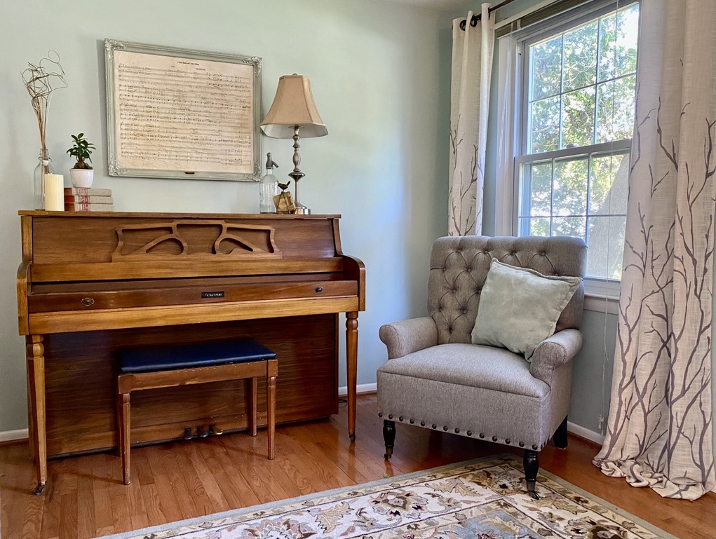
In this north-facing room, Tidewater may look more slightly more saturated, making it appear as a bolder medium depth blue on the walls.
In a south-facing room, you can expect the bright sunlight to wash it out a bit more, making it look like a near perfect light aqua blue.

Where Should I Use Sherwin Williams Tidewater?
Cool colors, such as blue and green, are welcoming and calming colors that invite you into a space and encourage you to relax. Tidewater is no exception. Because of this, Tidewater is a great color for a space that you want to feel peaceful, such as bedrooms, bathrooms, and living rooms.
In fact, many say blue is the best color for a bedroom. Check out other great wall paint colors for a bedroom here.
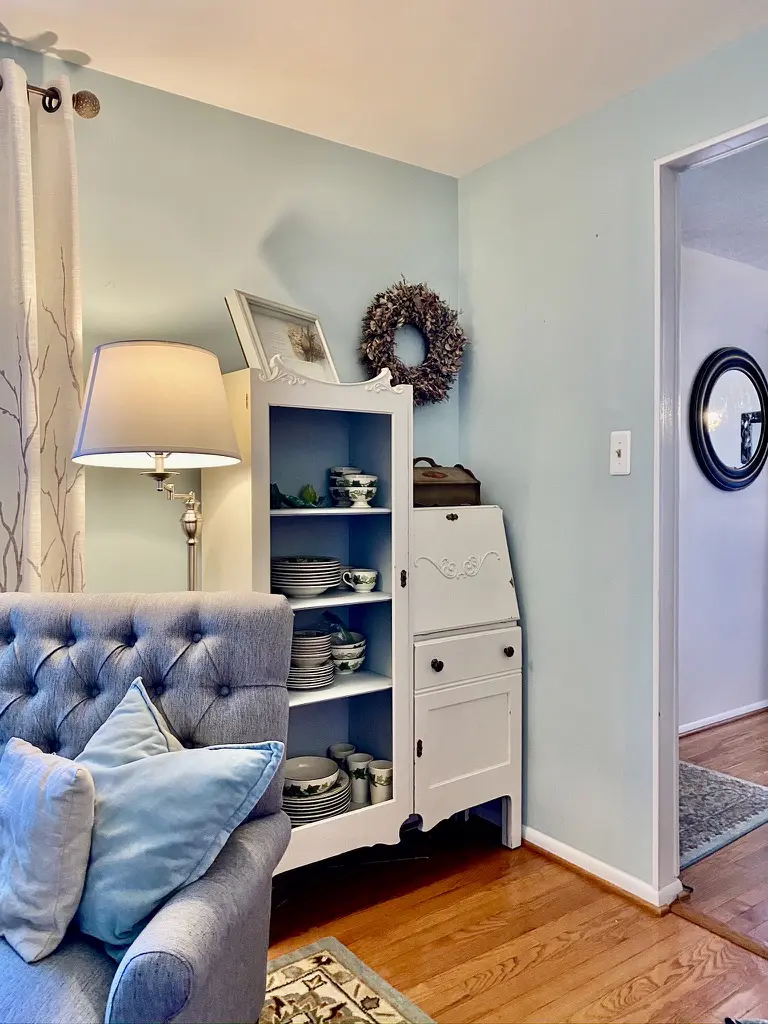
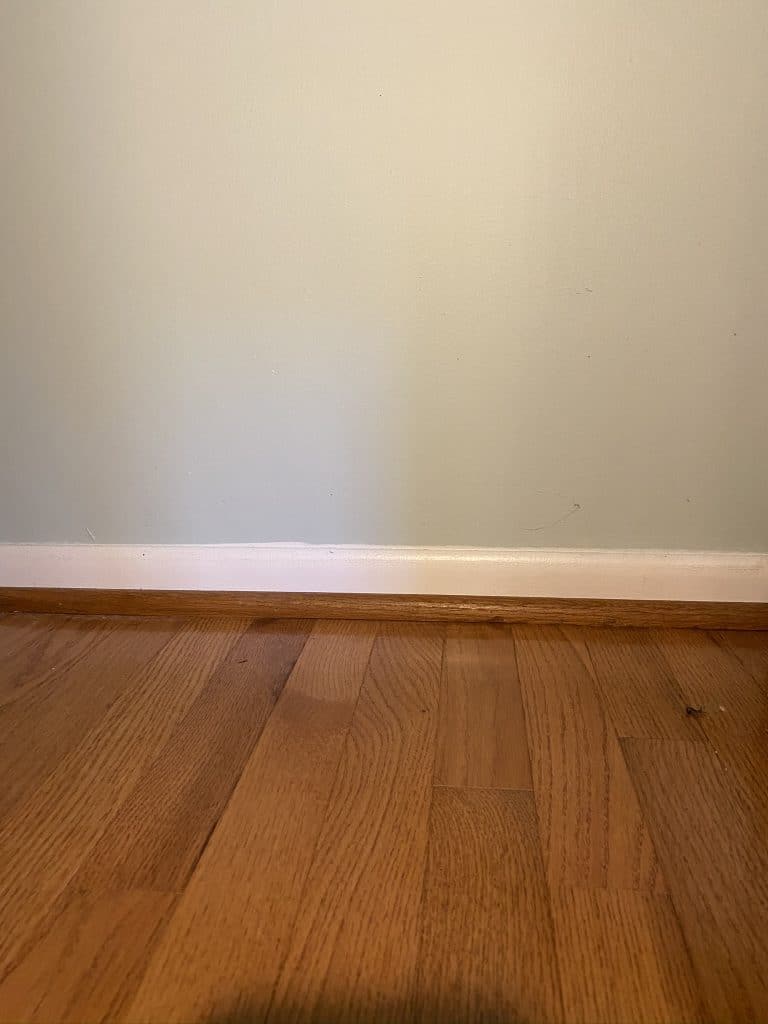
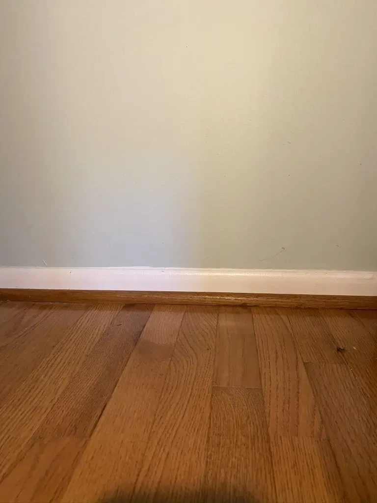
Tidewater goes well with both wood and white trim or cabinets. In addition, it looks great with honey colored wood floors. (Don’t judge me for the bad paint edging here – I didn’t do it!).
For more paint colors that go with honey colors oak cabinets, or for additional paint colors that go well with wood trim, check out these posts.
Coordinating Colors for Sherwin Williams Tidewater
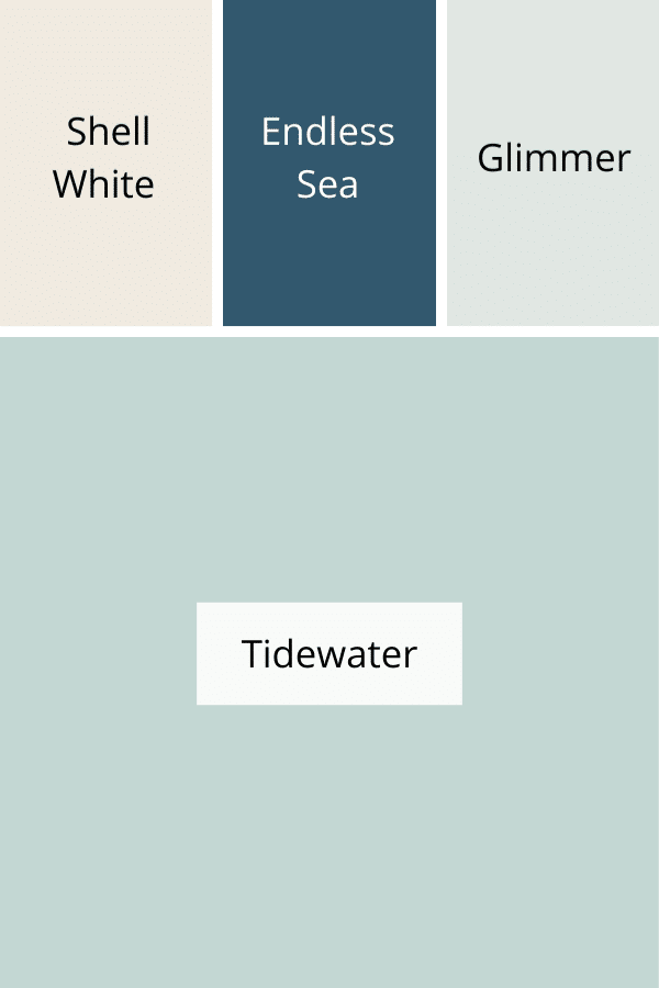
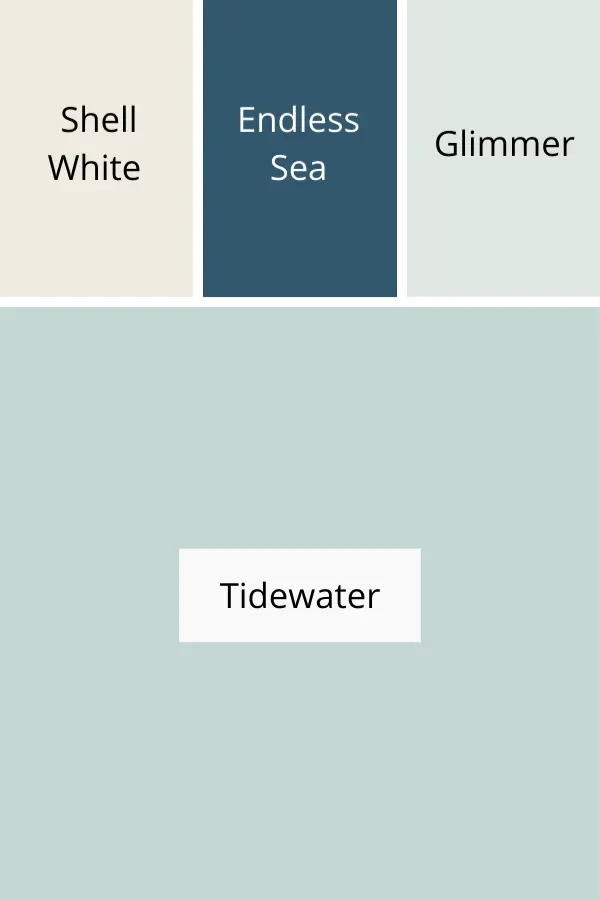
According to the experts at Sherwin Williams, Tidewater goes well with Shell White, Endless Sea, and Glimmer. This color palette, grounded in shades of blue, is great for a tone on tone look.
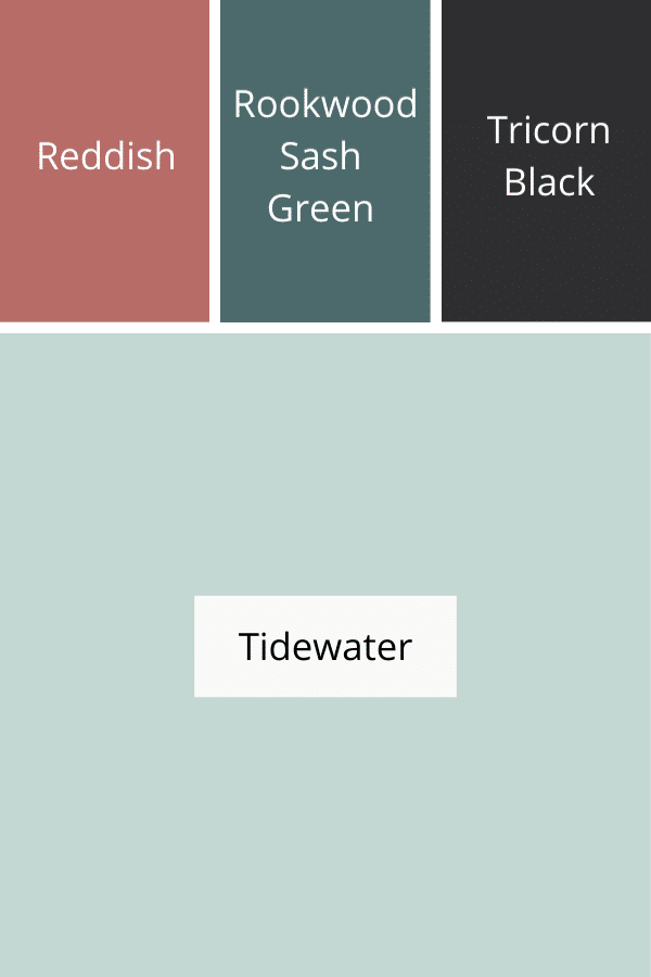
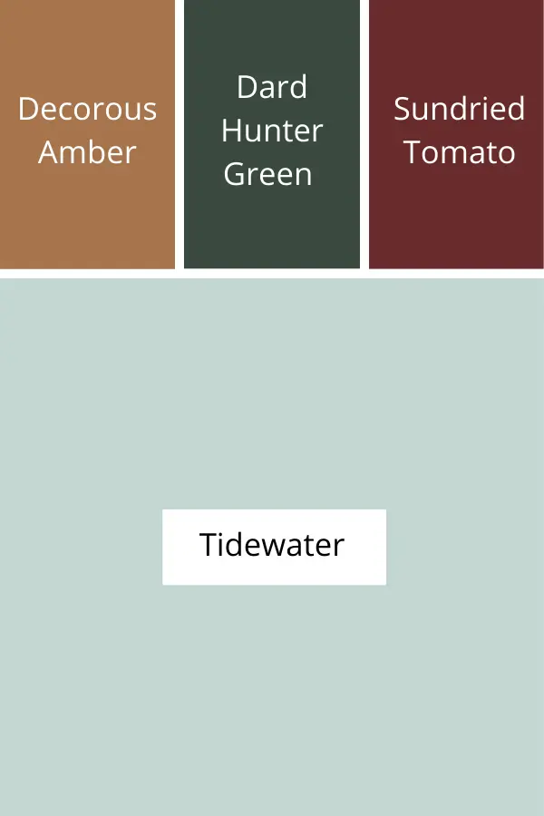
For a more classic look, Tidewater can be paired with a muted pink such as Reddish, a bluish green such as Rookwood Sash Green, and a dark black like Tricorn Black.
This color palette is similar to the one in the rug in the pictures above.

This next color palette of coordinating colors for Tradewind reminds me of a color scheme for a boho styled room. Dark green, deep red and amber brown juxtapose nicely with the soft blue.
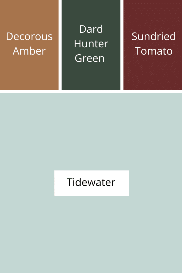
As you can see, Tradewind is a fairly versatile shade. It coordinates with a lot of different shades, and can be an anchor for a variety of styles.
Tidewater Compared to Other Popular Blue Paint Colors
Sherwin Williams Tidewater is a beautiful shade of aqua blue. When we compare it to other Sherwin Williams colors, we can start to see some of the nuances of it. This is helpful in determining whether it is the right shade for you, or if you should go with one of the more go-to paint colors.
I’ve chosen three super popular paint colors by Sherwin Williams for a comparison.
Sherwin Williams Tidewater vs. Sea Salt

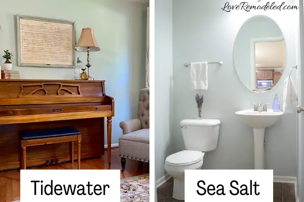
One of Sherwin Williams’ most popular colors is Sea Salt. It is considered a chameleon color, because it can look blue, green or even gray depending on your lighting and furnishings.
When you compare Sea Salt to Tidewater, Tidewater has much more blue than Sea Salt. Right next to each other, Sea Salt actually looks gray with a hint of green.
If you like Tidewater, but would prefer a color that is less punchy, and has more green, consider Sherwin Williams Sea Salt.
Sherwin Williams Tidewater vs. Watery
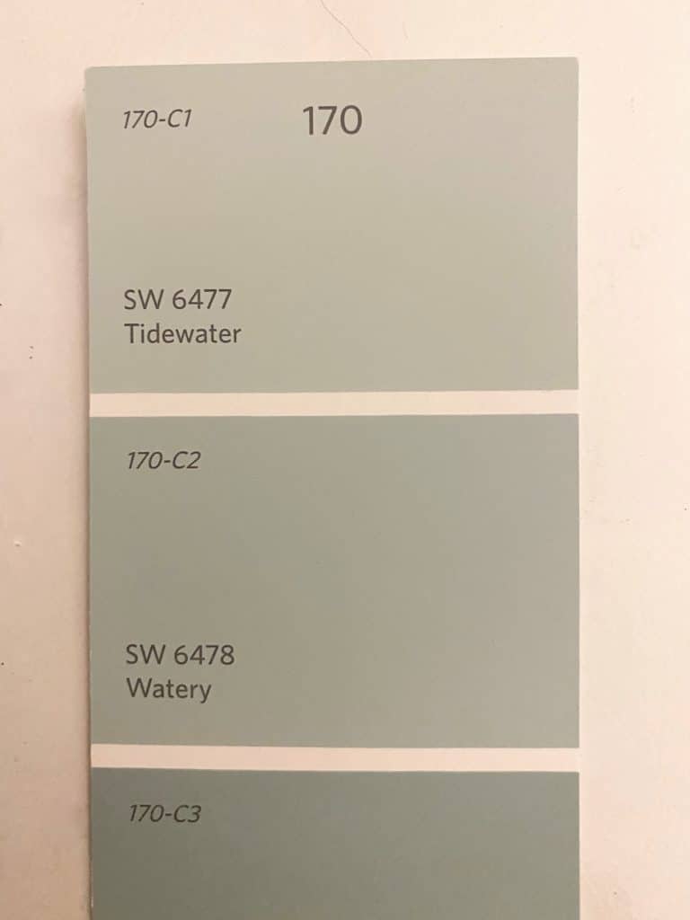
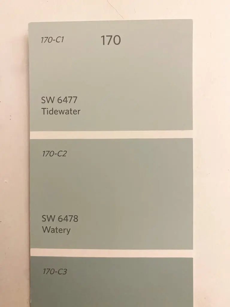
Watery is another great color from Sherwin Williams. It is the color right below Tidewater on the color strip.
Watery is very similar to Tidewater, but has more depth and a hint more blue.
If you like a darker color on your walls, or have a really bright and sunny space, Watery might be a better bet for you. But, the majority of people will probably find that Tidewater is plenty pigmented enough for their space.
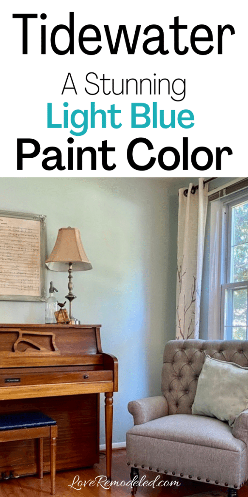
Sherwin Williams Tidewater vs. Rainwashed

Due to its popularity, I also wanted to include a color comparison of Tidewater and Rainwashed.
I always think of Rainwashed as sort of a sister color to Sea Salt. While they are similar shades, Rainwashed has more blue and less gray than Sea Salt. This makes it appear as more of a color on your walls than Sea Salt does.
When comparing Rainwashed to Tidewater, you find that Tidewater has more blue and less green than Rainwashed. In addition, Rainwashed has a bit more gray in its undertones than Tidewater does. When the colors are put next to eachother, Tidewater ends up looking like a powder blue.
To summarize, Sea Salt has the most green and gray, followed by Rainwashed. Of the three, Tidewater is the brightest and bluest paint shade.
Tidewater’s LRV of 65 means that it reflects more light than Rainwashed, as Rainwashed has an LRV of 59.
Click here for more information on the paint color Rainwashed.
Wondering How To Pick the Perfect Paint Color?
I have the best solution for you!
Samplize sells peel and stick paint samples in almost every paint color.
These no-mess, peel and stick sheets are made from real paint, so they will show you exactly what the paint color will look like.
Simply place them on your walls next to your trim, furnishings or fixed elements, and easily see which paint color works best in your space and with your lighting.
Then, peel the sheet off your wall and reapply it somewhere else if you like. You can try several different paint colors with no mess, no fuss and no cleaning paint brushes.


Oh, and you can have them in your home by tomorrow with OVERNIGHT shipping!
As a bonus, be sure to use the code LoveRemodeled10 at check out to get an extra 10% off! Samplize sheets are cheaper than a sample can of paint, and way less work.
They are the easiest (and fastest!) way to try a paint color in your home, with no hassle.
Final Thoughts on Sherwin Williams Tidewater
Tidewater is a beautiful blue paint color. It has a dash of green and a hint of gray that tones it down from being too bright.
When you want for a blue paint color for your walls, Tidewater should be on your shortlist!
Want to see all your paint options in one convenient place? Click here to get everything you need to start painting, including Sherwin Williams and Benjamin Moore paint color decks!


Have a question? Leave me a comment! Remember to check back for a response – it may take me up to a week or two depending on how busy I am, but I’ll try my best to get back to you!
Want to show off your project? Join the discussion in Love Remodeled’s Facebook group!