
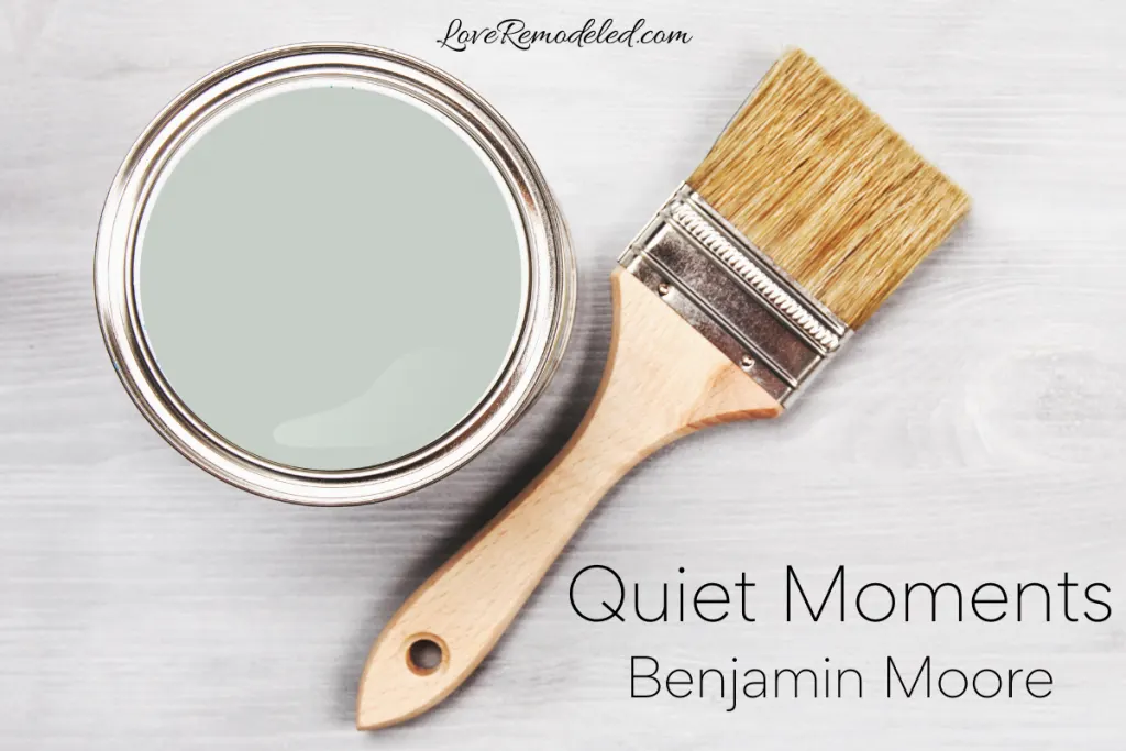
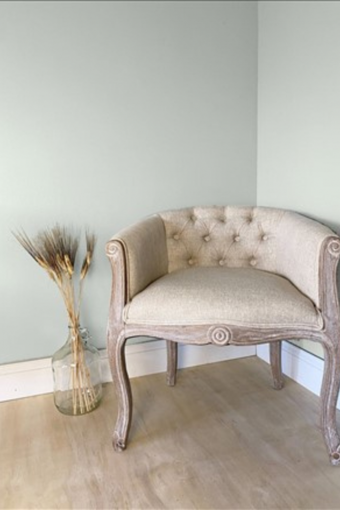
Quiet Moments is a soft blue-green paint color by Benjamin Moore. It is a very popular paint shade.
Quiet Moments is elegant, sophisticated and spa-like. But, this beautiful blue-green can also look a bit whimsical if used in a children’s room.
If you are interested in a light blue-green paint color, keep reading for all the details on Benjamin Moore Quiet Moments. Before we get into the details of this paint color though, let’s take a minute to clear a few things up.
This post may contain affiliate links. If you have any questions, please see my disclaimer page.
History of Benjamin Moore Quiet Moments
Quiet Moments was first included in the Classics fan deck. This means that it was one of Benjamin Moore’s original paint colors.
The formula of Quiet Moments has also been included in the Designer Classics collection and given the name Smokey Green.
So, Quiet Moments and Smokey Green are the same paint color, even though they have two different names and identifiers. Quiet Moments is 1563, while Smokey Green is CC-700.
What Color is Benjamin Moore Quiet Moments?
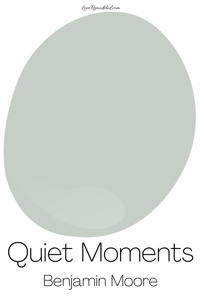
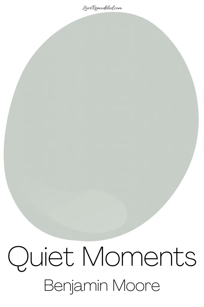
Quiet Moments is a light blue-green paint color with gray undertones. The gray is understated, but it mutes the brightness of Quiet Moments just enough to make it look elegant instead of juvenile.
Quiet Moments is one of those chameleon shades that can look green in some lights, blue in others, and once in a while just look grayish. In fact, it can look all of these different colors in the same room, depending on what sort of lighting is present.
You tend to see Quiet Moments look more green in bright, southern-facing light. In cooler northern-facing lights, you’ll see a bit more of the blue or gray in Quiet Moments.
Is Quiet Moments Warm or Cool?
Quiet Moments is a cool paint color. Cool paint colors include blue, green and (some) purple shades. Since Quiet Moments is a blue-green, it is definitely a cool paint color.
Cool paint colors feel expansive and soothing. They tend to make the walls feel like they’re receding into the distance, like the sky does. In particular, Quiet Moments gives a room a very relaxing and spa-like vibe.
Quiet Moments LRV

Benjamin Moore Quiet Moments has an LRV, or Light Reflectance Value, of 62.
The LRV scale is a metric that provides information about how much light a paint color reflects back into a room. It also tells us a bit about how light or dark a paint color is. So a paint color with an LRV of 0 is completely black (reflecting no light back into a room), while a paint color with an LRV of 100 is completely white (reflecting a lot of light back into a room).
An LRV of 62 means that Quiet Moments is in the light range of the LRV scale, but moving towards a medium shade. It isn’t dark by any means, but it has a bit more color to it than other light blue-green paint colors.
Coordinating Paint Colors for Benjamin Moore Quiet Moments
Quiet Moments goes really nicely with white, cream, gray, beige, greige and navy. When you pair Quiet Moments with other neutrals, it tends to bring a little bit of color to the room, without being too overbearing.
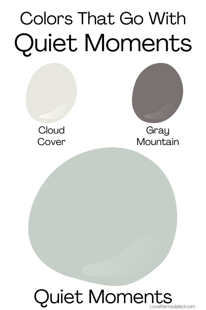

Here, you can see how Quiet Moments coordinates beautifully with Cloud Cover, a grayish off-white, and Gray Mountain, a darker brownish gray.

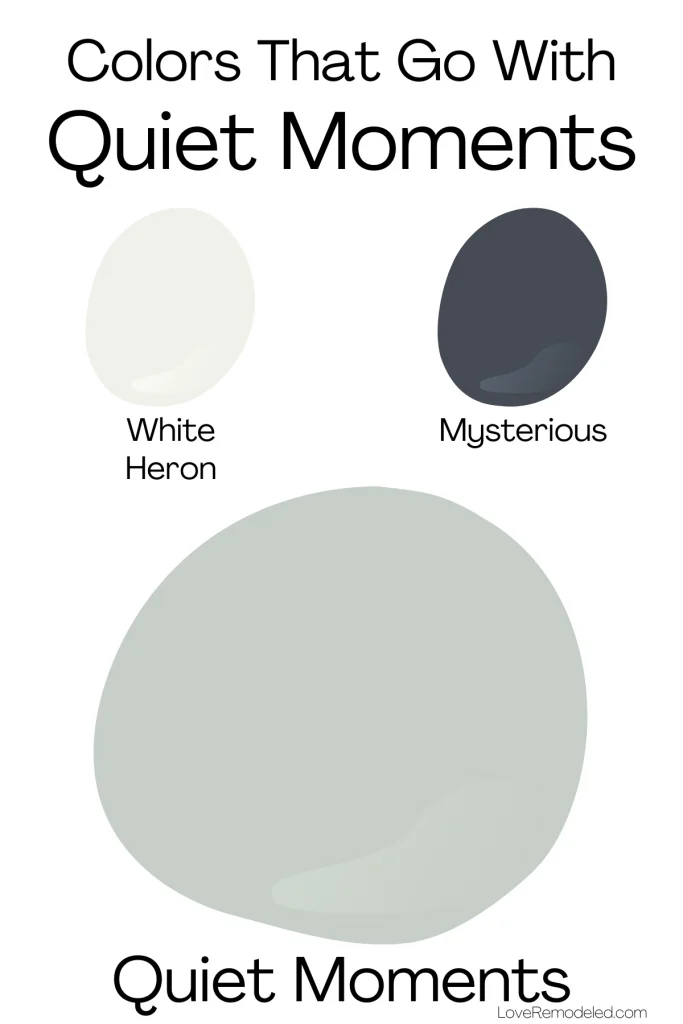
For a more dramatic look, you can pair Quiet Moments with White Heron, a soft white, and Mysterious, a dark navy.
Trim Paint Colors for Benjamin Moore Quiet Moments
If you’re looking for a trim paint color to coordinate with Quiet Moments, I have a few suggestions.

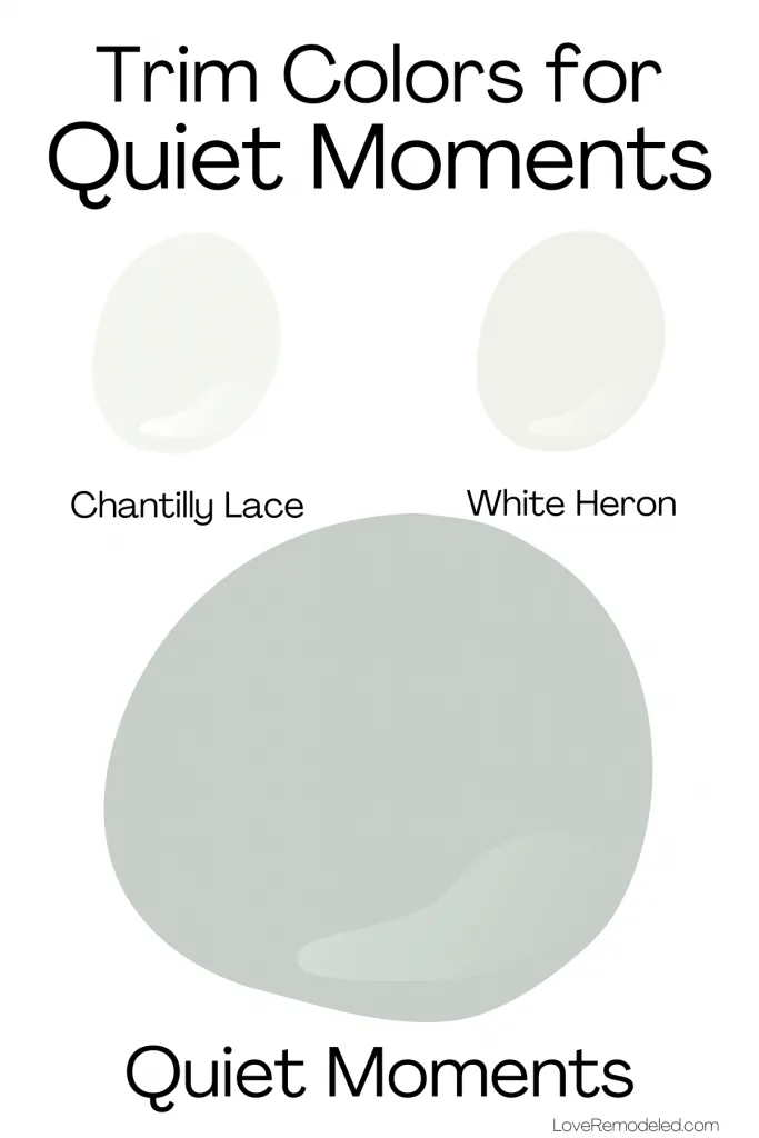
First, Quiet Moments goes really well with Chantilly Lace. Chantilly Lace is my go-to trim color for anyone who wants a bright, crisp white trim paint. It is almost undertone free, so it works with just about any other paint color.
Second, Quiet Moments works well with White Heron. White Heron is a softer white paint color with gray undertones. It is great for someone who likes white trim but wants something a little more muted, but not necessarily creamy.
Where Can I Use Benjamin Moore Quiet Moments?
Quiet Moments is a great paint color for just about any space. Because it is soft and sophisticated, Quiet Moments is a good color for a living room, dining room, kitchen, basement, hallway or entryway.
Due to its relaxing and soothing vibe, Quiet Moments also works really well in a bedroom or bathroom. It gives these rooms a spa-inspired feeling.
Quiet Moments can be used in farmhouse, coastal, traditional, and transitional style homes.
Blue-green paint colors like Quiet Moments are some of my favorites, due to their ability to work in a lot of different spaces.
Benjamin Moore Quiet Moments Compared to Other Popular Paint Colors
Each time I do a paint color review, I like to look at the paint color in comparison to other popular paint colors that are in the same color family.
In this case, I’ll compare Quiet Moments to several other blue-green paint colors. Specifically, let’s look at Quiet Moments compared to Sea Salt, Healing Aloe, Beach Glass and Palladian Blue.
Quiet Moments vs. Sea Salt
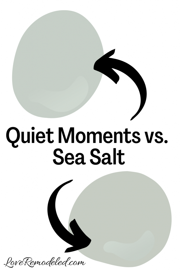

Sea Salt is a very popular Sherwin Williams paint color. It has been popular for years, due to its ability to act as a neutral.
Like Quiet Moments, Sea Salt is a blend of blue, green and gray. Additionally, Sea Salt and Quiet Moments have about the same depth to them.
But, Quiet Moments has a touch more blue, and Sea Salt has a touch more green. Truly though, these two paint colors are very similar to each other.
To choose between them, I would recommend trying them in your space. The lighting in your room may really enhance the blue or the green in them, making one better than the other.
My favorite way to try paint colors is to use Samplize sheets… more on that later.
Click here for more information about Sherwin Williams Sea Salt.
Quiet Moments vs. Healing Aloe
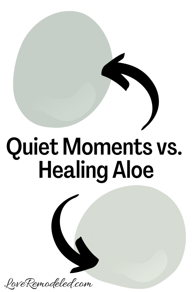

Healing Aloe is a popular Benjamin Moore blue-green paint color. It is a similar shade to Quiet Moments, but a little bit lighter.
In fact, Healing Aloe and Quiet Moments share a paint strip. A common misconception is that this means that they are the exact same color, just lighter or darker versions of each other. This isn’t necessarily true for Healing Aloe and Quiet Moments though.
If you want a light and airy blue green, Healing Aloe is the better choice. But because it is so light, it could run the risk of looking a bit washed out in a super bright room. In this instance, Quiet Moments may be a little better of a paint color for your space.
Click here for more information about Benjamin Moore Healing Aloe.
Quiet Moments vs. Beach Glass
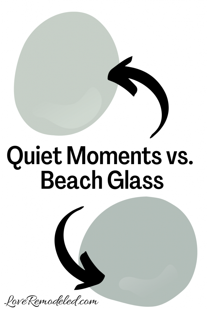
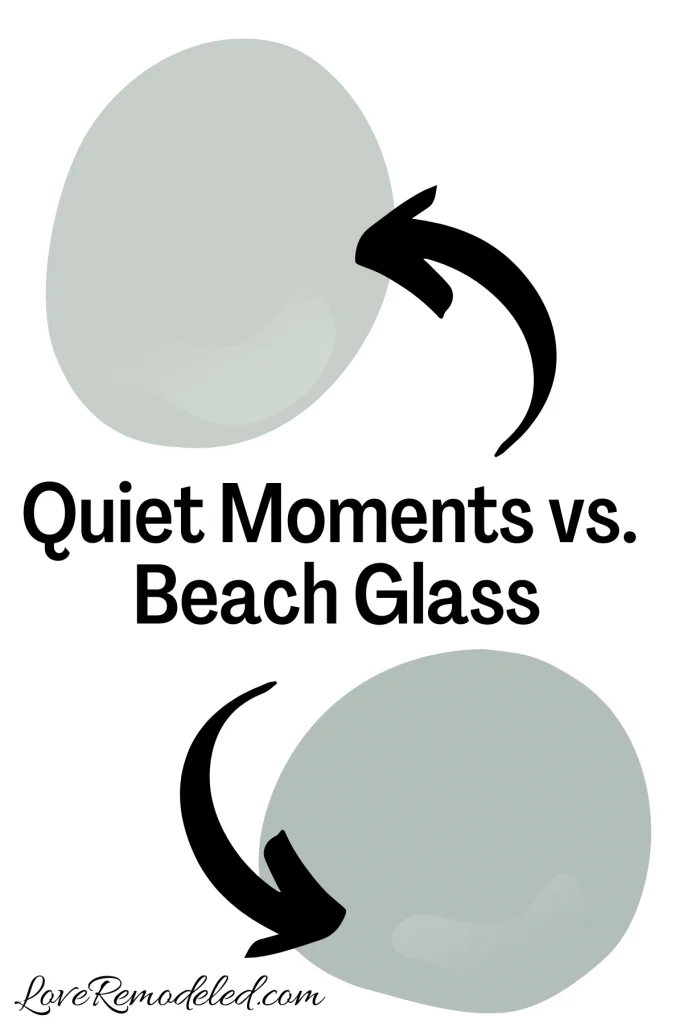
Beach Glass is another blue-green paint color from Benjamin Moore. Beach Glass also shares a color strip with Quiet Moments, but again, this doesn’t mean that they are just lighter or darker versions of each other.
Beach Glass is slightly darker than Quiet Moments, and is almost a mid-tone blue-green paint color. Additional, Beach Glass has a bit more green in it.
Because Beach Glass is darker than Quiet Moments, it doesn’t look quite as bright and airy as Quiet Moments does.
Beach Glass might be a better choice in a very brightly lit room where you want to make sure the color doesn’t get washed out. But, for the average room, Quiet Moments might be the better choice because it won’t make the room look darker than it is.
Quiet Moments vs. Palladian Blue
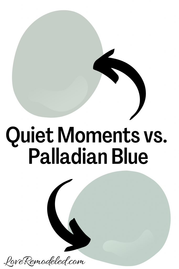
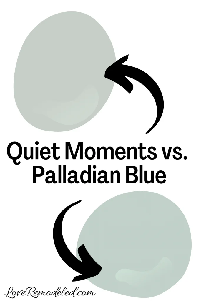
Palladian Blue is a gorgeous light blue-green paint color by Benjamin Moore. It has a little less gray in it than Quiet Moments does though, making it appear brighter.
They have very close LRVs though, meaning they have about the same depth to them.
Between the two, Quiet Moments looks a bit more mature. The gray in it gives it a level of sophistication.
Palladian Blue is still a great paint shade, but it comes across as more of a color than Quiet Moments does.
Click here for more information on Benjamin Moore Palladian Blue.
Wondering How To Pick the Perfect Paint Color?
I have the best solution for you!
Samplize sells peel and stick paint samples in almost every paint color.
These no-mess, peel and stick sheets are made from real paint, so they will show you exactly what the paint color will look like.
Simply place them on your walls next to your trim, furnishings or fixed elements, and easily see which paint color works best in your space and with your lighting.
Then, peel the sheet off your wall and reapply it somewhere else if you like. You can try several different paint colors with no mess, no fuss and no cleaning paint brushes.


Oh, and you can have them in your home by tomorrow with OVERNIGHT shipping!
As a bonus, be sure to use the code LoveRemodeled10 at check out to get an extra 10% off! Samplize sheets are cheaper than a sample can of paint, and way less work.
They are the easiest (and fastest!) way to try a paint color in your home, with no hassle.
Final Thoughts on Benjamin Moore Quiet Moments

Benjamin Moore Quiet Moments is a beautiful blue-green paint color that is sophisticated and mature. It is a great option for someone who wants a bit of color, but doesn’t want a shade that is bright.
Quiet Moments is perfect in a living room, dining room, kitchen, bathroom, or bathroom. It provides a soothing, spa-like feel that invites you to relax and stay a while.
If you are looking for a blue-green paint color that is soft but not too light, Quiet Moments may be the perfect shade for you.
Pick up your Samplize sheet of Quiet Moments here!
Want to see all your paint options in one convenient place? Click here to get everything you need to start painting, including Sherwin Williams and Benjamin Moore paint color decks!


Have a question? Leave me a comment! Remember to check back for a response – it may take me up to a week or two depending on how busy I am, but I’ll try my best to get back to you!
Want to show off your project? Join the discussion in Love Remodeled’s Facebook group!