Mindful Gray is one of the top paint colors by Sherwin Williams. It is a popular shade that is neutral and versatile.
When I think of the top three greige paint colors, I always come up with Agreeable Gray, Repose Gray, and Mindful Gray.
Mindful Gray is a part of the following Sherwin Williams color collections: Nurterer, Living Well – Renew, Top 50 Colors, and Rejuvenation – Spring/Summer 2021.
This post may contain affiliate links. If you have any questions, please see my disclaimer page.
Mindful Gray Color Details
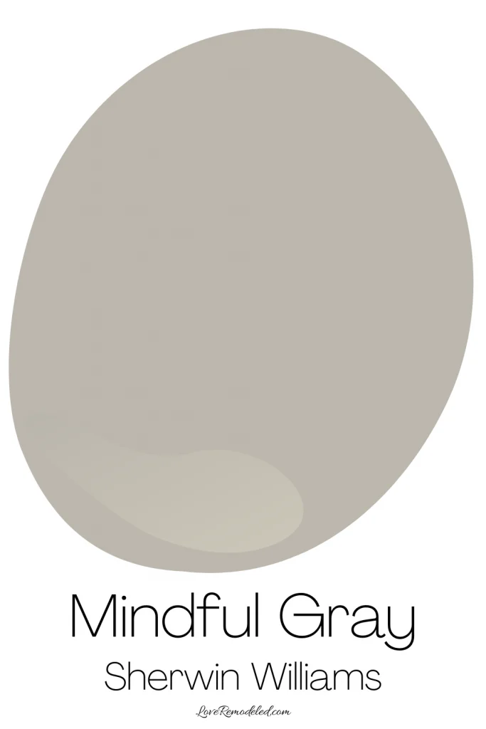
Sherwin Williams Mindful Gray is a greige paint color. Greige paint colors are blend of gray and beige. Mindful Gray also has some subtle blue and green undertones in it.
Mindful Gray has an LRV (Light Reflectance Value) of 48. While it is still technically classified as a light paint color, Mindful Gray is right on the cusp of being included as a “medium” shade on Sherwin Williams’ LRV scale.
The LRV scale goes from zero, which is completely black, to 100, which is completely white. So an LRV of 48 is just about in the middle of that scale.
Mindful Gray will bounce some light around a room, but because of its LRV, it is probably not the best shade for a very dark room. Instead, like all paint colors, it is going to need enough natural and artificial light to support it.
In a Northern facing room, you may find that the cool light coming in from the outside is going to bring out the slight blue undertone in Mindful Gray.
Is Sherwin Williams Mindful Gray Warm or Cool?
Sherwin Williams Mindful Gray is a warm paint color.
While almost all greige paint colors tend to be warmer, Mindful Gray also has those blue undertones that help balance it out.
It shouldn’t ever read too warm in your home because it is a nice balanced shade.
Sherwin Williams Mindful Gray Color Strip
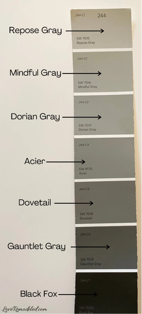
Mindful Gray shares a color strip with some other very popular Sherwin Williams paint colors.
Repose Gray, Dorian Gray, Dovetail, and Gauntlet Gray are all popular gray paint colors that are similar to Mindful Gray.
While they are on the same color strip, this does not necessarily mean that they are just lighter or darker versions of each other.
Instead you can expect them to be in the same color family, but they will have some slight variances in their undertones.
What is One Shade Darker than Mindful Gray?
People often ask which Sherwin Williams paint color is one shade darker than Mindful Gray.
On the color strip, Dorian Gray is the next shade darker than Mindful Gray. The two colors are actually pretty similar in depth and have fairly close LRVs.
Here is a full color review on Dorian Gray, if you’re interested.
If you want a shade that is going actually to look shade darker than Mindful Gray, I would probably recommend going with Acier. This color will show a bit more depth Mindful Gray, while still sharing the same tones.
If you like Mindful Gray but when something that is a little bit lighter, check out this full color review on Repose Gray.
Coordinating Colors for Mindful Gray
Mindful Gray goes well with blues and greens that have some gray in them, oranges, pinks, and other neutrals.
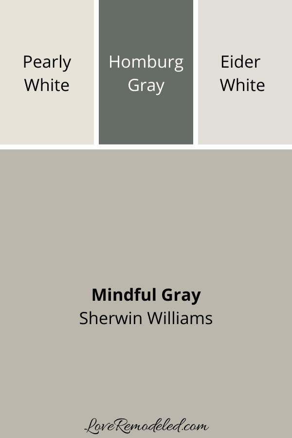
Sherwin Williams pairs Mindful Gray with Pearly White, a warm toned off-white paint color, Hamburg Gray, a darker gray paint color, and Eider White, a grayish off-white paint color.
Where Can I Use Mindful Gray
Mindful Gray is a great paint color for walls. As I mentioned before, I want to make sure you have enough natural and artificial light to make this color really shine.
Mindful Gray can work in living rooms, dining rooms, bedrooms, entryways, kitchens, and more.
Additionally, Mindful Gray is a good color for an exterior of the home. In particular, it works nicely on a Craftsman style home with blue, green, black, and tan accents.
You can also use Mindful Gray as an accent wall paint color. It would look very nice when paired with crisp white wainscoting.
Lastly, some people find that Mindful Gray makes a great neutral paint color for cabinets.
Mindful Gray Compared
When I do a full color review on paint colors, I always like to look at other paint colors that you might be considering.
I find that comparing paint colors together can help people decide which one is going to be right in their home.
For instance, if you are interested in Mindful Gray, you might also be interested in Repose Gray, Agreeable Gray, Anew Gray, and Revere Pewter.
Mindful Gray vs. Repose Gray
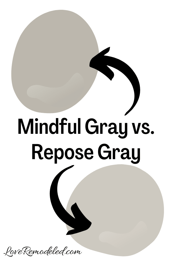
As I mentioned earlier, Repose Gray and Mindful Gray share a color strip.
Repose Gray is a little bit lighter of a paint color than Mindful Gray. It also has a higher LRV.
This means that if your room is slightly darker, you might want to go with Repose Gray over Mindful Gray.
In addition when you compare the two, Mindful Gray has just a hint of green in it, whereas Repose Gray has more of a true blue undertone.
Both Mindful Gray and Repose Gray are beautiful paint colors though. They will work in all the same places.
If you want a something with a bit more depth, go with Mindful Gray. But, if your room is darker, go with Repose Gray.
Click here for a full color review on Repose Gray.
Mindful Gray vs. Agreeable Gray
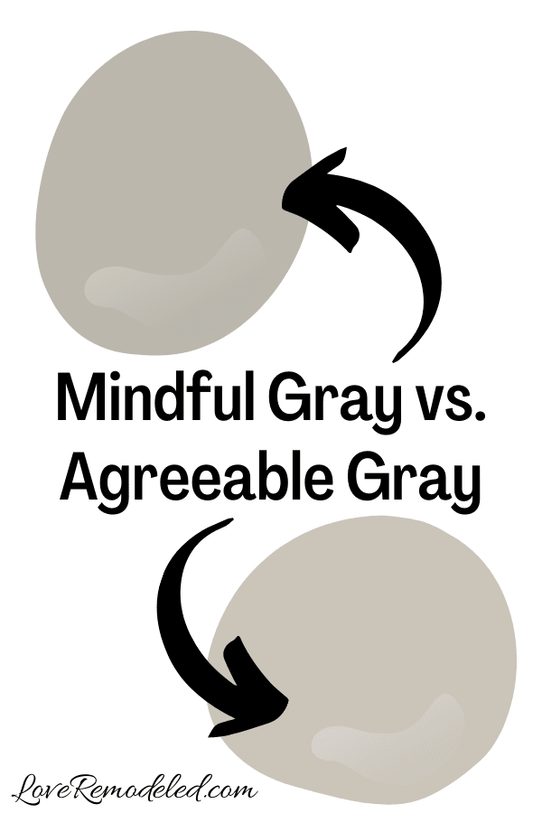
Agreeable Gray is Sherwin Williams’ long-standing, best selling paint color.
Like Mindful Gray, it is a greige paint color. Both have gray and beige undertones, and both also carry a subtle green undertone.
But, you will find that Mindful Gray reads slightly cooler than Agreeable Gray. This is because Mindful Gray also has a hint of blue in it. It is also because Agreeable Gray leans more beige than Mindful Gray.
Additionally, Mindful Gray is a darker paint color than Agreeable Gray. If you want a paint color that definitely looks warmer, go with Agreeable Gray.
But, if your room has a lot of warm light, as Southern facing room will, Mindful Gray might be a better shade to balance this warmth out.
Click here for a full color review on Agreeable Gray.
Mindful Gray vs. Anew Gray
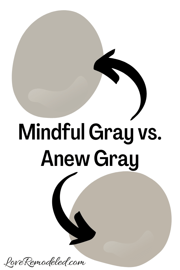
Anew Gray is another popular Sherwin Williams greige paint color.
Anew Gray shares a color strip with Agreeable Gray. It is one shade down from it.
Anew Gray and Mindful Gray have almost the same LRV. They will both reflect about the same amount of light into the room.
But when you compare the two, you find that Mindful Gray looks much cooler than Anew Gray.
Greige paint colors, as you remember, are a blend of gray and beige. Mindful Gray tends to be on the gray end of greiges, and Anew Gray tends to be on the beige end of greige paint colors.
The Anew Gray also has a slight green undertone to it.
Again, if you want a shade that will warm up a space, go with Anew Gray. But if you’re looking for a warm color that will bring a little more balance, go with Mindful Gray.
Click here for a full color review on Anew Gray.
Mindful Gray vs. Revere Pewter
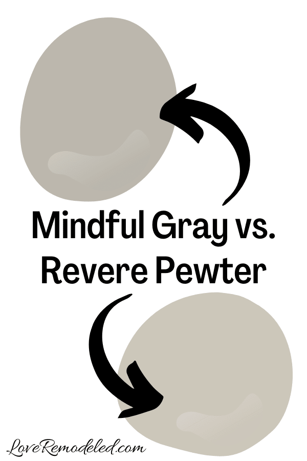
Revere Pewter is one of Benjamin Moore is all time best selling paint colors.
Revere Pewter is another greige paint color. But on the greige scale, Revere Pewter has more beige than gray in it. Remember, Mindful Gray is on the gray end of the greige scale.
Revere Pewter is a bit warmer than Mindful Gray and also a bit lighter than Mindful Gray.
Between the two, Mindful Gray is the more updated shade right now.
But they are both great on walls, cabinets, and exteriors.
Click here for a full color review on Revere Pewter.
Wondering How To Pick the Perfect Paint Color?
I have the best solution for you!
Samplize sells peel and stick paint samples in almost every paint color.
These no-mess, peel and stick sheets are made from real paint, so they will show you exactly what the paint color will look like.
Simply place them on your walls next to your trim, furnishings or fixed elements, and easily see which paint color works best in your space and with your lighting.
Then, peel the sheet off your wall and reapply it somewhere else if you like. You can try several different paint colors with no mess, no fuss and no cleaning paint brushes.
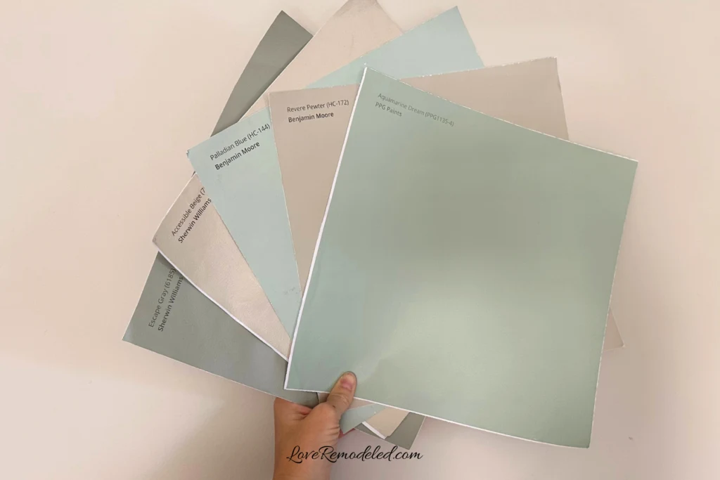
Oh, and you can have them in your home by tomorrow with OVERNIGHT shipping!
As a bonus, be sure to use the code LoveRemodeled10 at check out to get an extra 10% off! Samplize sheets are cheaper than a sample can of paint, and way less work.
They are the easiest (and fastest!) way to try a paint color in your home, with no hassle.
Trim Colors for Mindful Gray
People often ask what is the best white paint color to go with Mindful Gray.
For a clean, crisp trim color, go with High Reflective White or Pure White.
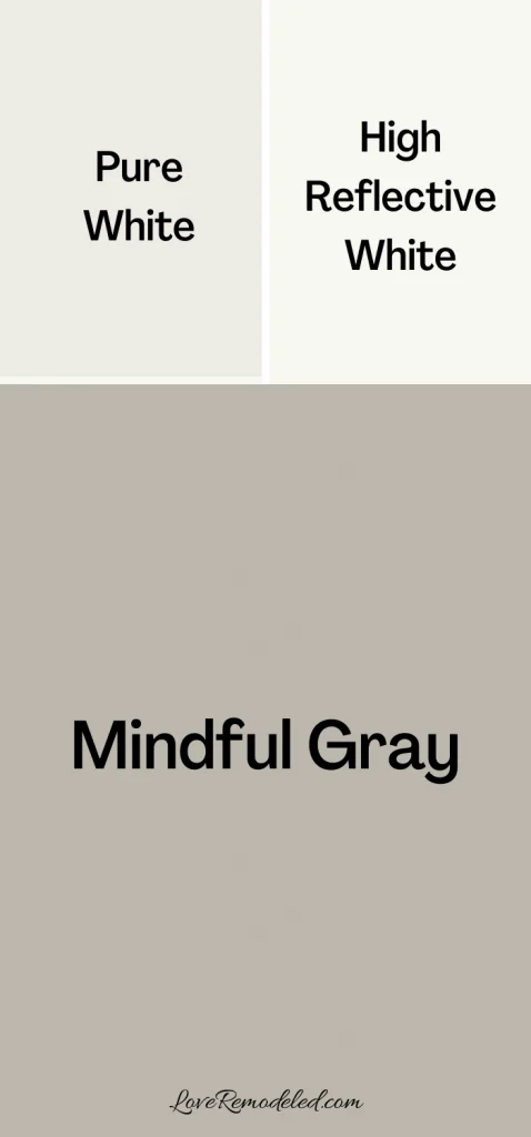
High Reflective White is close to the white brightest white that you can get in a paint, and will really help set off Mindful Gray. For a bright white look with a little bit of a softer edge, go with Pure White.
What Benjamin Moore Color is Close to Mindful Gray?
There is no Benjamin Moore paint color that is exactly equivalent to Mindful Gray.
But there are couple that are in the same color family.
For example, Northern Cliffs is a great paint color that is similar to Mindful Gray. But, Northern Cliffs has more green and more beige in it than Mindful Gray does.
Rockport Gray is also similar to Mindful Gray. But Rockport Gray is a darker paint color and it has a bit more gray in it.
Last, Fieldstone is a similar Benjamin Moore paint color to Mindful Gray as well. It has blue undertones as well, but a bit more color to it than Mindful Gray has.
Final Thoughts on Sherwin Williams Mindful Gray
Mindful Gray is a very popular, versatile paint color by Sherwin Williams.
It is one of the top three gray paint colors sold by Sherwin Williams, and for good reason. It has a little more depth than some of the other popular greige paint colors, which makes it great for a room that you want make stand out.
In addition, it is a balanced paint color which marries warm greige tones with cool blue and green tones.
If you are looking for a warm paint color that is neutral and goes with a lot of other shades, Mindful Gray should be on your shortlist.
Want to see all your paint options in one convenient place? Click here to get everything you need to start painting, including Sherwin Williams and Benjamin Moore paint color decks!
Have a question? Leave me a comment! Remember to check back for a response – it may take me up to a week or two depending on how busy I am, but I’ll be sure to get back to you!
Want to show off your project? Join the discussion in Love Remodeled’s Facebook group!


Lori
Monday 14th of March 2022
Just purchased mindful gray for kitchen walls. Swan stone Countertops are dark green with white speckles. What color of white would go good on cabinets. All trim done in high reflective white.Appreciate your thoughts for cabinets
Lauren
Saturday 19th of March 2022
If the trim is in High Reflective White, I would definitely consider it for the cabinets as well. If you want something less start, maybe think about Pure White. Good luck!
Kim
Thursday 21st of October 2021
I am looking for a dark blue or black or charcoal to pair with mindful gray. Can you make some suggestions?
Lauren
Sunday 24th of October 2021
Hi Kim! Check out Iron Ore, Naval, Black Fox and Gauntlet Gray. Good luck!